Maintenance for the week of January 5:
• PC/Mac: No maintenance – January 5
• NA megaservers for maintenance – January 7, 4:00AM EST (9:00 UTC) - 10:00AM EST (15:00 UTC)
• EU megaservers for maintenance – January 7, 4:00AM EST (9:00 UTC) - 10:00AM EST (15:00 UTC)
• PC/Mac: No maintenance – January 5
• NA megaservers for maintenance – January 7, 4:00AM EST (9:00 UTC) - 10:00AM EST (15:00 UTC)
• EU megaservers for maintenance – January 7, 4:00AM EST (9:00 UTC) - 10:00AM EST (15:00 UTC)
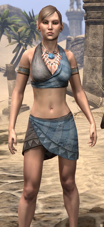
ZOS we need to talk about this outfit.
-
Olauron✭✭✭✭✭
✭There are a lot of motifs and costumes with skirts. It is good to have something with shorts too. The flap is ugly, though.
If you agree with OP, why are you summoning Almalexia? She would definitely not agree with OP.MaleAmazon wrote: »Holy Almalexia.
Agree with OP. Either make it hotpants (silly, but at least coherent), put in a skirt or put on some pants. Crotch flaps and oversized shoulder pads are the plague of fantasy outfit design.The Three Storm Sharks, episode 8 released on january the 8th.
One mer to rule them all,
one mer to find them,
One mer to bring them all
and in the darkness bind them.5 -
Syldras✭✭✭✭✭
✭✭✭✭✭I, on the other hand, do not like long, full skirts much.
They're impractical and overly girly looking.
Of course your personal opinion is valid, but I'm wondering why long skirts are "girly"? Masses of mages in ESO run around in robes - which are, actually, nothing else than dresses, if you look at the shape of the garment. The traditional Dunmer "robe" (in ESO as the "Sixth House robe" costume) isn't even a robe but a combination of long skirt, shirt, jacket and belt.If you agree with OP, why are you summoning Almalexia? She would definitely not agree with OP.
No shorts, no overknee boots Plus, all parts have the same style and fit together. @Syldras | PC | EU
The forceful expression of will gives true honor to the Ancestors.
Sarayn Andrethi, Telvanni mage (Main)
Darvasa Andrethi, his "I'm NOT a Necromancer!" sister
Malacar Sunavarlas, Altmer Ayleid vampire
Soris Rethandus, a Sleeper not yet awake3 -
MornaBaine✭✭✭✭✭
✭✭✭✭✭Bottom line: crotch flaps don't belong on almost anything. They are BARELY acceptable on SOME armor. But NEVER on clothing!
The booty shorts just look completely out of place on this outfit. End of story.
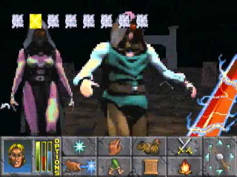
I am not opposed to skimpy clothing. I have no objection to this outfit:
In fact, that outfit is even skimper than the one under discussion. But it looks like something that belongs in the world of Nirn, not some atrocity cobbled together at Hot Topic.PAWS (Positively Against Wrip-off Stuff) - Say No to Crown Crates!8 -
Pauls✭✭✭✭✭This is special outfit for vampire [snip] RP
[edited for inappropriate content]Edited by ZOS_Lunar on July 15, 2020 12:50PM3 -
MasterSpatula✭✭✭✭✭
✭✭✭✭✭I'm a bit confused here. Is this supposed to be Columbia, Janet, or Brad?"A probable impossibility is preferable to an improbable possibility." - Aristotle4 -
Mettaricana✭✭✭✭✭
✭✭✭Keep it as is zos has never made a skirt look good on anything ever. Plus we haven't seen a thigh on anything yet4 -
MornaBaine✭✭✭✭✭
✭✭✭✭✭Taleof2Cities wrote: »I'm guessing you're aware by now, @MornaBaine, but not everything that is datamined makes it to Live.
Gods I hope and pray this crime against fashion does NOT ever make it to live.PAWS (Positively Against Wrip-off Stuff) - Say No to Crown Crates!2 -
mattaeus01b16_ESO✭✭✭✭✭Lose the mudflap, and add a Victorian Gothic cocktail skirt/dress *nods*Player 1 "You all suck, dont you know how to play this game?"
Player 2 "Huh?"
Player 1 "just run passed everything!"
Player 3 "We could just kill them on the way"
Player 4 "Why am I 89% of total DPS, one of the only ones that Qued as DPS, and yet in a group with 3 other DPS that cant seem to kill the basic mobs in a normal dungeon, and being told I suck?"
Player 1 "Whatever, GFL"
Player 1 has left the group...3 -
MornaBaine✭✭✭✭✭
✭✭✭✭✭Mettaricana wrote: »Keep it as is zos has never made a skirt look good on anything ever. Plus we haven't seen a thigh on anything yet
Not true. The other outfit I posted clearly shows a lot of thigh. It is, in fact, a rather daring miniskirt. And it'd be cool if they did some more things like that. Heck, they can even do the shorts if they really want to... on something else. They just don't belong with that top!PAWS (Positively Against Wrip-off Stuff) - Say No to Crown Crates!1 -
Shewolf075✭✭✭If anything, would be good if the art team could take a little more inspiration from the other old designs of previous TES titles, such like the vampires from TESII: Daggerfall as one example of a simple and effective, classic and not too modern. I know folks don't like those "flaps" but they can look great depending on the design.

5 -
LadyNalcarya✭✭✭✭✭
✭✭✭✭✭Dusk_Coven wrote: »The crotch flap is probably just a nod toward modesty. Without it we're just inching closer to TERA.
And short-shorts plus thigh gap emphasizing high boots is too juvenile in comparison to the upper part of the costume -- which despite the cleavage window still has a much more mature look.
Short-shorts are also sort of anachronistic. Overall that is the one piece that is out of place in the outfit so they sort-of covered it up with the front flap. They were probably working hard to get the bare thighs in there somehow.
I don't really think that vampire nobles care about modesty. And those shorts are not particularly revealing, a lot of people irl wear shorts like these during summer (well, obviously not the leather fantasy kind, but same length).
Besides, it's kinda stupid to censor character's legs in a game that features blood, torture, invasions from hell and such.Edited by LadyNalcarya on July 14, 2020 11:24AMDro-m'Athra Destroyer | Divayth Fyr's Coadjutor | Voice of Reason
PC/EU6 -
Thevampirenight✭✭✭✭✭
✭✭Not often you get shorts in a costume so I would say its modest for the type of outfit it is. Since its not really skimpy but does reveal legs. At least in my opinion. Lets get that into the crown store please!. Though maybe it would look good with a more skirt not a long one a more modest one. Kinda like the Altmer hero. But at the same time they could remove the coat and it would look good with the shorts. I don't know on this one. Will be interesting.
Edited by Thevampirenight on July 14, 2020 11:34AMPC NA
Please add Fangs to Vampires.1 -
Syldras✭✭✭✭✭
✭✭✭✭✭Shewolf075 wrote: »If anything, would be good if the art team could take a little more inspiration from the other old designs of previous TES titles, such like the vampires from TESII: Daggerfall as one example of a simple and effective, classic and not too modern.
As long as they don't bring back the dancers in red bikinis. The ones dancing around Mannimarco's white marble coffin, I mean.
@Syldras | PC | EU
The forceful expression of will gives true honor to the Ancestors.
Sarayn Andrethi, Telvanni mage (Main)
Darvasa Andrethi, his "I'm NOT a Necromancer!" sister
Malacar Sunavarlas, Altmer Ayleid vampire
Soris Rethandus, a Sleeper not yet awake6 -
Grianasteri✭✭✭✭✭
✭Why is everyone talking about crotch flaps? That is no way to talk [snip]. Be respectful.
[edited for inappropriate content]Edited by ZOS_Lunar on July 15, 2020 12:52PM4 -
InaMoonlight✭✭✭✭✭I just object against the crotchflap, and if it could be entirely dyed, I think I could make it work for my khajiit
 Edited by InaMoonlight on July 14, 2020 11:34AMEdit = Typos ... as usual. <;D1
 -
Isaura✭✭✭Yeah, it feels like she just got out of bed (or coffin or whatever) and forgot to put on some pants or a skirt
 Could have been gorgeous, I like the top part
3 -
Syldras✭✭✭✭✭
✭✭✭✭✭Yeah, it feels like she just got out of bed (or coffin or whatever) and forgot to put on some pants or a skirt Could have been gorgeous, I like the top part
Maybe it's No Pants Day?
https://en.wikipedia.org/wiki/No_Pants_Day
Wikipedia says it's in May, but who knows how the customs in Tamriel are.@Syldras | PC | EU
The forceful expression of will gives true honor to the Ancestors.
Sarayn Andrethi, Telvanni mage (Main)
Darvasa Andrethi, his "I'm NOT a Necromancer!" sister
Malacar Sunavarlas, Altmer Ayleid vampire
Soris Rethandus, a Sleeper not yet awake0 -
BisDasBlutGefriert✭✭✭✭✭I don't know, but that looks like a fortnite skin, not an eso outfit to me. (Shrugs)~There’s a positive in every negative. Sometimes the positive is harder to find than other times, but there is ALWAYS one there~1
-
Nemesis7884✭✭✭✭✭
✭✭✭✭✭Shewolf075 wrote: »If anything, would be good if the art team could take a little more inspiration from the other old designs of previous TES titles, such like the vampires from TESII: Daggerfall as one example of a simple and effective, classic and not too modern. I know folks don't like those "flaps" but they can look great depending on the design.
that looks really nice1 -
Anumaril✭✭✭✭✭Oh my that looks hideous. The top looks fine enough, but for the love of all that is holy, please change the bottom to be a gown, tunic, or just regular trousers.1
-
valkyrie93✭✭✭✭✭nah i like it with the shorts. my char will probably wear it for a bit
 for what it's worth, girl gamer here too. don't care and actually like that there's another skimpy outfit lol. there are so many non-skimpy ones to choose from.. Edited by valkyrie93 on July 14, 2020 12:59PMPC EU5
 -
Magenpie✭✭✭✭✭Nemesis7884 wrote: »
To be honest @NemMasterSpatula wrote: »I'm a bit confused here. Is this supposed to be Columbia, Janet, or Brad?
Y'know I think you've hit closest to the mark with the problem, along with @Dusk_Coven's comment about anachronism.
The language being used is interesting too. It's not that people think it's too skimpy, it's that it looks 'trashy', silly and just not very nice. What's more, I think those views are very much connected to the modern real world. So some people might think that particular 'look' sparks their...ahem...interests, as it were, which is why there are comments about [snip] etc. It's kind of Caberet too? And y'know what, that's fine if that's what floats your boat.
But ESO isn't set in that kind of place, we're supposed to be in a fantasy world of ...*waves arms about*...the past. I'm struggling because on the one hand it feels like we're meant to be in a kind of early Middle Ages (oh and Rome for heaven's sake) but then you've got costumes like 'Holiday in Balmora' which lands about 1200 years later than that, so who the bloody hell knows *shrugs*.
I just think this costume is a bridge too far into the Nope in terms of the land we're supposed to inhabit here. And it looks silly. Do people really want their Vamps to look silly?
Does that make any sense?
Loads of Edits because I wroted badde.
[edited for inappropriate content]Edited by ZOS_Lunar on July 15, 2020 12:53PM0 -
Magenpie✭✭✭✭✭Shewolf075 wrote: »If anything, would be good if the art team could take a little more inspiration from the other old designs of previous TES titles, such like the vampires from TESII: Daggerfall as one example of a simple and effective, classic and not too modern. I know folks don't like those "flaps" but they can look great depending on the design.

See I don't think of those as 'flaps' - that's a dress with very deep splits up the thigh. That's fine and would look good if it was done well. The flaps we have on ESO armour are awkward and cardboard stiff, and don't sit nicely often ruining a perfectly good outfit piece or costume.1 -
Moonsorrow✭✭✭✭✭
✭✭Would look cool without that silly crotch flap..
ZOS, whoever designs costumes there - could you tell them to stop putting crotch flaps on them? Not only they look bad, but they also flip with the rest of the costume on many Personalities, like on the Brassy Assassin SO many flaps clip in and out through the bottom half of the costume, looks bad.4 -
Raudgrani✭✭✭✭✭
✭Booty shorts AND butt flap, now that's a failure. Seems to me you are mostly upset about the shorts thing, and that sort of concerns me. What's with this fundamental religious kind of stance young people have today? If people want to wear booty shorts - here or in real life - let them.
In some parts of the world, many people are fighting and being jailed or even killed, over the simple fact that they want to dress the way they want. Try to remember this. If you don't like that kind of garment, don't use it - but don't try to stop others from using it.5 -
Hurbster✭✭✭✭✭
✭✭Looks fine but the crotch flap is silly.So they raised the floor and lowered the ceiling. Except the ceiling has spikes in it now and the floor is also lava.2 -
SpacemanSpiff1✭✭✭✭✭
✭✭the flap looks weird, but the rest is fine. id prefer it without full gloves though.2
This discussion has been closed.
