We are currently investigating issues some players are having logging into the European PC/Mac megaserver. We will update as new information becomes available.
PTS Update 46 - Feedback Thread for UI Modernization
-
 daim✭✭✭✭✭Anyone can do these “artistic” ink blobs that were in previous UI and added nothing of note. It was never really looking good. It was a bit more artsy but it was a bad art. Function is better than bad art if you can’t have both.
If you prefer a flat and "cleaner" design you can use the addon Bandits User Interface right now.
I think I will use that addon instead of the new "modernized" design.
Unfortunately, the menu windows also have a harsher look due to the hard borders, as opposed to the current smooth transitions of the window borders.
Unfortunately, there is no add-on for this (yet).
Bandits doesn't change much of the graphics though, but it adds tons of functionality and QoL.
I mainly use it for the curved health bars, which is awesome.""I am that which grips the heart in fright, hearkens night and silences the light." It was written on my sword, long…long ago." ―Ajunta Pall
PC|EU0 -
 Aylish✭✭✭✭✭I always loved the classic vintage design of the old UI and refused using addons or addon settings that change my UI.
But as we may not have any choice but use the new ugly stuff I will probably switch to Perfect Pixel. It‘s also flat and modern but it‘s done way better than the new vanilla hud.
At least the addon author knows how to use transparency and frame borders properly.
I‘m still hoping for an ingame setting switch to use the old UI instead.
But this thread is a perfect example for ZOS only hearing positive feedback and not caring for negative feedback at all.
Instead, my fingers are crossed for someone already working on a UI addon to get the old UI back.6 -
 DerAlleinTiger✭✭✭✭✭DerAlleinTiger wrote: »You have a right to your opinion... but I genuinely want to know how in the world you can think that more detail, more theming, more 'immersion,' more care, more just... love for what they're making somehow is 'amateur?' You can like the new flat, 'clean' (boring, I'd say), sharp-edged design, but come on. Let's not pretend like the old one doesn't have a whole lot more heart and soul in it. Anyone can make the new UI with a couple hours playing around with the shape tools in Photoshop. The old one has actual designs, textures, gradients, depth.
You don't have to like the old one more, but can we at least not pretend that flat, soulless, basic designs are somehow less amateurish than custom textured designs? The old UI design made me think that whoever was making it actually cared about what they were creating, that it was actually one part of a larger experience. The new one? It looks like an intern halfway through a graphic design program was told to create 'a health bar for a videogame - any videogame' and did just that. Put it into almost any other game and it'd fit just as well. How is that not more amateurish, regardless of personal taste?
Anyone can do these “artistic” ink blobs that were in previous UI and added nothing of note. It was never really looking good. It was a bit more artsy but it was a bad art. Function is better than bad art if you can’t have both.
But we did have both. The new UI is bland, featureless, and doesn't actually make it anymore functional. Even ZOS themselves said that functionality is exactly the same, just... uglier, and boxier, and sharper as if it's a sci-fi game. Everything is exactly where it was before, with the exact same functionality as before. They might have added a bit more information to some of the boxes and such, but all of it has nothing to do with the actual UI design. All of it could have been added exactly as it is now.
And sure, making a UI isn't actually a high-bar thing for anyone actually trying... but that's the thing. This new UI isn't even trying, and it would be even easier for someone to make. It's not even truly a 'design,' but looks like an in-engine dialogue box function for Unreal Engine or Unity. It's exactly the same as the current live one, but with less effort.7 -
daim✭✭✭✭✭They could just give the job to some enthusiastic fan / mod creator, give a relatively small compensation and get the job done properly.
Just like Colossal Order/Paradox with Cities Skylines when they hired some of the best addon creators for the game (not that it was enough to save SCL2 but the idea is great).""I am that which grips the heart in fright, hearkens night and silences the light." It was written on my sword, long…long ago." ―Ajunta Pall
PC|EU4 -
 Maxxermax✭✭✭You saw the Skyrim megamod project Skywind lately?
 https://youtu.be/8wWpMR5mo-w?si=OdpJuZp8smk3vLWB
The lines there aren't drawn continuously either.
It's meant to give the whole thing a rusty, aged look.
Because it's a game set in a medieval setting.
I also think the decorations and the font of the UI are beautiful.Edited by Maxxermax on May 29, 2025 4:09PM3 -
 xylena_lazarow✭✭✭✭✭
✭✭✭✭✭The dark blue hp bars for no-healing are too close in color to normal blue hp bars for group members. It's easy to confuse enemies for group members in PvP, or to end up trying to heal an unhealable random in a PvE world event. The colors should be much more distinct, or functionality added for letting addons change the colors of hp bars.PC/NA || Cyro/BGs || retired until Dagon brings a new dawn of PvP metas1 -
 LesserCircle✭✭✭✭✭
✭I thought I had some UI addon on, just to realise I don't have any addons on PTS, after reading through this thread I believe the UI changes will be going live for update 46 and that's extremely disappointing, hope someone makes a "Classic ESO UI" Addon.5 -
 Soarora✭✭✭✭✭
✭✭✭✭✭I looked at ui addons yesterday and the only one I found that might still work is an oblivion themed ui but I think it’s overkill. May be worth a shot to look into though, could be of interest to someone.[PC/NA] Dungeoneer (Tank/DPS), Retired Trialist, and amateur Battlegrounder (DPS) with a passion for The Elder Scrolls lore.- Current GM of Hard Dungeoneers
- Tanks: Sorcerer - Necromancer - Templar
- DPS: Frost Warden - Stamarc
- Ex-healer
- Dungeons: 32/32 HMs - 26/26 Tris
View my builds!
1 -
 Elsonso✭✭✭✭✭
✭✭✭✭✭It occurred to me that if they were really serious about modernizing the UI, they would get rid of the modal dialog that gets put up when the player is disconnected for mundane reasons, like timing out.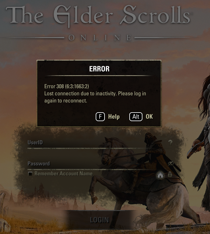
Is it really necessary to block access to the whole UI until that dialog is cleared? They could just put the same information in an info box and let players get on with whatever it is they are going to be doing next.XBox EU/NA:@ElsonsoJannus
PC NA/EU: @Elsonso
PSN NA/EU: @ElsonsoJannus
Total in-game hours: 11321
X/Twitter: ElsonsoJannus2 -
Aylish✭✭✭✭✭
No they can‘t because they won‘t touch UI functionality at all.They could just put the same information in an info box and let players get on with whatever it is they are going to be doing next.
That‘s another issue with the whole „UI modernization“ thing: Nothing is getting modernized as „Make UI better“. It only becomes ugly and flat.
5 -
Elsonso✭✭✭✭✭
✭✭✭✭✭
No they can‘t because they won‘t touch UI functionality at all.They could just put the same information in an info box and let players get on with whatever it is they are going to be doing next.
That‘s another issue with the whole „UI modernization“ thing: Nothing is getting modernized as „Make UI better“. It only becomes ugly and flat.
Yes, the modernization seems to be more like repainting a room. Sadly, I don’t care much for the new paint color.
I don’t think that people will be lining up to play because of the changes they make. I do think the marketing about them updating the UI is more valuable than the actual changes. They could have done a lot less development work for the same results.
Edit… it will be interesting to see the new “modern” UI tomorrow. What is on PTS looks like a mishmash of incomplete work. We will be seeing it for the first time next week.Edited by Elsonso on June 1, 2025 12:15PMXBox EU/NA:@ElsonsoJannus
PC NA/EU: @Elsonso
PSN NA/EU: @ElsonsoJannus
Total in-game hours: 11321
X/Twitter: ElsonsoJannus2 -
 KapiteinBoterham✭✭✭✭The new UI is absolutely atrocious and looks like it has all life sucked out of it. How about we spend those dev resources of fixing bugs that have been in the game for years?
Edited by KapiteinBoterham on June 9, 2025 6:44PM7 -
 Xaemyl✭✭✭Here to chime in with another vote against the new ui. At least add a toggle for the old one ...5
 -
 ArchMikem✭✭✭✭✭
✭✭✭✭✭The flat modern UI isn't appealing to me, as the fine details get lost. It is feeling somewhat similar to the Gamepad UI in my opinion now.
Hope there is an option to choose the UI style in the future without having to use add-ons.
Im on Console and I've always been jealous of the PC user interface. The flat blocky menus never felt natural, and they think this is what people want?CP2,100 Master Explorer - AvA Two Star Warlord - Console Peasant - Khajiiti Aficionado - The Clan
Quest Objective: OMG Go Talk To That Kitty!8 -
 karthrag_inak✭✭✭✭✭
✭✭✭Heavy boundary around icons looks terrible, like khajiit is playing 1990's version. Please give the ability to undo this "update".PC-NA : 19 Khajiit and 1 Fishy-cat with fluffy delusions. cp3600
GM of Imperial Gold Reserve trading guild (started in 2017) since 2/2022
Come visit Karth's Glitter Box, Khajiit's home. Fully stocked guild hall done in sleek Khajiit stylings, with Grand Master Stations, Transmute, Scribing, Trial Dummies, etc. Also has 2 full bowling alleys, nightclub, and floating maze over Wrothgar.(Pariah's Pinacle)5 -
daim✭✭✭✭✭I fear we will need to make an addon to revert this change and keep the old UI
Just to note on this thread, someone already did.
https://forums.elderscrollsonline.com/en/discussion/678389/thoughts-on-the-pc-ui-art-style-modernization#latest""I am that which grips the heart in fright, hearkens night and silences the light." It was written on my sword, long…long ago." ―Ajunta Pall
PC|EU2 -
E_Lucan✭✭✭While I understand that the people responsible for the UI change likely put a lot of work into it and I respect their dedication, I do have to say I much prefer the older UI. It had more personality. This UI, with big gradients and no extra detail like highlights or texture, takes me right out of the immersion in the game and also makes the game look a touch less professional in my opinion. I hope there will be no issues using the add-on that was made to revert it back.4
-
KapiteinBoterham✭✭✭✭I also don't like that you guys changed the mount categories. At least make the category of mounts that I don't have disappear when I select "show unlocked". So I'm not reminded every time what sorts of mounts I'm missing. :'(
.Edited by KapiteinBoterham on June 6, 2025 2:00PM2 -
KapiteinBoterham✭✭✭✭There is too much information being displayed when you hover your mouse over the quest objective (on the map), making it look incredibly cluttered.
If you wanted to know the name of the quest you could just look up the name of the quest in your journal (after making it active), no need to display it when hovering. And do we really need to be reminded that we can click the marker to make it our active quest? This is kind of common sense..
Now we have these big blocks of text when all I want to see is what my current objective is.
.Edited by KapiteinBoterham on June 6, 2025 6:07PM0 -
 SpiritKitten✭✭✭✭✭Every time I port now I get a message that I could port for free at a wayshrine. Ridiculous!2
 -
KapiteinBoterham✭✭✭✭How about you guys make a popup window that comes up once when there is a wayshrine cost or you activate a quest marker?
You can put in one of those "don't show again" checkboxes so it comes up every time until you uncheck the box.
That way it doesn't clutter up the menu!2 -
KapiteinBoterham✭✭✭✭And now "(M) show on map" is no longer at the bottom (you know neatly next to the other options) but in the text field??
.Edited by KapiteinBoterham on June 7, 2025 2:37PM1 -
Elsonso✭✭✭✭✭
✭✭✭✭✭SpiritKitten wrote: »Every time I port now I get a message that I could port for free at a wayshrine. Ridiculous!
This sounds like an addon, to me.KapiteinBoterham wrote: »And now "(M) show on map" is no longer at the bottom (you know neatly next to the other options) but in the text field??
.
I assume you are talking about the Quest journal where the "[M] Show On Map" is below the tasks instead of along the bottom. This is a bizarre change, to be honest. Maybe people were missing the option, or they were worried that people would miss the option?
If so... The option to abandon the quest should be up there, too. People may not know they can abandon quests because the option is buried at the bottom of the screen.
A User Interface Design professional would not be a bad hiring choice, here.Edited by Elsonso on June 8, 2025 12:47PMXBox EU/NA:@ElsonsoJannus
PC NA/EU: @Elsonso
PSN NA/EU: @ElsonsoJannus
Total in-game hours: 11321
X/Twitter: ElsonsoJannus2 -
KapiteinBoterham✭✭✭✭@Elsonso No, there is now a message saying " ! Fast travel is free when you use a Wayshrine in the world." if you click on a Wayshrine without porting from a wayshrine.
This, changing categories of mounts, adding so much info to the quest markers or putting the "show on map" button in a different spot after 10 years!! is just something I can't wrap my head around.
.Edited by KapiteinBoterham on June 8, 2025 7:49PM1 -
Elsonso✭✭✭✭✭
✭✭✭✭✭KapiteinBoterham wrote: »@Elsonso No, there is now a message saying " ! Fast travel is free when you use a Wayshrine in the world." if you click on a Wayshrine without porting from a wayshrine.
This and changing categories of mounts, adding so much info to the quest markers or putting the "show on map" button in a different spot after 10 years!! is just something I can't wrap my head around.
.
@KapiteinBoterham what prompts this? I have been on PC NA and EU last week and have spent hundreds porting around and did not once see this. Maybe I have some setting, like tutorials, turned off?
Screen cap?XBox EU/NA:@ElsonsoJannus
PC NA/EU: @Elsonso
PSN NA/EU: @ElsonsoJannus
Total in-game hours: 11321
X/Twitter: ElsonsoJannus0 -
 SilverBride✭✭✭✭✭
✭✭✭✭✭I saw the fast travel popup once yesterday but it was only the first time I did it, not every time.PCNA0 -
Elsonso✭✭✭✭✭
✭✭✭✭✭KapiteinBoterham wrote: »@Elsonso sure mate: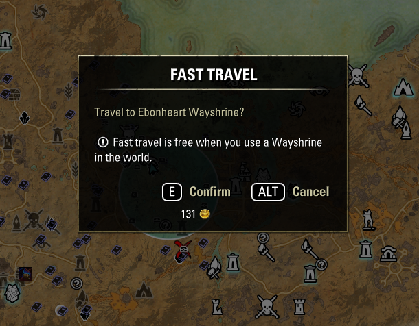
It's not that invasive honestly, but then again I don't port around for gold that much (I'm a cheapskate).
IMO the mount categories, the exorbitant amount of quest marker info and the repositioning of the "(M) show on map" button are much more invasive.
.
Ahh. I was thinking this was a new dialog that appeared, not just new text that appeared in the existing confirmation dialog. My misunderstanding.
Edit: and I'm not even sure it is new text vs text that I just never noticed.Edited by Elsonso on June 8, 2025 3:52PMXBox EU/NA:@ElsonsoJannus
PC NA/EU: @Elsonso
PSN NA/EU: @ElsonsoJannus
Total in-game hours: 11321
X/Twitter: ElsonsoJannus0 -
KapiteinBoterham✭✭✭✭It's not that invasive honestly, but then again I don't port around for gold that much (I'm a cheapskate).
The change to mount categories, the exorbitant amount of quest marker info and the repositioning of the "(M) show on map" button clutter up the menu much more.
.Edited by KapiteinBoterham on June 8, 2025 3:59PM0
