Maintenance for the week of May 25:
• PC/Mac: No maintenance – May 25
• ESO Store and Account System for maintenance – May 27, 6:00AM EDT (10:00 UTC) - 4:00PM EDT (20:00 UTC)
• PC/Mac: No maintenance – May 25
• ESO Store and Account System for maintenance – May 27, 6:00AM EDT (10:00 UTC) - 4:00PM EDT (20:00 UTC)
PTS Update 46 - Feedback Thread for UI Modernization
-
 Elvenheart✭✭✭✭✭
✭✭✭✭DerAlleinTiger wrote: »After spending two... or three... or nine hours on the Oblivion remake yesterday, the changes here just become all the more jarring and insulting to the playerbase. You want to see a UI modernization? Look there! THAT is a good UI modernization! It's cleaner, sleeker, more functional and yet has kept the soul and style of the original.
How is it that a third-party company using a whole different game engine can make a UI that still has the soul of an almost 20-year-old game while improving it, but here we just get Microsoft Office for an 11-year-old game? What is going on here? Do you guys need to go hire Virtuous for your UI design now? It might be worth it if this is the alternative.
It doesn't matter if one is an MMO and the other a singleplayer game, the design fundamentals and concepts apply all he same. Avoid sharp lines that draw the eye away from the actual gameplay. Keep the character and 'soul' of the game intact. Maintain the theme and 'feel' of the setting. Keep it functional and keep it familiar for an 11-year-old title. Add QOL if anything, shortcuts, things to make the experience smoother without taking it away.
OMG, ZOS, please please listen to this before it’s too late. I don’t want to have to get a T-shirt that says, “In ESO I survived AWA, U35, Vengeance, & Subclassing only to be done in by the UI!”Edited by Elvenheart on April 23, 2025 8:24PM8 -
 tomofhyrule✭✭✭✭✭
✭✭✭✭✭FabresFour wrote: »
Is that black retangle in the group names is a bug? Because honestly, it's REALLY UGLY. The rest of the interface is pretty okay—I mean, it’s not really my style, but it has its appeal. But that group with a black bar on the screen really clutters the interface a lot.
Ah, I think I figured it out.
Here's Live:
Notice how the black smudge does go pretty far past on the right side. Since it's got that smudge texture, it doesn't look out of place, but if they got rid of the transparency layer and just left the black box... we'd get exactly the shape we have on PTS.
That's... well, honestly it's lazy. That's not an improvement, that's literally just removing the alpha channel and not adjusting the box to fit the new thing. That alone makes this 'improvement' look like a lack of care and minimum of effort was put in, to say nothing about how the Live UI feels more in-universe whereas the PTS version feels sterile.
I'd love for someone to explain why this UI change was necessary. And to explain why essentially all that was done was "we removed the alpha channels and couldn't even be bothered to resize any of the boxes.22 -
 Aelthwyn✭✭✭✭✭I preferred the way the old UI fades out into the background rather than the new distinct straight edges. Personally I like seeing more background through it and just... I don't know, not feeling as separated from the game world while viewing the skills, bag, etc. I can get used to it, but I preferred the previous.
However what I really hate is the hard edged black box around the companion just floating there while you are Not in the menues. Please make that blend more, make it more transparent, more subtle. It's distracting and annoying.7 -
 Elsonso✭✭✭✭✭
✭✭✭✭✭The game icon has also changed:
Before: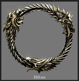
After:
I call that a step backwards.DerAlleinTiger wrote: »After spending two... or three... or nine hours on the Oblivion remake yesterday, the changes here just become all the more jarring and insulting to the playerbase. You want to see a UI modernization? Look there! THAT is a good UI modernization! It's cleaner, sleeker, more functional and yet has kept the soul and style of the original.
I disagree and am wondering if a mod can make it less modern and pull in more "soul and style" of the original Oblivion game. (Edit: I find the NPC dialog to be something that particularly needs work, but I am not a fan of the font they used)
I am not looking there for inspiration here in that department.
Edited by Elsonso on April 24, 2025 2:21PMXBox EU/NA:@ElsonsoJannus
PC NA/EU: @Elsonso
PSN NA/EU: @ElsonsoJannus
Total in-game hours: 11321
X/Twitter: ElsonsoJannus6 -
 DerAlleinTiger✭✭✭✭✭
I disagree and am wondering if a mod can make it less modern and pull in more "soul and style" of the original Oblivion game. (Edit: I find the NPC dialog to be something that particularly needs work, but I am not a fan of the font they used)
I am not looking there for inspiration here in that department.
I find that... interesting, since it basically has the exact same inventory and character menus as Oblivion did, including the parchment style and bordering, but with cleaner 'meta' menus like the options and such. And the gameplay UI is almost identical with some clean-up. You're the very first person I've ever heard actually not like it. But fair enough, you can think as much.
My point is, though, that is they absolutely have to "update" the ESO design, then do something more akin to that instead of just pure, soulless, cold, sharp lines and solid colors that make it look like a Windows app. Keep *some* of the style, at least.
Ideally, they just wouldn't touch it at all, but if they must I'll take that over what they currently have on PTS.2 -
 icapital✭✭✭✭the heck is this? this "new" UI looks bad and soulless.
if we wanted to use ELVUI we would.
Do what WoW did and modernize the UI while keeping the original aesthetics of the game.
For those that want a boring soulless look to their UI, there are mods for that.6 -
 Maxxermax✭✭✭WTH? Did you see the crafting UI?
PTS
(New image for a better comparison.)
This black rectangle in the bottom left with a simple line looks so horrible (what color is this line supposed to be? beige? not even slightly golden anymore).
Live
I can see why some people like the new UI better in some cases.
Another comparison in a darker environment.
Can you see why I like the old UI better?
PTS
But again: The choice of which UI should be optional!
Edited by Maxxermax on April 25, 2025 8:57AM5 -
 Danikat✭✭✭✭✭
✭✭✭✭✭I don't like it. It looks very flat, especially the health bars and the skill icons. Honestly my first impression was that it wasn't finished. I also don't like the hard lines on the sides of the menus, I'm not sure what purpose they're supposed to serve but they're distracting.
I know some addons have UI in the same style but I always assumed that's because they weren't made by artists and they didn't know how to make it look better, or didn't think it was worth the time and stuck with whatever was quick and easy to do. That's how the new UI looks to me - like a rush-job by someone who doesn't know how to put the finishing touches on it.
If it goes live as it is my first priority on patch day will be finding an addon to revert it back to the current style which IMO looks both more professional and more fitting for a fantasy RPG.PC EU player | She/her/hers | PAWS (Positively Against Wrip-off Stuff) - Say No to Crown Crates!
"Remember in this game we call life that no one said it's fair"10 -
Elsonso✭✭✭✭✭
✭✭✭✭✭XBox EU/NA:@ElsonsoJannus
PC NA/EU: @Elsonso
PSN NA/EU: @ElsonsoJannus
Total in-game hours: 11321
X/Twitter: ElsonsoJannus5 -
 Syldras✭✭✭✭✭
✭✭✭✭✭If it goes live as it is my first priority on patch day will be finding an addon to revert it back to the current style which IMO looks both more professional and more fitting for a fantasy RPG.
There's an idiom in my country that translates to "Getting no reply is also a reply". Since we've not gotten any reaction to this "feedback" thread after 5 full pages of, except for 1 post, completely negative feedback, I don't have the impression that there's a big chance that this update will not go live (If I'm wrong and our feedback is heard, then all I can say is that it doesn't feel this way if there's only silence, and it would really help to actually inform us that our posts are taken into consideration).
So, yes, I really hope someone will create an addon that reverts the change. I've never downloaded an UI mod my whole life so far, because I'm usually content with the original one, but this time the new one looks so ugly to me, it's a must.
Edited by Syldras on April 25, 2025 2:17PM@Syldras | PC | EU
The forceful expression of will gives true honor to the Ancestors.
Sarayn Andrethi, Telvanni mage (Main)
Darvasa Andrethi, his "I'm NOT a Necromancer!" sister
Malacar Sunavarlas, Altmer Ayleid vampire
Soris Rethandus, a Sleeper not yet awake5 -
icapital✭✭✭✭If it goes live as it is my first priority on patch day will be finding an addon to revert it back to the current style which IMO looks both more professional and more fitting for a fantasy RPG.
There's an idiom in my country that translates to "Getting no reply is also a reply". Since we've not gotten any reaction to this "feedback" thread after 5 full pages of, except for 1 post, completely negative feedback, I don't have the impression that there's a big chance that this update will not go live (If I'm wrong and our feedback is heard, then all I can say is that it doesn't feel this way if there's only silence, and it would really help to actually inform us that our posts are taken into consideration).
So, yes, I really hope someone will create an addon that reverts the change. I've never downloaded an UI mod my whole life so far, because I'm usually content with the original one, but this time the new one looks so ugly to me, it's a must.This is the official feedback thread for UI Modernization. Specific feedback that the team is looking for includes the following:- Do you have any general feedback on the UI updates for PC?
- Any issues with broken, missing, outdated, or generally weird looking art assets
- Known Issue- Tab menu icons are still using old assets
This is the official feedback thread for UI Modernization. Specific feedback that the team is looking for includes the following:- Do you have any general feedback on the UI updates for PC?
- Any issues with broken, missing, outdated, or generally weird looking art assets
- Known Issue- Tab menu icons are still using old assets
@ZOS_Kevin any updates on this thread and the feedback?1 -
 colossalvoids✭✭✭✭✭
✭✭✭✭✭DerAlleinTiger wrote: »
I disagree and am wondering if a mod can make it less modern and pull in more "soul and style" of the original Oblivion game. (Edit: I find the NPC dialog to be something that particularly needs work, but I am not a fan of the font they used)
I am not looking there for inspiration here in that department.
I find that... interesting, since it basically has the exact same inventory and character menus as Oblivion did, including the parchment style and bordering, but with cleaner 'meta' menus like the options and such. And the gameplay UI is almost identical with some clean-up. You're the very first person I've ever heard actually not like it. But fair enough, you can think as much.
My point is, though, that is they absolutely have to "update" the ESO design, then do something more akin to that instead of just pure, soulless, cold, sharp lines and solid colors that make it look like a Windows app. Keep *some* of the style, at least.
Ideally, they just wouldn't touch it at all, but if they must I'll take that over what they currently have on PTS.
Personally Oblivion's "modernisation" is the same thing as we have at hand here. Yes, they've used some of the old assets but overall it has distinct "blades" meets eso look to me, hopefully it would be modded pretty quickly to resemble more of the original style. ESO though is an mmo se we're stuck with bad decisions no matter we like it or not if that's can't be changed back via an add-on.2 -
Syldras✭✭✭✭✭
✭✭✭✭✭You know, I'd be curious about the artistic vision behind this. If there was one and they could explain why they changed this and that, I might be more accepting of it, if it makes sense to me.
But without getting details about this, I somehow get the impression they simplify everything because they think their relevant target group are people who've seen too many tiktok videos so their brain has regressed their attention span to that of a common house fly. I don't feel adressed by this.@Syldras | PC | EU
The forceful expression of will gives true honor to the Ancestors.
Sarayn Andrethi, Telvanni mage (Main)
Darvasa Andrethi, his "I'm NOT a Necromancer!" sister
Malacar Sunavarlas, Altmer Ayleid vampire
Soris Rethandus, a Sleeper not yet awake4 -
tomofhyrule✭✭✭✭✭
✭✭✭✭✭I'm assuming (or rather praying, since any other reasoning would be one of the most inane moves in the history of this game) that this is because they're trying to save space for something.
They did say the animation changes were in order to save some backend space so new ones could be added (like a new class please 🥺), so I assume it's the same idea here - they want to claw back some space for something. However, I didn't really think the UI took up that much space that it'll affect anything... and the fact that addons can change the UI completely makes me think it's not even something that's based on server-client transmission.
So all I really can think of is "this .png with an alpha channel has a filesize a few KB bigger than the one without an alpha, so we'll go with that." Similarly, the textures on all of the borders and areas all will need a texture file large enough to hold all of the details, but if the details are removed and replaced with a solid color block, then those texture files are unneeded.
It would be great to have someone to suggest why this was done here. I still hate the new one, but it would be a lot more palatable to trade this UI if I knew we were getting e.g. a Dwemer Artificer class next year and they needed every byte of space for it. As it is, it looks like someone was just like "ew, why do I want a medieval-esque UI in my medieval-esque game when I could have a sterile UI that looks like an Office app UI for my medieval-esque game instead!"2 -
icapital✭✭✭✭tomofhyrule wrote: »I'm assuming (or rather praying, since any other reasoning would be one of the most inane moves in the history of this game) that this is because they're trying to save space for something.
They did say the animation changes were in order to save some backend space so new ones could be added (like a new class please 🥺), so I assume it's the same idea here - they want to claw back some space for something. However, I didn't really think the UI took up that much space that it'll affect anything... and the fact that addons can change the UI completely makes me think it's not even something that's based on server-client transmission.
So all I really can think of is "this .png with an alpha channel has a filesize a few KB bigger than the one without an alpha, so we'll go with that." Similarly, the textures on all of the borders and areas all will need a texture file large enough to hold all of the details, but if the details are removed and replaced with a solid color block, then those texture files are unneeded.
It would be great to have someone to suggest why this was done here. I still hate the new one, but it would be a lot more palatable to trade this UI if I knew we were getting e.g. a Dwemer Artificer class next year and they needed every byte of space for it. As it is, it looks like someone was just like "ew, why do I want a medieval-esque UI in my medieval-esque game when I could have a sterile UI that looks like an Office app UI for my medieval-esque game instead!"
or just add another SSD??? lmao.2 -
 Alpheu5✭✭✭✭✭
✭✭The game icon has also changed:
Before:
After:
The new one is more flexible for various color spaces and can be more reliably scaled/rotated than a realistically rendered icon, so there were definitely valid reasons to have an alt version on hand for the website, animations, and other promotional materials. That said, it is a bit strange that they used it as the icon for the game itself, doubly-so pairing that beige hue with such a feathered drop shadow.Dalek-Rok - Argonian Sorcerer || Dalek-Shād - Argonian Nightblade || Dalek-Shul - Argonian Templar || Dalek-Xal - Argonian Dragonknight || Mounts-the-Snout - Argonian Warden || Dalek-Xul - Argonian Necromancer || Two-Spires - Argonian Arcanist || Dalek-Nesh - Argonian Sorcerer || Dalek-Kör - Argonian DragonknightJudas Helviaryn wrote: »Don't incorporate bugs into your builds, and you won't have [an] issue.0 -
Maxxermax✭✭✭@tomofhyrule UI is front end and client based. It would only save a view Kilobytes on your HDD/SSD and Ram.
@Alpheu5 You know the realistic Ouroboros is the standard image on this forum for all users without a personalised user icon and that a big one is in the forumuser profile?
Like mine https://forums.elderscrollsonline.com/en/profile/Maxxermax
Why stylize it?Edited by Maxxermax on April 25, 2025 7:50PM2 -
Danikat✭✭✭✭✭
✭✭✭✭✭If it goes live as it is my first priority on patch day will be finding an addon to revert it back to the current style which IMO looks both more professional and more fitting for a fantasy RPG.
There's an idiom in my country that translates to "Getting no reply is also a reply". Since we've not gotten any reaction to this "feedback" thread after 5 full pages of, except for 1 post, completely negative feedback, I don't have the impression that there's a big chance that this update will not go live (If I'm wrong and our feedback is heard, then all I can say is that it doesn't feel this way if there's only silence, and it would really help to actually inform us that our posts are taken into consideration).
So, yes, I really hope someone will create an addon that reverts the change. I've never downloaded an UI mod my whole life so far, because I'm usually content with the original one, but this time the new one looks so ugly to me, it's a must.
I think it's very unlikely they will change it. I gave up on using the PTS for actual testing because aside from very minor adjustments to skills and occasional bugs feedback is always ignored. I think having a PTS is mostly a marketing gimmick, it's well known that once something makes it onto the PTS it is going live regardless of what anyone thinks of it.
But the UI bothered me enough that I wanted to at least add to the topic which we'll all inevitably be linking back to later to say that yes, it was on the PTS, yes they were told no one liked it and no, there was no response.PC EU player | She/her/hers | PAWS (Positively Against Wrip-off Stuff) - Say No to Crown Crates!
"Remember in this game we call life that no one said it's fair"3 -
Alpheu5✭✭✭✭✭
✭✭@Alpheu5 You know the realistic Ouroboros is the standard image on this forum for all users without a personalised user icon and that a big one is in the forumuser profile?
Yes? I never said it was unusable, only less versatile. The top one is a static image of a 3D render in specific lighting, which limits its applicability. If it's rotated, the light source rotates with it. Its highlights and shadows would probably clash with any typography layered over it. Forum profiles, software icons, and the main menu are all perfectly acceptable uses for it.
A white version of the ouroboros has been spinning in our loading screens for millions of collective hours. It's shown up in official trailers, streams, and merchandise over the years in various hues/materials. It can be edited to fit the aesthetic of its surroundings while remaining recognizable at even small sizes. However, its current execution as the icon of the executable isn't done very well since the beige-on-shadow combo makes it very muddy when scaled to fit on a taskbar. Flat versions of logos aren't a problem when used correctly. Businesses have been using them for nearly a century for a reason.
For comparison, here is the flat version sans drop shadow being used in a 2015 physical publication of Tales of Tamriel.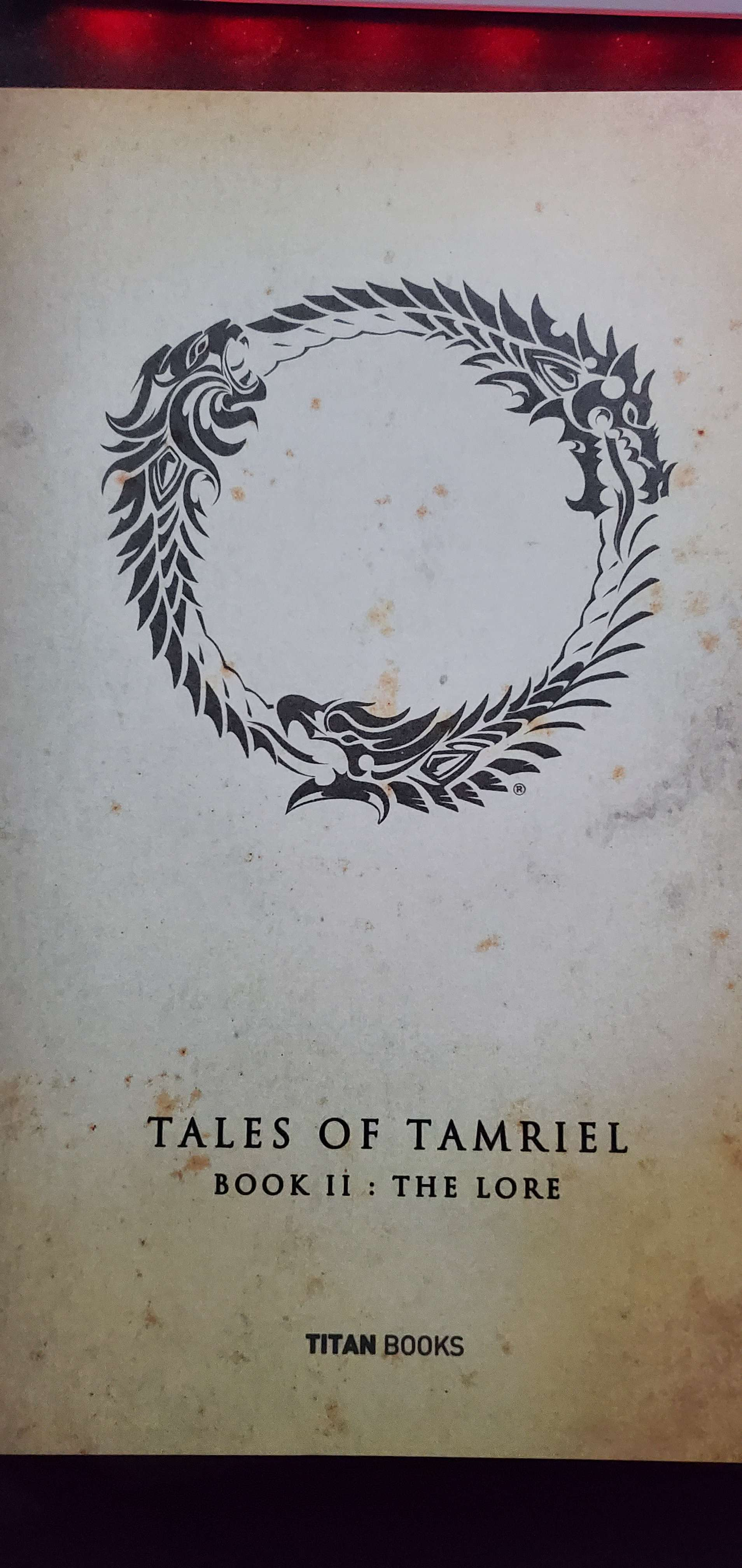
Dalek-Rok - Argonian Sorcerer || Dalek-Shād - Argonian Nightblade || Dalek-Shul - Argonian Templar || Dalek-Xal - Argonian Dragonknight || Mounts-the-Snout - Argonian Warden || Dalek-Xul - Argonian Necromancer || Two-Spires - Argonian Arcanist || Dalek-Nesh - Argonian Sorcerer || Dalek-Kör - Argonian DragonknightJudas Helviaryn wrote: »Don't incorporate bugs into your builds, and you won't have [an] issue.1 -
Maxxermax✭✭✭On the podcast with Rich Lambert and Matt Firor, I heard that they don't listen to forum comments much because it's difficult to distinguish between real players and just haters.
They want feedback from people who actually play the game.
So, the question is, have you also submitted your concerns as a ticket in-game?0 -
tomofhyrule✭✭✭✭✭
✭✭✭✭✭On the podcast with Rich Lambert and Matt Firor, I heard that they don't listen to forum comments much because it's difficult to distinguish between real players and just haters.
They want feedback from people who actually play the game.
So, the question is, have you also submitted your concerns as a ticket in-game?
Yes, actually. I /bug everything that I see on PTS even before I bring it to the forums.
However, ever since the Orsinium debacle last year, I honestly lost a lot of faith in that process. For context, that was U41 and I was running the Orsinium MQ to get screenshots and I found a gamebreaking bug since they added invisible walls in front of the quest objectives. I reported it with /bug and as a forum thread and in the official feedback thread immediately.
It finally got acknowledged when they announced they were having an event specifically to do the Orsinium MQ right after the patch dropped (which would have been impossible) and I posted on the official news article thread and then got one of my Stream Team friends to tell Gina specifically in their private discord.
I understand that there is a lot of "hater feedback" on the forums. However, if an official feedback thread gets this much action, it may be a reasonable thing to figure out what's going on to see if it is haters or if there is an issue. After all, there have been numerous times that people complaining about a PTS change has gone unacknowledged, and then it goes live and - surprise, surprise - the people on Live have the same complaints that were ignored on the PTS thread.5 -
 Cooperharley✭✭✭✭✭
✭Echoing the sentiments here. The new UI is extremely bad. The hard edges are hideous.
I saw someone say it looks like Bandits UI, but I've used Bandits UI for YEARS and can definitely say it doesn't. This is BAD.
Do NOT let it make it to live. (especially without it being optional!)
While on the topic of the UI.. WHY does every single type of mount now need its own tab?? It was fine with Equines, Felines, Canines, Camelids, Ursine, Bipedal, Heavy-Weights, etc, etc. Now there's just a jumbo cluttered unorganized list of everything what a mess.
Who was asking for the UI to be modernized??
The UI being modernized would be dope - this is not modernization, this is a major messup.PC-NA | @Cooperharley1 -
Syldras✭✭✭✭✭
✭✭✭✭✭On the podcast with Rich Lambert and Matt Firor, I heard that they don't listen to forum comments much because it's difficult to distinguish between real players and just haters.
They want feedback from people who actually play the game.
I think it's very obvious if someone is just hating on things or whether someone gives detailed thoughtful feedback.
Also, can't you only register a forum account if they've approved your apply beforehand anyway?@Syldras | PC | EU
The forceful expression of will gives true honor to the Ancestors.
Sarayn Andrethi, Telvanni mage (Main)
Darvasa Andrethi, his "I'm NOT a Necromancer!" sister
Malacar Sunavarlas, Altmer Ayleid vampire
Soris Rethandus, a Sleeper not yet awake6 -
 SilverBride✭✭✭✭✭
✭✭✭✭✭On the podcast with Rich Lambert and Matt Firor, I heard that they don't listen to forum comments much because it's difficult to distinguish between real players and just haters.
They want feedback from people who actually play the game.
I think it's very obvious if someone is just hating on things or whether someone gives detailed thoughtful feedback.
Also, can't you only register a forum account if they've approved your apply beforehand anyway?
Once a player has a forum account, they have it. They can stop playing the game but still continue to post on the forums indefinitely.PCNA1 -
Syldras✭✭✭✭✭
✭✭✭✭✭SilverBride wrote: »Once a player has a forum account, they have it. They can stop playing the game but still continue to post on the forums indefinitely.
But what for? Honestly, if I stopped playing a game I could imagine much more interesting things than staying in its forum and complaining.
And the other thing I wrote is still true: Someone who just wants to cause trouble certainly won't write long, detailed, and thoughtful posts. Many posters in this thread have written in very much detail why they dislike the new design, what they like better about the old one, or what they, in general, imagine as a fitting UI for a fantasy game. Whether one agrees with everything is another story, but I think there are many interesting insights in this thread, that the devs could very much profit from.@Syldras | PC | EU
The forceful expression of will gives true honor to the Ancestors.
Sarayn Andrethi, Telvanni mage (Main)
Darvasa Andrethi, his "I'm NOT a Necromancer!" sister
Malacar Sunavarlas, Altmer Ayleid vampire
Soris Rethandus, a Sleeper not yet awake2 -
 Freelancer_ESO✭✭✭✭✭
✭On the podcast with Rich Lambert and Matt Firor, I heard that they don't listen to forum comments much because it's difficult to distinguish between real players and just haters.
They want feedback from people who actually play the game.
So, the question is, have you also submitted your concerns as a ticket in-game?
Personally, I shifted from submitting tickets in-game to forum feedback as I generally found that bugs I reported in-game didn't get fixed but, when I mentioned it on forums it did get fixed.
ZOS has some forum staff that are quite active so I'd assume that while individual developers may not be familiar with the various forum users I'd assume that the forum staff are familiar with the more active users.
My assumption would be that since much of the criticism including mine doesn't like the new UI overall the feedback will probably not lead to that much change unless ZOS already had internal disagreement regarding the UI. If we just had issues with a little bit of it, it'd be easy enough to bend a little and change things but since many of us dislike most of it, they'd either need to dumpster pretty much all of their work in that area or implement functionality to turn it off to keep those of us that really don't like it happy and that is likely a big ask.SilverBride wrote: »Once a player has a forum account, they have it. They can stop playing the game but still continue to post on the forums indefinitely.
But what for? Honestly, if I stopped playing a game I could imagine much more interesting things than staying in its forum and complaining.
And the other thing I wrote is still true: Someone who just wants to cause trouble certainly won't write long, detailed, and thoughtful posts. Many posters in this thread have written in very much detail why they dislike the new design, what they like better about the old one, or what they, in general, imagine as a fitting UI for a fantasy game. Whether one agrees with everything is another story, but I think there are many interesting insights in this thread, that the devs could very much profit from.
ESO has around 26 million accounts. If one in 100,000 accounts that played the game has nothing better to do than argue/complain on forums for a game they no longer play that leaves your forum with 260 users that are doing that.
Pretty much every gaming forum I've been on has a few users that were doing that.1 -
Elvenheart✭✭✭✭✭
✭✭✭✭tomofhyrule wrote: »As it is, it looks like someone was just like "ew, why do I want a medieval-esque UI in my medieval-esque game when I could have a sterile UI that looks like an Office app UI for my medieval-esque game instead!"
I’m afraid this truly sounds like the most likely scenario. 😟2 -
Maxxermax✭✭✭SilverBride wrote: »Once a player has a forum account, they have it. They can stop playing the game but still continue to post on the forums indefinitely.
But what for? Honestly, if I stopped playing a game I could imagine much more interesting things than staying in its forum and complaining.
And the other thing I wrote is still true: Someone who just wants to cause trouble certainly won't write long, detailed, and thoughtful posts. Many posters in this thread have written in very much detail why they dislike the new design, what they like better about the old one, or what they, in general, imagine as a fitting UI for a fantasy game. Whether one agrees with everything is another story, but I think there are many interesting insights in this thread, that the devs could very much profit from.
I can only share what I heard.
Admittedly, it was about the launch of ESO, but I believe that's Matt Firor's opinion about "people out there at internet land".
Look at this timestamp:
The Elder Scrolls Online Podcast - A Kinda Funny Gamescast Limited Series - Episode 2 time 17:52Edited by Maxxermax on April 28, 2025 3:25PM1 -
 Maitsukas✭✭✭✭✭
✭✭✭The bar-swap icon can barely stand out now in certain backgrounds (Deshaan terrain):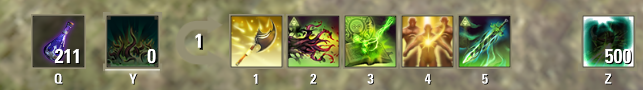
While bar-swapping is locked with Oakensoul for example (Base Game Dark Elf low wall as background):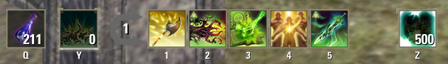 Edited by Maitsukas on April 29, 2025 2:41PMPC-EU @maitsukas
Posting the Infinite Archive and Imperial City Weekly Vendor updates.
Also trying out new Main Quests, Companions, ToT decks, Events and Styles on PTS.4 -
Maxxermax✭✭✭They also seem to want to introduce new animations for weapon swinging, which also looks terrible compared to the live server.
The character now always looks forward while swinging the weapon(s) instead of turning his head to the side, which looks very unnatural.
You can't even really see the arm movements anymore.Edited by Maxxermax on April 28, 2025 10:38PM5