Maintenance for the week of May 25:
• PC/Mac: No maintenance – May 25
• ESO Store and Account System for maintenance – May 27, 6:00AM EDT (10:00 UTC) - 4:00PM EDT (20:00 UTC)
• PC/Mac: No maintenance – May 25
• ESO Store and Account System for maintenance – May 27, 6:00AM EDT (10:00 UTC) - 4:00PM EDT (20:00 UTC)
PTS Update 46 - Feedback Thread for UI Modernization
-
 Drazorious✭✭✭The old UI is so much better. The new UI looks like a poorly done UI mod.Stuff and things11
 -
 Elsonso✭✭✭✭✭
✭✭✭✭✭RaddlemanNumber7 wrote: »The black rectangle holding the Companion's name and health bar is too obtrusive. I'm pretty sure it is significantly larger than it needs to be.
I assumed that this was a defect that would get fixed.
XBox EU/NA:@ElsonsoJannus
PC NA/EU: @Elsonso
PSN NA/EU: @ElsonsoJannus
Total in-game hours: 11321
X/Twitter: ElsonsoJannus2 -
 tomofhyrule✭✭✭✭✭
✭✭✭✭✭Interesting, the new PC patch gave us the new login screen.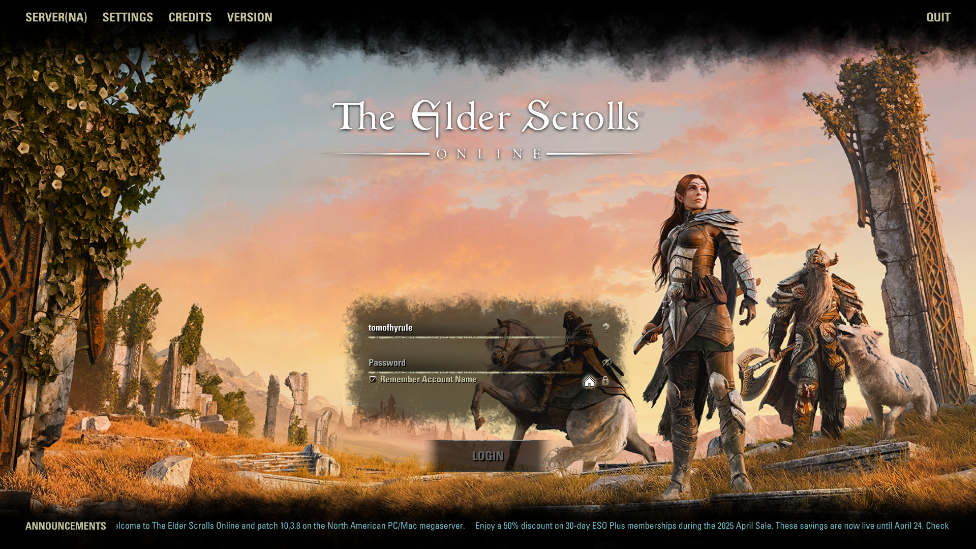
Compared to how it looked on PTS last week.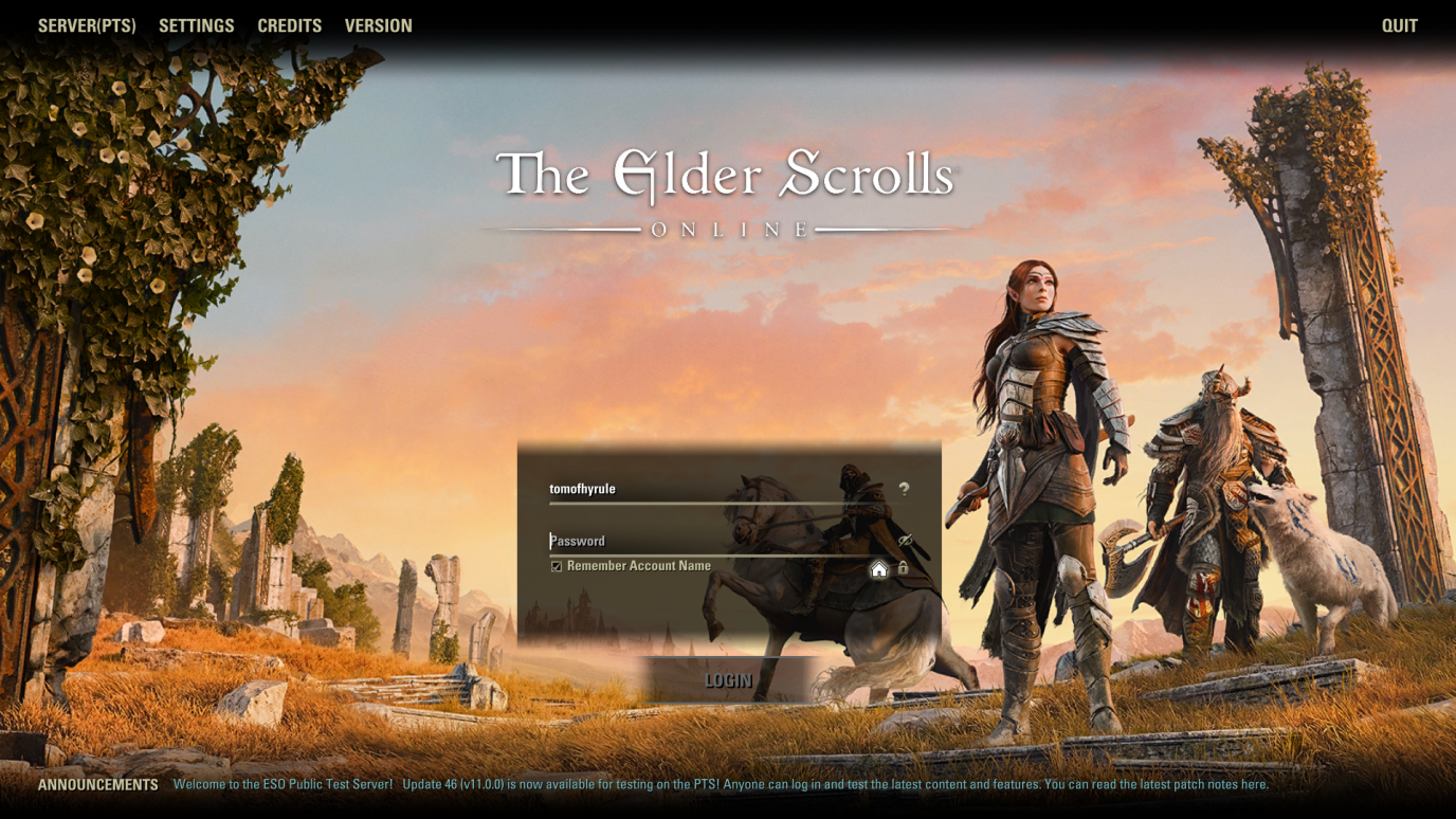
Remind me again how this is in any way an 'improvement?'
The PTS one isn't even consistent! You have all horizontal lined faded but all vertical lines are harsh. It looks like someone just made some black boxes, but a vertical blur on them, and said "done!"
The Live version is at least consistent and makes everything look like a parchment-ish thing which matches with a medieval-y fantasy setting.12 -
 Maitsukas✭✭✭✭✭
✭✭✭The game icon has also changed:
Before: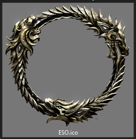
After: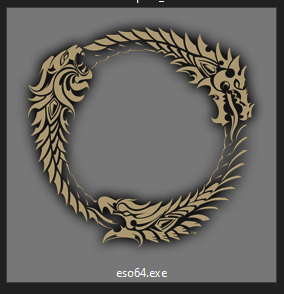
PC-EU @maitsukas
Posting the Infinite Archive and Imperial City Weekly Vendor updates.
Also trying out new Main Quests, Companions, ToT decks, Events and Styles on PTS.10 -
 Elvenheart✭✭✭✭✭
✭✭✭✭RaddlemanNumber7 wrote: »The black rectangle holding the Companion's name and health bar is too obtrusive. I'm pretty sure it is significantly larger than it needs to be.
Is there a way to turn it off or turn the blackness down to zero so you can’t see it?
2 -
tomofhyrule✭✭✭✭✭
✭✭✭✭✭The game icon has also changed:
...
...
Does... does someone just have a deep-seated hate for 3D effects?
This is really giving that bland corporate artstyle you see everywhere nowadays. You know the one that's designed to be as inoffensive as possible, which ends up just inspiring such a deep loathing in anyone who looks at it?13 -
Maitsukas✭✭✭✭✭
✭✭✭The game icon has also changed:
Before:
After:
This also applies to the LIVE version.PC-EU @maitsukas
Posting the Infinite Archive and Imperial City Weekly Vendor updates.
Also trying out new Main Quests, Companions, ToT decks, Events and Styles on PTS.2 -
 Syldras✭✭✭✭✭
✭✭✭✭✭Maybe they think too complex or "unmodern" looking designs are too confusing for "modern people"? Next update is probably exchanging robes with jeans and t-shirts.
But seriously: They said they want to listen to us more. This would be the perfect occasion to show us they do, by scrapping the new design and just keeping everything the way it is.
@Syldras | PC | EU
The forceful expression of will gives true honor to the Ancestors.
Sarayn Andrethi, Telvanni mage (Main)
Darvasa Andrethi, his "I'm NOT a Necromancer!" sister
Malacar Sunavarlas, Altmer Ayleid vampire
Soris Rethandus, a Sleeper not yet awake10 -
Elvenheart✭✭✭✭✭
✭✭✭✭I wonder if changing the UI from the beautiful, three dimensional designs to a flat two dimensional look reduces resources on the game/server strain?2 -
 Ilsabet✭✭✭✭✭
✭✭The giant black box around the party list takes up way too much real estate for no reason.
The new resource bars are flat and uninspiring.
In both cases the way it is now (on Live) is fine.
I haven't actively checked out the extent of the UI changes, but those were the things that immediately stuck out to me when I logged on. And I know they've been mentioned (a lot) in this thread, but doesn't hurt to add my voice to the chorus. Edited by Ilsabet on April 21, 2025 5:20PMIlsabet Menard - DC Breton Nightblade archer - Savior of Pretty Much Everything, Grand Overlord & Empress Nubcakes
My characters and their overly elaborate backstories
Ilsabet's Headcanon
The Adventures of Torbyrn Windchaser - Breaking the Ice & Ashes to Ashes
Bastian's Tattoos: An Inaccurate Headcanon
PC NA1 -
 Ragnarok0130✭✭✭✭✭
✭✭Elvenheart wrote: »I wonder if changing the UI from the beautiful, three dimensional designs to a flat two dimensional look reduces resources on the game/server strain?
If you look at a lot of software this is the direction modern UI has been going recently. I suspect they are using people who work on UI in other programs to do this effort in ESO and the horrible minimalist generic modern UI is what they are familiar with designing.1 -
 DerAlleinTiger✭✭✭✭✭StarMightyMaster wrote: »A overhaul and updated UI is needed it's old and it looking it's age also maybe something they can work on over this year and have it ready for next year
Needed? By who? For what? What can you not do because of the current UI design that this new UI design allows you to do?
Out of all the many, many complaints about the game I've heard over the past 11 years, the UI's art design has never been one of them. Some people have said they want more information displayed, and I've said I want more cohesive and standardized tooltips, but those aren't what's being addressed here and nor do they need to change the art design to achieve either of those as evidenced by the fact that they've already done the former on live with the very last update.4 -
 Estin✭✭✭✭✭
✭The game icon has also changed:
Before:
After: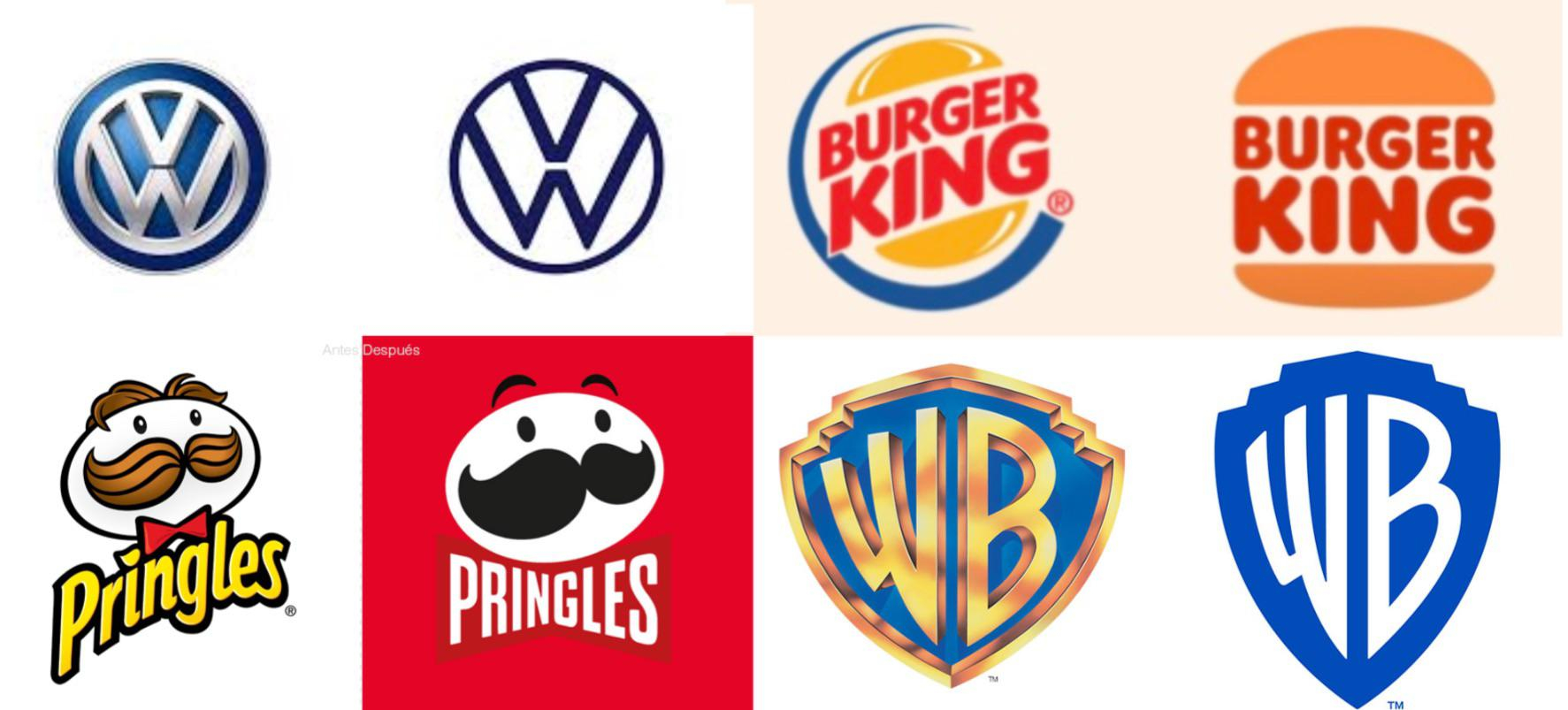
I really hate the trend of taking stylized logos and making them 1 dimensional because it's "modernized". It doesn't look good and makes everything look soulless. I bet this is all Microsoft's doing.
ZOS, you're fully Unionized. You should have the power to reject these UI changes because they do not look good at all. It's a complete eyesore and sucks the fantasy out of the game. I don't want to be reminded of Microsoft Teams or Excel when I'm playing my high fantasy MMO.18 -
tomofhyrule✭✭✭✭✭
✭✭✭✭✭Well, 11.0.1 is "updating" more icons to to "match the new modern UI style."
Still really wish we could get a Dev comment explaining why this is necessary. We only ever get the dev comments on some of the balance changes; nobody ever stops to comment on other more cosmetic changes, particularly if they're controversial.14 -
 licenturion✭✭✭✭✭
✭tomofhyrule wrote: »Well, 11.0.1 is "updating" more icons to to "match the new modern UI style."
Still really wish we could get a Dev comment explaining why this is necessary. We only ever get the dev comments on some of the balance changes; nobody ever stops to comment on other more cosmetic changes, particularly if they're controversial.
Just checked. Can't really see much difference. It still all over the place. Some icons still are 'rugged', others are not. Some progress bar have a new flat style, others do not.
The biggest offender that makes the UI look very clinical and static (also known as modern) is those ugly lined gradients.
I doubt much will change though. Ever talked to a UI designer? They are usually max level in stubbornness. I bet this goes live, even if 99 percent people says 'bleh' Edited by licenturion on April 21, 2025 6:38PM4 -
Maxxermax✭✭✭Elvenheart wrote: »I wonder if changing the UI from the beautiful, three dimensional designs to a flat two dimensional look reduces resources on the game/server strain?
Not so much, I think. The UI is part of files in the game folder on your PC. Maybe they save you 10 MB on the storage Drive and Ram.
If you need to revert the UI to the old style via addon it takes more space.2 -
tomofhyrule✭✭✭✭✭
✭✭✭✭✭I don't suppose some addon dev could quick save all the files from Live so we could get a "Classic UI" addon?14 -
 SpaceElf✭✭✭FabresFour wrote: »
Is that black retangle in the group names is a bug? Because honestly, it's REALLY UGLY. The rest of the interface is pretty okay—I mean, it’s not really my style, but it has its appeal. But that group with a black bar on the screen really clutters the interface a lot.
Oh my gosh, I thought it was a bug too. I really hope that’s a bug and not intentional. It was very distracting.
While I don’t have a problem with visually sharp, clean borders executed here, it looks awkward, incomplete, and disproportionate to the element it is supporting as a whole. It takes up too much visual space, particularly on the right. I would say cropping the box to be a little bit smaller and centered would be an improvement.
Respectfully, I am surprised to learn that this is a finished product.
Edited by SpaceElf on April 21, 2025 6:39PM3 -
 master_vanargand✭✭✭✭✭
✭Maybe the UI designer is a spy.
It's common for companies to sabotage rival games from within.2 -
 colossalvoids✭✭✭✭✭
✭✭✭✭✭I really, really hope someone would come up with a rustic version of the UI or something in that direction or I'd need some free time and learn lua finally. The best UI in tes was Oblivion and the further we go into the Skyrim land the less interested I am personally. No wonder the most download mod is an UI one, thought devs would get a hint or two on why's.2 -
silentxthreat✭✭✭✭I would like a way to increase or decrease size of the ui like action skill bars or resource bars. I would also like a way to move these without needing some add on. I use bandits add on just because I want my resource bars stacked because im blind in one eye. It makes it more easy for me to read when its not across my whole screen0
-
Maxxermax✭✭✭This is the official feedback thread for UI Modernization. Specific feedback that the team is looking for includes the following:
- Do you have any general feedback on the UI updates for PC?
- Any issues with broken, missing, outdated, or generally weird looking art assets
- Known Issue- Tab menu icons are still using old assets
Could you please comment on the concerns raised and confirm that adjustments are at least being considered?5 -
ceruulean✭✭✭✭Can the company focus more on UX rather than UI? Stuff like the U45 Green Champion points becoming passives are great. They take out the busywork and decision fatigue of the game.
However, we still don't have the option to enable account-wide keybindings, yet we have account-wide achievements. Even the most egregiously pay-to-win trash MMO titles on the market have account-wide keybindings. All the hot MOBAS that Gen Z and Alpha are playing have account-wide settings. If you don't change this, you're going to put off every new player that makes a new character. It's been 11! years.
https://forums.elderscrollsonline.com/en/discussion/650100/please-give-us-a-toggle-for-account-wide-settings-and-keybindingsEdited by ceruulean on April 22, 2025 4:44PM8 -
tomofhyrule✭✭✭✭✭
✭✭✭✭✭Hi, me again.
Ok, so I don't think I've made my distaste of the new UI a secret, but I will say that if there's an event announcement on the Character Select Screen that it looks really bad.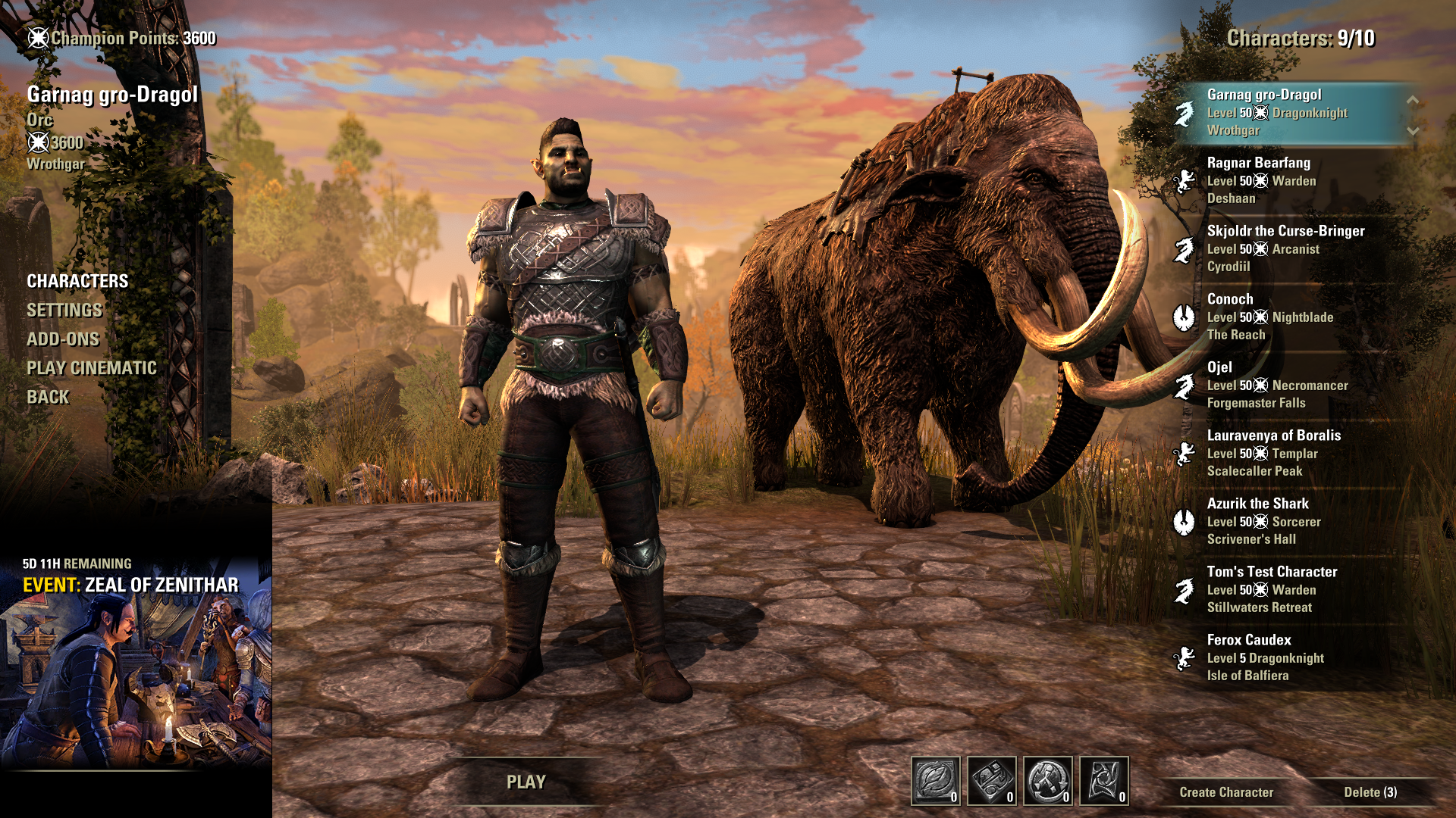
My eye is completely drawn to that hard line next to the event announcement. Every other line is softer or slightly blurred, but that harsh vertical line (that has a clear row of black pixels to highlight that specific line) completely draws my eye away.
If we must have this UI change, can we at least have a gold border on the promo and not a harsh black line there?10 -
DerAlleinTiger✭✭✭✭✭After spending two... or three... or nine hours on the Oblivion remake yesterday, the changes here just become all the more jarring and insulting to the playerbase. You want to see a UI modernization? Look there! THAT is a good UI modernization! It's cleaner, sleeker, more functional and yet has kept the soul and style of the original.
How is it that a third-party company using a whole different game engine can make a UI that still has the soul of an almost 20-year-old game while improving it, but here we just get Microsoft Office for an 11-year-old game? What is going on here? Do you guys need to go hire Virtuous for your UI design now? It might be worth it if this is the alternative.
It doesn't matter if one is an MMO and the other a singleplayer game, the design fundamentals and concepts apply all he same. Avoid sharp lines that draw the eye away from the actual gameplay. Keep the character and 'soul' of the game intact. Maintain the theme and 'feel' of the setting. Keep it functional and keep it familiar for an 11-year-old title. Add QOL if anything, shortcuts, things to make the experience smoother without taking it away.Edited by DerAlleinTiger on April 23, 2025 2:02PM15 -
 Ezhh✭✭✭✭✭
✭tomofhyrule wrote: »Hi, me again.
Ok, so I don't think I've made my distaste of the new UI a secret, but I will say that if there's an event announcement on the Character Select Screen that it looks really bad.
My eye is completely drawn to that hard line next to the event announcement. Every other line is softer or slightly blurred, but that harsh vertical line (that has a clear row of black pixels to highlight that specific line) completely draws my eye away.
If we must have this UI change, can we at least have a gold border on the promo and not a harsh black line there?
This looks like a computing student's first attempt at a UI with zero understanding of the product the UI is for or for basic UI development standards. That hard black edge on the event section is beyond bad. It's inconsistent, doesn't align with the surrounding elements, harsh and unpleasant to look at and just all round bad.14