Maintenance for the week of March 2:
• PC/Mac: No maintenance – March 2
• PC/Mac: No maintenance – March 2
Should we Keep or Change the new Selection Screen?
-
 Northwold✭✭✭✭✭
✭✭Keep it@ArchangelIsraphel Makes good points on the (slightly nightmarish) world of colour management. I also have a calibrated setup.
A couple of other points:
- If anyone is using their monitor with no lights on in the room, well, don't. Bad for your eyes doesn't begin to describe it.
- If anyone is using a wide / non-standard gamut monitor then you need to set it to srgb mode to play almost all games if using windows. Otherwise certain colours will go completely wild. Most notably red... And orange. May not be noticeable most of the time in most games. But when the screen is almost entirely made up of shades of orange, that's when it's going to be apparent.
- Common colours where "normal" screens can go seriously awry are, you guessed it, red and orange. If you've cranked saturation up in your screen's settings you may well be seeing the issue.
I personally don't have a problem with the character screen and rather like it. However, ZOS may have stumbled into a situation where it's displaying in a wildly different manner on different people's screens so perhaps it does need to be toned down.
I used to do poster and advertising shots for a living and anything orange or red you had to take a view on because of the screen problem and also because orange doesn't play nice with / translate well into the sRGB colour space (which is the range of colours everyone looking at your image will be seeing it in, unless it's print). It's very hard to tell what it'll look like on non-pro level screens when you're creating the image. Indeed, I used to keep a crappy screen and a crappy old phone with a crappy screen around just to be able to check stuff like this.Edited by Northwold on March 13, 2024 9:49AM5 -
 Aurielle✭✭✭✭✭
✭✭✭✭✭Keep itArchangelIsraphel wrote: »It's beautiful. I do not find it too bright on my larger screens, nor do I find it too bright on my smaller screens. My large screens have been properly calibrated, however.
From what I have seen of screenshots where people are complaining that the new background appears too saturated/too bright, it frequently seems like they have not properly calibrated the color settings on their monitors (Or have monitors that cannot be calibrated) and have certain color/brightness settings set far too high.
Side Note: In game lighting and settings are also fine and appear no different to me than they were before.
It is often the case that DEV teams do not see what you see on their monitors when they are designing features of the game, because they are also using properly calibrated equipment. To them, it looks perfectly fine. In the meantime, the end user of the product frequently either does not know how to calibrate their monitor, or does it the wrong way, thus they experience issues with seeing colors.
I am not saying any of this to be insulting or degrading, but instead pointing out where the real issues may lie in order to assist the DEV team in understanding why there is such a wide discrepancy in the user base.
I run into this all the time in my field of work, where I need to utilize CMYK colors for print. My monitors are properly calibrated to display colors accurately. However, I frequently run into clients who tell me certain shades of red appear orange on their screens, or have other issues with brightness, because their monitors either aren't calibrated, OR because the monitor is incapable of displaying a full color gamut due to hardware limitations.
As such, I have to make adjustments to the preview image my client sees, so that the product appears correctly to them on the device they are previewing it on. Meanwhile, I send the color-accurate CMYK version to the printers, and everything comes out correct 100% of the time, with no issues.
While I know my line of work is different from the videogame industry, some of the same principals still apply. Perhaps it would be helpful if the DEV's considered the user-end hardware limitations when designing some additional settings that might allow people to adjust lighting/gamma on the log in screen, independently from in game settings, while still keeping the higher end settings available for those who have hardware capable of displaying the graphics in the intended way.
Videogames are usually developed utilizing an sRGB colorspace, and monitors incapable of displaying an 100% sRGB color space can end up seeing anything from over, to understated images. Truth be told, even owners of 100% sRGB screens can calibrate them incorrectly and end up with eye-searingly bad color.
So...yes.
TLDR; there are a lot of factors concerning hardware and if/how a user calibrates said hardware that could be contributing to the wide discrepancy in how this log in screen is being perceived.
Lots of great points here. I do web design as a hobby, and spent many painstaking hours calibrating (and re-calibrating) my monitor. The new login screen looks great, to me — not overpowering or oversaturated in the slightest. Know what DOES look oversaturated? A lot of the highly unrealistic Reshade profiles people use and claim to love in this game… I half wonder if they’re part of the problem for folks, in addition to improper monitor calibration.
On a related note, I’m hypersensitive to the appearance of text (web design will do that to you), and spent a decent amount of time getting ESO’s text to look perfect (pre-patch). Post-patch, I’m not experiencing ANY of the text appearance issues people are now complaining here about.
People are very quick to blame and complain without taking the time to tweak and troubleshoot.Edited by Aurielle on March 13, 2024 10:23AM7 -
Aurielle✭✭✭✭✭
✭✭✭✭✭Keep it
- If anyone is using their monitor with no lights on in the room, well, don't. Bad for your eyes doesn't begin to describe it.
Can’t emphasize this enough! I use bias lighting for everything, from gaming to web design. Govee light bars mounted directly to the rear of my monitor.
A good layman’s article on bias lighting: https://www.howtogeek.com/213464/how-to-decrease-eye-fatigue-while-watching-tv-and-gaming-with-bias-lighting/3 -
 MotherOfMoss✭✭✭✭Keep it but tone down the brightness and saturationI think the background itself is pretty; the only thing I would change is the stark lighting on my character. (And that's not going to kill me)Edited by MotherOfMoss on March 13, 2024 10:32AMPC-EU | Long-time fan of TES Online: Furnishing and fashion simulator with massively multiplayer online chatting features.2
 -
 Danikat✭✭✭✭✭
✭✭✭✭✭Keep itI think it looks beautiful and it's a nice change from some of the duller backgrounds. (Also I'm glad to have that bleeding tooth fungus off the screen, they're interesting fungi, but not very nice to look at.)
Also I agree that a lot of people are probably running into problems because they've never calibrated their monitors. I encounter this all the time because a big part of my work is supporting volunteers and that often means helping someone set up a new out of the box computer, which for some reason almost always comes with brightness set to 100% and sometimes contrast set very high as well, so I'm forever telling people looking at a document with a white background should not hurt your eyes and if it does you need to turn the brightness down.I_killed_Vivec wrote: »I'm in two minds...
It's very autumnal, which isn't good if you're in the northern hemisphere, rapidly approaching the vernal equinox.
But it does look good.
A lot of the backgrounds have been seasonal, so I don't see how this one is any different. The original AD one had trees covered in blossom which only happens in spring and the EP one had snow on grassy areas which only happens in winter (if it was permafrost there wouldn't be grass) and they were used for years. The Necrom one had flowers in bloom indicating it was summer, and we had that all through the winter.Edited by Danikat on March 13, 2024 10:51AMPC EU player | She/her/hers | PAWS (Positively Against Wrip-off Stuff) - Say No to Crown Crates!
"Remember in this game we call life that no one said it's fair"2 -
 Roztlin45✭✭✭✭✭Keep itIt’s nice. The fall season of the existence and last warmth before the cold dark of winter.0
 -
 Xarc✭✭✭✭✭
✭✭✭Keep itI hate it; it's hard on the eyes on a literal level and makes my characters look weird.
Imo you have to adjust the gamma or contrast of your screen because in normal situation it's OK and looks good@xarcs FR-EU-PC -Please visit my house ingame !
sorry for my english, it's not my native language, I'm french
"Death is overrated", Xarc
Xãrc -- breton necro - DC - AvA rank50
Xarcus -- imperial DK - DC - AvA rank50 - [pve] pureclass
Elnaa - breton NB - DC - AvA rank50
Xärc -- breton NB - DC - AvA rank49 - [pve] pureclass
Isilenil - Altmer NB - AD - AvA rank41
Felisja - Bosmer NB - DC - AvA rank43
Glàdys - redguard templar - DC - AvA rank40 - [pve & pvp] pureclass
Xaljaa - breton NB - now EP - AvA rank40
Bakenecro - khajiit necro - DC - AvA rank28
Xalisja - bosmer necro - DC - AvA ?
Shurgha - orc warden EP - AvA rank? [pve & pvp]pureclass
Scarlętt - breton templar DC - AvA rank?
- in game since April 2014
- on the forum since December 20141 -
 code65536✭✭✭✭✭
✭✭✭✭✭Keep itThe scenery is fine, it just needs to be less bright. Strangely enough it looked better on PTS at least for me.
I would suspect in that case that your graphics settings on PTS do not exactly match your graphics settings on Live.Nightfighters ― PC/NA and PC/EU
Dungeons and Trials:Personal best scores:- Dragonstar Arena: 46817 (NA)
- Maelstrom Arena: 600526 (NA)
- Blackrose Prison: 99274 (EU) (Unchained)
- Maw of Lorkhaj: 165227 (EU)
- Halls of Fabrication: 220708 (NA) (Tick-Tock Tormentor #1, #2, #3, #4, #5, #6, #7, #8, #9, #10, #11, #12)
- Asylum Sanctorium: 114957 (NA) (Immortal Redeemer #1, #2, #3, #4, #5, #6, #7, #8, #9, #10)
- Cloudrest: 131256 (NA) (Gryphon Heart #1, #2, #3, #4, #5, #6, #7)
- Sunspire: 250866 (EU) (Godslayer #1, #2, #3, #4, #5, #6, #7)
- Kyne's Aegis: 235841 (EU) (Dawnbringer #1, #2, #3, #4, #5, #6, #7, #8)
Dungeon trifectas:- Mountain God and Leave No Bone Unbroken
- Apex Predator and Pure Lunacy
- Depths Defier and Relentless Raider
- Defanged the Devourer and Nature's Wrath
- In Defiance of Death and No Rest for the Wicked
- Bane of Thorns and True Genius
- Ardent Bibliophile and Subterranean Smasher
- Battlespire's Best and Bastion Breaker
- Zero Regrets and Land, Air, and Sea Supremacy
- Fist of Tava and Invader's Bane
- Curator's Champion (Valinna) and Temporal Tempest
- Unshakeable Fervor and Lighting the Embers
Extended Journal Add-Ons: Item Set Browser ― Loot Log ― Character Knowledge ― Collectibles Tracker ― RaidificatorPC/Console Add-Ons: Combat Alerts ― Group Buff PanelsOther Add-Ons: Deconstruction Junk Marker ― Purge Tracker ― Asylum Status Panel ― Smart Looter ― Improved Companion Rapport Information1 -
 Braffin✭✭✭✭✭
✭✭✭Keep itThanks for the poll.
Seems like there is a clear majority (2/3 of participants) in favor of the new login screen.Never get between a cat and it's candy!
---
Overland difficulty scaling is desperately needed. 9 years. 6 paid expansions. 24 DLCs. 40 game changing updates including One Tamriel, an overhaul of the game including a permanent CP160 gear cap and ridiculous power creep thereafter. I'm sick and tired of hearing about Cadwell Silver & Gold as a "you think you do but you don't" - tier deflection to any criticism regarding the lack of overland difficulty in the game. I'm bored of dungeons, I'm bored of trials; make a personal difficulty slider for overland. It's not that hard.5 -
 SilverBride✭✭✭✭✭
✭✭✭✭✭Keep it but tone down the brightness and saturationThanks for the poll.
Seems like there is a clear majority (2/3 of participants) in favor of the new login screen.
That is true, but having 1/3 of the playerbase unhappy with it is something I've never seen before. I've never seen a character selection screen cause so much conflict with so many having issues with it. The mushroom didn't even get this much attention.PCNA2 -
 SaffronCitrusflower✭✭✭✭✭
✭✭✭It doesn't matter. It's just the character selection screen. It will change with U42 again and we only have to look at it for a few seconds, like it or not.3 -
 ArchangelIsraphel✭✭✭✭✭
✭✭✭✭✭Keep it@Northwold @Aurielle
Great points, both of you. Lots of good information in both of your posts for those who are seeking to make adjustments on their end.
I'll say that once I realized the font issues were on my end and that some of my settings weren't quite correct on my 1440 screens for gaming, I'm perfectly fine now. My own mistake with the fonts is a classic example of how even those of us who have experience with hardware can have user-error created issues. It is always beneficial to check yourself first, and if you are having a problem, look up a guide!
Some further considerations on the issue:
I'd also like to add for those looking to re-calibrate their monitors- using the in game calibration tool is not the same thing as actually re-calibrating your hardware for accurate color. While they can help, looking into the deeper settings of the monitor itself will provide better results.
GPU tweaks may also be needed. Your display is the most important aspect of ensuring color quality, however there are aspects of the GPU's operations which can affect the sRGB values displayed on your screen. (parallel shaders, overheating, ext) HDMI outputs can even prevent you from getting an accurate color range under certain circumstances.
If any of you are playing on a laptop that doesn't have a good screen...those are a whole other animal that can be even harder to calibrate. Don't even get me started on the subject of integrated graphics cards, the effect on GPU's, and optimus x.x;
Like Northwold said, when you really start getting into the nitty gritty of it, its a nightmare.
(I'm also glad I'm not the only one who has to keep some basic computer and phone screens around so that I can check things on them to see how my customer is perceiving the appearance of a product. It prevents so many miscommunications!)PC l NA
Legends never die
They're written down in eternity
But you'll never see the price it costs
The scars collected all their lives
When everything's lost, they pick up their hearts and avenge defeat
Before it all starts, they suffer through harm just to touch a dream
Oh, pick yourself up, 'cause
Legends never die2 -
 AScarlato✭✭✭✭✭
✭Keep itKeep it. It looks great. If anything they should add the option to choose your background like they did music.3 -
 Elsonso✭✭✭✭✭
✭✭✭✭✭Keep itI quite like it, as I said on the first day of PTS.XBox EU/NA:@ElsonsoJannus
PC NA/EU: @Elsonso
PSN NA/EU: @ElsonsoJannus
Total in-game hours: 11321
X/Twitter: ElsonsoJannus0 -
 Pixiepumpkin✭✭✭✭✭
✭✭✭Keep itI have no issues. I also maintain a correct color profile (sRGB), room lighting and have my brightness on 5 of 100. I run an IPS design monitor with solid black levels.
I also set my gamma in game to the recommended setting on the slider.
In my experience if something looks bad on a monitor, its either an inexpensive monitor and or not calibrated properly. Both of which make a mountain of difference."Class identity isn’t just about power or efficiency. It’s about symbolic clarity, mechanical cohesion, and a shared visual and tactical language between players." - sans-culottes3 -
SilverBride✭✭✭✭✭
✭✭✭✭✭Keep it but tone down the brightness and saturationIf only one screen looks too bright and saturated and everything else in game and every other thing on my computer looks good, the odds are the problem is the one screen.Edited by SilverBride on March 13, 2024 8:37PMPCNA5 -
Pixiepumpkin✭✭✭✭✭
✭✭✭Keep itNot necessarily. Everything might be oversaturated or pushed up, but its not as noticible. Oranges have a tendancy to crush pretty hard with increased settings.
Not all colors are rendered the same way."Class identity isn’t just about power or efficiency. It’s about symbolic clarity, mechanical cohesion, and a shared visual and tactical language between players." - sans-culottes3 -
Pixiepumpkin✭✭✭✭✭
✭✭✭Keep itSecondly. If one is already viewing a highly saturated monitor, they will get used to it. People have a tendancy to think what is brighter or more saturated is "better looking". Same goes with audio. People will think the louder (or more sensitive speaker) sounds better than a less sensitive (quieter with same wattage at same listening distance).
I sold high end Audio Video when I was a teen for about 10 years while I went through college. I learned early on the general publics perception of what is good vs bad. In fact, a properaly calibrated TV/monitor over one right out of the box, 99% of the public will choose the uncalibrated one because its brigher and will have higher saturation. Manufacturers do this because they know people will buy the flashiest one on the sales floor.
Our most expensive TV' and 50,000 dollar projectors all had their own viewing rooms. This is a case where A/B testing does not work (and I'd argue its the same for speakers).
In my professional life I have worked in print advertising, POP display advertising, web design, and game design and in every case we were using very carefully calibrated equipment. We had light rooms set up for print we hung on walls to get the correct ambient lighitng to ensure the pantone colors were correct. Disney is SUPER picky about this. The only way to achieve the results to maintain consistence amoung printers, monitors etc is to have them calibrated.
I cant say what is going wrong with your end and why your monitor looks so bad, but I have literally spent the past 35+ years of my life working in industries that require very specific monitor/projector/TV calibrations....and I am simply not seeing any issues here.
EDIT:
That being said. It does look like they are using a yellow/orange color filter for the entire scene as a stylistic approach. This might be the issue people are seeing. Its similar to new worlds characer select screen. I will update this with screenshots later (I have to update that game first in order to log in).
Edited by Pixiepumpkin on March 13, 2024 9:30PM"Class identity isn’t just about power or efficiency. It’s about symbolic clarity, mechanical cohesion, and a shared visual and tactical language between players." - sans-culottes4 -
SilverBride✭✭✭✭✭
✭✭✭✭✭Keep it but tone down the brightness and saturationThe screen is all orange and yellow... two of my least favorite colors... and it's bright and it's all I can see. Another screen when logging my character in that used to be one of my favorites now looks like it was washed in orange, so something was done to more than just this one screen. I will try to get a screenshot of that one next time it comes up and post it here.
PCNA0 -
SilverBride✭✭✭✭✭
✭✭✭✭✭Keep it but tone down the brightness and saturationThat just shows how monochromatic this screen is. It's ALL orange and yellow. Even the grasses look like they are coated in yellow.PCNA1 -
Elsonso✭✭✭✭✭
✭✭✭✭✭Keep itSilverBride wrote: »That just shows how monochromatic this screen is. It's ALL orange and yellow. Even the grasses look like they are coated in yellow.
This is what I took from PTS and posted back in January. I didn't compare to what is currently there, but I certainly liked this: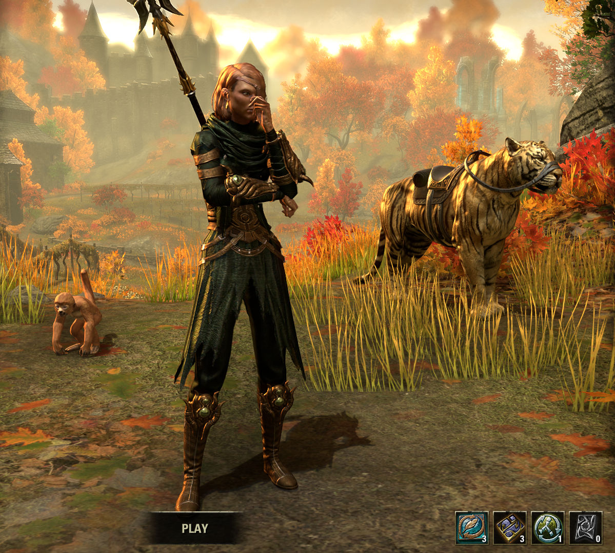
XBox EU/NA:@ElsonsoJannus
PC NA/EU: @Elsonso
PSN NA/EU: @ElsonsoJannus
Total in-game hours: 11321
X/Twitter: ElsonsoJannus3 -
 danno8✭✭✭✭✭
✭✭✭✭✭Keep itEven if I disliked it, It's just one screen. Yes the lighting is too bright and directionally off, but really...3 -
 LunaFlora✭✭✭✭✭
✭✭✭✭✭Keep it but tone down the brightness and saturationSaffronCitrusflower wrote: »It doesn't matter. It's just the character selection screen. It will change with U42 again and we only have to look at it for a few seconds, like it or not.
it won't change with update 42.
it will change with update 45 in a year.miaow! i'm Luna ( she/her ).
🌸*throws cherry blossom on you*🌸
"Eagles advance, traveler! And may the Green watch and keep you."
🦬🦌🐰
PlayStation and PC EU.
LunaLolaBlossom on psn.
LunaFloraBlossom on pc.5 -
Northwold✭✭✭✭✭
✭✭Keep itA little bit more on orange and sRGB. The sRGB colour space has a relatively limited coverage of different shades of orange compared to what you'd expect (and of greens, but vivid greens don't tend to come up so much).
Once you hit the limits, what should be orange gets converted to a 100% luminance value -- a blown out highlight.
Some of the screenshots in this and other threads on this topic look (on my screen, which is the only reference point I have) *wildly* oversaturated, *wildly* too bright, and *wildly* excessive in their contrast levels. They are screenshots, so they are directly displaying what people's graphics cards are outputting, rather than what their *screens* are showing.
So, for some people, the reason the character selection screen *may* look very wrong in terms of saturation and brightness is likely to have something to do with what your card is outputting, completely separate from questions of your screen. That may be because you've changed saturation settings etc in your graphics card's settings, it may be because you are running visual mods that mess with saturation, contrast, gamma, etc, but some of the screenshots look literally twice as saturated as others. It may even be a driver issue (though there doesn't seem to be any commonality in terms of which users are seeing the weirder renderings of the image) or some sort of problem with how colours are being rendered by cards introduced with the patch.
But because orange is one of the problem colours (and one that doesn't commonly get used all over an image at high intensity, only for small details), you may not notice this elsewhere in the game. But you will notice it in an almost entirely orange setting.Edited by Northwold on March 14, 2024 10:06AM3 -
 Grizzbeorn✭✭✭✭✭
✭✭✭Keep itSilverBride wrote: »That just shows how monochromatic this screen is. It's ALL orange and yellow. Even the grasses look like they are coated in yellow.
Well, it is pollen season in a lot of places right now.2 -
 SpacemanSpiff1✭✭✭✭✭
✭✭Keep ityes, it is very good. probably one of the character selection screens of all time.1

 https://www.youtube.com/watch?v=t8Ydtut55EI&ab_channel=BrianHerman
