Update 49 is now available for testing on the PTS! You can read the latest patch notes here: https://forums.elderscrollsonline.com/en/categories/pts
Maintenance for the week of February 2:
• PC/Mac: No maintenance – February 2
• ESO Store and Account System for maintenance – February 3, 6:00AM EDT (11:00 UTC) - 4:00PM EDT (21:00 UTC)
• PC/Mac: No maintenance – February 2
• ESO Store and Account System for maintenance – February 3, 6:00AM EDT (11:00 UTC) - 4:00PM EDT (21:00 UTC)
God Awful Green "Collect" Icon
-
 Elsonso✭✭✭✭✭
✭✭✭✭✭spartaxoxo wrote: »TheMajority wrote: »I HATE the puzzle symbol and wish they would not use something so modern looking and pointless to the game
Jigsaw puzzles are significantly less modern than robots.
Anyway I love the puzzle symbol. I'm so incredibly glad they added a way to quickly and easily see what I don't know in traders. Now if they could just let me filter for it, that would be great
Do you like the bright green puzzle symbol, or just that they provided an indicator for uncollected set pieces? Also, how long did it take you to figure out what the bright green puzzle symbol was for?
I like the indicator. I do not think that bright green was a good choice for colors. I do not think that the puzzle symbol was the right art to use. It took me a few minutes of dedicated time to figure out what it was and whether it was something I should care about. It was not immediately obvious in purpose. Green mystery meat.
XBox EU/NA:@ElsonsoJannus
PC NA/EU: @Elsonso
PSN NA/EU: @ElsonsoJannus
Total in-game hours: 11321
X/Twitter: ElsonsoJannus2 -
 Pixiepumpkin✭✭✭✭✭
✭✭✭I don't actually mind the icon as an idea. Its good to know when my main does not know a recipe. Makes it easier to purse guild traders to buy stuff.
I don't like the bright green, that is annoying. It could have been silver with a sheen to it and would have worked just as good imo. But I guess the old way of making cool icons is out (oddly, the flat design is passe now, moving back to artisitc icons is the way forward"."Class identity isn’t just about power or efficiency. It’s about symbolic clarity, mechanical cohesion, and a shared visual and tactical language between players." - sans-culottes1 -
 AzuraFan✭✭✭✭✭
✭✭✭✭I really like it. Using a controller with the console UI, before I often had to scroll to the bottom of a recipe or whatever to see if I'd already collected it. Now I can easily see what I don't have just by scanning through the list. No need to even look at the item's details. It's great!4 -
 SilverBride✭✭✭✭✭
✭✭✭✭✭I don't understand why it's a jigsaw puzzle piece. That just seems so out of place. I'd prefer a small dot, or square, or something similar.PCNA2 -
 LalMirchi✭✭✭✭✭
✭✭Somehow I feel that a question mark icon would be more appropriate than the puzzle icon as a question mark is a common symbol for unknown entities. A question mark icon could be made much smaller than the current puzzle icon and still serve the same purpose.5 -
Pixiepumpkin✭✭✭✭✭
✭✭✭SilverBride wrote: »I don't understand why it's a jigsaw puzzle piece. That just seems so out of place. I'd prefer a small dot, or square, or something similar.
Well I could see a jigsaw puzzle icon for motifs, style pages that are part of a set, collectables, etc. But one off items like recipies makes no sense and I find it odd as well.
I can see where the designer was going with the idea, but it's not really all inclusive and as you suggest would be better served as something simple like a dot."Class identity isn’t just about power or efficiency. It’s about symbolic clarity, mechanical cohesion, and a shared visual and tactical language between players." - sans-culottes0 -
 spartaxoxo✭✭✭✭✭
✭✭✭✭✭spartaxoxo wrote: »TheMajority wrote: »I HATE the puzzle symbol and wish they would not use something so modern looking and pointless to the game
Jigsaw puzzles are significantly less modern than robots.
Anyway I love the puzzle symbol. I'm so incredibly glad they added a way to quickly and easily see what I don't know in traders. Now if they could just let me filter for it, that would be great
Do you like the bright green puzzle symbol, or just that they provided an indicator for uncollected set pieces? Also, how long did it take you to figure out what the bright green puzzle symbol was for?
I like the indicator. I do not think that bright green was a good choice for colors. I do not think that the puzzle symbol was the right art to use. It took me a few minutes of dedicated time to figure out what it was and whether it was something I should care about. It was not immediately obvious in purpose. Green mystery meat.
It took me a few seconds to figure it out and then when I did I was hype. Unlike other symbols, I found it caught my attention right away that it was important and then it just took looking at a couple of items to figure out what it meant. I've missed a lot of these small UI changes in the past and took me a long time to use options I would have liked. So I really appreciated that this was called attention to.3 -
 whitecrow✭✭✭✭✭
✭✭✭Somehow I feel that a question mark icon would be more appropriate than the puzzle icon as a question mark is a common symbol for unknown entities. A question mark icon could be made much smaller than the current puzzle icon and still serve the same purpose.
Eddie Nygma is that you??4 -
 NoSoup✭✭✭✭✭I really didn't like it at first but now I've found it to be great....Formally SirDopey, lost forum account during the great reset.....2
 -
 TheMajority✭✭✭✭✭
✭spartaxoxo wrote: »TheMajority wrote: »I HATE the puzzle symbol and wish they would not use something so modern looking and pointless to the game
Jigsaw puzzles are significantly less modern than robots.
Anyway I love the puzzle symbol. I'm so incredibly glad they added a way to quickly and easily see what I don't know in traders. Now if they could just let me filter for it, that would be great
whose even talking about robots?
it's a bad symbol with bad associations and should not be in the gameTime flies like an arrow- but fruit flies like a banana.
Sorry for my English, I do not always have a translation tool available. Thank you for your patience with our conversation and working towards our mutual understanding of the topic.2 -
spartaxoxo✭✭✭✭✭
✭✭✭✭✭TheMajority wrote: »spartaxoxo wrote: »TheMajority wrote: »I HATE the puzzle symbol and wish they would not use something so modern looking and pointless to the game
Jigsaw puzzles are significantly less modern than robots.
Anyway I love the puzzle symbol. I'm so incredibly glad they added a way to quickly and easily see what I don't know in traders. Now if they could just let me filter for it, that would be great
whose even talking about robots?
it's a bad symbol with bad associations and should not be in the game
Dwemer constructs and Clockwork fabricants are robots. A puzzle piece is not too modern to the things that are already canon. They've been around for hundreds of years. I don't know what associations you're talking about but I'm sick of letting hateful groups takeover the most innocuous things.
Puzzles are just collectible toys. Puzzle pieces are parts to a greater whole. And to that extent, a puzzle is fitting.Edited by spartaxoxo on June 30, 2025 12:17AM5 -
LalMirchi✭✭✭✭✭
✭✭Somehow I feel that a question mark icon would be more appropriate than the puzzle icon as a question mark is a common symbol for unknown entities. A question mark icon could be made much smaller than the current puzzle icon and still serve the same purpose.
Eddie Nygma is that you??
LOL. Riddle me this "What does a dot signify?"
Having looked more closely at the new puzzle icon I must say that I like it a lot. It's well designed and beautiful. I love the green color as well.
4 -
 agelonestar✭✭✭✭✭
✭I actually like the new UI and I can see what they're trying to do with the new "collect" icon....... but wow, it's GREEN.
I don't mind it, but maybe a few shades less neon would be good.GM of Sunfire's Sect trading guild on PC/EU. All that is gold does not glitter; not all those who wander are lost...... some of us are just looking for trouble.GM of Sunfire's Sect (Open) & Dark Star Rising (Priv) | Retired GM of several trade guilds | Trader | Here since the beta3 -
TheMajority✭✭✭✭✭
✭spartaxoxo wrote: »TheMajority wrote: »spartaxoxo wrote: »TheMajority wrote: »I HATE the puzzle symbol and wish they would not use something so modern looking and pointless to the game
Jigsaw puzzles are significantly less modern than robots.
Anyway I love the puzzle symbol. I'm so incredibly glad they added a way to quickly and easily see what I don't know in traders. Now if they could just let me filter for it, that would be great
whose even talking about robots?
it's a bad symbol with bad associations and should not be in the game
Dwemer constructs and Clockwork fabricants are robots. A puzzle piece is not too modern to the things that are already canon. They've been around for hundreds of years. I don't know what associations you're talking about but I'm sick of letting hateful groups takeover the most innocuous things.
Puzzles are just collectible toys. Puzzle pieces are parts to a greater whole. And to that extent, a puzzle is fitting.
you need to think of the broader cultural meaning of it in context to certain groups then you would understand why it's bad/insulting that they use it.Time flies like an arrow- but fruit flies like a banana.
Sorry for my English, I do not always have a translation tool available. Thank you for your patience with our conversation and working towards our mutual understanding of the topic.3 -
SilverBride✭✭✭✭✭
✭✭✭✭✭TheMajority wrote: »...you need to think of the broader cultural meaning of it in context to certain groups then you would understand why it's bad/insulting that they use it.
I never knew a puzzle piece had any meaning beyond just being a puzzle piece. I was against using it because it feels out of place.
Then I googled it and found out something I wasn't aware of. Now I feel even more strongly that it should be changed.PCNA2 -
whitecrow✭✭✭✭✭
✭✭✭I have seen it used for autism awareness but I don't see why that makes it offensive here.6 -
Elsonso✭✭✭✭✭
✭✭✭✭✭SilverBride wrote: »TheMajority wrote: »...you need to think of the broader cultural meaning of it in context to certain groups then you would understand why it's bad/insulting that they use it.
I never knew a puzzle piece had any meaning beyond just being a puzzle piece. I was against using it because it feels out of place.
Then I googled it and found out something I wasn't aware of. Now I feel even more strongly that it should be changed.
They are not the same image and they don't mean the same thing. Neither is derogatory towards the other.
What I wonder is if there is a better image that could reflect the "not-collected" status of the item. I don't view the "sticker book" as being a "puzzle". It is more of a check list.XBox EU/NA:@ElsonsoJannus
PC NA/EU: @Elsonso
PSN NA/EU: @ElsonsoJannus
Total in-game hours: 11321
X/Twitter: ElsonsoJannus5 -
SilverBride✭✭✭✭✭
✭✭✭✭✭What I wonder is if there is a better image that could reflect the "not-collected" status of the item. I don't view the "sticker book" as being a "puzzle". It is more of a check list.
I don't see any of the items that have this mark as puzzles. All it needs is a small shape rather than a symbol of anything.PCNA0 -
 code65536✭✭✭✭✭
✭✭✭✭✭What I wonder is if there is a better image that could reflect the "not-collected" status of the item. I don't view the "sticker book" as being a "puzzle". It is more of a check list.
"Sticker book" items don't get the puzzle icon.
There are two distinct icons. One is the puzzle piece with a plus sign , and the other is set collection helm with a plus sign
  .
.
So, if I were to put on my UI designer hat, there are some things that I don't like about how this was approached.- The distinction between the two icons is useless. Do players really need different icons to tell the difference between an uncollected set piece and an uncollected style page? It should already be obvious with the icon of the item itself: you have something like a bow or a robe on one hand and a sheet of paper on the other. Having two different icons instead of a single unified icon doesn't provide useful, actionable information to the user. It adds some minor development complexity (you needed to get someone to create two different icons, and the UI code has to handle these different icons), and the icons are more complex than necessary. The important part of the icon is the plus sign. That's really all that was needed: just a simple plus sign, with nothing else.
- Because the icons are visually complex and not just a simple plus sign, they need to be a certain size in order for users to discern these features. There is a limit to how much they can be shrunken down. You can shrink down a plain plus sign by a lot and people can still tell that it's a plus, but with a more complicated image, after a while, it becomes a jumbled mush.
- This means that these new icons need to occupy a significant amount of space. In the inventory, there is already space reserved for a status icon, where you will see things like an exclamation point if the item is new, a lock if it's locked, a red hand if it's stolen, or blue arrows if it's BoP-tradable. These new icons now share this space with those icons, and if an item has multiple status icons, then the icon display will cycle through the applicable icons. Which is fine... for the inventory. But what about guild traders or mail attachments or player-to-player trades?
- For example, to make space for these icons in the guild store interface, the gamepad version of the guild store UI had to eliminate the sort-by-age column, which has apparently angered some hardcore traders on console. And the new icons do not appear at all for mail attachments or player-to-player trade windows because there's simply no space.
- Having a simple symbol enables the use of a smaller icon, and the use of a smaller icon opens the possibility of the icon being overlaid atop the item icon, similar to how the stack size count is a number overlaid atop the item icon rather than appearing as a column of its own. And just as that stack size number can appear in a wide variety of contexts--inventory, guild store, mail attachments, trade windows--all without taking up any additional space, an overlaid collection status icon would be similarly versatile.
And these design considerations are precisely why I implemented my collection icons the way I did, as a simple plus sign (or a number of pips) overlaid atop the item icon, as you can see here, with ZOS's icon for comparison.
I wasn't the first PC addon author to add collection status icons. There are many that predate mine by years, but almost all of them did things the same way that ZOS did things: by having the icons in a separate column, rather than as an overlay, and I didn't like the way those addons did things.
I just think that an overlay is better design. It would've saved the sort-by-age column for those hardcore traders on console, and it would've meant that you could accommodate these icons in more contexts, like mail attachments.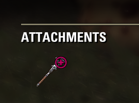
Now, to be fair, there is one advantage to the way ZOS implemented the new status icons: the status icon column in the inventory/bank UI (not in the guild store, though) is sortable, so you can sort by status, and that would be a functionality that you would lose by doing things the way I suggest. So there is a trade-off to consider here, and perhaps some people would view that ability to sort as being more important.Edited by code65536 on July 1, 2025 12:11AMNightfighters ― PC/NA and PC/EU
Dungeons and Trials:Personal best scores:- Dragonstar Arena: 46817 (NA)
- Maelstrom Arena: 600526 (NA)
- Blackrose Prison: 99274 (EU) (Unchained)
- Maw of Lorkhaj: 165227 (EU)
- Halls of Fabrication: 220708 (NA) (Tick-Tock Tormentor #1, #2, #3, #4, #5, #6, #7, #8, #9, #10, #11, #12)
- Asylum Sanctorium: 114957 (NA) (Immortal Redeemer #1, #2, #3, #4, #5, #6, #7, #8, #9, #10)
- Cloudrest: 131256 (NA) (Gryphon Heart #1, #2, #3, #4, #5, #6, #7)
- Sunspire: 250866 (EU) (Godslayer #1, #2, #3, #4, #5, #6, #7)
- Kyne's Aegis: 235841 (EU) (Dawnbringer #1, #2, #3, #4, #5, #6, #7, #8)
Dungeon trifectas:- Mountain God and Leave No Bone Unbroken
- Apex Predator and Pure Lunacy
- Depths Defier and Relentless Raider
- Defanged the Devourer and Nature's Wrath
- In Defiance of Death and No Rest for the Wicked
- Bane of Thorns and True Genius
- Ardent Bibliophile and Subterranean Smasher
- Battlespire's Best and Bastion Breaker
- Zero Regrets and Land, Air, and Sea Supremacy
- Fist of Tava and Invader's Bane
- Curator's Champion (Valinna) and Temporal Tempest
- Unshakeable Fervor and Lighting the Embers
Extended Journal Add-Ons: Item Set Browser ― Loot Log ― Character Knowledge ― Collectibles Tracker ― RaidificatorPC/Console Add-Ons: Combat Alerts ― Group Buff PanelsOther Add-Ons: Deconstruction Junk Marker ― Purge Tracker ― Asylum Status Panel ― Smart Looter ― Improved Companion Rapport Information3 -
 Cardhwion✭✭✭It is just so much more convenient if you can choose the character that is supposed to learn or collect stuff and just make the icon either only on that char or on any char but just to indicate „learnable for main char“, like several addons do it.
Even if an addon doesn‘t have this multi character feature, you can just deactivate your addon on other chars, where you don‘t care if they could learn it.
It‘s a good feature but not done well. I prefer my addons for it.
The is one good addon for that... or not. It's called "ignore by brain" and does not need a download. The icon can simply be ignored, if you do not want to learn something on an alt. You just have to decide to ignore it, instead of getting worked up about it."Why did I follow him...? I don't know. Why do things happen as they do in dreams? All I know is that, when he beckoned... I had to follow him. From that moment, we traveled together, East. Always... into the East."0 -
 LootAllTheStuff✭✭✭✭✭What I wonder is if there is a better image that could reflect the "not-collected" status of the item. I don't view the "sticker book" as being a "puzzle". It is more of a check list.
"Sticker book" items don't get the puzzle icon.
There are two distinct icons. One is the puzzle icon with a plus sign, and the other is set collection helmet icon with a plus sign .
So, if I were to put on my UI designer hat, there are some things that I don't like about how this was approached.- The distinction between the two icons is useless. Do players really need a different icon to tell the difference between an uncollected set item and an uncollected style page? It should already be obvious with the icon of the item self: you have something like a bow or a robe on one hand and a sheet of paper on the other. Having two different icons instead of a single unified icon doesn't provide useful, actionable information to the user. It adds some minor development complexity (you needed to get someone to create two different icons, and the UI code has to handle these different icons), and the icons are more complex than necessary. The important part of the icon is the plus sign. That's really all that was needed: just a simple plus sign, with nothing else.
- Because the icons are visually complex and not just a simple plus sign, they need to be a certain size in order for users to discern these features. There is a limit to how much they can be shrunken down. You can shrink down a plain plus sign by a lot and people can still tell that it's a plus, but with a more complicated image, after a while, it becomes a jumbled mush.
- This means that these new icons need to occupy a significant amount of space. In the inventory, there is already space reserved for a status icon, where you will see things like an exclamation point if the item is new, a lock if it's locked, a red hand if it's stolen, or blue arrows if it's BoP-tradable. These new icons now share this space with those icons, and if an item has multiple status icons, then the icon display will cycle through the applicable icons. Which is fine... for the inventory. But what about guild traders or mail attachments or player-to-player trades?
- For example, to make space for these icons in the guild store interface, the gamepad version of the guild store UI had to eliminate the sort-by-age column, which has apparently angered some hardcore traders on console. And the new icons do not appear at all for mail attachments or player-to-player trade windows because there's simply no space.
- Having a simple symbol enables the use of a smaller icon, and the use of a smaller icon opens the possibility of the icon being overlaid atop the item icon, similar to how the stack size count is a number overlaid atop the item icon rather than appearing as a column of its own. And just as that stack size number can appear in a wide variety of contexts--inventory, guild store, mail attachments, trade windows--all without taking up any additional space, an overlaid collection status icon would be similarly versatile.
And these design considerations are precisely why I implemented my collection icons the way I did, as a simple plus sign (or a number of pips) overlaid atop the item icon, as you can see here, with ZOS's icon for comparison.
I wasn't the first PC addon author to add collection status icons. There are many that predate mine by years, but almost all of them did things the same way that ZOS did things: by having the icons in a separate column, rather than as an overlay, and I didn't like the way those addons did things.
I just think that an overlay is better design. It would've saved the sort-by-age column for those hardcore traders on console, and it would've meant that you could accommodate these icons in more contexts, like mail attachments.
Now, to be fair, there is one advantage to the way ZOS implemented the new status icons: the status icon column in the inventory/bank UI (not in the guild store, though) is sortable, so you can sort by status, and that would be a functionality that you would lose by doing things the way I suggest. So there is a trade-off to consider here, and perhaps some people would view that ability to sort as being more important.
I hadn't even realised there were two different neon green icons until you pointed it out - they're simply too similar and too small on my screen to tell apart.
I do like your idea of adding something to the item icon. However, red on black is terrible as a contrast ratio and I didn't realise the + symbol was not actually part of the icon until I took a second look.
In short: UI design is harder than it looks!
1 -
Pevey✭✭✭✭✭
✭✭✭LootAllTheStuff wrote: »What I wonder is if there is a better image that could reflect the "not-collected" status of the item. I don't view the "sticker book" as being a "puzzle". It is more of a check list.
"Sticker book" items don't get the puzzle icon.
There are two distinct icons. One is the puzzle icon with a plus sign, and the other is set collection helmet icon with a plus sign .
So, if I were to put on my UI designer hat, there are some things that I don't like about how this was approached.- The distinction between the two icons is useless. Do players really need a different icon to tell the difference between an uncollected set item and an uncollected style page? It should already be obvious with the icon of the item self: you have something like a bow or a robe on one hand and a sheet of paper on the other. Having two different icons instead of a single unified icon doesn't provide useful, actionable information to the user. It adds some minor development complexity (you needed to get someone to create two different icons, and the UI code has to handle these different icons), and the icons are more complex than necessary. The important part of the icon is the plus sign. That's really all that was needed: just a simple plus sign, with nothing else.
- Because the icons are visually complex and not just a simple plus sign, they need to be a certain size in order for users to discern these features. There is a limit to how much they can be shrunken down. You can shrink down a plain plus sign by a lot and people can still tell that it's a plus, but with a more complicated image, after a while, it becomes a jumbled mush.
- This means that these new icons need to occupy a significant amount of space. In the inventory, there is already space reserved for a status icon, where you will see things like an exclamation point if the item is new, a lock if it's locked, a red hand if it's stolen, or blue arrows if it's BoP-tradable. These new icons now share this space with those icons, and if an item has multiple status icons, then the icon display will cycle through the applicable icons. Which is fine... for the inventory. But what about guild traders or mail attachments or player-to-player trades?
- For example, to make space for these icons in the guild store interface, the gamepad version of the guild store UI had to eliminate the sort-by-age column, which has apparently angered some hardcore traders on console. And the new icons do not appear at all for mail attachments or player-to-player trade windows because there's simply no space.
- Having a simple symbol enables the use of a smaller icon, and the use of a smaller icon opens the possibility of the icon being overlaid atop the item icon, similar to how the stack size count is a number overlaid atop the item icon rather than appearing as a column of its own. And just as that stack size number can appear in a wide variety of contexts--inventory, guild store, mail attachments, trade windows--all without taking up any additional space, an overlaid collection status icon would be similarly versatile.
And these design considerations are precisely why I implemented my collection icons the way I did, as a simple plus sign (or a number of pips) overlaid atop the item icon, as you can see here, with ZOS's icon for comparison.
I wasn't the first PC addon author to add collection status icons. There are many that predate mine by years, but almost all of them did things the same way that ZOS did things: by having the icons in a separate column, rather than as an overlay, and I didn't like the way those addons did things.
I just think that an overlay is better design. It would've saved the sort-by-age column for those hardcore traders on console, and it would've meant that you could accommodate these icons in more contexts, like mail attachments.
Now, to be fair, there is one advantage to the way ZOS implemented the new status icons: the status icon column in the inventory/bank UI (not in the guild store, though) is sortable, so you can sort by status, and that would be a functionality that you would lose by doing things the way I suggest. So there is a trade-off to consider here, and perhaps some people would view that ability to sort as being more important.
I hadn't even realised there were two different neon green icons until you pointed it out - they're simply too similar and too small on my screen to tell apart.
I do like your idea of adding something to the item icon. However, red on black is terrible as a contrast ratio and I didn't realise the + symbol was not actually part of the icon until I took a second look.
In short: UI design is harder than it looks!
As a long-time user of many of code's addons, including Loot Log and Character Knowledge, and as someone with not the absolute best eyesight, I think the contrast is good. In-game, it is very easy and intuitive to know at a glance what to do with a particular drop. Eat it? Put it in bank to pass to main crafter? Or sell/junk it? I'm so used to the added symbols from the mod, I can't imagine having to play without them. A lot of information is tracked across characters and even accounts and conveyed with a single small icon with just a few variations. More data than the simple "known" or "unknown" on the new base game icon that only relates to the particular character you happen to be playing at that moment.
Edited by Pevey on June 30, 2025 11:36PM0 -
code65536✭✭✭✭✭
✭✭✭✭✭LootAllTheStuff wrote: »red
I'm more interested about how information is presented, and the choice of color is, frankly, just a minor bit of minutiae. The icons that ZOS use as well as the icons that I use in my addons are actually a neutral white, and the color you see is applied right before it's displayed, and so is trivially easy to change (or would be if such a setting were to be exposed).
(In any case, addons are also afforded the luxury of customization, and the addon color is an user-adjustable setting; I defaulted to red simply because I wanted something different from the white/green/blue/purple/gold quality colors.)Edited by code65536 on June 30, 2025 11:43PMNightfighters ― PC/NA and PC/EU
Dungeons and Trials:Personal best scores:- Dragonstar Arena: 46817 (NA)
- Maelstrom Arena: 600526 (NA)
- Blackrose Prison: 99274 (EU) (Unchained)
- Maw of Lorkhaj: 165227 (EU)
- Halls of Fabrication: 220708 (NA) (Tick-Tock Tormentor #1, #2, #3, #4, #5, #6, #7, #8, #9, #10, #11, #12)
- Asylum Sanctorium: 114957 (NA) (Immortal Redeemer #1, #2, #3, #4, #5, #6, #7, #8, #9, #10)
- Cloudrest: 131256 (NA) (Gryphon Heart #1, #2, #3, #4, #5, #6, #7)
- Sunspire: 250866 (EU) (Godslayer #1, #2, #3, #4, #5, #6, #7)
- Kyne's Aegis: 235841 (EU) (Dawnbringer #1, #2, #3, #4, #5, #6, #7, #8)
Dungeon trifectas:- Mountain God and Leave No Bone Unbroken
- Apex Predator and Pure Lunacy
- Depths Defier and Relentless Raider
- Defanged the Devourer and Nature's Wrath
- In Defiance of Death and No Rest for the Wicked
- Bane of Thorns and True Genius
- Ardent Bibliophile and Subterranean Smasher
- Battlespire's Best and Bastion Breaker
- Zero Regrets and Land, Air, and Sea Supremacy
- Fist of Tava and Invader's Bane
- Curator's Champion (Valinna) and Temporal Tempest
- Unshakeable Fervor and Lighting the Embers
Extended Journal Add-Ons: Item Set Browser ― Loot Log ― Character Knowledge ― Collectibles Tracker ― RaidificatorPC/Console Add-Ons: Combat Alerts ― Group Buff PanelsOther Add-Ons: Deconstruction Junk Marker ― Purge Tracker ― Asylum Status Panel ― Smart Looter ― Improved Companion Rapport Information0 -
Elsonso✭✭✭✭✭
✭✭✭✭✭What I wonder is if there is a better image that could reflect the "not-collected" status of the item. I don't view the "sticker book" as being a "puzzle". It is more of a check list.
"Sticker book" items don't get the puzzle icon.
There are two distinct icons. One is the puzzle icon with a plus sign, and the other is set collection helmet icon with a plus sign.
So, if I were to put on my UI designer hat, there are some things that I don't like about how this was approached.- The distinction between the two icons is useless. Do players really need a different icon to tell the difference between an uncollected set item and an uncollected style page? It should already be obvious with the icon of the item self: you have something like a bow or a robe on one hand and a sheet of paper on the other. Having two different icons instead of a single unified icon doesn't provide useful, actionable information to the user. It adds some minor development complexity (you needed to get someone to create two different icons, and the UI code has to handle these different icons), and the icons are more complex than necessary. The important part of the icon is the plus sign. That's really all that was needed: just a simple plus sign, with nothing else.
- Because the icons are visually complex and not just a simple plus sign, they need to be a certain size in order for users to discern these features. There is a limit to how much they can be shrunken down. You can shrink down a plain plus sign by a lot and people can still tell that it's a plus, but with a more complicated image, after a while, it becomes a jumbled mush.
- This means that these new icons need to occupy a significant amount of space. In the inventory, there is already space reserved for a status icon, where you will see things like an exclamation point if the item is new, a lock if it's locked, a red hand if it's stolen, or blue arrows if it's BoP-tradable. These new icons now share this space with those icons, and if an item has multiple status icons, then the icon display will cycle through the applicable icons. Which is fine... for the inventory. But what about guild traders or mail attachments or player-to-player trades?
- For example, to make space for these icons in the guild store interface, the gamepad version of the guild store UI had to eliminate the sort-by-age column, which has apparently angered some hardcore traders on console. And the new icons do not appear at all for mail attachments or player-to-player trade windows because there's simply no space.
- Having a simple symbol enables the use of a smaller icon, and the use of a smaller icon opens the possibility of the icon being overlaid atop the item icon, similar to how the stack size count is a number overlaid atop the item icon rather than appearing as a column of its own. And just as that stack size number can appear in a wide variety of contexts--inventory, guild store, mail attachments, trade windows--all without taking up any additional space, an overlaid collection status icon would be similarly versatile.
Interestingly, I have been looking at it every day since it launched, and I did not know there were two icons.XBox EU/NA:@ElsonsoJannus
PC NA/EU: @Elsonso
PSN NA/EU: @ElsonsoJannus
Total in-game hours: 11321
X/Twitter: ElsonsoJannus3 -
 katanagirl1✭✭✭✭✭
✭✭✭✭✭I saw one of those icons on some gear that one of my characters actually had equipped. I need to go back and figure out why.
EDIT: that might not sound so strange but it is a character that I have not made or farmed new gear for in years, maybe it was before stickerbook
Edited by katanagirl1 on July 1, 2025 5:11AMKhajiit Stamblade main
Dark Elf Magsorc
Redguard Stamina Dragonknight
Orc Stamplar PVP
Breton Magsorc PVP
Dark Elf Necromancer
Dark Elf Magden
Khajiit Stamblade
Khajiit Stamina Arcanist
PS5 NA0 -
BretonMage✭✭✭✭✭
✭✭Late to the thread, but I think they should tweak the symbol to make it less lurid, and less, uh, puzzling. It honestly took me a while to figure out what the symbol meant. Puzzle pieces mean they're part of a larger whole, but what they're trying to impart here is the fact that the recipe is unknown. Imo they should:
- lower the brightness a little
- make it slightly smaller
- change the puzzle symbol to a question mark2 -
Elsonso✭✭✭✭✭
✭✭✭✭✭Elvenheart wrote: »Is there an addon that can replace the 🧩 with something less garish?
If an addon change the entire UI to revert it back to what it was, I am reasonably certain that this icon can be changed.XBox EU/NA:@ElsonsoJannus
PC NA/EU: @Elsonso
PSN NA/EU: @ElsonsoJannus
Total in-game hours: 11321
X/Twitter: ElsonsoJannus0

