Maintenance for the week of September 22:
• NA megaservers for maintenance – September 22, 4:00AM EDT (8:00 UTC) - 10:00AM EDT (14:00 UTC)
• EU megaservers for maintenance – September 22, 8:00 UTC (4:00AM EDT) - 14:00 UTC (10:00AM EDT)
• NA megaservers for maintenance – September 22, 4:00AM EDT (8:00 UTC) - 10:00AM EDT (14:00 UTC)
• EU megaservers for maintenance – September 22, 8:00 UTC (4:00AM EDT) - 14:00 UTC (10:00AM EDT)
We will be performing maintenance for patch 11.2.1 on the PTS on Monday at 8:00AM EDT (12:00 UTC).
Official Feedback Thread for Nameplates
-
Elsonso✭✭✭✭✭
✭✭✭✭✭
Oh wow, it seems the entire Chat Bubble interface element has been blown up for some reason.refers more to chat bubbles than nameplates, though i am unsure what causes this bug. so the text in the chat bubble appears HUGE. but it's fine on the NA server and looks like this on the PTS only.
Should we start a pool on whether it will be fixed or not before the end of July?
XBox EU/NA:@ElsonsoJannus
PC NA/EU: @Elsonso
PSN NA/EU: @ElsonsoJannus
Total in-game hours: 11321
X/Twitter: ElsonsoJannus0 -
Jiigen✭✭✭Too much information, @username is not necessary to show, and I dont want to show mine to everybody. Plus, it's so immersion breaking!
I agree that it's not necessary to show. Actually the longer ESO has been in existence, the further away it's been moving from it's clean UI that they wanted to keep minimal. Showing of the @username over mouseover/target is too much. I want it removed.
And I would also prefer mine not to be visible either for other players, but that is something so integrated with ESO I doubt they'll take it out apart from opting out of having it shown for other players."To a thing like me, a thing like you, well... Think how you'd feel if a bacterium sat at your table and started to get snarky." -Death
PC EU1 -
Emma_Overload✭✭✭✭✭
✭✭✭✭✭My Official Feedback is that I do NOT want anybody to identify my characters by @username, and I don't want to see anybody else's @username, either. This is an online RPG, remember?!
I want an option to turn this off, at the very least, and not just from my own field of view. When I say turn it off, I mean I don't want my @username to show up in anybody's field of view, not passively and not when they actively mouse over my toon.
Edited by Emma_Overload on May 7, 2016 4:07PM#CAREBEARMASTERRACE5 -
Cinbri✭✭✭✭✭
✭✭✭✭Can we get color of title a little bit different from name? Coz sometimes similar color confusing.0 -
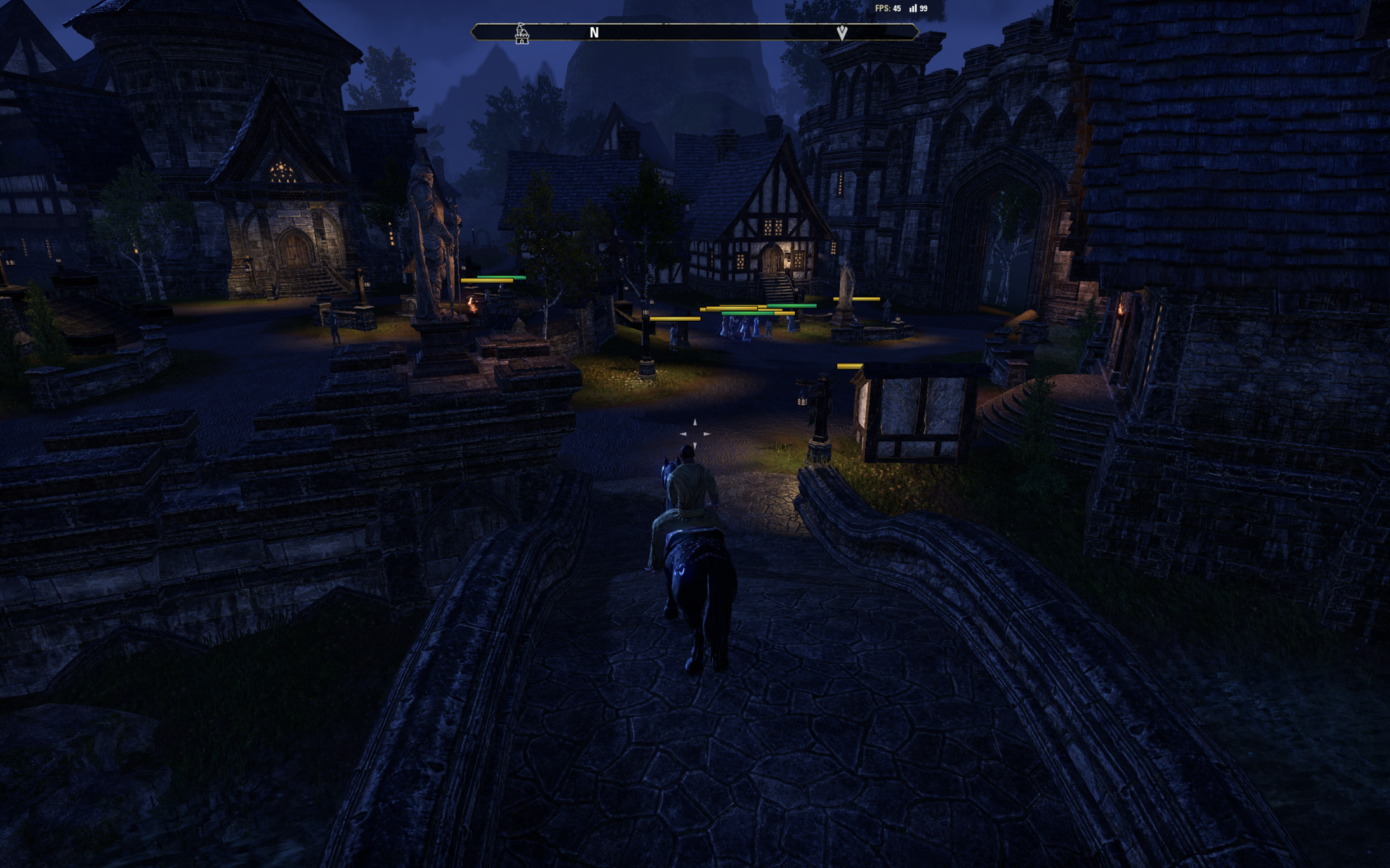
nathan_bri✭✭✭✭The health bars are still YUGE as a particular candidate would say. I peg their size at between 10 and 12 feet wide on the group of characters shown here. Can we get some sort of sizing control on it and have them actually get smaller as they get farther away?
0 -
nathan_bri✭✭✭✭This is what they look like on live. Can we please have this as an option? I hate the new name plates. Hate, hate, hate as in they make me not want to play. This is not WoW. I don't want WoW when I log into ESO. I also don't want an arcade game. The huge health bars make ESO look like an arcade game.
Yes, I want my nighttime to look like nighttime, which makes the new, terrible health bar sizes stick out like a sore thumb.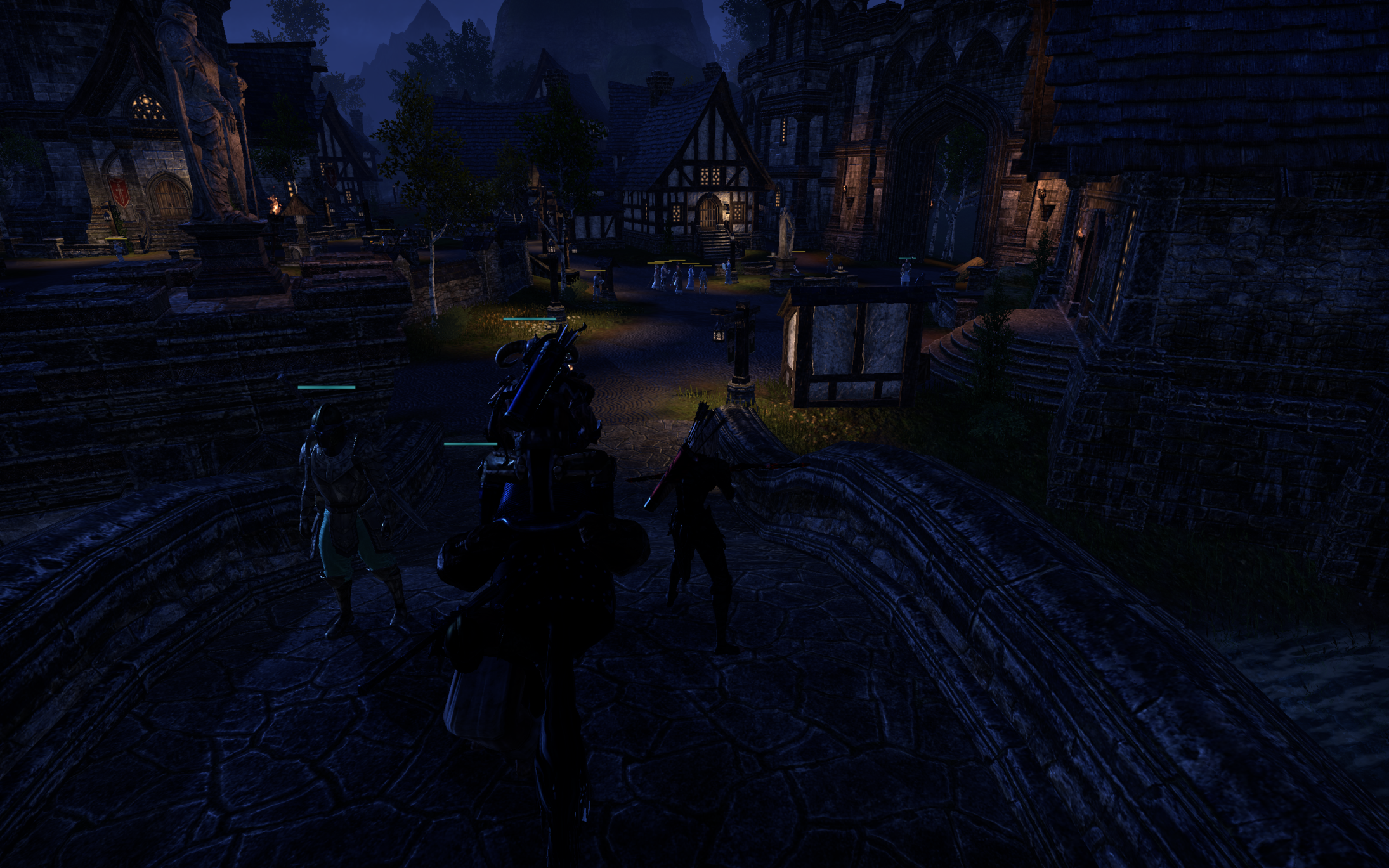
Edited by nathan_bri on May 10, 2016 7:49PM0 -
Enodoc✭✭✭✭✭
✭✭✭✭✭nathan_bri wrote: »The health bars are still YUGE as a particular candidate would say. I peg their size at between 10 and 12 feet wide on the group of characters shown here. Can we get some sort of sizing control on it and have them actually get smaller as they get farther away?
At least that weird yellow border is gone. They look better, but they're still too big.UESP: The Unofficial Elder Scrolls Pages - A collaborative source for all knowledge on the Elder Scrolls series since 1995
Join us on Discord - discord.gg/uesp1 -
susmitds✭✭✭✭✭
✭✭✭✭✭The addition of the new Nameplates and health bats in DB takes UI customization to a whole new level.
But this is on the other hand introduces a new problem of a very clustered and crowded UI.
From my observations, the titles of players are taking a major part of the space in the new Nameplates. I noticed that the titles are larger than the average character name.
By having the nameplates on, in crowded towns and in PvP, the screen gets filled with the flying text of the nameplates and it gets very hard to distinguish between them.
However, if titles are not shown in the nameplates, the amount of text on screen is significantly decreased and the nameplates would become a lot more viable in crowded areas.
Also it is much more easier to identify someone on screen with only the character name.
When I am looking for, suppose, "Sir Eronwen" in a crowded Rawlkha, it would be much easier to identify "Sir Eronwen" than "Dominion Hero Sir Eronwen" or "Fighters' Guild Victor Sir Eronwen" as we might not know what title they are using which take up the most part in the nameplates, and even if we do, there can be dozens of other Dominion Heroes and Fighters' Guild Victors running about nearby making it very hard to find the right person.
A good solution would be to have the titles hidden from the nameplates by default, and adding an option to show player titles in nameplates in settings.
This would make the UI cleaner and more streamlined.
And anyway, we can already see other players' titles by aiming at them.2 -
Helluin✭✭✭nathan_bri wrote: »The health bars are still YUGE as a particular candidate would say. I peg their size at between 10 and 12 feet wide on the group of characters shown here. Can we get some sort of sizing control on it and have them actually get smaller as they get farther away?

At least that weird yellow border is gone. They look better, but they're still too big.
Still too big for me as well.
Otherwise an option to personalize the size of bars would be nice.
Speaking about Ultimates in the UI, is it possible to show not just the ultimate points but also how many points are required for the slotted ultimate please? As example 74/150.
FTC as addon has a similar feature.Edited by Helluin on May 12, 2016 9:35PM"... and the blue fire of Helluin flickered in the mists above the borders of the world, in that hour the Children of the Earth awoke, the Firstborn of Ilúvatar."0 -
ShedsHisTail✭✭✭✭✭
✭My only input on nameplates is this...
Please make sure they can be toggled on and off, that way if I hate them I can go back to playing without."As an online discussion of Tamrielic Lore grows longer, the probability of someone blaming a Dragon Break approaches 1." -- Sheds' Law
Have you seen the Twin Lamps?1 -
Elsterchen✭✭✭✭✭
✭Nameplates and healthbars in PvP:
ESO introduced a new PVP based mini-game called: Find thy enemie. Special bonus to ebonheart fraction, as all enemie NPCs are indicated in red.
[img][/img]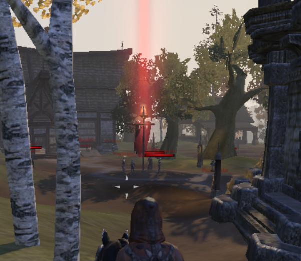
if you are colourblind, rejoyce! All friendly NPC are displayed in green allowing you to enjoy a special hard-mode feature!.
[img][/img]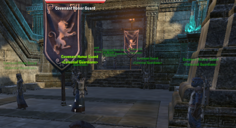
on a sidenote: The target frame changes still annoy me. Please let us decide how we represent our characters.
Edited by Elsterchen on May 13, 2016 9:08AM0 -
Elsonso✭✭✭✭✭
✭✭✭✭✭@ZOS_GinaBruno ... not sure if this old thread is still being watched.
It seems that the nameplates are smaller this patch, but the core problem remains. The nameplate stays the same size no matter how far away the character is. This means that they appear huge for distant people, and Itty bitty for close up people. This is actually the opposite of what usability would suggest.
Also, the nameplate follows the NPC or character at a height that is irrelevant to what they are doing. That means that when Lyris is right up close, and kneeling, the Itty bitty nameplate (per appearance) is way way above her head at the top of the screen. Particularly in First Person, the default in Wailing Prison.Edited by Elsonso on May 13, 2016 12:50PMXBox EU/NA:@ElsonsoJannus
PC NA/EU: @Elsonso
PSN NA/EU: @ElsonsoJannus
Total in-game hours: 11321
X/Twitter: ElsonsoJannus0 -
Jiigen✭✭✭Elsterchen wrote: »On a sidenote: The target frame changes still annoy me. Please let us decide how we represent our characters.
You make some good points in the rest of your post.
And that side note is definitely not one that should be missed, the way you describe it makes sense, but right now it's not customize-able on the PTS."To a thing like me, a thing like you, well... Think how you'd feel if a bacterium sat at your table and started to get snarky." -Death
PC EU0 -
susmitds✭✭✭✭✭
✭✭✭✭✭The addition of the new Nameplates and health bats in DB takes UI customization to a whole new level.
But this is on the other hand introduces a new problem of a very clustered and crowded UI.
From my observations, the titles of players are taking a major part of the space in the new Nameplates. I noticed that the titles are larger than the average character name.
By having the nameplates on, in crowded towns and in PvP, the screen gets filled with the flying text of the nameplates and it gets very hard to distinguish between them.
However, if titles are not shown in the nameplates, the amount of text on screen is significantly decreased and the nameplates would become a lot more viable in crowded areas.
Also it is much more easier to identify someone on screen with only the character name.
When I am looking for, suppose, "Sir Eronwen" in a crowded Rawlkha, it would be much easier to identify "Sir Eronwen" than "Dominion Hero Sir Eronwen" or "Fighters' Guild Victor Sir Eronwen" as we might not know what title they are using which take up the most part in the nameplates, and even if we do, there can be dozens of other Dominion Heroes and Fighters' Guild Victors running about nearby making it very hard to find the right person.
A good solution would be to have the titles hidden from the nameplates by default, and adding an option to show player titles in nameplates in settings.
This would make the UI cleaner and more streamlined.
And anyway, we can already see other players' titles by aiming at them.
@Wrobel , @ZOS_DaryaK , @ZOS_Finn2 -
Taisynn✭✭✭✭✭Please give us options to turn things off or up the transparency of things on the UI. I'm a roleplayer and PVE'er most days. I really, really don't care how many CP's people have or your @name. Just let me see the character name and I'm good.
Please give us options to turn off Nameplates and CP counts. I really, really couldn't care less. I just want to be able to see character names and have a minimalistic UI. You guys are literally crowding out screens out too much and I HATE it.@ZOS_GinaBruno @ZOS_JessicaFolsom
Please tell them we want options to turn them off. I don't care what other people want to see - they can see my @name and health bars if they want to. But please give me an option to turn them off. I LIKE the current live UI system and I am devestated you guys are changing it for PC.
Things I want:
- Transparency Option - they don't need to block things out
- Size - let us decide how big or small things on the UI are
- Removal - let players decide if they want to see nameplates.
- Backtrack - Give us the option to return to the minimalist UI from Thieves Guild. Or even give us UI skins that can change the way it looks.
Please give us CHOICE.
Edited by Taisynn on May 14, 2016 5:16PMPC - @Taisynn - NA - CP 268
Shizuko url=https://docs.google.com/document/d/1CvZa0PPdzAfUv9h_rd8J2vwc1B4NnZGkPL_n4WfgYfs/edit?usp=sharing"]RP Profile[/url - Bosmer - LVL50 - Nightblade 50 Provisioning, 50 Woodworking, 50 Clothing, 50 Alchemy Ebonhart Pact
Nev'e - Bosmer - LVL 18 - Templar 50 Enchanting Ebonhart Pact
Proud Member of the Guilds:
Rusty Old Dragons (Trade) | Children of Skyrim (RP/EP) | Goldleaf Acquisitions (RP/EP)
Spicy Economics (Trade) | The Jackals (RP/EP)1
