Maintenance for the week of March 23:
• PC/Mac: No maintenance – March 23
• PC/Mac: No maintenance – March 23
Thoughts on the PC UI art style "modernization"?
-
 DenverRalphy✭✭✭✭✭
✭✭✭✭✭I like itWe spoke for many pages and never got an answer why. Why a fantasy mmo with plenty of modern ui addons needs a modern ui. Why an elder scrolls game needs its iconic elder scrolls feel taken away.
My guess would be that it's just one more action to "Trim the Fat" so to speak, in an attempt to stave off an inevitable increase to the Minimum Requirements as the game evolves. The game's footprint grows every year. Every little bit counts I guess.
Some things gotta give to free up resources after changes like improvements to the starter zone visuals, new scribing systems, subclassing, etc.. those all add to the bloat.Edited by DenverRalphy on June 2, 2025 5:17PM1 -
 licenturion✭✭✭✭✭
✭I have mixed feelings about itIncultaWolf wrote: »tomofhyrule wrote: »Welp, alreday found an issue...
LOL
There is more. I used to be a UX guy and I usually see every inconsistency immediately
- The top icons of the Collections UI are still the old ones
- The settings page still have the old rugged lines
- The quest dialog doesn't have the gradient and still has the vertical rugged divider
- In controller UI all the resource bars still look the same but the bosses health bar is redesigned and flat
- They forgot to update the note icon in the guild member list and notifications
- The compass has the old texture
- The left arrow on the announcement page is new style, the right arrow is the old style.
- The premium login reward 'star' is forgotten
- In the crown store all the category icons are updated with the new highlight effect, but companions section has not
- In the collection tab all the category icons are updated with the new highlight effect, but allies and tools section have not
- In the skills tab the assignment and scribing icons are the old style
- ...
I could go on...
They had more than a month to polish this up. They knew this new UI would be highly divisive, so it really should have fully done and with an option to revert to the older 'rugged texture' style.
@ZOS_Kevin: feel free to send this list to the UI team for further refinement.Edited by licenturion on June 2, 2025 5:57PM17 -
 xencthlu✭✭✭✭I dislike ittomofhyrule wrote: »I also really question how this was done in the first place.
We were told in Matt's letter that the whole point of the new patch scheme was to not have to rush things and instead release them when they were ready. And yet this patch proves that was all smoke and mirrors.
On PTS, we had a different UI every week it seemed. Sure, things were more polished from week 1 to week 5, but it was still being actively tweaked (and no feedback was considered) over that time. Even now, there are things that are different than they were on PTS.
So... why did this need to come out now, when it was obviously unfinished? Would it not have been better to wait until it was finished before pushing it out?
(Or even better: collect feedback from players and scrap it early?)
When they posted the letter, I felt like I was alone in being *very* worried. The chapter format was instituted as, essentially, a hail mary because when Zenimax had a release schedule that looked a lot more like this, ESO was floundering. I'm starting to feel vindicated. They set a specific release date for this update and did not budge even when there was still work that needed to be done. How is that different from the chapter format?Edited by xencthlu on June 2, 2025 5:19PMI care what you think.11 -
 tomofhyrule✭✭✭✭✭
✭✭✭✭✭I dislike itDenverRalphy wrote: »We spoke for many pages and never got an answer why. Why a fantasy mmo with plenty of modern ui addons needs a modern ui. Why an elder scrolls game needs its iconic elder scrolls feel taken away.
My guess would be that it's just one more action to "Trim the Fat" so to speak, in an attempt to stave off an inevitable increase to the Minimum Requirements as the game evolves. The game's footprint grows every year. Every little bit counts I guess.
Some things gotta give to free up resources after changes like improvements to the starter zone visuals, new scribing systems, subclassing, etc.. those all add to the bloat.
I wish they would have said that.
Granted, that's what I assume, but it'd be a lot easier to digest this change if they were like "Hey, we're reducing the load of the UI in order to make room for future content!" rather than "we're making it modern because we feel like it!"
I don't expect them to say what they need the space for (please be a new Class though), but maybe just any acknowledgement of the fact that it was wildly unpopular on PTS and that our voices are being heard as players would help.4 -
 Grizzbeorn✭✭✭✭✭
✭✭✭I have mixed feelings about itNoticeMeArkay wrote: »Grizzbeorn wrote: »I imagine that they did it to reduce strain on the servers; a reason with which I can't argue.
But aesthetically-speaking... https://www.youtube.com/watch?v=cDGlN6mluGA&ab_channel=Triox
The UI is run by your client. You do not constantly download data from the servers to uphold the appearance of the UI.
Thanks for the correction.
Could it then be similar reasoning as the client-side "Energy Sustainability Measures" they pushed on us a while back?0 -
FadeShade✭✭I dislike itFrom pts feedback thread on ui:
https://forums.elderscrollsonline.com/en/discussion/676245/pts-update-46-feedback-thread-for-ui-modernization/p1On the podcast with Rich Lambert and Matt Firor, I heard that they don't listen to forum comments much because it's difficult to distinguish between real players and just haters.
They want feedback from people who actually play the game.
So, the question is, have you also submitted your concerns as a ticket in-game?
I think we should follow this advice and make sure we also submit in-game feedback, F1. Perhaps with enough feedback through that channel, it may elicit change?4 -
 Gankform✭✭✭I dislike itThey picked Perfect pixel to give us something (new)?:D the new ui is bad and low quality..lol10
 -
shadyjane62✭✭✭✭✭
✭✭✭I dislike itGrizzbeorn wrote: »I imagine that they did it to reduce strain on the servers; a reason with which I can't argue.
But aesthetically-speaking...https://www.youtube.com/watch?v=cDGlN6mluGA&ab_channel=Triox
It will reduce the strain on the servers because of all the people that play less (me).10 -
 code65536✭✭✭✭✭
✭✭✭✭✭I have mixed feelings about itFrom pts feedback thread on ui:
https://forums.elderscrollsonline.com/en/discussion/676245/pts-update-46-feedback-thread-for-ui-modernization/p1On the podcast with Rich Lambert and Matt Firor, I heard that they don't listen to forum comments much because it's difficult to distinguish between real players and just haters.
They want feedback from people who actually play the game.
So, the question is, have you also submitted your concerns as a ticket in-game?
I think we should follow this advice and make sure we also submit in-game feedback, F1. Perhaps with enough feedback through that channel, it may elicit change?
If you like the change, you probably think, "that's nice" and then go on with your life.
If you dislike the change, you are probably going to be motivated to take action.
I'm okay with these changes--sure there are some specific areas that could use more polish, but it's an ongoing thing (there are a number of changes between the final PTS and live, and I imagine that there will be more in the future to iron out those rough edges). And because I'm okay with these changes, I never even opened the PTS thread about the UI changes. Most people I know are fine with these changes too.
The point is that forum threads have a selection bias. Same with the in-game /feedback. People who are content aren't going to use /feedback, it's going to be just people who aren't.
Which is why ZOS periodically sends out surveys to randomly-selected players (I have multiple accounts, and so I can see that it's a different account that gets the survey each time I happen to get one of my accounts caught in the dragnet), and I suspect that those kinds of feedback with less selection bias are what they're more likely to listen to.Nightfighters ― PC/NA and PC/EU
Dungeons and Trials:Personal best scores:- Dragonstar Arena: 46817 (NA)
- Maelstrom Arena: 600526 (NA)
- Blackrose Prison: 99274 (EU) (Unchained)
- Maw of Lorkhaj: 165227 (EU)
- Halls of Fabrication: 220708 (NA) (Tick-Tock Tormentor #1, #2, #3, #4, #5, #6, #7, #8, #9, #10, #11, #12)
- Asylum Sanctorium: 114957 (NA) (Immortal Redeemer #1, #2, #3, #4, #5, #6, #7, #8, #9, #10)
- Cloudrest: 131256 (NA) (Gryphon Heart #1, #2, #3, #4, #5, #6, #7)
- Sunspire: 250866 (EU) (Godslayer #1, #2, #3, #4, #5, #6, #7)
- Kyne's Aegis: 235841 (EU) (Dawnbringer #1, #2, #3, #4, #5, #6, #7, #8)
Dungeon trifectas:- Mountain God and Leave No Bone Unbroken
- Apex Predator and Pure Lunacy
- Depths Defier and Relentless Raider
- Defanged the Devourer and Nature's Wrath
- In Defiance of Death and No Rest for the Wicked
- Bane of Thorns and True Genius
- Ardent Bibliophile and Subterranean Smasher
- Battlespire's Best and Bastion Breaker
- Zero Regrets and Land, Air, and Sea Supremacy
- Fist of Tava and Invader's Bane
- Curator's Champion (Valinna) and Temporal Tempest
- Unshakeable Fervor and Lighting the Embers
Extended Journal Add-Ons: Item Set Browser ― Loot Log ― Character Knowledge ― Collectibles Tracker ― RaidificatorPC/Console Add-Ons: Combat Alerts ― Group Buff PanelsOther Add-Ons: Deconstruction Junk Marker ― Purge Tracker ― Asylum Status Panel ― Smart Looter ― Improved Companion Rapport Information3 -
 Dock01✭✭✭✭I like itAt first, i was a little freaked out i thought the update reset my graphics settings, all is in ultra etc, but it's a pain to set it all back. It turns out it was just a new UI, which is welcoming! it's good! i like it, especially the character menu that was sweettttt0
 -
 KurganNazzir✭✭✭I dislike itDack_Janiels wrote: »For people that don’t like the new UI look that are on PC, I have uploaded a addon to GitHub to revert the changes. Due to the size it will not be published to esoui; that is also probably a reason the devs did not have an option to revert in the game since the goal was to trim file sizes. Unzipped folder size is roughly 1.2gigs.
https://github.com/DakJaniels/Pre101046UI/releases/tag/v2
Installation is the same as you would install any other addon. Unzip file, move the folderPre101046UI
into the addon directory. So,
the path would be\Elder Scrolls Online\live\AddOns\Pre101046UI
not\Elder Scrolls Online\live\AddOns\Pre101046UI-v2\Pre101046UI
Thank you so much for this, it's now the second add-on I've installed for the game.
New UI
With add-on
New UI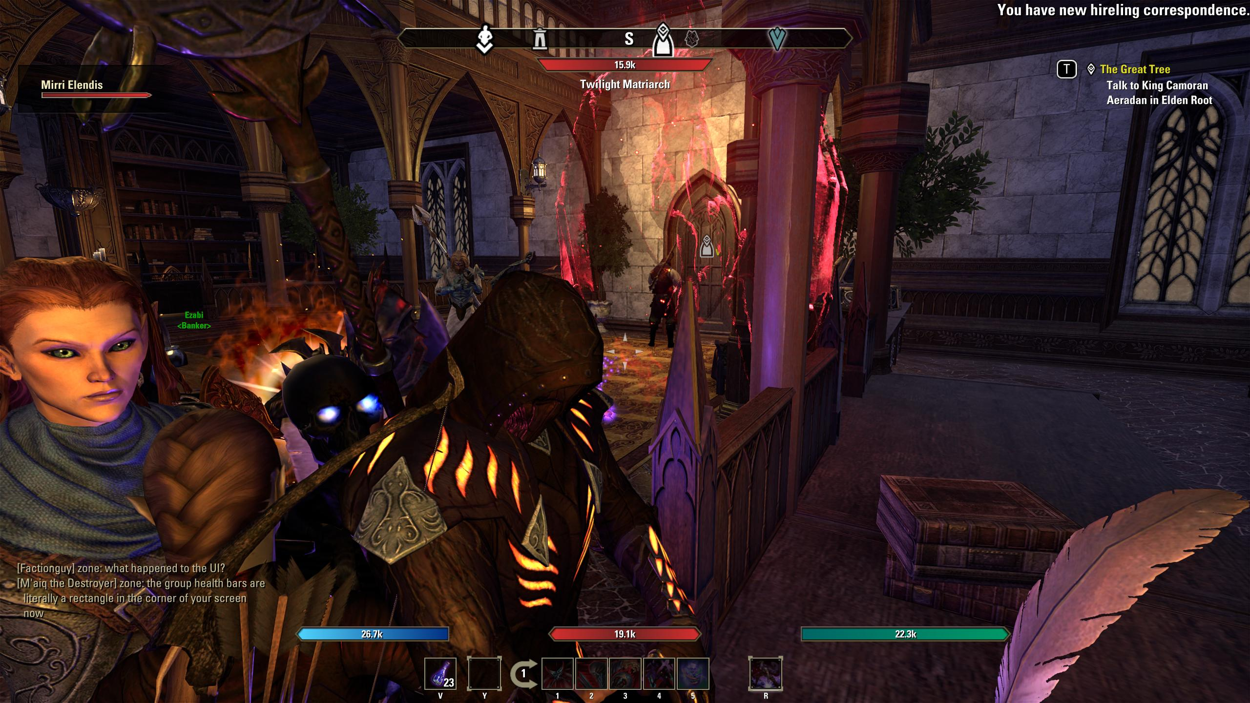
With add-on
13 -
 Danikat✭✭✭✭✭
✭✭✭✭✭I dislike itFrom pts feedback thread on ui:
https://forums.elderscrollsonline.com/en/discussion/676245/pts-update-46-feedback-thread-for-ui-modernization/p1On the podcast with Rich Lambert and Matt Firor, I heard that they don't listen to forum comments much because it's difficult to distinguish between real players and just haters.
They want feedback from people who actually play the game.
So, the question is, have you also submitted your concerns as a ticket in-game?
I think we should follow this advice and make sure we also submit in-game feedback, F1. Perhaps with enough feedback through that channel, it may elicit change?
It couldn't hurt to submit your feedback in-game but it's very unlikely anything will change at this point. ZOS made this decision before the update even appeared on the PTS and they're not going to revert a change they've pushed through just because it's unpopular with players.
Like everything in the game we get what they have decided we will have and accept it, fix it with an addon or quit playing.Edited by Danikat on June 2, 2025 5:57PMPC EU player | She/her/hers | PAWS (Positively Against Wrip-off Stuff) - Say No to Crown Crates!
"Remember in this game we call life that no one said it's fair"7 -
Hymzir✭✭✭✭✭
✭I dislike itWhenever I hear: "We're gonna implement a new UI", I shudder. 99% of the time, it means the end result is gonna suck.
Colour me non-surprised to see that be the case here with ESO too.
To be blunt about it, your new UI is garbage. It's ugly, messy, and crude.
Adding a shade box under the chat window sidebar is an act of stupidity. And giving the notifications icon an animated pulse is even dumber. And the blue outline around the icon for the selected tab... It makes my head hurt.
In short, just looking at this UI makes me feel nauseous. It's that bad. This thing is poorly designed and badly implemented and obviously half-baked. Why rush this live?
And the dumbest thing about all of this is that it was completely unnecessary. You could've spent the resources on something that actually mattered. Like fixing stuck in combat.
But as always, whenever some brainiac decides to update the UI they never listen to the users and push whatever "vision" they have and pretend that everyone likes it. After all, can't admit to having wasted money on a bad design.
That part is not just ZOS, it's pretty much universal these days.
Just for once, I'd hope someone would prove me wrong and come out in public and admit that they made a mistake and revert back to the old. Or at least give the option to keep the old style for those who were fine and happy with it.
But it never happens.
Guess I'll be downloading that 1.2 gig UI mod this week...20 -
 I dislike itSigh.
I guess the PTS version was the release version, after all?
It's SO annoying... who thought this was a great idea... Let's add some shadow for this element. To make it really pop for no reason at all...PC-EU
Dastan Kingfrey - Gentleman Thief, Adventurer and Philanthropist
Kenneth Kingfrey - Spellsword, member of the Mages Guild
Thurin Hammerhand - Northern Warden, Traveller and NOT a dwarf
Kenneth Willysson - Wanderer, Mountaineer and Swinger of Axes
PS4-EU11 -
 LordDraw✭✭✭I dislike itI don't like this new console UI.
This is why I gave negatuve review to Baldur's Gate 3. Most of you don't even know how good it looked before Larian made changes e.g. to sliders.4 -
 Elsonso✭✭✭✭✭
✭✭✭✭✭I dislike itlicenturion wrote: »There is more. I used to be a UX guy and I usually see every inconsistency immediately
- The top icons of the Collections UI are still the old ones
- The settings page still have the old rugged lines
- The quest dialog doesn't have the gradient and still has the vertical rugged divider
- In controller UI all the resource bars still look the same but the bosses health bar is redesigned and flat
- They forgot to update the note icon in the guild member list and notifications
- The compass has the old texture
- The left arrow on the announcement page is new style, the right arrow is the old style.
- The premium login reward 'star' is forgotten
- In the crown store all the category icons are updated with the new highlight effect, but companions section has not
- In the collection tab all the category icons are updated with the new highlight effect, but allies and tools section have not
- In the skills tab the assignment and scribing icons are the old style
- ...
I could go on...
They had more than a month to polish this up. They knew this new UI would be highly divisive, so it really should have fully done and with an option to revert to the older 'rugged texture' style.
I actually expected it to be fully done before launch. This just means that for the next few patches they will be rolling out the rest of it incrementally.
I would not be opposed to them rolling it back incrementally, though. XBox EU/NA:@ElsonsoJannus
PC NA/EU: @Elsonso
PSN NA/EU: @ElsonsoJannus
Total in-game hours: 11321
X/Twitter: ElsonsoJannus4 -
maboleth✭✭✭✭✭
✭I like itEven though I voted for "like it" I have to say that hp/mag/stam bars as well as companion background are very ugly.
Previously I thought HP/M/S bars looked fine, but when you play, I find them distracting and almost 'mobile games'-like.
What I find absolutely funny is they make a PTS 'feedback' thread only to push the exact same settings as planned, regardless.
If anything ZOS, please stop wasting time for people. Just say "here's what it is, this is how we envisioned UI" and own it.4 -
 Estin✭✭✭✭✭
✭I dislike itI'm certain they were trying to capitalize on the Oblivion Remaster by making the UI similar to it so new players™ aren't put off by the "dated" looking UI when they come to ESO after the remaster. If you look at the Oblivion Remaster, there are quite a bit of similarities with clean lines, black boxes with gold accents, solid black fading to transparency, etc. Even the resource bars are the exact same. The problem is that the Oblivion Remaster's UI has style to it. The outlines have bevel/shadow to them to make them stand out, and the UI isn't entirely black. The character screen, wait screen, map, fast travel, etc all have a paper background in addition to those styles. The UI in Oblivion Remaster looks Modern and Stylistic. The New ESO UI looks Flat and Soulless because it's just black boxes with hard edges and no bevel/shadow to make anything stand out, as well as nothing stylistic to pair with it.Edited by Estin on June 2, 2025 7:08PM6 -
 MasterSpatula✭✭✭✭✭
✭✭✭✭✭I dislike itIt's ugly, messy, and crude.
This is the word I've been looking for. I'd already described it as janky in guild chat, but crude really nails it. It's like someone took a design class with the full intention of implementing the exact opposite of everything they learned."A probable impossibility is preferable to an improbable possibility." - Aristotle8 -
 Eclipse318✭✭✭I dislike itI have to say that hp/mag/stam bars as well as companion background are very ugly.
Previously I thought HP/M/S bars looked fine, but when you play, I find them distracting and almost 'mobile games'-like.
This is 100% of my problem with the change. The colors are so strong and bright, especially when adventuring in dark places, that it's super distracting and detracts from any immersion in the game. If they can just tone everything down, both brightness and color shade, it would help immensely and be an easy fix.5 -
licenturion✭✭✭✭✭
✭I have mixed feelings about itEclipse318 wrote: »I have to say that hp/mag/stam bars as well as companion background are very ugly.
Previously I thought HP/M/S bars looked fine, but when you play, I find them distracting and almost 'mobile games'-like.
This is 100% of my problem with the change. The colors are so strong and bright, especially when adventuring in dark places, that it's super distracting and detracts from any immersion in the game. If they can just tone everything down, both brightness and color shade, it would help immensely and be an easy fix.
If you have a modern screen and turn on HDR in the game you will have a slider HDR UI brightness and HDR UI contrast. U can tone it tone it down like that. If you have an old screen without HDR that wont work.2 -
 MotherOfMoss✭✭✭✭I have mixed feelings about itI don't like it, but I generally dislike any change to what I am used to, and the same goes for everyone on Earth, which is why UI changes always result in backlash.
Besides the default change resistance, I think the new UI elements are blocky and sort of trigger my attention more; time will tell if I get used to them enough that I no longer notice them all the time. I personally liked the old schooley vibe of the old UI, was more in keeping with TES visuals and I feel these are a bit of a departure from that. Can't say I'm on board with that as a trend, but...
I read somewhere that the change was in part aimed at reducing file sizes and, hopefully with that, performance. If a little cleanup helps, I don't mind. The UI is still fairly inobtrusive, and hopefully as my eyes get used to it, it won't bother me, even if I don't think it's the peak choice for UI visuals in a fantasy game.PC-EU | "The Lollygaggers" Guild | Long-time fan of TES Online: Furnishing and fashion simulator with massively multiplayer online chatting features.1 -
 Desiato✭✭✭✭✭
✭✭I like itI prefer it. Less noisy UI elements makes it easier on my eyes.
It sort of reminds me of the OS UI transition 20 years ago from skeuomorphism and "lickable" elements to flatter, darker modern UIs.
I actually don't notice much of a difference because I already used the dark UI and PerfectPixel addons. I wouldn't want to play without PerfectPixel.spending a year dead for tax reasons1 -
 Cruxanero✭✭✭✭✭I have mixed feelings about itWhere is the "I don't mind" option? Of course the old UI was prettier, but I don't play the game for it's pretty UI. And if it helps to lessen the bloat I'm all for it.Eclipse318 wrote: »This is 100% of my problem with the change. The colors are so strong and bright, especially when adventuring in dark places, that it's super distracting and detracts from any immersion in the game. If they can just tone everything down, both brightness and color shade, it would help immensely and be an easy fix.
For immersion, any UI is distracting for me. So when I'm questing/adventuring/exploring I use an addon that hides absolutely everything anyway (the only exception is the ability bar, which gets visible in combat again. But during combat I have other problems than being distracted by the UI anyway^^).Edited by Cruxanero on June 2, 2025 9:14PM1 -
 karthrag_inak✭✭✭✭✭
✭✭✭I dislike itKhajiit finds this part of the update particularly unpleasant.PC-NA : 19 Khajiit and 1 Fishy-cat with fluffy delusions. cp3600
GM of Imperial Gold Reserve trading guild (started in 2017) since 2/2022
Come visit Karth's Glitter Box, Khajiit's home. Fully stocked guild hall done in sleek Khajiit stylings, with Grand Master Stations, Transmute, Scribing, Trial Dummies, etc. Also has 2 full bowling alleys, nightclub, and floating maze over Wrothgar.(Pariah's Pinacle)4 -
 Deimus✭✭✭✭I dislike itSeems too corporate with the straight bolded edges and how the progress bars fill. It would fit better in a sci-fi or futuristic setting, but for fantasy it feels out of place. ESO UI should have map textures, journal and ink blots, or a magic sigils kind of vibes not office vibes.Edited by Deimus on June 2, 2025 9:46PMGrave Robber - Robbed
Harmony - Shattered
Stalking Blastbones - Sacrificed
Corpse Consumers - Buried11 -
 darkriketz✭✭✭I dislike itI discovered the new UI this evening and I really don't like it.
Some details are well thought, like the inventory icons that tell you which pieces of gear aren't already in your Collections, but the new appearance for health, stam and magicka bar, and basically everyone and everything's health bar, I hate it. These bars look flat and impersonal, they lack the Elder Scrolls identity.
The black-translucent box around/behind the companion healthbar, in the same way, is awful and unnecessary.
So far I haven't noticed much, I haven't explored the UI, I mostly got rid of my many survey maps xD but some inventory icons seems bigger and... simpler ? I don't want to sound rude but my first thought was "toddler video game simple graphics", which again, isn't the best option.
The new loading screens without black bars at the top and bottom on the screen, though : I LOVE IT.Edited by darkriketz on June 2, 2025 10:12PM4