Tome of Dawn & Dusk: Bugs & Feedback

BloodstainedFay
✭✭✭✭✭
Hi ZOS! Some feedback and bugs, i might be blind but could not find a discussion thread for the tome
Bugs
Feedback
Again, at a glance the features itself look cool. I especially liked the companion exp boost item and the infinite archive packs as well. But monster hunter personality, a main selling point of the premium- disappointing.
Edited by BloodstainedFay on January 27, 2026 3:52PM Bugs
- Items are not preview-able inside the tome itself. The moment you move your mouse away from the item in the tome, the preview ends- making it impossible to cycle through the idles
- Tome appeared halfway down the screen for me. Looks very weird.
Feedback
- Weeklies & Seasonals seem fair. I rerolled an Imperial City district capture into "read 5 lorebooks" which was nice to see
- The Monster Hunter personality needs some work. It using a predefined weapon is a lackluster "feature" that has been complained about many times over in similar personalities (such as swashbuckler, maniacal jester). At the very least, if you are using a 2Hander Or Staff it should use those. This way you wouldn't have to make entirely new animations for dual wield/etc, using the predefined weapon for those- whilst allowing 2handers/staffs to shine with your own motifs. Currently, the predefined sword clips into your sheathed 2hander which is also very weird. Alternatively, if you are using the mesa stalker sword as a style, allow it to use that weapon instead of the personality's, as they are identical
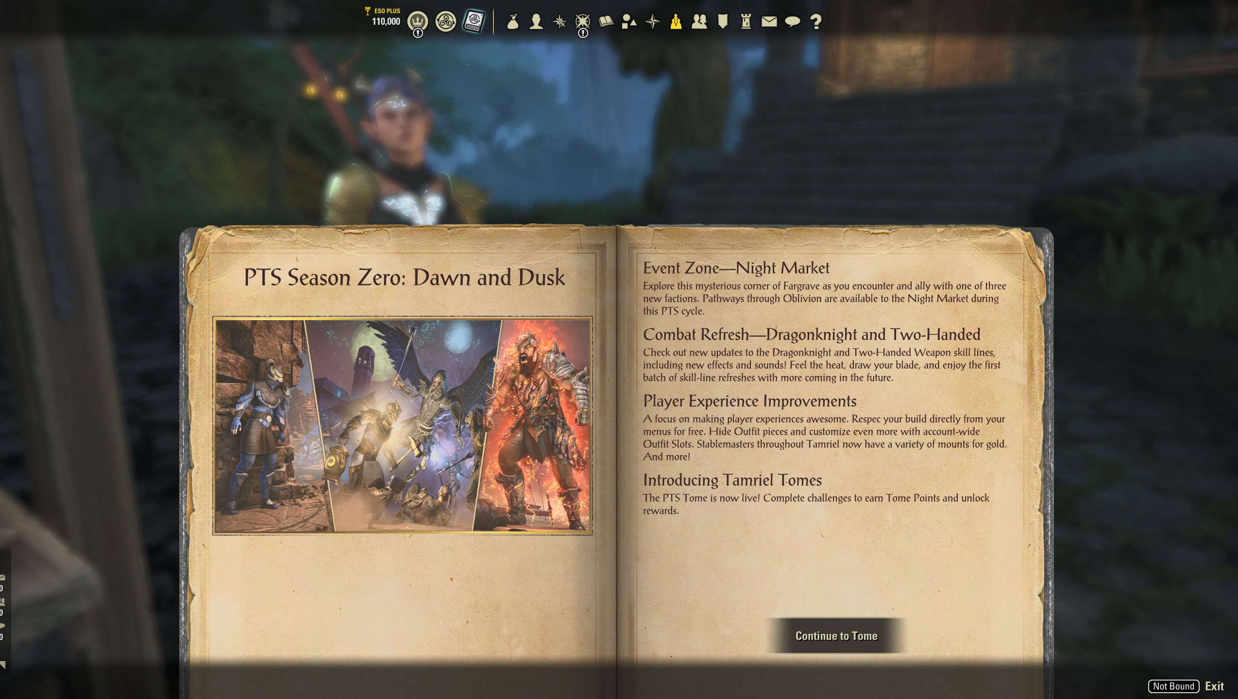
- I appreciated the "update recap" on the initial tome screen. Very beneficial for players who don't use the forums to check for patch notes.
Again, at a glance the features itself look cool. I especially liked the companion exp boost item and the infinite archive packs as well. But monster hunter personality, a main selling point of the premium- disappointing.
PC-EU: BloodstainedFay
Find me on the UESP!
Find me on the UESP!
4
-
 flizomica✭✭✭✭✭Just want to second the feedback about the monster hunter personality. It's the only reason I would have considered buying the premium tome, and it's such a missed opportunity. I was really hoping it would use your currently sheathed weapon instead of some random new Khajiit-themed style, which does not suit my characters. That combined with the clipping issues would make it unusable for me even as a free reward.7
 -
 FabresFour✭✭✭✭✭
✭I have to agree, this personality loses much of its purpose by not carrying the player's weapon, which is quite disappointing. Otherwise, I agree with all the points made.
@FabresFour - 2444 CP
Director and creator of the unofficial translation of The Elder Scrolls Online into BR-Portuguese.
Twitch: twitch.tv/FabresFour5 -
 LonePirate✭✭✭✭✭
✭✭✭Some issues I have seen so far.- I was not able to access/obtain some of the rewards despite having enough seals and the item not being locked.
- There is no notification on screen when you complete a challenge. Endeavors currently notify you with a text banner on the screen when you complete an endeavor.
- I re-rolled the Complete an Arena challenge and it populated a second instance of the Kill 5 Citizens with the Blade of Woe challenge. Perhaps this is acceptable; but it's odd to have two identical challenges at the same time.
- Is there a shortcut key to open the tome? If so, I missed it. If not, one needs to be added.
4 -
BloodstainedFay✭✭✭✭✭LonePirate wrote: »Some issues I have seen so far.
- I was not able to access/obtain some of the rewards despite having enough seals and the item not being locked.
- There is no notification on screen when you complete a challenge. Endeavors currently notify you with a text banner on the screen when you complete an endeavor.
- I re-rolled the Complete an Arena challenge and it populated a second instance of the Kill 5 Citizens with the Blade of Woe challenge. Perhaps this is acceptable; but it's odd to have two identical challenges at the same time.
- Is there a shortcut key to open the tome? If so, I missed it. If not, one needs to be added.
The shortcut is F4! The help menu in-game actually says this too but it's easy to miss.PC-EU: BloodstainedFay
Find me on the UESP!0 -
 twisttop138✭✭✭✭✭
✭✭Since I am not on pts I read the ESO hub article. Am I correct in seeing that the only difference between premium and plus is one costume and some points? As for the other rewards and the way the page looks, not great. Coming from fallout 76, you would wanna emulate or surpass their battle pass page. For all the issues, they get that right. The sample page in the article has what looks to be small icons, cheaply done. Definitely hope they rethink this though I know that's unlikely.2 -
 Maitsukas✭✭✭✭✭
✭✭✭Is there a way to bind the Tamriel Tomes interface to a different key? My muscle memory kicks in and wants to open the Group Menu to see the Weekly Endeavors Challenges.PC-EU @maitsukas
Posting the Infinite Archive and Imperial City Weekly Vendor updates.
Also trying out new Main Quests, Companions, ToT decks, Events and Styles on PTS.1 -
 Emeratis✭✭✭✭✭I too was looking for the official feedback thread but since we're already rolling here I have my own stuff to share.
Feedback
Let's start with the ui. While parts of it have it's endearing charm, it's massively clunky. The book going off the screen was I assume meant to look charming but instead it comes off as messy and unfinished. Above screenshot by the op looks fine but the secondary ui looks awkward visually. Artistically, lines often guide the eye and the hard line of the book leading off the page often has my eye naturally going off my screen or feeling like I have some weird popup ad from yesteryear on my screen. I really do see the vision but it's really not landing for this ui.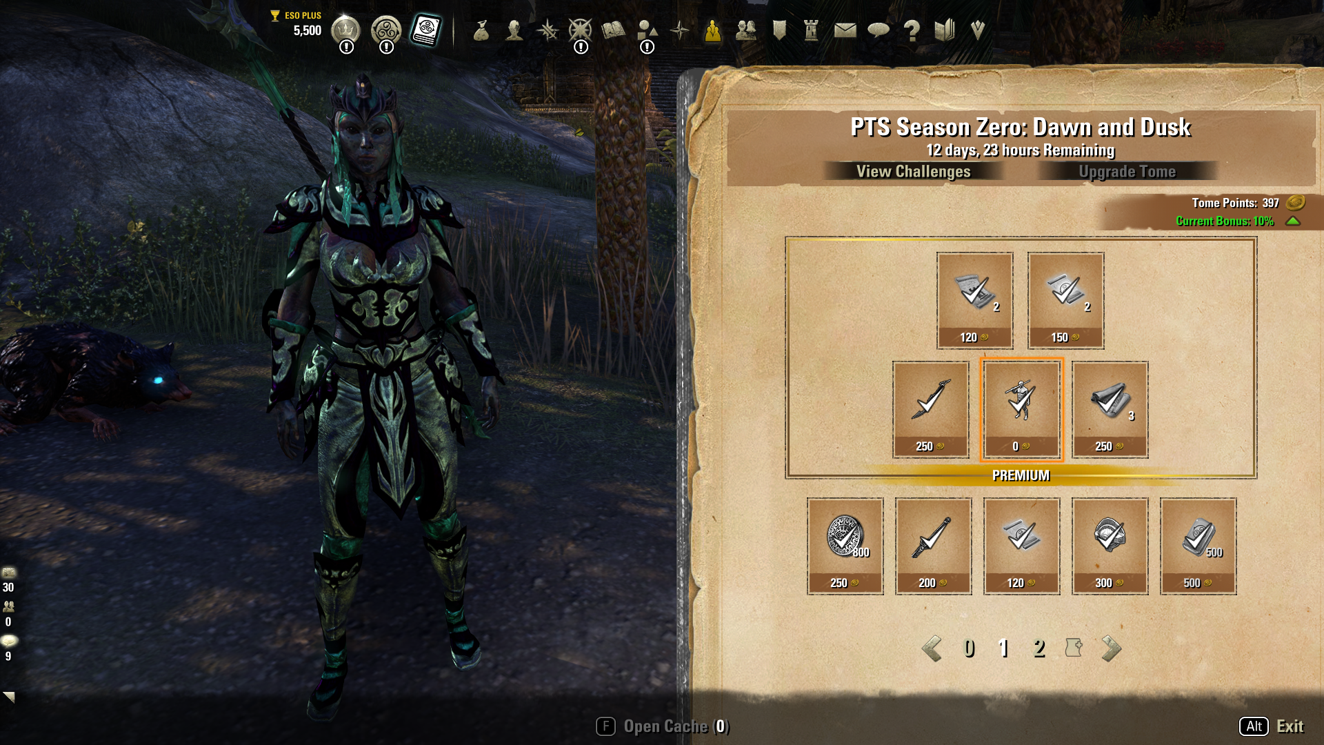
I'd much rather have a book that we can flip or using something closer to the actual in game lorebook ui which already lets us turn pages and interact in ways that feel more pleasant.
Not just aesthetically, but functionality wise the Tome ui is incredibly clunky. With Endeavors and Golden Pursuits, we could get right into the list easily but for Tomes we have to do multiple clicks to get to the list of what to do. The challenges ui once you're there are equally clunky. It took me a moment to figure out how to reroll challenges (it's F). When a tier of a challenge is done, you need to do those multiple clicks to go into the ui to claim it. This is doubly frustrating. For the first, in the old system I would often do combat based endeavors in my trials hardmode/tri progs and it would auto award. Now, if there is a tiered combat challenge, the current system has me either try to claim it mid combat to not lose progress, or try to afk in an ongoing encounter to claim it so as to not lose progress. Also, as I have tried to claim the challenges because there are no addons currently for the new system and the old endeavor tracker addons are broken, I have sometimes forgotten to claim challenges after reaching a tier complete leading me to lose progress. As I mentioned with rerolls and will later down with ui previews in the Tomes, you have to press R to claim and not click it which is an ongoing pain point on the Tome's player facing ui and part of what makes it feel so clunky.
Weekly challenges have checkboxes on some and x of y on others and I cannot personally tell what is different functionally between those but is it possible to streamline the ui so it's one or the other and not both? When I was first doing the challenges I was wondering "what are these boxes?" My best guess is one is meant to be repeatable up to a point and others are limited repeatable? The Seasonal challenges seem to have the similar problem. "Daily Login" is 1/99 but both others have a single checkbox to complete and not a tiered one like the weekly challenges.
The alchemical ingredients hint requests specific items for bonus credit but seasoned players might not look at the hints assuming they are for newer players. Perhaps writing the bonus in the actual challenge might work better? I do like the idea in concept that certain challenges have specific bonuses to complete them quicker though. It's a nice touch.
I do not know if the rewards preview being hidden to a few pages until you earn more is a pts hiding thing or not but it absolutely cannot go live. Players have a right to see the full reward track and cost of cosmetics in a Tome before they purchase it. Considering this has money involved and almost every other game lets a player fully preview what they are getting and how much it will cost in tokens or time before purchasing a battle pass, eso's battle pass system needs to do similar for fairness and transparency. People already find battle passes hard to stomach, hiding things will make that worse.
Bugs- I tried to do "Open 1 Chest from Treasure Maps" twice, it counted for "Loot 1 Treasure Chest" but did not progress the treasure maps one at all.
- Click to preview a cosmetic in the Tomes does not hide the book ui and is buggy. Using the R key hides the book and previews things properly but given how preview click or R key functions in every other preview ui in game this needs to be fixed before going live. I am not surprised that some people thought it was fully bugged.
I know a lot of this is negative or may seem nitpicky but the average player is probably going to feel similar frustrations and if you want people to feel comfortable with battlepasses in eso, it needs to feel good both functionally, aesthetically, and fairness wise. I know people are still on the fence or concerned about the Tome system. While not comprehensive, addressing or fixing some of the above would go a long way to help with some of the misgivings. I tried to keep my feedback as constructive as possible and offer insight and solutions despite it being mostly negative. I'm hoping it helps a better version of Tomes make it to live. I will say I find the thematic around this battlepass more endearing than other battle pass systems I've interacted with so that is a nice start/base for this, just need to fix some bugs and polish up some ui and functionality.Edited by Emeratis on January 27, 2026 4:44PM7 -
BloodstainedFay✭✭✭✭✭Incredible feedback from the above commenter! @ZOS_Kevin highly suggest y'all take a look at this when you have the time. I was short in my original post but @Emeratis hit the nail on the head as wellEdited by BloodstainedFay on January 27, 2026 4:27PMPC-EU: BloodstainedFay
Find me on the UESP!2 -
Emeratis✭✭✭✭✭
The default key is f4, but I have mentioned in my post above in general how clunky it is to get to the challenges part of the list. Even with the key binding it is a few more clicks to actually see your lists and/or claim things.LonePirate wrote: »Is there a shortcut key to open the tome? If so, I missed it. If not, one needs to be added.
Edit: whoops this thread is moving fast and this was already answered, my bad!Edited by Emeratis on January 27, 2026 4:31PM2 -
Maitsukas✭✭✭✭✭
✭✭✭
Those checkboxes show how many times that specific challenge can be done.I too was looking for the official feedback thread but since we're already rolling here I have my own stuff to share.
Feedback
Weekly challenges have checkboxes on some and x of y on others and I cannot personally tell what is different functionally between those but is it possible to streamline the ui so it's one or the other and not both? When I was first doing the challenges I was wondering "what are these boxes?" My best guess is one is meant to be repeatable up to a point and others are limited repeatable? The Seasonal challenges seem to have the similar problem. "Daily Login" is 1/99 but both others have a single checkbox to complete and not a tiered one like the weekly challenges.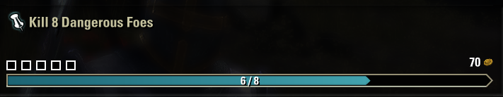
PC-EU @maitsukas
Posting the Infinite Archive and Imperial City Weekly Vendor updates.
Also trying out new Main Quests, Companions, ToT decks, Events and Styles on PTS.2 -
Maitsukas✭✭✭✭✭
✭✭✭Bug: Open X Chests from Treasure Maps doesn't appear to progress. Perhaps the change to the Treasure Map consumption behavior is the reason for it.Edited by Maitsukas on January 27, 2026 5:00PMPC-EU @maitsukas
Posting the Infinite Archive and Imperial City Weekly Vendor updates.
Also trying out new Main Quests, Companions, ToT decks, Events and Styles on PTS.2 -
 Soarora✭✭✭✭✭
✭✭✭✭✭I love that the first screen informs players of changes, its a great step in the right direction for informing the playerbase that doesn't know to check the forums or social media. That said, the UI does feel... weird. The "view challenges" and "upgrade tome" text is escaping the buttons and the buttons feel very close to the remaining time. I also understand why the menu is off to the side (so you can preview things), but it does feel offputting and too many buttons to flip through the pages. There doesn't feel like there's any rhyme or reason to what page things are on, so my thought would be to dedicate one page to the premium additions (the first page) and the second page to the free additions. If that's not enough space, could have the book centered like it is when you first open it and add some kind of closing/opening animation (maybe it closes front over back, so it'd be covering the same real estate as it is right now when its closed) to get it out of the way when you press preview (I mean, right now when you press preview it disappears entirely so don't even need an animation, though an animation would be cool). Especially since I don't think the mouse-over-to-preview addition is necessary. That's not how you preview anything else in the game.
(Also, why is the last page a paper with a + instead of a number? I assume that's a part of the dev menu?)
For the seasonal challenges, the time remaining (I'm looking at the daily login reward) feels EXTREMELY close to the progress bar and off-center. It makes me uncomfortable.
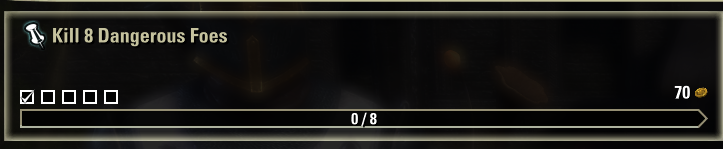
For weekly challenges, the description for "Kill dangerous foes" is "Kill foes with shielded life-bars" which is misleading. They're not shielded. The help menu and guide pop-up don't describe dangerous foes that way (and who calls health bars "life-bars"?), the menus describe the health bar additions as "unique" and "lavish". I think "lavish" instead of "shielded" would make more sense. To me, shielded means they have a shield or they're a guard.
Scatter the Darkness' wording is also a bit odd: "Defeat The Serpent in the trial, Sanctum Ophidia". The comma feels like it doesn't belong there?Edited by Soarora on January 27, 2026 5:30PM[PC/NA] Dungeoneer (Tank/DPS), Semi-retired Trialist, and amateur Battlegrounder (DPS) with a passion for The Elder Scrolls lore.
Current GM of Hard Dungeoneers
Tanks: Sorcerer - Necromancer - Templar
DPS: Frost Warden - Stamarc - StamDK - Hybrid NB Healer
Ex-Healer: Warden - Arcanist
Dungeons: 34/34 HMs - 28/28 Tris2 -
 ZOS_KevinCommunity ManagerHi all, we also now have an official thread for the Tome as well. https://forums.elderscrollsonline.com/en/discussion/688186
We are going to share this thread with the dev team now. Thank you!Community Manager for ZeniMax Online Studio and Elder Scrolls OnlineDev Tracker | Service Alerts | ESO Twitter4 -
 LunaFlora✭✭✭✭✭
✭✭✭✭✭awesome feature.
agree on other the feedback from other people.
Personalities like Monster Slayer and Maniacal Jester really should use your equipped weapon.
Awesome that there seems to be a good variety of challenges and that you can reroll for different challenges.
The book interface is cute and seems simple to use.
However, i wish the Tome interface was more like Golden Pursuits and well most other menus, dark background specifically as the paper beige makes it harder to see and read things.
i know it is a tome so paper makes sense, but even an option for dark paper background would be helpful. i think some books already use it, skillbooks or Shalidor's Library?miaow this is my forum signature! my name is Luna ( she/her ).
🌸*throws cherry blossom on you*🌸
"Eagles advance, traveler! And may the Green watch and keep you."
🦬🦌🐰
PlayStation EU is my primary server.
LunaFloraBlossom on PlayStation 5 and PC.
my main character is a Bosmer Warden named Greehnhart in-game, Greenie Florahart in full.
all characters on PS EU:- Luna Blossom, Bosmer Dragonknight.
- Dotty Greehnhart, Bosmer Sorcerer.
- Lía Greehnhart, Khajiit Nightblade.
- Lady Greehnhart, Altmer Templar. Lady is her name and title.
- Holly Blossom, Altmer Sorcerer.
- Sally Jadehart, Argonian Nightblade. Like a green salamander.
- Dorothy Pizzalover, Orc Warden. add pizzas to the game please.
- Greehnhart, Bosmer Warden.
- Lúcia Azurehart, imperial Necromancer. Azureblight, she has a Maarselok outfit.
- Bunny Rubyhart, Dunmer Nightblade.
- Wisteria Antheia, Khajiit Templar. blue hair like the wisteria.
- Cynthia Turquesa, Breton Warden.
- Rubyhart, Bosmer Nightblade.
- Hestia Rubyhart, Dunmer Dragonknight.
- Aurelia Cherryhart, Altmer Warden. Spriggan.
- Aurora Honey, Redguard Templar. Meridian cultist.
- Speaks-With-Blossom, Argonian Warden.
- Lulu Nightshade, Nord Necromancer.
- Lunetta Gleamblossom, Bosmer Arcanist. Ohmes Khajiit.
- Dianna Hyacinth, Altmer Arcanist. Maormer, water hyacinth.
Links to my Housing threads:Weapon Racks
https://forums.elderscrollsonline.com/en/discussion/692081/housing-request-weapon-racks-wishlist-with-pictures
Desks
https://forums.elderscrollsonline.com/en/discussion/691313/housing-request-more-desk-furnishings-please
Orc
https://forums.elderscrollsonline.com/en/discussion/687765/wishlist-for-orcish-furnishings
Music control
https://forums.elderscrollsonline.com/en/discussion/683673/request-for-housing-music-changer
Sanguine
https://forums.elderscrollsonline.com/en/discussion/679400/housing-sanguine-furnishings-from-west-solstice-please
Statues
https://forums.elderscrollsonline.com/en/discussion/691652/housing-statues-from-zones-as-furnishings-please
Links to my Fashion threads:Tassets and Loincloths
https://forums.elderscrollsonline.com/en/discussion/650919/list-of-outfit-styles-without-tassets-and-loincloths-will-try-to-update
Outfit System refresh
https://forums.elderscrollsonline.com/en/discussion/690938/lunas-outfit-system-improvements-request-thread
Dye Stamps
https://forums.elderscrollsonline.com/en/discussion/688775/please-let-us-collect-the-dye-stamp-exclusive-dyes-outfit-system-request
Unavailable Styles
https://forums.elderscrollsonline.com/en/discussion/686841/please-release-all-unavailable-outfit-styles-for-outfits0 -
ZOS_KevinCommunity ManagerBloodstainedFay wrote: »Hi ZOS! Some feedback and bugs, i might be blind but could not find a discussion thread for the tome
Bugs- Items are not preview-able inside the tome itself. The moment you move your mouse away from the item in the tome, the preview ends- making it impossible to cycle through the idles
- Tome appeared halfway down the screen for me. Looks very weird.
Hi BloodstainedFay. Just following up here from the other post as well.
If your resolution is not 1920x1080, OR you are using a large monitor like 4K, the Tome is going to stretch a bit. This actually happens with all ESO UI, but the Tome is just the first one to really highlight this.
There is a hotkey to fully Preview the item within the Tome UI, F4. The mouseover Preview is what we call "light Preview". To give a quick view of the item. You can also hit 'R' for the full preview while doing the light preview. However, we are thinking about some future improvements to better the experience.
Community Manager for ZeniMax Online Studio and Elder Scrolls OnlineDev Tracker | Service Alerts | ESO Twitter4 -
 Radiate77✭✭✭✭✭
✭✭+1 for fixing the personality to use our equipmentDragon Priest [Restoring Light, Draconic Power, Grave Lord]
Death Knight [Grave Lord, Winter’s Embrace, Siphoning]
Pyromancer [Ardent Flame, Dawn’s Wrath, Earthen Heart]
Summoner [Living Death, Grave Lord, Daedric Summoning]
Ranger [Animal Companions, Green Balance, Shadow]
Druid [Earthen Heart, Animal Companions, Stormcalling]
Elementalist [Stormcalling, Winter’s Embrace, Ardent Flame]
Dawnguard [Dawn’s Wrath, Restoring Light, Ardent Flame]1 -
 couriersix✭✭✭I found the UI's readability to be harsh and difficult to navigate. The trade points icon was hard to see since it was so tiny and I didn't like that I couldn't preview the entire tome. I also do hope that we'll be able to earn enough to purchase all items within the tome, instead of being forced to pick and choose what we want.Edited by couriersix on January 28, 2026 2:22AMPC / NA - cp 1700+ - EP magicka necro.1
 -
axan22✭✭✭The only thing that is a bit strange and i would say prob more for new players is that you now have to do in game things to earn trade bars to then buy endeavours to then buy things in the crown shop, so its a currency for a currency to buy things in a shop.
Other than that its seems fine, be interesting to see more how many points you get for things how much of a grind it will be, as log in items have now gone so that's 28-31 free items gone away, yes the free track is free but still need to earn the points to buy them.
It would have been nice if the challenges were in the Tome and not in that god awful UI it has now.
0 -
 This_0ne✭✭✭✭I'm not sure I understood correctly, but is it possible to fully preview the tome's contents right away, especially before purchasing the premium version, or does access to the pages unlock as I earn points (and I won't be able to view the contents)? It seems like a pig in a poke, and I'm not sure if it's worth purchasing.3