Maintenance for the week of July 20:
• [COMPLETE] PC/Mac: NA and EU megaservers for patch maintenance – July 20, 4:00AM EDT (8:00 UTC) - 12:00PM EDT (16:00 UTC)
• [COMPLETE] Xbox: NA and EU megaservers for patch maintenance – July 20, 4:00AM EDT (8:00 UTC) - 12:00PM EDT (16:00 UTC)
• [COMPLETE] PlayStation®: NA and EU megaservers for patch maintenance – July 20, 4:00AM EDT (8:00 UTC) - 12:00PM EDT (16:00 UTC)
Black Gem Foundry, did we forget about colourblind people?

Katheriah
✭✭✭✭✭
✭✭✭
✭✭✭
Guys seriously a mechanic on the endboss with yellow and green? We're currently at that boss with someone in the group who literally CANNOT see the difference.
Why did you have to pick yellow and green?
What in Oblivion were you thinking?
Why did you have to pick yellow and green?
What in Oblivion were you thinking?
10
-
 TFPAcer✭✭✭Each colour has a different shape which seems to be the "expected" way for colour blind people to distinguish them but they're simply not visually distinct enough for that to be viable quickly. Accessibility is once again an afterthought.4
 -
 ZOS_Finn✭✭✭✭✭There should be symbols (Square, Circle, Triangle) in addition to the colors. Similar to what we did in Moon Hunter Keep. Are those not helping?Associate Design Director4
 -
 LunaFlora✭✭✭✭✭
✭✭✭✭✭i agree that the colours chosen are not great,
however there are symbols as well.
are the symbols not visible either?miaow this is my forum signature! my name is Luna ( she/her ).
🌸*throws cherry blossom on you*🌸
"Eagles advance, traveler! And may the Green watch and keep you."
🦬🦌🐰
PlayStation EU is my primary server.
LunaFloraBlossom on PlayStation 5 and PC.
my main character is a Bosmer Warden named Greehnhart in-game, Greenie Florahart in full.
all characters on PS EU:- Luna Blossom, Bosmer Dragonknight.
- Dotty Greehnhart, Bosmer Sorcerer.
- Lía Greehnhart, Khajiit Nightblade.
- Lady Greehnhart, Altmer Templar. Lady is her name and title.
- Holly Blossom, Altmer Sorcerer.
- Sally Jadehart, Argonian Nightblade. Like a green salamander.
- Dorothy Pizzalover, Orc Warden. add pizzas to the game please.
- Greehnhart, Bosmer Warden.
- Lúcia Azurehart, imperial Necromancer. Azureblight, she has a Maarselok outfit.
- Bunny Rubyhart, Dunmer Nightblade.
- Wisteria Antheia, Khajiit Templar. blue hair like the wisteria.
- Cynthia Turquesa, Breton Warden.
- Rubyhart, Bosmer Nightblade.
- Hestia Rubyhart, Dunmer Dragonknight.
- Aurelia Cherryhart, Altmer Warden. Spriggan.
- Aurora Honey, Redguard Templar. Meridian cultist.
- Speaks-With-Blossom, Argonian Warden.
- Lulu Nightshade, Nord Necromancer.
- Lunetta Gleamblossom, Bosmer Arcanist. Ohmes Khajiit.
- Dianna Hyacinth, Altmer Arcanist. Maormer, water hyacinth.
Links to my Housing threads:Weapon Racks
https://forums.elderscrollsonline.com/en/discussion/692081/housing-request-weapon-racks-wishlist-with-pictures
Desks
https://forums.elderscrollsonline.com/en/discussion/691313/housing-request-more-desk-furnishings-please
Orc
https://forums.elderscrollsonline.com/en/discussion/687765/wishlist-for-orcish-furnishings
Music control
https://forums.elderscrollsonline.com/en/discussion/683673/request-for-housing-music-changer
Sanguine
https://forums.elderscrollsonline.com/en/discussion/679400/housing-sanguine-furnishings-from-west-solstice-please
Statues
https://forums.elderscrollsonline.com/en/discussion/691652/housing-statues-from-zones-as-furnishings-please
Links to my Fashion threads:Tassets and Loincloths
https://forums.elderscrollsonline.com/en/discussion/650919/list-of-outfit-styles-without-tassets-and-loincloths-will-try-to-update
Outfit System refresh
https://forums.elderscrollsonline.com/en/discussion/690938/lunas-outfit-system-improvements-request-thread
Dye Stamps
https://forums.elderscrollsonline.com/en/discussion/688775/please-let-us-collect-the-dye-stamp-exclusive-dyes-outfit-system-request
Unavailable Styles
https://forums.elderscrollsonline.com/en/discussion/686841/please-release-all-unavailable-outfit-styles-for-outfits0 -
TFPAcer✭✭✭@ZOS_Finn
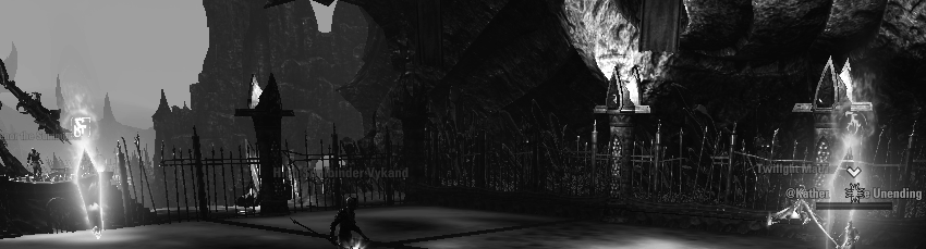
Greyscale image for illustration purposes. The symbols are too small at a distance to easily distinguish (compared to a non colourblind player who can look at the entire crystal) and the shape is almost invisible due to the circular effect around them.Edited by TFPAcer on August 18, 2025 8:11PM18 -
Katheriah✭✭✭✭✭
✭✭✭There should be symbols (Square, Circle, Triangle) in addition to the colors. Similar to what we did in Moon Hunter Keep. Are those not helping?
I appreciate the response!
The shapes might be something we'll get used to when we've done it a couple of times, but with the thin lines they are much less visible than the big blobs of colours (for me, who can see colours well). For me the Daedric (?) symbols in the shapes are visually cluttering. And we also have to track the movement, so it's much more difficult for colourblind people.
Even if we will get used to the shapes, imho it's just really silly to pick yellow and green for a big colourful blob while we know so much about accessibility.3 -
ZOS_Finn✭✭✭✭✭OK, thanks for the feedback folks. We will take a look at this.Associate Design Director14
-
 pupsas✭✭Just did a first time run for this dungeon and it was absolutely atrocious. My colorblindness is on the mild side and I rarely have any issues, but this was pretty bad.
As for the different shapes, those got blurred by the magic haze effect around them. From afar the circle looks almost identical to the square.
I think simply changing green or yellow symbol to blue would fix all the issues.1


