Update 49 is now available for testing on the PTS! You can read the latest patch notes here: https://forums.elderscrollsonline.com/en/categories/pts
Maintenance for the week of February 2:
• PC/Mac: No maintenance – February 2
• ESO Store and Account System for maintenance – February 3, 6:00AM EDT (11:00 UTC) - 4:00PM EDT (21:00 UTC)
• PC/Mac: No maintenance – February 2
• ESO Store and Account System for maintenance – February 3, 6:00AM EDT (11:00 UTC) - 4:00PM EDT (21:00 UTC)
Greymoor dead colors...why?

Boboli
✭✭✭
I have been playing ESO since release and honestly hate to complain in forums but I never liked the "dream/realm" sequences in ESO quests where colors in landscape are muted/filtered/bland. So as I started Greymoor I began exploring Western Skyrim and it's washed out with green/blue global filtering applied to all textures...looks flat, boring. For such an amazing location that looks great in the original Skyrim game, why mute the world back to blandness? I rode around for an hour looking to see if this "effect" changes and it seems the entire region is dead in color compared the all other regions in the game...why?
8
-
ImmortalCX✭✭✭✭✭I like the contrast between zones.
Summerset was colorful and polished. They went another direction with GREYmoor.20 -
Boboli✭✭✭The coloring effect is a global reduction in saturation with hue filter applied to all textures. It may save texutre loading/memory since the color depth appears reduced. It just seems crazy to visually mute such an awesome setting, really is disappointing for such a memorable iconic location. I do feel they nailed the physical modeling/reproduction of Skyrim but not in regards to pallet and color depth.3
-
stefan.gustavsonb16_ESO✭✭✭✭✭
✭I disagree with their choice of blue/red tint (reduced green intensity) for indoor areas. It makes interiors and decorations look considerably less vivid than in other areas of the game.
Their overtuned (imo) global color filter is a particuarly bad fit with the UI for antiquities excavation. It's hard to even see the difference between yellow and green, because both colors are washed out and desaturated.Edited by stefan.gustavsonb16_ESO on May 31, 2020 10:37AM1 -
Varana✭✭✭✭✭
✭✭✭Original Skyrim also had this desaturated colour palette, combined with a yellow-ish tint all over. I think they tried to go for a similar experience.
It might also have something to do with how it looks in snowy weather and cold fog where you want that desaturated look.4 -
Boboli✭✭✭Original Skyrim also had this desaturated colour palette, combined with a yellow-ish tint all over. I think they tried to go for a similar experience.
It might also have something to do with how it looks in snowy weather and cold fog where you want that desaturated look.
I hate to be a whiner and hesitated to post, way too many complaints for complaining sake in forums these days IMHO. I just see such a huge difference that is such a departures from the more varied, realistic, deeper colors in most other areas. I can adjust gamma to give it more depth, but it still has the flat/bland visual feel IMHO. I played Skyrim for 100s of hours and always loved the landscapes visually, actually I just reinstalled it for another play and the textures work great, they feel varied and interesting, they connect to the land visually, they make sense, conducive to immersion. My issue with Greymoor is the monotone type of very low saturation and global tinting muting what is otherwise awesome landscapes.
Anyway, enough of my words, I guess people are fine with it, actually seem to prefer it. Thanks for the feedback. Have fun!0 -
rexagamemnon✭✭✭✭✭
✭I might be the overall tone ZOS was going for. they specifically said it was a "Gothic" theme. vampires and werewolves, its supposed to be gloomy and doomy.
I really liked the summers colors, it was very happy and relaxing.1 -
 Nirntrotter✭✭✭✭✭It does look different than other zones, but that just heightens the appeal for me. It's probably one of my favourite zones already2
 -
 ProfessorKittyhawk✭✭✭✭✭
✭I don't mind the color change. Thats something I like about this game, the variety of environments and colors. Love the snowy, wintery climate.0 -
 Pyr0xyrecuprotite✭✭✭✭✭I actually like the muted tones of the overland Skyrim experience - very nostalgic reminder of the TES 5 Skyrim game.
However, if you look around at night (or at Harrowstorms), the colours are much brighter, and just wait until you go down into Blackreach - it's gorgeous! (Original Skyrim area of Blackreach was quite dim and gloomy most of the time; there is much more lighting in this new ESO part of Blackreach - and it's a much better playing experience for me tbh.)3 -
 Ratzkifal✭✭✭✭✭
✭✭✭✭✭Go back to vanilla TESV and see how bland and dead the colours there are. I am sure they went with that direction to make it look more like the way it did in TESV.This Bosmer was tortured to death. There is nothing left to be done.0 -
 Kiralyn2000✭✭✭✭✭
✭✭✭✭✭Original Skyrim also had this desaturated colour palette, combined with a yellow-ish tint all over. I think they tried to go for a similar experience.
It might also have something to do with how it looks in snowy weather and cold fog where you want that desaturated look.
I hate to be a whiner and hesitated to post, way too many complaints for complaining sake in forums these days IMHO. I just see such a huge difference that is such a departures from the more varied, realistic, deeper colors in most other areas.
Amusingly, I could go back over the years and find threads from people complaining about how "cartoony"/unrealistic/oversaturated the base game is. Ah, the joy of subjective opinions. 2
 -
 Hurbster✭✭✭✭✭
✭✭I just turn up the colour saturation on my Nvidia settings.So they raised the floor and lowered the ceiling. Except the ceiling has spikes in it now and the floor is also lava.0 -
 scorpius2k1✭✭✭✭✭
✭I really wish they would do something about the drab and dull look to the game, idc if TESV looked cold, dull, and uninviting. This is ESO, and the dull color palette / blue hue and lack of any sharpening on the textures really takes away from an otherwise great look this game COULD have. At the very least, in the VIDEO SETTINGS add in options for SATURATION/HUE/SHARPNESS. @ZOS_GinaBruno @ZOS_JessicaFolsom please pass this along to devs as a suggestion, this topic comes up on a regular basis with new and veteran players.
Here is a stock vs reshade enhancement preset I made to take out the blue overtone, add some contrast/saturation, and light sharpening without taking away from the original "as-intended" look. This screenshot was in Summerset. It really makes the game look a lot more alive and textures/details pop a lot more. I know Elder Scrolls games are "supposed to" look cold and unwelcoming but ...why for ESO? The dull and less detailed appearance actually takes away from the game imho, especially when you experience it like I have. To be honest, I can't play without the preset now lol. I really wish ZoS would reconsider their approach in this area, and hopefully, yet another post about this confirms even more players want change. Good eyes OP (fingers crossed)
Full Res => https://scorpex.org/share/eso-lighting-sharpening-fix.jpg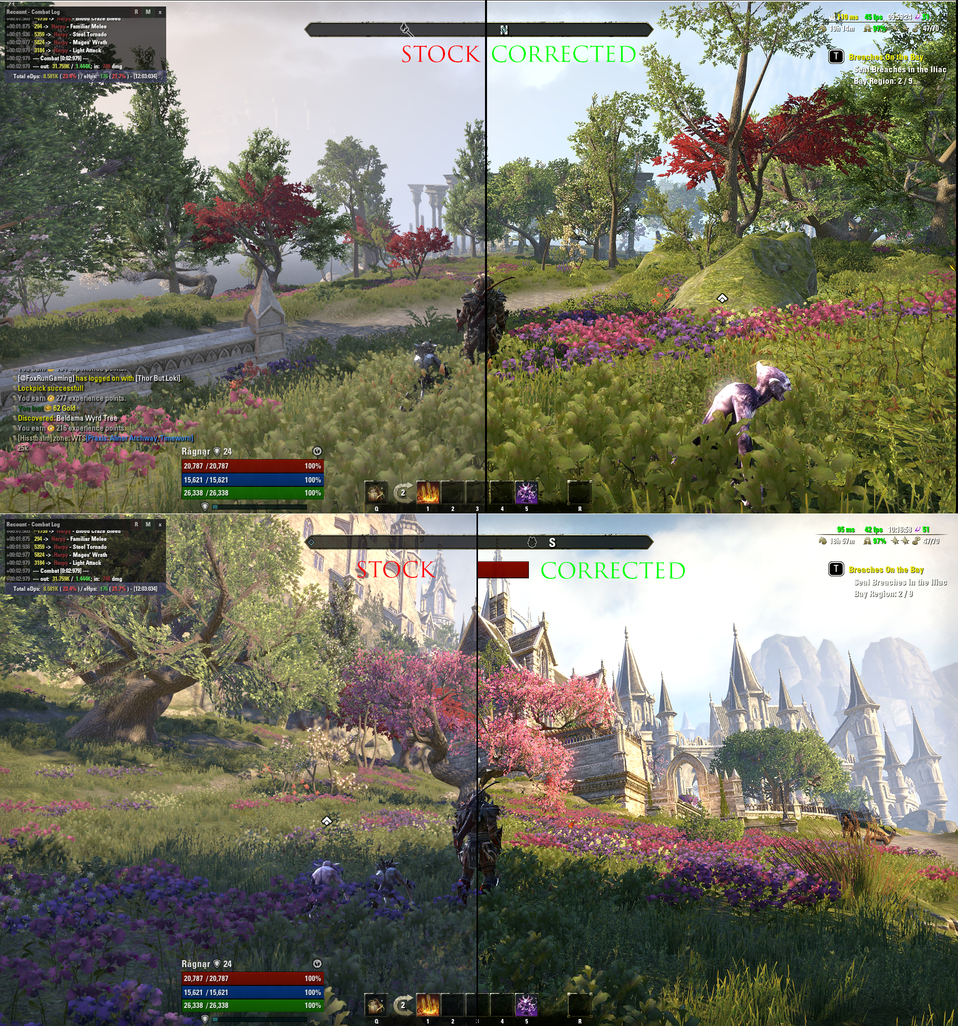
Edited by scorpius2k1 on May 31, 2020 5:21PM🌎 PC/NA
🐧 Linux (Arch)
🧑💻 ESO Addon Dev
⚔️ Stamplar | Magplar | Stamcro | Magsorc | Magcro Healer8 -
Jaraal✭✭✭✭✭
✭✭✭✭✭Yeah, that's the first thing I noticed when I walked into Solitude, how bland and washed out all the colors were.
Summerset was colorful and beautiful, and every expansion since has just gotten duller and grimier. I was hoping we were done with moldy buildings once we left Elsweyr, but it appears the mold is still here with Greymoor.... it's just gotten yellower.
Edited by Jaraal on May 31, 2020 7:20PM1 -
 BisDasBlutGefriert✭✭✭✭✭Those are GORGEOUS @scorpius2k1!!!~There’s a positive in every negative. Sometimes the positive is harder to find than other times, but there is ALWAYS one there~0
 -
Iccotak✭✭✭✭✭
✭✭✭✭ESO enb removing the grey from the game - enhancing the colors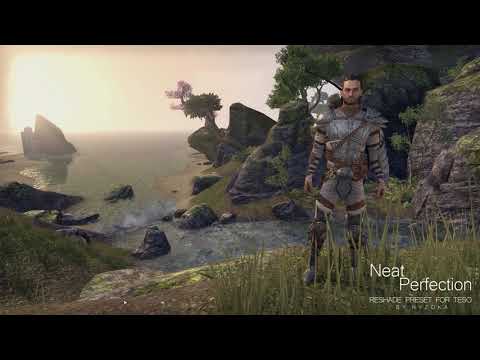 https://www.youtube.com/watch?v=PwFjXuXcUfc
@scorpius2k1
Can we download that?1 -
Boboli✭✭✭Yeah, that's the first thing I noticed when I walked into Solitude, how bland and washed out all the colors were.
Summerset was colorful and beautiful, and every expansion since has just gotten duller and grimier. I was hoping we were done with moldy buildings once we left Elsweyr, but it appears the mold is still here with Greymoor.... it's just gotten yellower.
A big part of my career was computer modeling/animation/video presentations for land development projects. Creating the materials/texture sets is a huge task for any environment/project and takes time.
During the modeling creation process in making draft preview animations when texture color sets were not yet ready we would quickly substitute dulling/filtering to balance to existing textures or to textures with otherwise incompatible colors to make them look suitable for initial client meetings. They were bland, lacking depth and variety as I see in Greymoor.
Bottom-line for me, IMHO, is that Skyrim in ESO is just not a believable setting WRT to texture/object coloring in outdoor environments, whether "gothic" or not, it looks to be created with efficient but bland filtering that eliminated otherwise needed careful color aggregation balancing. The snow is tinted green as is most everything else. The pathways, rocks, tree trunks are gray without much variety at all.
I totally get that many people love this look but it just really yanks me right out of becoming immersed into the game world for the outdoor spaces. I know I can adjust my settings, I am only making an observation and was curious what others felt.
Love ESO, thanks for the feedback!
Edited by Boboli on June 1, 2020 4:27AM1 -
 kind_hero✭✭✭✭✭
✭✭Original Skyrim also had this desaturated colour palette, combined with a yellow-ish tint all over. I think they tried to go for a similar experience.
It might also have something to do with how it looks in snowy weather and cold fog where you want that desaturated look.
I hate to be a whiner and hesitated to post, way too many complaints for complaining sake in forums these days IMHO. I just see such a huge difference that is such a departures from the more varied, realistic, deeper colors in most other areas. I can adjust gamma to give it more depth, but it still has the flat/bland visual feel IMHO. I played Skyrim for 100s of hours and always loved the landscapes visually, actually I just reinstalled it for another play and the textures work great, they feel varied and interesting, they connect to the land visually, they make sense, conducive to immersion. My issue with Greymoor is the monotone type of very low saturation and global tinting muting what is otherwise awesome landscapes.
Anyway, enough of my words, I guess people are fine with it, actually seem to prefer it. Thanks for the feedback. Have fun!
I'm not sure if this is the reason, but somehow the overland areas seems a bit off to me compared to the original Skyrim. But I tend to believe it has to do with the engine, and not the colors. Skyrim had more gritty graphics. Blackreach looks great, but it's not like the Blackreach painted in loading screens or paintings or the one we remember from Skyrim. To many purple amethyst geodes. There were no purple geodes or yellow corals in the Blackreach we know.
My favourite area from a graphics point of view is Wrothgar.[PC/EU] Tamriel Hero, Stormproof, Grand Master Crafter0 -
Red_Feather✭✭✭✭✭
✭✭What is neat is the overland of skyrim is very stark even though it's above ground, and it completely contrasts the underground which is somehow both dark but vibrant!0 -
 asuitandtyb14_ESO✭✭✭✭✭I can tell you, as a Canadian who has lived in overcast, cold places, it is very accurate. It may not be welcoming, or warm, but when it is cold, and the sun is distant, and the clouds are thick, this is about how it looks.2
 -
Boboli✭✭✭asuitandtyb14_ESO wrote: »I can tell you, as a Canadian who has lived in overcast, cold places, it is very accurate. It may not be welcoming, or warm, but when it is cold, and the sun is distant, and the clouds are thick, this is about how it looks.
I can definitely relate seeing the Vancouver and Washington in winter or as a kid Chicago in winter, it's all shades of gray it seems.
As far as in-game comparison, I popped into Eastmarch and Wrothgar and that really shows the contrast between texture/color schemes used, filtering applied to Skyrim is clearly apparent. It almost like looking through sunglasses or something. I know many people really like, that's great to see. Personally I love ESO and appreciate all the hard work and growth it has had over the years. I pretty much play most days. I really appreciate having a quality game to enjoy during some monumental challenging times, my hat's off to ZOS, especially now. As I stated, I loath complaint posts just for the sake of complaining. My intent was to make an observation and see what others thought, the comments have been enlightening")
Thanks, have fun!0
