Maintenance for the week of May 4:
• PC/Mac: No maintenance – May 4
• PC/Mac: No maintenance – May 4
Visual Update of Original Content
Iccotak
✭✭✭✭✭
✭✭✭✭
✭✭✭✭
Introduction
Zenimax has made great strides in the continued development of Elder Scrolls Online. Most of the complaints have been taken care of, they improved the leveling system, they improved combat, they have continued to add content, and this latest DLC makes me very excited for the future of the game. So I would like to point out that I am very happy with how the game is doing and that this post is in no way intended to hate on ESO. This is constructive criticism.
Seeing the new high quality content that the DLCs provide really makes me notice the problems with the old art direction from the launch of the game. There is a noticable difference in quality, and detail, between vanilla and the expansion zones
I will be covering three Sections
1. Landscape
2. Architecture
3. Gear
NOTE: There are a lot of images here
LANDSCAPE
Landscape has one problem. A lack of detail. The vanilla zones, while varied, lack little touches and high quality detail taht makes the environments feel alive.
Here are some examples of vanilla zones
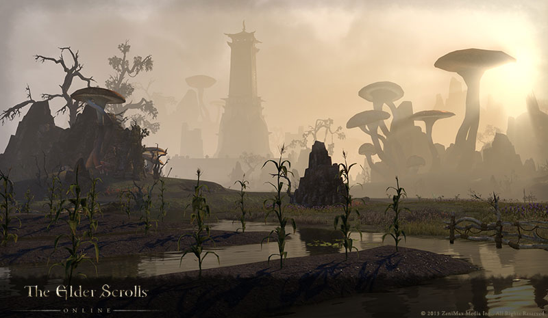


You might not think those are too bad until you get a look at the Expansion areas
Examples

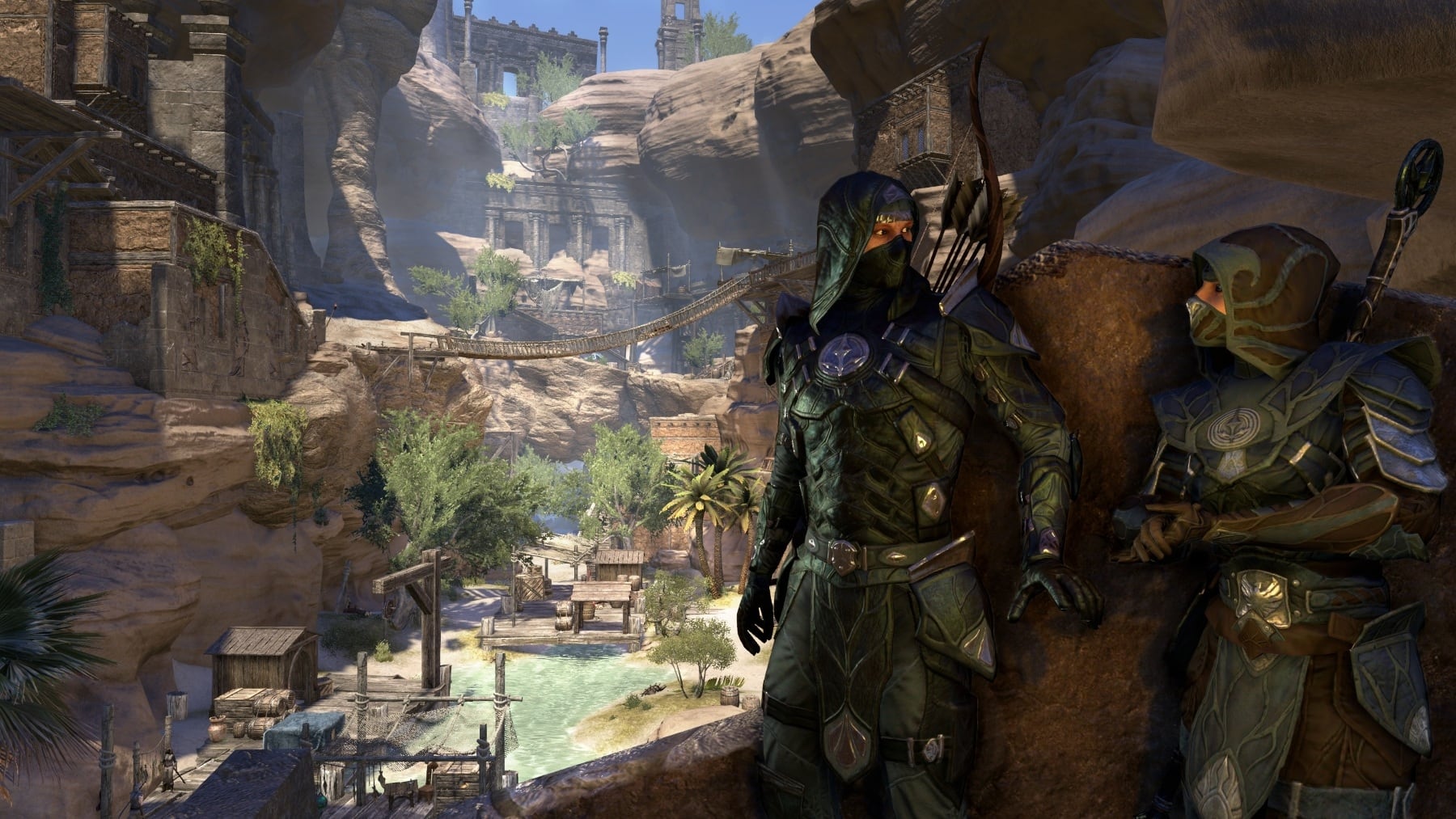
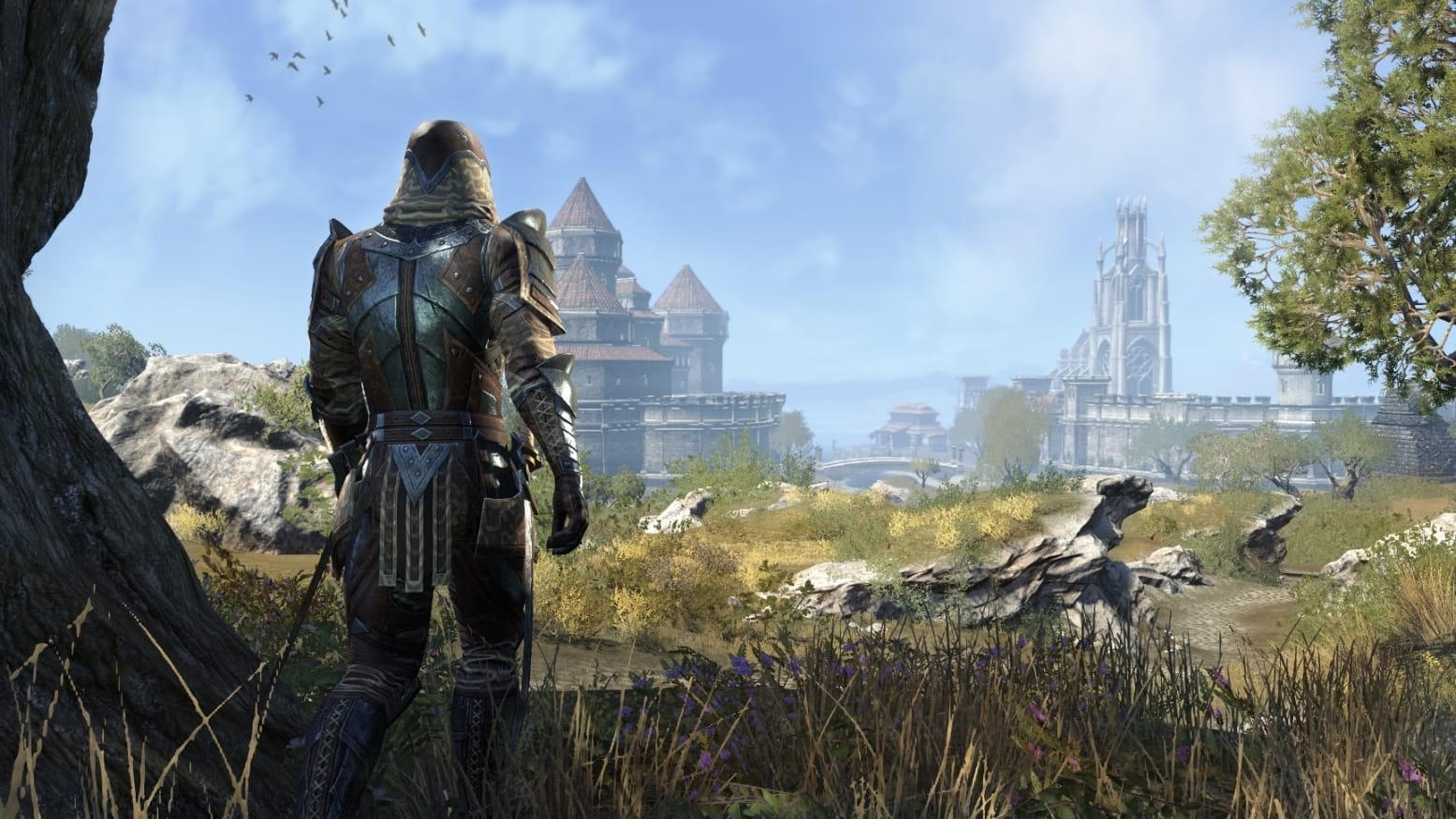

You may notice that incomparison to each other, and besides that they take place in different climates. The vanilla and DLC environments differ greatly in life and detail.
The DLC landscape has more surface detail textures, correctly placed fauna, and even the rocks, all of these aspects really makes the DLC zones feel like an Elder Scrolls Game.
Between these two shots it feels like two different games in terms of quality and life, and that needs to be fixed. I am not saying that this must be fixed right this instant, but little updates here and there, to eventually bring life to the evironments, would be great and would go long way.
Vanilla
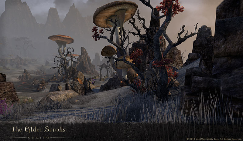
DLC

ARCHITECTURE
I feel that this comic sums up my problem with the Architecture, and the gear, we see in the vanilla content.

The word that describes what the vanilla content is lacking is realistic. When you played an Elder Scroll game you had the feeling that the place could exist. The vanilla architecture was exaggerated, very exaggerated, which is why you would see many people comparing this game to World of Warcraft. They could pick up on an exagerated art style, which does not have a place in the Elder Scrolls. Zenimax definitely heard this complaint which is why we see such a drastic difference between the Vanilla and DLC zones.
Vanilla Examples

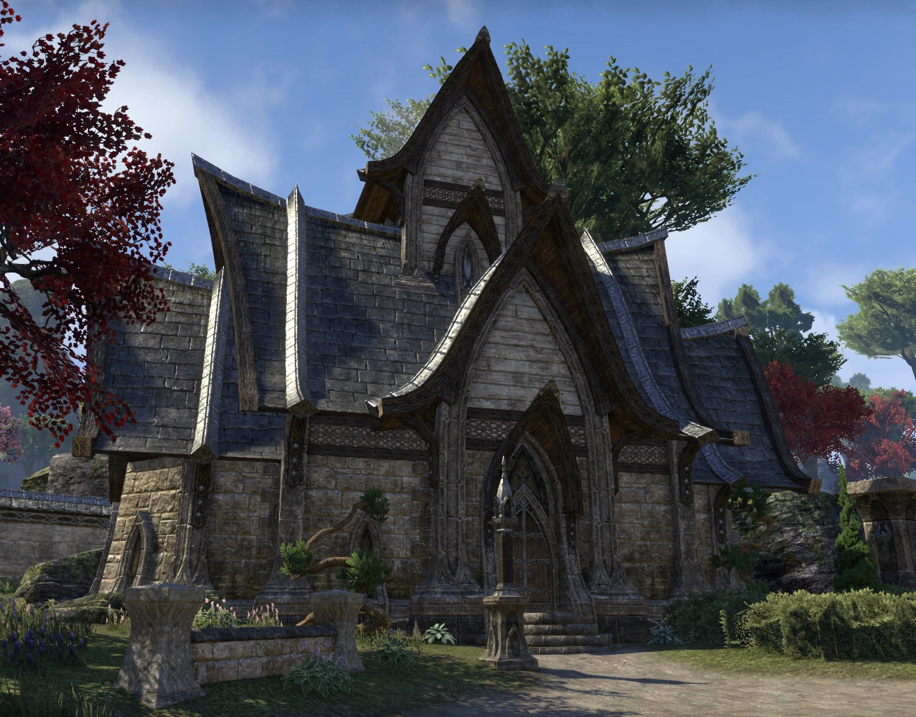
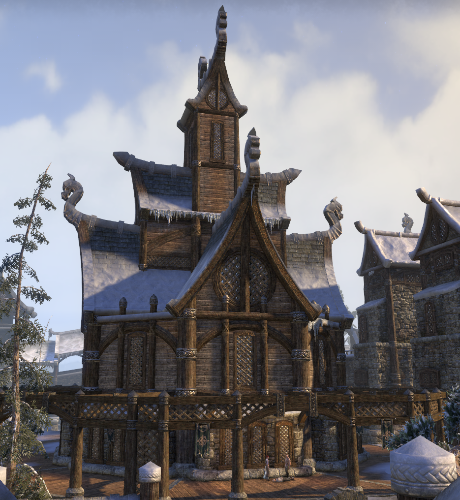
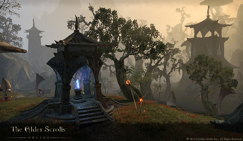
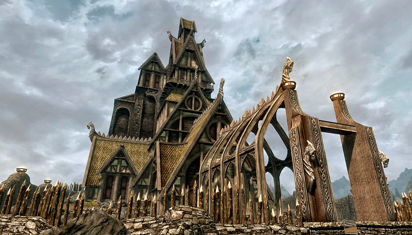
No matter the race, all of the architecture was highly exaggerated. Notice how tame Skyrim is compared to vanilla ESO
In the DLC they avoided exaggerating.


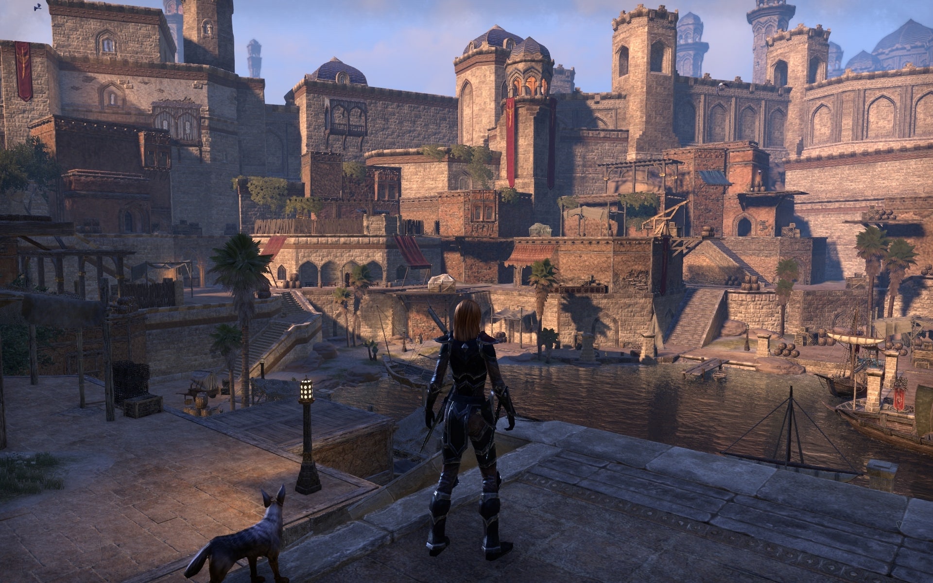
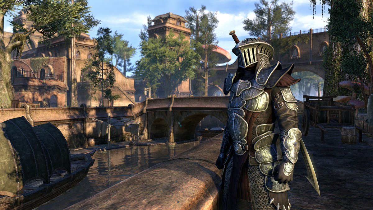
Less exaggeration allows the architecture to feel more unique and specific to the varying cultures.
GEAR
I talked about this in an old post of mine
https://forums.elderscrollsonline.com/en/discussion/240296/little-things-the-game-could-use#latest
I'll sum it up here. The vanilla gear is very generic, exaggerated. and lacks any real distinction.
A real problem that I see happening though is that we have been getting costumes based on cinematic characters' gear. Cinematic characters who wear gear that looks more realistic and like something we would see in an Elder Scrolls game.
Example: The Warden that we saw in the new Morrowind trailer will have a costume that you can buy with the pre-order.

Why doesn't currently existing gear look like that? Or these other outfits we see in the cinematics?


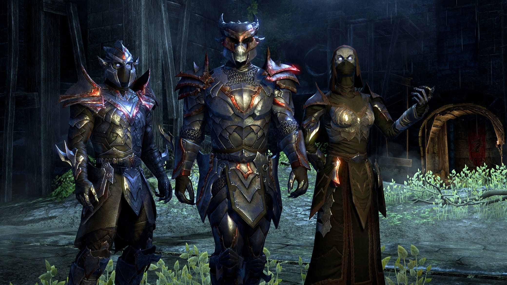
We eventually got the Daedric armor we saw in the trailer

But it looks painted on
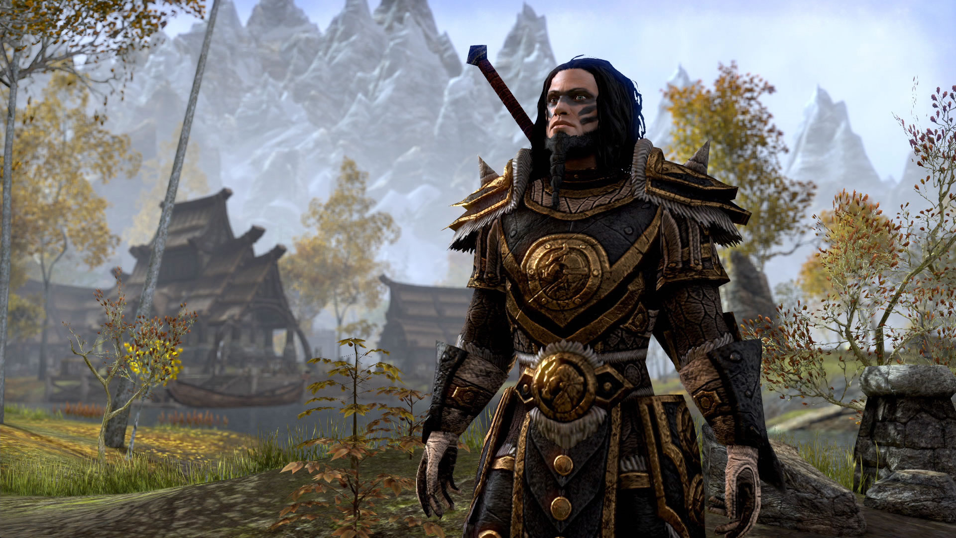
But original Vanilla armors still look like this.

.jpg/revision/latest?cb=20131013141432)

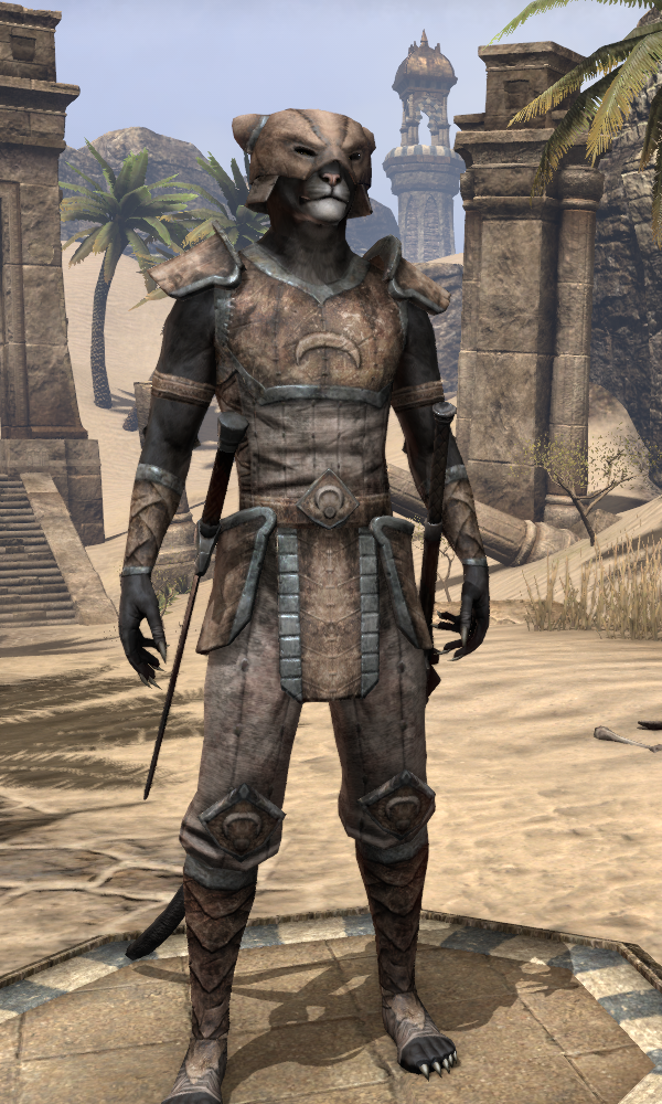
Lately DLC and updated armors have addressed this and look more 3-Dimensional and that they pop off of the body. But fix the old too.
Don't just make new content feel like an Elder Scrolls game when there is still old content that feels more like a cartoon. Upgrade already existing content and bring new life to the game.
Reminder: I am quite happy with the progress Zenimax has made with this game and I still enjoy playing it.
While the new DLC content has been fantastic and of high quality, you cannot have that the only thing that lures audience in. The rest of the game needs to look great too.
I would prefer that the quality between the new Morrowind Expansion and the rest of the vanilla content ramain equal to eachother and not let themselves stand out like a sore thumb.
Edited by Iccotak on February 2, 2017 3:22AM Zenimax has made great strides in the continued development of Elder Scrolls Online. Most of the complaints have been taken care of, they improved the leveling system, they improved combat, they have continued to add content, and this latest DLC makes me very excited for the future of the game. So I would like to point out that I am very happy with how the game is doing and that this post is in no way intended to hate on ESO. This is constructive criticism.
Seeing the new high quality content that the DLCs provide really makes me notice the problems with the old art direction from the launch of the game. There is a noticable difference in quality, and detail, between vanilla and the expansion zones
I will be covering three Sections
1. Landscape
2. Architecture
3. Gear
NOTE: There are a lot of images here
LANDSCAPE
Landscape has one problem. A lack of detail. The vanilla zones, while varied, lack little touches and high quality detail taht makes the environments feel alive.
Here are some examples of vanilla zones


You might not think those are too bad until you get a look at the Expansion areas
Examples


You may notice that incomparison to each other, and besides that they take place in different climates. The vanilla and DLC environments differ greatly in life and detail.
The DLC landscape has more surface detail textures, correctly placed fauna, and even the rocks, all of these aspects really makes the DLC zones feel like an Elder Scrolls Game.
Between these two shots it feels like two different games in terms of quality and life, and that needs to be fixed. I am not saying that this must be fixed right this instant, but little updates here and there, to eventually bring life to the evironments, would be great and would go long way.
Vanilla

DLC

ARCHITECTURE
I feel that this comic sums up my problem with the Architecture, and the gear, we see in the vanilla content.

The word that describes what the vanilla content is lacking is realistic. When you played an Elder Scroll game you had the feeling that the place could exist. The vanilla architecture was exaggerated, very exaggerated, which is why you would see many people comparing this game to World of Warcraft. They could pick up on an exagerated art style, which does not have a place in the Elder Scrolls. Zenimax definitely heard this complaint which is why we see such a drastic difference between the Vanilla and DLC zones.
Vanilla Examples


No matter the race, all of the architecture was highly exaggerated. Notice how tame Skyrim is compared to vanilla ESO

In the DLC they avoided exaggerating.


Less exaggeration allows the architecture to feel more unique and specific to the varying cultures.
GEAR
I talked about this in an old post of mine
https://forums.elderscrollsonline.com/en/discussion/240296/little-things-the-game-could-use#latest
I'll sum it up here. The vanilla gear is very generic, exaggerated. and lacks any real distinction.
A real problem that I see happening though is that we have been getting costumes based on cinematic characters' gear. Cinematic characters who wear gear that looks more realistic and like something we would see in an Elder Scrolls game.
Example: The Warden that we saw in the new Morrowind trailer will have a costume that you can buy with the pre-order.

Why doesn't currently existing gear look like that? Or these other outfits we see in the cinematics?


We eventually got the Daedric armor we saw in the trailer

But it looks painted on

But original Vanilla armors still look like this.


.jpg/revision/latest?cb=20131013141432)


Lately DLC and updated armors have addressed this and look more 3-Dimensional and that they pop off of the body. But fix the old too.
Don't just make new content feel like an Elder Scrolls game when there is still old content that feels more like a cartoon. Upgrade already existing content and bring new life to the game.
Reminder: I am quite happy with the progress Zenimax has made with this game and I still enjoy playing it.
While the new DLC content has been fantastic and of high quality, you cannot have that the only thing that lures audience in. The rest of the game needs to look great too.
I would prefer that the quality between the new Morrowind Expansion and the rest of the vanilla content ramain equal to eachother and not let themselves stand out like a sore thumb.
45
-
Dr_Resilient✭✭✭As a Architecture student, I really like the constructions and the landscape. I wish i could construct my own house
 2
2 -
Vanthras79✭✭✭✭✭I think ZOS should touch up vanilla zones from time to time. This would be ideal for lowering the drastic comparison to DLC zones. I think the OP did a good job of presenting his/her arguments for touching up vanilla zones. Now if we can only get the attention of ZOS...
@ZOS_KaiSchober @ZOS_GinaBruno @ZOS_JessicaFolsomNorion Germain - Telvanni Wizard, Covenant Battle Mage, Mage's Guild Magister, Resident of Daggerfall Overlook, Lord of Tel Galen, Psijic Monk, Antiquarian, Breton Scholar, and Traveler.9 -
Vanthras79✭✭✭✭✭Dr_Resilient wrote: »As a Architecture student, I really like the constructions and the landscape. I wish i could construct my own house

That is what I liked about the Hearthfire DLC to Skyrim. You could build your manor from the ground up, as long as you wanted the pre-selected nord styles. Perhaps you should draft a letter to the lead systems designer to let ZOS know how you feel. Maybe if we mail ZOS some drafted suggestions/concerns they may take a more careful review of the preposed idea.
I mean the forums are great, but I can only imagine ideas can get lost in the quagmire of rants and raves on these forums.Norion Germain - Telvanni Wizard, Covenant Battle Mage, Mage's Guild Magister, Resident of Daggerfall Overlook, Lord of Tel Galen, Psijic Monk, Antiquarian, Breton Scholar, and Traveler.0 -
Sentinel✭✭✭✭I agree completely. If some of the older zones were retouched a bit, given a bit more atmosphere and realistic artistic style, people will be more immersed and engaged in the base game just as well as the DLC. It could be a nice area to invest in for the long term health of the game so that new players can be enticed by a wide variety of eye candy in every zone.1
-
NewBlacksmurf✭✭✭✭✭
✭✭✭✭✭Maybe the q4 content updates will touch some-PC (PTS)/Xbox One: NewBlacksmurf
~<{[50]}>~ looks better than *5010 -
Iccotak✭✭✭✭✭
✭✭✭✭Found this thread talking about the weather in ESO. Getting rid of the Fog totally changes the atmosphere of the game.
https://forums.elderscrollsonline.com/en/discussion/156070/eso-contextual-fog-concept
1 -
MarkusLiberty✭✭✭✭✭I wholeheartedly agree. We've witnessed a massive visual upgrade in the latest DLCs, and Vvardenfell looks to be even better.
I think the most efficient thing they can do with vanilla zones is to re-design the landscape rocks. DLC zones are adorned with amazing, hand sculpted rock formations, whereas vanilla zones are stuck with simple rock meshes with tileable textures. Which isn't just ugly, but completely outdated in terms of modern day video game visuals.
I'm an environment artist myself, so I'm aware of the amount of work such an upgrade would require. But as new MMOs are being developed, Zenimax will have to do something in order to compete with the next generation game environments.
I dont think DLC zones alone will be enought.*Special Snowflake*1 -
Rosveen✭✭✭✭✭
✭✭✭✭Could you please hide the pictures in spoiler tags? This thread murders mobile phones.4 -
Turelus✭✭✭✭✭
✭✭✭✭✭I'm pretty sure some of those are promotional screenshots of in game vs actual in game. Which means Photoshop and making nice.@Turelus - EU PC Megaserver
"Don't count on others for help. In the end each of us is in this alone. The survivors are those who know how to look out for themselves."7 -
Moonscythe✭✭✭✭✭I kind of agree with you and kind of don't. I liked the architecture from the beginning. The racial and cultural differences were quite clear and it was a massive relief not to have to spend all of my time in drafty Nord barns with dead animals on the walls and floors. As for the clothing, again, it was nice to have some color back after the Skyrim palette that ran from dark brown to light brown. Many others must like colour, too, if the dyed armors are any indication.
On the other hand, the pictures you show of the DLC zones, as well as the new cinematic trailer are idealized and they don't look quite all that in game. I do think a re-visit to older graphics for a refresh would be grand so long as it was subtle. I find many of the effects added by modders to be more cartoon-like than the originals they complained about. For example I dislike removing the "fog". Having no atmospheric effects makes it all look like a second rate, though highly detailed, CGI image. Nobody can count the leaves on the trees a half mile away in the real world.Scura di Notte - Altmer Nightblade (gear)
Lalin del Sombra - Bosmer Sorcerer (alchemy/enchanting)
Angevin Sarkany - Bosmer Dragonknight
Alkemene Velothi - Dunmer Warden (Morrowind)
Sanna yos'Phalen - Altmer Sorcerer (provisioning)
Cosima di Mattina -Altmer Sorcerer
Naria Andrano - Dunmer Templar
Luca della Serata - Redguard Templar0 -
ADarklore✭✭✭✭✭
✭✭✭✭✭I would be happy if they just updated/re-touched the original armor and weapons, the racial crafted items just looks extremely outdated right now IMO.CP: 2130 ** ESO+ ** ~~ ***** Strictly a solo PvE quester *****
~~Started Playing: May 2015 | Stopped Playing: July 2025 | Returned: March 2026~~5 -
Rex-Umbra✭✭✭✭✭
✭✭Agree old content needs a visual quality uplift.Xbox GT: Rex Umbrah
GM of IMPERIUM since 2015.3 -
Dr_Resilient✭✭✭Found this thread talking about the weather in ESO. Getting rid of the Fog totally changes the atmosphere of the game.
https://forums.elderscrollsonline.com/en/discussion/156070/eso-contextual-fog-concept
It would be really cool more rain(heavy rain), storms and such. This kind of things are very important for the immersion in the game.3 -
Dr_Resilient✭✭✭Vanthras79 wrote: »Dr_Resilient wrote: »As a Architecture student, I really like the constructions and the landscape. I wish i could construct my own house

That is what I liked about the Hearthfire DLC to Skyrim. You could build your manor from the ground up, as long as you wanted the pre-selected nord styles. Perhaps you should draft a letter to the lead systems designer to let ZOS know how you feel. Maybe if we mail ZOS some drafted suggestions/concerns they may take a more careful review of the preposed idea.
I mean the forums are great, but I can only imagine ideas can get lost in the quagmire of rants and raves on these forums.
I will think about that. I don't want to waste my time writing down my ideas and have my e-mail on trash can. If at least I knew if my ideas would contribute with something.0 -
Vanthras79✭✭✭✭✭"It would be really cool more rain(heavy rain), storms and such. This kind of things are very important for the immersion in the game."
If you ever played Morrowind (ES III) The storms sounded very real. The Thunder was loud and the storms were intense. The rain and snow in ESO are light and showery, with the exception of some places (Tempest Island and Sorrow). Better weather effects (i.g. Thunderstorms, Monsoons, and Blizzards) are something ZOS should consider to help the process of immersion.Edited by Vanthras79 on February 2, 2017 7:08PMNorion Germain - Telvanni Wizard, Covenant Battle Mage, Mage's Guild Magister, Resident of Daggerfall Overlook, Lord of Tel Galen, Psijic Monk, Antiquarian, Breton Scholar, and Traveler.1 -
Mashille✭✭✭✭✭
✭✭✭To be honest I feel the Architecture in ESO looks far better than games like Skyrim and the Khajiit architecture looks fantastic to me if I'm honest. However I do agree that DLC zones look far more detailed nad look like more effort was put into them than Vanilla zones and it would be really refreshing if Vanilla Zones has as much life and random stuff crammed into them as DLC zones.
Also...
Why would you bring back these horrid, horrid memories...House Baratheon: 'Ours Is The Fury'0 -
SirIronclad✭✭✭The artificial fog is a huge issue. Indoors it should just be disabled completely (and suddenly dungeons would actually look dark). Problem is that the ingame world was designed with the fog in mind. So if we want the option to not have the wall of fog displayed, we need a whole new environmental weather system. I really think this is a major issue that needs to be resolved as it just robs the landscapes off their beauty.0
-
Iccotak✭✭✭✭✭
✭✭✭✭Started Vvardenfel today, the difference in quality between this chapter and the vanilla zones is staggering.
I think if new players traveled to any of the vanllia zones they would be disapointed after their experiences in higher quality chapter of Vvardenfel.
ZOS please look at visually updating the vanilla content, it will vastly help the game in the long run.
Example: Take the time to recreate the Skrim zones from TESV as you did with the new Morrowind map.
Edited by Iccotak on May 23, 2017 7:14AM0 -
QuebraRegra✭✭✭✭✭
✭To be honest I feel the Architecture in ESO looks far better than games like Skyrim and the Khajiit architecture looks fantastic to me if I'm honest. However I do agree that DLC zones look far more detailed nad look like more effort was put into them than Vanilla zones and it would be really refreshing if Vanilla Zones has as much life and random stuff crammed into them as DLC zones.
Also...
Why would you bring back these horrid, horrid memories...
is that a cape... because that looks like a cape?0 -
Rinmaethodain✭✭✭✭✭
✭I agree too.
We can all see whats going on with old gear styles and newest and now furniture also join the same scheme.
ZOS is pushing out new content too fast while they ignore what was already released.
New DLC zones thrive with life and are well designed while old zones remain in "old standard".
Lets look at 9 basic styles they look awful and dull. Flat armor, poor quality textures and gear pieces are badly matched together (heavy armor where half of players neck is exposed). Just zoom in Imperial armor too see lack of details. Newly released styles? High details, high quality textures and actually well though out design.
Unfortunately this does not stop with equipment. Furniture! Newest addition to game, you would think that with such addition ZOS would put great work to polish out all furniture pieces.... nope
As a furniture collector, i spent a lot of time looking at them piece by piece. And with plain eye i can tell apart which furniture was designed before a thematic appropriate DLC was released and which furniture piece comes from DLC.
This shows up with Redguard furniture -> There is "Old redguard" that comes from base game, Alkir Desert zones and similar and there is "New redguard" which comes obviously from Thieves Guild DLC. There is "Old argonian" coming from Shadowfen base game zone and "New argonian" coming from Shadow of Hist dungeon. And now we have "Old Dark Elf" from base game and "New Dark Elf" under name of Dunmeri Houses from Vvardenfell.
The scheme repeats, its been year, two and more is coming and old content is let to rot while new content is meant to overshadow it. Dwemer furniture? You would think we can see some new pieces there, and yes we do see them but at the same time immediately we notice "the old dwmemer" poorly designed, just plain extracted from game - square shaped pipes.
Is this the game we want to play? Where old content is always ignored on purpose just to make people always go for new one? Game that looks like made out of patches badly seamed together?2 -
Victoria_Marquis✭✭✭One of the big selling push for me, personally..
Is graphics, and of course game play and content.
But even a great game with lots of great content gets old feeling after a bit if the graphics start falling behind the newer games. And now with the advancement of gaming systems like ps pro and xb scorpion making consoles more like mid range gaming PC's graphics from new games are going to make old games like ESO look... Well... Outdated.
Right now playing in Morrowind I'm taking my time, it's so beautiful that I do not want to leave the zone. I know eventually I'll have to move on to the old original game,... And like discussed above I'm not looking forward to going back to the old sad looking cartoon graphics.
The original zones of the game definitely need a face lift. Hopefully ZOS will get more feedback like this and start updating the graphics to be on par with the new DLC's.2 -
Wrubius_Coronaria✭✭✭✭✭The design of ESO before release in 2014 was more cartoonish, something closer to World of warcraft. It can explain the exagerated look of vanilla zones.
 https://www.youtube.com/watch?v=k1R5R_9Huac
Edited by Wrubius_Coronaria on June 11, 2017 6:53PM4 -
tinythinker✭✭✭✭✭
✭✭✭✭✭Suggested this a while back along with buffing and sharpening base-game content. Some folks thought these things unnecessary and the request unreasonable. But before the game went B2P they even had a guest on ESO Live who talked about his work making the delves less cookie-cutter.
On the other hand you can't just hire good devs at the drop of a hat to be your retouch team even if you have truckloads of cash to spend on recruitment. So even if ZOS gets behind the make-over idea it isn't a simple thing to accomplish.❤Experienced, new, returner?❤ Help keep ESO's community strong ᕙ༼ຈل͜ຈ༽ᕗ -- share what you love about the game, offer constructive feedback, and make friends.ʕ·ᴥ·ʔ
. . . . . . . . . . . . . . . . . . . . . . . . . . . . .
Who are you in Tamriel (whether it's just your character's attitude & style or a full backstory)? - Share your Character's Story! ◔ ⌣ ◔
(And let us know 🔷What Kind of Roleplayer You Are🔷 - even if that only extends to choosing your race)
. . . . . . . . . . . . . . . . . . . . . . . . . . . . .
Support Mudcrab Mode for ESO (\/)!_!(\/) - part joke, part serious, all glorious! You butter be ready for this1 -
Thrudra_Magia✭✭✭Interesting post, but there are a couple of items that need to be clarified.
1) Do not compare vanilla Skyrim with ESO. They are two very different types of games. As a first person-solo player game, vanilla Skyrim was made to be modified by its fans; ESO was not.
2) There are no other games to compare the architecture. For example, you compare Anvil with Reapers March. ZoS had a base for the Anvil architecture, but nothing for Khajiiti.
That all being said, forget comparing DLC content to base game, although the comparisons are fair. What I'd like to know is why does the game looked washed out.
Note the following two images. They are taken at the same time of night, but one is from Live (the washed out image), and the other is from the PTS.
Live
PTS
0 -
Iccotak✭✭✭✭✭
✭✭✭✭jhodges89b14_ESO wrote: »Interesting post, but there are a couple of items that need to be clarified.
1) Do not compare vanilla Skyrim with ESO. They are two very different types of games. As a first person-solo player game, vanilla Skyrim was made to be modified by its fans; ESO was not.
Not how it works. Yes they are different games but whether or not one is made to be modified by its fans does not affect architecture and art design.
My point is that Skyrim and previous Elder Scroll titles go for more realistically proportioned and less 'cartoony' designs.
One of the big criticisms of ESO was that it felt more cartoony like WOW and less like it was part of the Elder Scrolls franchise.
They clearly heard this because the DLC content went less cartoony since they changed art directors.
There is a big difference between old and new concept art in this game.
This Comic is the summary of my point.
0 -
Avalon✭✭✭✭✭The design of ESO before release in 2014 was more cartoonish, something closer to World of warcraft. It can explain the exagerated look of vanilla zones.
 https://www.youtube.com/watch?v=k1R5R_9Huac
That's the BEST WoW graphics I have seen!! O.O1 -
Iccotak✭✭✭✭✭
✭✭✭✭Latest DLC pictures released proving my point again.
Look at the detail on this Armor set.
And these Wonderfully sculpted rocks. This is what the rest of the Vanilla game Needs
Look at the realistically proportioned and non-cartoonish architecture!4 -
WildRaptorX✭✭✭✭✭
✭They’ll do it eventually. So many people are asking for this.
Ever noticed how the DLC NPC’s look slightly better aswell (maybe the lighting and extra details)0 -
Nifty2g✭✭✭✭✭
✭✭✭✭✭maybe, just maybe it is a budget issue. the dlc will always look way more polished and more effort in them#MOREORBS0

