Maintenance for the week of December 23:
• NA megaservers for maintenance – December 23, 4:00AM EST (9:00 UTC) - 9:00AM EST (14:00 UTC)
• EU megaservers for maintenance – December 23, 9:00 UTC (4:00AM EST) - 14:00 UTC (9:00AM EST)
• NA megaservers for maintenance – December 23, 4:00AM EST (9:00 UTC) - 9:00AM EST (14:00 UTC)
• EU megaservers for maintenance – December 23, 9:00 UTC (4:00AM EST) - 14:00 UTC (9:00AM EST)
Name edit* First person tweaks needed to improve it
dsalter
✭✭✭✭✭
✭✭
✭✭
i have 2 examples of first person that really push my irritate button, they are simple but get the point across
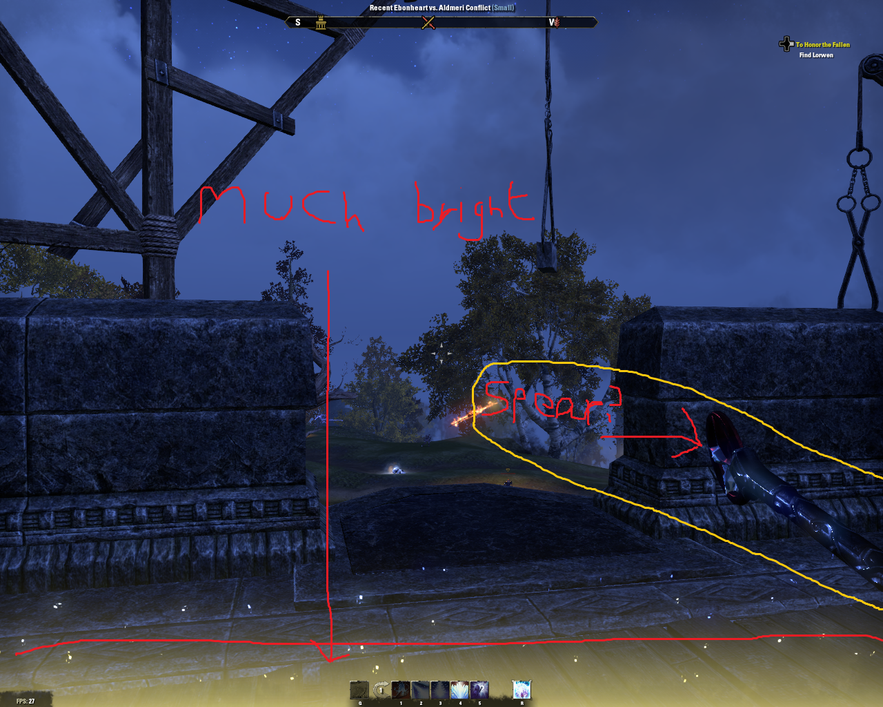
Example one : why are many destruction staffs held like spears? in first person this is extremely annoying as it just looks awful when you throw light attacks since if standing still the staff jerks up fast to push it down again. don't see this issue with restoration staffs. also buff borders can be quite bright...
[img][/img]
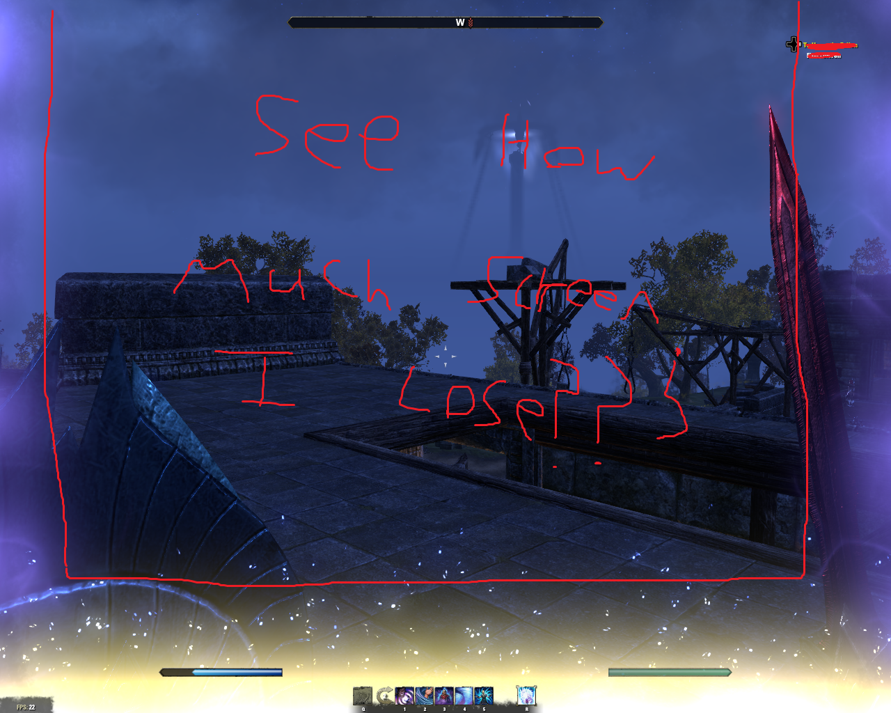
Example two : more emphasis on the buff ability brightness, this can be painful to look at sometimes (tho the image doesnt quite show it as bright as ingame) and can really make it hard to even see, why not cut them back abit? i sometimes struggle with noticing dark shard procs if not for the sound this would be very often
[img][/img]
@ZOS_GinaBruno , sorry Gina but i have no idea who is in charge of this one so tagged the only team member i knew would know
Edited by dsalter on March 22, 2016 5:19AM Example one : why are many destruction staffs held like spears? in first person this is extremely annoying as it just looks awful when you throw light attacks since if standing still the staff jerks up fast to push it down again. don't see this issue with restoration staffs. also buff borders can be quite bright...
[img][/img]

Example two : more emphasis on the buff ability brightness, this can be painful to look at sometimes (tho the image doesnt quite show it as bright as ingame) and can really make it hard to even see, why not cut them back abit? i sometimes struggle with noticing dark shard procs if not for the sound this would be very often
[img][/img]

@ZOS_GinaBruno , sorry Gina but i have no idea who is in charge of this one so tagged the only team member i knew would know
PLEASE REPLY TO ME WITH @dsalter otherwise i'm likely to miss the reply if its not my own thread
EU - [Arch Mage Dave] Altmer Sorcerer
Fight back at the crates and boxes, together we can change things.
EU - [Arch Mage Dave] Altmer Sorcerer
Fight back at the crates and boxes, together we can change things.
1
-
Lenikus✭✭✭✭✭..given the stances the character takes, i see no problem with either weapon placement... you sure you just don't wanna look down and see cleavage on ur female characters like you could mod Skyrim to allow?... Mai cave. >:32
-
dsalter✭✭✭✭✭
✭✭..given the stances the character takes, i see no problem with either weapon placement... you sure you just don't wanna look down and see cleavage on ur female characters like you could mod Skyrim to allow?
in third person most weapons are held in a very similar fashion to first person, but many destruction staffs seem to be an exception to this rule and they hold them as if they are spears, giving light attacks a jerky animation.
P.s. i geif no care for cleavage, if i need it i'll play skyrimPLEASE REPLY TO ME WITH @dsalter otherwise i'm likely to miss the reply if its not my own thread
EU - [Arch Mage Dave] Altmer Sorcerer
Fight back at the crates and boxes, together we can change things.0 -
Lenikus✭✭✭✭✭
I don't believe you. >.>i geif no care for cleavage
Either way, the stances (specially the destro staff one) were already changed and improved once, we get what we get for now, they won't re-do their work anytime soon.
And the lights that sometimes get too bright are the only way they have to visually cue you about the currently active buffs.... Mai cave. >:31 -
Eshelmen✭✭✭✭✭I just want first person on my horse. That would be fun. Holding the reigns while trotting hard and jumping in first person would be awesome.PC and PS4 EP only player3
-
runagate✭✭✭✭✭
✭✭✭OP: Gina Bruno pretty much designs everything, as well as codes 75% of the game, so that's the appropriate person to contact.
I like the chart you drew and am using it to teach people the new Maw of Lorkaj Trial, specifically to guide the people who go off to kill the thingees in that place behind the purple door place.2 -
dsalter✭✭✭✭✭
✭✭OP: Gina Bruno pretty much designs everything, as well as codes 75% of the game, so that's the appropriate person to contact.
I like the chart you drew and am using it to teach people the new Maw of Lorkaj Trial, specifically to guide the people who go off to kill the thingees in that place behind the purple door place.
Gina is god then?PLEASE REPLY TO ME WITH @dsalter otherwise i'm likely to miss the reply if its not my own thread
EU - [Arch Mage Dave] Altmer Sorcerer
Fight back at the crates and boxes, together we can change things.0 -
kampori✭✭✭The thing I hate most about first person is how when you turn to face something in first person, back in third person you're still stood facing whatever direction you started looking in.This Is Not Here3
-
dsalter✭✭✭✭✭
✭✭The thing I hate most about first person is how when you turn to face something in first person, back in third person you're still stood facing whatever direction you started looking in.
thats because the camera is still third person technically but with a very believable first person illusion PLEASE REPLY TO ME WITH @dsalter otherwise i'm likely to miss the reply if its not my own thread
EU - [Arch Mage Dave] Altmer Sorcerer
Fight back at the crates and boxes, together we can change things.1 -
Mojmir✭✭✭✭✭
✭✭✭✭✭Maybe if you talk in third person like a khajit,while in first person. Ugh now I'm dizzy3 -
OrphanHelgen✭✭✭✭✭
✭✭You cant see your own shadow in first person eitherEdited by OrphanHelgen on March 20, 2016 11:45AMPC, EU server, Ebonheart Pact
Finally a reason not to play League of Legends2 -
dsalter✭✭✭✭✭
✭✭OrphanHelgen wrote: »You cant see your own shadow in first person either
true but thats actually no big deal for me, many newer games still lack thisPLEASE REPLY TO ME WITH @dsalter otherwise i'm likely to miss the reply if its not my own thread
EU - [Arch Mage Dave] Altmer Sorcerer
Fight back at the crates and boxes, together we can change things.0 -
Ffastyl✭✭✭✭✭The thing I hate most about first person is how when you turn to face something in first person, back in third person you're still stood facing whatever direction you started looking in.
If you play in first person exclusively for a session, your character will always face the direction of the first person camera. You may notice some players are walking/running backwards with weapons sheathed - this is a result of playing in only first.
I would like to add more and more polished animations to the list of first person demands. Possibly a wider FoV too. Certain animations such as Two-Handed animations were never updated along with everything from the big Update 6 first person revamp. Head bob was added, but there are no separate animations for hit and miss on basic attacks and whiffing a heavy attacking from left to right will force the camera to third for a split second during recovery."A person is smart. People are dumb, panicky, dangerous animals and you know it."
PC NA
Daggerfall Covenant
Ffastyl - Level 50 Templar
Arturus Amitis - Level 50 Nightblade
Sulac the Wanderer - Level 50 Dragonknight
Arcturus Leland - Level 50 Sorcerer
Azrog rus-Oliphet - Level 50 Templar
Tienc - Level 50 Warden
Aldmeri Dominion
Ashen Willow Knight - Level 50 Templar
Champion Rank 938
Check out:
Old vs New Intro Cinematics
"My strength is that I have no weaknesses. My weakness is that I have no strengths."
Member since May 4th, 2014.1 -
dsalter✭✭✭✭✭
✭✭The thing I hate most about first person is how when you turn to face something in first person, back in third person you're still stood facing whatever direction you started looking in.
If you play in first person exclusively for a session, your character will always face the direction of the first person camera. You may notice some players are walking/running backwards with weapons sheathed - this is a result of playing in only first.
I would like to add more and more polished animations to the list of first person demands. Possibly a wider FoV too. Certain animations such as Two-Handed animations were never updated along with everything from the big Update 6 first person revamp. Head bob was added, but there are no separate animations for hit and miss on basic attacks and whiffing a heavy attacking from left to right will force the camera to third for a split second during recovery.
any picture/video evidence of this? the more the merrier PLEASE REPLY TO ME WITH @dsalter otherwise i'm likely to miss the reply if its not my own thread
EU - [Arch Mage Dave] Altmer Sorcerer
Fight back at the crates and boxes, together we can change things.0 -
Pendrillion✭✭✭✭Put your field of view to 130? Helps me as first person enthusiast. But! 1st is really kind of dangerous in Cyrodiil. We should have a forced first person campaign... That would be fun. Makes zerging also more difficult
 Edited by Pendrillion on March 21, 2016 10:15AM2
 -
FrozenAnimal✭✭✭✭I want to see my legs and my shadow in first person.Vollmond Rudel - Deutschsprachige Werwolfgilde, Plattform: PC/Mac
Unsere Mitglieder riechen nach nasser Hund, unsere gejagten Widersacher nach Urin.
Anfragen an: @FroziAnimal [Ingame] oder @FrozenAnimal [Forum]
_______________________________________________________________________
Reason No. 1,000,000 - PvP Justice System
Reason No. 999,999 - Open World PvP/E with One Tamriel?0 -
dsalter✭✭✭✭✭
✭✭I like your paint skills.
took me many a years to perfect these masterful arts of paintPLEASE REPLY TO ME WITH @dsalter otherwise i'm likely to miss the reply if its not my own thread
EU - [Arch Mage Dave] Altmer Sorcerer
Fight back at the crates and boxes, together we can change things.1
