Consider making the Tamriel Tomes UI look more like a book page

Vaqual
✭✭✭✭✭
✭
✭
I feel like you missed an opportunity for a very seamless integration of this system by keeping the modern minimalist look for the Tamriel Tomes UI. Also the Season related title image could benefit from being closer to a period appropriate artwork. There are filters than can easily achieve such a look and I am sure you already knew that. Just consider it, I feel the current look clashes a bit with the delivery.
Just a random example for the style, of course the font would have to be readable enough, surely you get the gist of it:
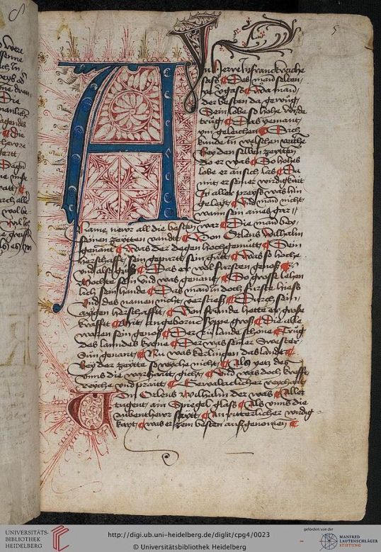
Just a random example for the style, of course the font would have to be readable enough, surely you get the gist of it:
4
-
 JHartEllis✭✭✭✭✭The black pages for challenges are a lot more jarring. I'd like to see those artsied up first.Edited by JHartEllis on April 4, 2026 7:00PMGuild leader of Spicy Economics and Spicy Life on PC/NA
ESO Stream Team Partner on Twitch: https://www.twitch.tv/jhartellis
Twitter: https://twitter.com/JHartEllis
YouTube: https://www.youtube.com/JHartEllis
Website: https://spicyeconomics.com/2