Maintenance for the week of April 6:
• PC/Mac: No maintenance – April 6
• PC/Mac: No maintenance – April 6
I don't love the Tome UI

Nemesis7884
✭✭✭✭✭
✭✭✭✭✭
✭✭✭✭✭
It comes across as beta or work in progress....really dont love it. I hope they will improve on it... maybe its better for mouse and keyboard but on gamepad its very...rough...
37
-
 BretonMage✭✭✭✭✭
✭✭I agree, it looks quite plain, and a bit unfinished. A lot of unfilled space, inconsistent sized fonts... Would actually be really helpful if the "claimed" progress numbers (eg. "Claimed: 0/99") were the same size/bolded like the other text.
Also, I was hoping for a "ching" sound on claiming tome points, like we get for golden pursuits, or any other type of auditory feedback.Edited by BretonMage on April 2, 2026 4:06PM4 -
 YORKSHIRE76✭✭✭I'm struggling to see what in the heck I'm doing, white highlight upon a white background. This ui is terrible,14
 -
msetten✭✭✭✭✭On console, you can hardly see which reward or button is selected, unless you sitting very close to the TV (and I have 65inch OLED with about 1.25m distance). It seems they have not taken into account that console players are often nog close to their display.5
-
Twohothardware✭✭✭✭✭
✭✭They need to get some console users more involved in testing things instead of just PTS on PC. The new Tome UI does look pretty beta and hard to navigate on console.
And while on the topic of console the frame rate in ESO is really bad in certain areas on PS5 Pro. In the Solstice delves it drops way down and stutters.5 -
 SolidBeast✭✭✭Twohothardware wrote: »They need to get some console users more involved in testing things instead of just PTS on PC. The new Tome UI does look pretty beta and hard to navigate on console.
It looks beta and hard to navigate on the PC."Many fall, but one remains."6 -
 Emeratis✭✭✭✭✭I gave them a lot of feedback on the pts. They did say some of it could not be fixed before live. Imo it still needs a ton of work but it is also better than how it appeared on the pts in a lot of ways thankfully.5
 -
MoonPile✭✭✭✭✭
✭Agree, and like Emeratis, I also gave feedback on PTS. But the UI design didn't change much.
To say it as politely as I can, the design is aesthetically poor, and it lacks clarity. It made me wonder what happened behind the scenes, if this got offloaded to someone without Art/Design Director oversight or something.
Among other things:
Before I unlocked enough Tome Points, everything was grey with different locks on it, like this – the "PREMIUM" label is so close to the bottom row that I thought the bottom row were the premium items: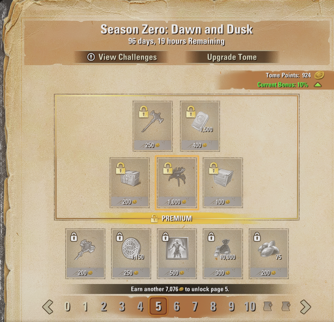
So I thought I'd be able to unlock the Duo Dynamo spider. But no, I guess it's impossible to get that without paying, even if you do manage to get ~10,000 points for it? Too bad.
Since we were given tester currencies on PTS and everything was much jankier there, none of that was really clear to me.
In happier news, at least it seems like the furnishings are all unbound? At least, in this set. Happy to see that, thanks for listening to that feedback (if this is due to feedback):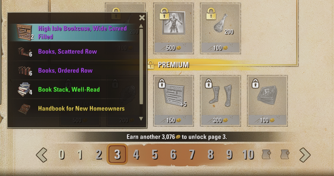
Edited by MoonPile on April 2, 2026 7:15PM4 -
 DreadKnight✭✭✭✭I thought it was glitches, text is far too small with a large expanse of space around the outside. Very, very poor design.6
 -
 Tra_Lalan✭✭✭✭✭Yes it looks bad.
Also switching between tome and challanges (esspecially back from challanges to tome) is difficult to find.
Its weird that ZOS can do such a nice graphic for monthly survival guide on their webpage, and does such poor one for the "ingame big thing".3 -
Vedova✭✭✭Its horrible, very very clunky !!!
And its not clear where to click, there is no resizing, cannot move it, its locked in the corner. The icons are tiny. Try and preview some of the costume parts still have to manually press a button, while some of the parts sometimes auto preview. Its not very practical, or easy to see how to get back to the tomes when looked at the challenges, maybe as this is because we cannot move/resize it.
its just plain clunky and un appealing, if want me to use this system they should make it lot easier to navigate.
They give us all these recent good QoL features for the game then they come up with shoddy , not user friendly UI for the tomes
Maybe they should go take a look at Where winds meet, a free to play game that seems to have a very clear battle pass system compared to this effort by ZoS.
5 -
 wolfie1.0.✭✭✭✭✭
✭✭✭✭Its even worse on the steam deck....
On my laptop its impossible to even read.0 -
 Danikat✭✭✭✭✭
✭✭✭✭✭A lot of people raised these issues when it was on the PTS, but as always what they give us for "testing" is the finished version with no time in their schedule for anything more than minor numerical adjustments to fix bugs.
By the next time it could be fixed they'll probably tell us we're used to it and like the way it's done so it can't be changed.PC EU player | She/her/hers | PAWS (Positively Against Wrip-off Stuff) - Say No to Crown Crates!
"Remember in this game we call life that no one said it's fair"5 -
 DragonRacer✭✭✭✭✭
✭✭✭On console, you can hardly see which reward or button is selected, unless you sitting very close to the TV (and I have 65inch OLED with about 1.25m distance). It seems they have not taken into account that console players are often nog close to their display.
THIS. A friend and I both were exploring the tome and commented how it’s nearly impossible to see what is highlighted because the white outline is so faint.
I realize I just turned 41 today and my eyesight may be starting to become sketchy enough to consider buying some readers in the nearish future, but my TV screen is pretty darn big. I think I should be able to reasonably see which button I have highlighted - especially when making purchases and especially on console where I cannot point a mouse at the exact thing I want to click on, but instead have to button around and rely on seeing the highlighted thing. I had to squint like a mofo to ensure which tome upgrade I was buying. LOLPS5 NA. GM of The PTK's - a free trading guild (CP 500+). Also a werewolf, bites are free when they're available. PSN = DragonRacer133 -
 LootAllTheStuff✭✭✭✭✭Agreed about the white highlight against a pale background and white frame. I really don't understand why it seems so hard for designers to understand the need for sufficient contrast. It's one of those accessibility issues that, when addressed properly, benefits everyone.6
 -
 liliub17_ESO✭✭✭✭Visually, it's pretty horrible, rather crude (or is that called "retro" now).
Utility-wise, it's pretty horrible, rather clunky.2 -
 FieryPhoenix✭✭✭LootAllTheStuff wrote: »Agreed about the white highlight against a pale background and white frame. I really don't understand why it seems so hard for designers to understand the need for sufficient contrast. It's one of those accessibility issues that, when addressed properly, benefits everyone.
As a professional designer myself I feel fairly confident in saying this wasn’t laid out by someone who was formally trained in art or design, it violates soooo many design rules. This seems much more like it got shoved off on an intern because the real artists are working on other things."Aut inveniam viam aut faciam" - "I shall either find a way or make one"
PCNA & PSNA7 -
Marronsuisse✭✭✭✭It's really pretty awful and also out of step with the rest of the game's UI.
We always have a black script font on the paper textures, while the rest of the UI is a clean white font on a black background. Now we've got that clean white font on... the very light paper background. Aside from the fact that they look weird together, they have to add black and brown bars just to make the font more legible, which is not a good look, in my opinion. That's aside from the fact that it's all too cramped; it seems they don't want to use scroll bars or menus.
I get that these are "Tomes" but I think they need to let go of the paper idea. I understand wanting to make the theme work, but I'm not sure it is, here.
1 -
 PurpleScroll✭✭✭✭You can't even unpin a challenge from the HUD. I've finished the anniversary one and now it's permanently stuck on my HUD, unless I switch to another challenge - I just want it gone entirely
Update: The unpin keybind disappears if it's a completed challenge, but appears for non-completed ones. Nice QA there.Edited by PurpleScroll on April 3, 2026 4:47AM1 -
 Arunei✭✭✭✭✭
✭✭✭✭
I made a VERY rough mockup of something that imo at least would have felt more intuitive. The book being weirdly cut off is jarring so put a whole book instead. Make use of one side of the book to CLEARLY list what's Premium and Free, with enough space that it's clear to tell which is which, page info at bottom still. Make use of the other side for the Challenge stuff, instead of having to navigate to a completely different UI that doesn't match the aesthetic of the Tome at all (and can be difficult to figure out how to get back to the Tome as well).
Also changing pages on the left side wouldn't affect the right side, it would always show what Challenges you have regardless of what page you're looking at on the left.
Edited by Arunei on April 3, 2026 4:56AMPC-NA | Been around since closed beta
Avid RPer. Hit me up in-game @Ras_Lei if you're interested in getting together for some arr-pee shenanigans!
RP Characters:
Sarah Lacroix: Breton Vampire who really really REALLY likes likes learning Magick and also her Altmer husbando
Kaalhil Swiftstrike: Tiny shapeshifting monster hunter Bosmeri lady with enough sass to kill a dragon or ten
Gwendolyn Jenelle: Friendly healer with a coffee addiction and her own medical practice
Krisiel: Literally crazy Werewolf, no like legit insane. She nuts
Kiju Veran: Ex-Fighters Guild Suthay who likes to punch things and is also a spy and ALSO a Werewolf
Niralae Elsinal: Young Altmeri woman with way too much Magicka and Vampire husbando
Slondor: TESified Slenderman, except lazier and has more of a thing for deals than Clavicus Vile does
Marius Vastino: Sarah's Imperial apathetic sire who likes to monologue
Lirawyn Calatare: Traveling performer and bard who's 101% vanilla bean
Soliril Larethian: Blind alchemist who uses animals to see and brews plagues in his spare time4 -
 Ezhh✭✭✭✭✭
✭Not so long ago they changed up the UI to "modernise" it....
Yet this feels the reverse of modern.
Even its positioning off in the corner feels weird and it doesn't fit in with anything else in the UI at all.Edited by Ezhh on April 3, 2026 5:32AM5 -
TinyDragon✭✭✭I also really struggled with the UI.
I couldn't easily figure out the Premium was in the box, I thought it was the row under.
Previewing cosmetics is awful, it's so difficult in the UI. Going back and forwards previewing is really unpleasant.
The tasks are challenging to understand, time wise. Clicking through is annoying, and I'm not sure how to get there easily.
I wish it was still under the Endeavours section, and used a similar UI, as that was easy to understand and access. I don't see why it couldn't have a new menu for Tomes there.
Redeeming an item was also unintuitive, I've never had to hold to claim an item. A pop up to confirm would be more in line with the way everything else works.
Edited by TinyDragon on April 3, 2026 6:04AM2 -
 Toanis✭✭✭✭✭What I constantly do while browsing the items is clicking on "<" or "0" and ending up on the "book cover". Yeah, that's how books work, but this is a list of items in a video game where you browse back and forth and just a bad UX.
As for maintaining the impression of "Tome" - even the cheapest book has a distinct separation between content pages and cover. There is already a "go back" button, don't add its functionality as "page 0" to the list of items.
Not UI, but what I don't like is the tome point costs changing on later pages. For 500 tome points we get 750 trade bars on page 1, 1000 on page 3 and 2000 on page 9. That's a big incentive to grind tome points to get a better deal, and contrary to the promoted idea of moving away from FOMO and pointless grind.
Edited by Toanis on April 3, 2026 7:03AM2 -
 Faulgor✭✭✭✭✭
✭✭✭✭✭Yeah, I am sorry to say - it's absolutely dreadful.
I get the idea to have the visual elements of a tome - that's fine. But it can't impact functionality the way it currently does.
UI needs to convey relevant information with as little navigation/interaction as possible.
The most important parts in the tome section, at least to me, are:
- Challenges. Which challenges can I currently do, how many points do I get from them, and how much time do I have to do them.
- Rewards. Most importantly, unique rewards need to stand out, compared to currencies and consumables. It needs to be clear which rewards are only available with the Premium pass.
Currently, challenges are a bit too obscure. While it's selected by default when opening the tome UI, it shares the same problem as all other elements in being too small. Further, it would be immensely helpful if each challenge showed the total amount earnable, so if you can complete a challenge that grants 60 points 6 times, it should list 360 somewhere.
Rewards are a mess to navigate through, especially with a gamepad. Whenever possible, everything should be presented as a list, so I can browse through it in one direction. Too much screen space is wasted on nothing, the important elements are too small, and it is not clear which element is highlighted/selected because the background color is too bright in comparison.
The page selection is confusing, almost appearing bugged, starting at 0 and ending in 2 symbols for "bonus pages". I don't mind the concept of a Season Zero, with Emperor Zero and all that, but pages in a book, or a tome, usually start with 1 ... stick to it.
Side note: overall, wanting to select specific pages will be such a common occurence. You might browse through the tome to see what is available, in which case you'll flick through every page, or you'll want to buy something, which is most likely the highest currently unlocked page. You could lose a lot of visual noise by focusing on those.Alandrol Sul: He's making another Numidium?!?
Vivec: Worse, buddy. They're buying it.0 -
 ADarklore✭✭✭✭✭
✭✭✭✭✭I'll chime in too and say the UI looks very bad, it doesn't look 'modern' at all. Perhaps the devs should have looked at the battlepass of other games and created something similar- because none of the other games I've played have a battlepass that looks as bad as this one does.CP: 2105 ** ESO+ ** ~~ ***** Strictly a solo PvE quester *****
~~Started Playing: May 2015 | Stopped Playing: July 2025 | Returned: March 2026~~0 -
JeroenB✭✭✭✭I do not understand how this UI was allowed to hit the live service. It feels like a proof-of-concept mock-up of functionality with no attempt yet to integrate into the underlying game's visual and interaction principles.
There is much of the game's current visual direction that I have no problem with as elements of a game in general, but strongly dislike as elements of this game. (Exemplified by the visual pollution of the arcanist, new DK, and sparklefart mounts.) They may be well-designed game elements in isolation, but not for the context of this particular game (imhoe obviously).
This does not hold for the Tome UI however. Both the Tome and the Challenges panels feel very amateurish and unpolished as game UI in general, for any game. The whole thing feels reminiscent of the sub-€5-games on Steam by one guy with an interesting idea but insufficiently broad skills in execution.
Specifically for ESO,- the visual design feels conflicting with the rest of the game -- especially the recent major 'simplification' overhaul;
- the functional design, how the UI 'works' and how the player interacts with the functionality and how the UI panels are integrated into the broader UI, feels disconnected from an mismatched to the rest of the game.
At minimum, it seems to me, the Challenges panel should be moved into the Group & Activity side panel where Golden Pursuits are and the previous Endeavours were.3 -
twisttop138✭✭✭✭✭
✭FieryPhoenix wrote: »LootAllTheStuff wrote: »Agreed about the white highlight against a pale background and white frame. I really don't understand why it seems so hard for designers to understand the need for sufficient contrast. It's one of those accessibility issues that, when addressed properly, benefits everyone.
As a professional designer myself I feel fairly confident in saying this wasn’t laid out by someone who was formally trained in art or design, it violates soooo many design rules. This seems much more like it got shoved off on an intern because the real artists are working on other things.
As an artist, I'd happily give them a free lesson on contrast.0 -
imPDA✭✭✭✭I would like to make better UI tbh, at least try to. I am not UI guy either, but last time I was disappointed by UI (list of campaigns), I did this and people liked it. The idea was to place all campaigns to one tab with all info quickly available + it is interactive (double click to queue, hover over to see additional info)

Now I also want to do something similar and place all rewards into one screen like this .
.
I have just started and trying to find all API functions to get all rewards, etc, so it is very rough first estimation. It is going to have numbers on bottom, bigger offsets between tiers, between premium and standard rewards, different backgrounds, outline, checks to see already bought items, etc. Basically, one column = one tier (1..10), top 5 are premium, bottom 5 are standard. If you can share your thought on this, and any other ideas, or schematic layout, I will look into it and try to implement it") (screenshot without drawing if you want to use it https://imgur.com/SW1dHST) Your Friendly Neighborhood PvP Enjoyer (prior to U48)0
(screenshot without drawing if you want to use it https://imgur.com/SW1dHST) Your Friendly Neighborhood PvP Enjoyer (prior to U48)0 -
Emeratis✭✭✭✭✭I'd actually like them to embrace the gimmick of the Tome ui. Give us a floating shelf, give tomes a book cover we can view with a nice art asset (tales of tribute/oblivion classes style art), when we flip through pages there is a little page flip animation, make it on center and when we preview an item manually/willingly the book slides down and we see the preview. Little things like that that make the tes ui shine and it could help in fixing some of the player facing ui problems.
As for the Challenges, I'd rather they go in the journal. I hated how the old system put Endeavors/Golden Pursuits in the group finder but putting them in the crown store adjacent ui is worse. Code's Extended Journal mirrors the in game Journal ui with more icons/tabs. I would like to see Challenges go there and they could add the upcoming Rumors and Favors there for a much more intuitive ui over all that feels immersive/fun.Edited by Emeratis on April 3, 2026 4:37PM1
