Maintenance for the week of May 11:
• PC/Mac: No maintenance – May 11
• PC/Mac: No maintenance – May 11
My Hud Opinion

GodHawk
✭✭
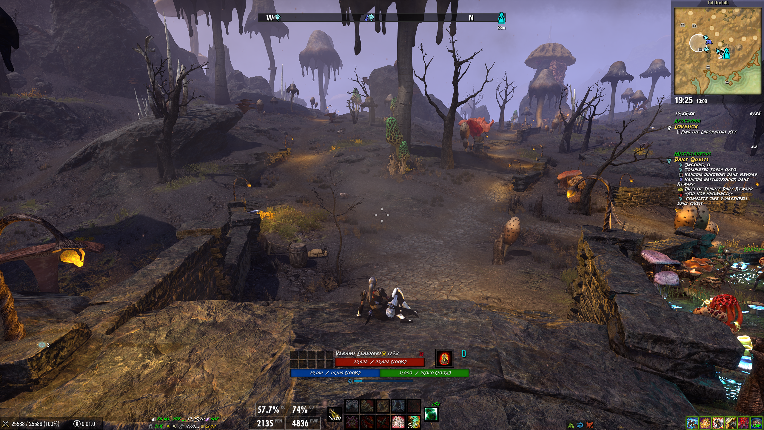
My HUD is set like this right now, and I want to hear you guys opinion that anything I can improve on it.
Any addons recommendations is welcome.
Thank you
0
-
 Soarora✭✭✭✭✭
✭✭✭✭✭I think it looks completely fine to be honest. Nice and clean, as long as it works for you where you have the elements (some people have their skill bar up by their cursor, I just have it in the default spot personally). Usually UI problems show up in combat since multiple addons have similar alerts and give boss health bars. I know I have addon overlap just because of my screen size.[PC/NA] Dungeoneer (Tank/DPS), Retired Trialist, and amateur Battlegrounder (DPS) with a passion for The Elder Scrolls lore.- Current GM of Hard Dungeoneers
- Tanks: Sorcerer - Necromancer - Templar
- DPS: Frost Warden - Stamarc
- Ex-healer
- Dungeons: 32/32 HMs - 26/26 Tris
View my builds!
1 -
GodHawk✭✭I think it looks completely fine to be honest. Nice and clean, as long as it works for you where you have the elements (some people have their skill bar up by their cursor, I just have it in the default spot personally). Usually UI problems show up in combat since multiple addons have similar alerts and give boss health bars. I know I have addon overlap just because of my screen size.
Thank you so much, that mean a lot. Its been a long week trying various options and positions, installing and unistalling addons to see what I like. Always looking something it fit1 -
 redlink1979✭✭✭✭✭
✭✭✭Seems great to me, super clean"Sweet Mother, sweet Mother, send your child unto me, for the sins of the unworthy must be baptized in blood and fear"- Sons of the Night Mother | VforVendetta | Grownups Gaming EU | English Elders [PS][EU] 2500 CP
- Daggerfall's Mightiest | Eternal Champions | Legacy | Tamriel Melting Pot [PS][NA] 2300 CP
- SweetTrolls | Spring Rose | Daggerfall Royal Legion | Tinnitus Delux [PC][EU] 2525 CP
- Bacon Rats | Silverlight Brotherhood | Canis Root Tea Party | Vincula Doloris [PC][NA] 2300 CP
0 -
 Baertram✭✭✭✭✭Hello GodHawk,
for me it would already be too much on the HUD") but everyone plays differently (allthough I coded many addons I do not like the ones that add extra UI controls to the HUD unless really needed or fully integrating into the vanilla UI, or PerfectPixel UI).
but everyone plays differently (allthough I coded many addons I do not like the ones that add extra UI controls to the HUD unless really needed or fully integrating into the vanilla UI, or PerfectPixel UI).
I find your's looks good, as you moved most to the edges and keep the center and important parts clean.
Most important is: If you can play with that, and you aren't missing anything, it's "perfect"!
Means: I would not ask if anyone else can recommand anything else to add. There can always be something else on top, but if you do not miss it, you can enjoy the game w/o it (at least until you find something that's soooo awesome I'm glad the addons I consider that are mostly related to inventory mangament, crafting etc, so nothing on the HUD ). Edited by Baertram on February 28, 2026 12:25PM1
 -
 Yudo✭✭✭✭✭Ah nice and clean, with only the things you consider important.
Generally I like visual balance, right now you are "right" heavy with map, quest tracker and buff tracker, while left side is a bit empty. You'll probably get a lot of subjective feedback but I disable the quest tracker completely. If I need it ill open the quest menu.
I opted to put the map a bit lower in line with the chat box position, and I show chat background permanently instead of fading in and out, but I think TR corner is very common. As long as you can enjoy the view!0 -
GodHawk✭✭Hello GodHawk,
for me it would already be too much on the HUD but everyone plays differently (allthough I coded many addons I do not like the ones that add extra UI controls to the HUD unless really needed or fully integrating into the vanilla UI, or PerfectPixel UI).
I find your's looks good, as you moved most to the edges and keep the center and important parts clean.
Most important is: If you can play with that, and you aren't missing anything, it's "perfect"!
Means: I would not ask if anyone else can recommand anything else to add. There can always be something else on top, but if you do not miss it, you can enjoy the game w/o it (at least until you find something that's soooo awesome I'm glad the addons I consider that are mostly related to inventory mangament, crafting etc, so nothing on the HUD ).Ah nice and clean, with only the things you consider important.
Generally I like visual balance, right now you are "right" heavy with map, quest tracker and buff tracker, while left side is a bit empty. You'll probably get a lot of subjective feedback but I disable the quest tracker completely. If I need it ill open the quest menu.
I opted to put the map a bit lower in line with the chat box position, and I show chat background permanently instead of fading in and out, but I think TR corner is very common. As long as you can enjoy the view!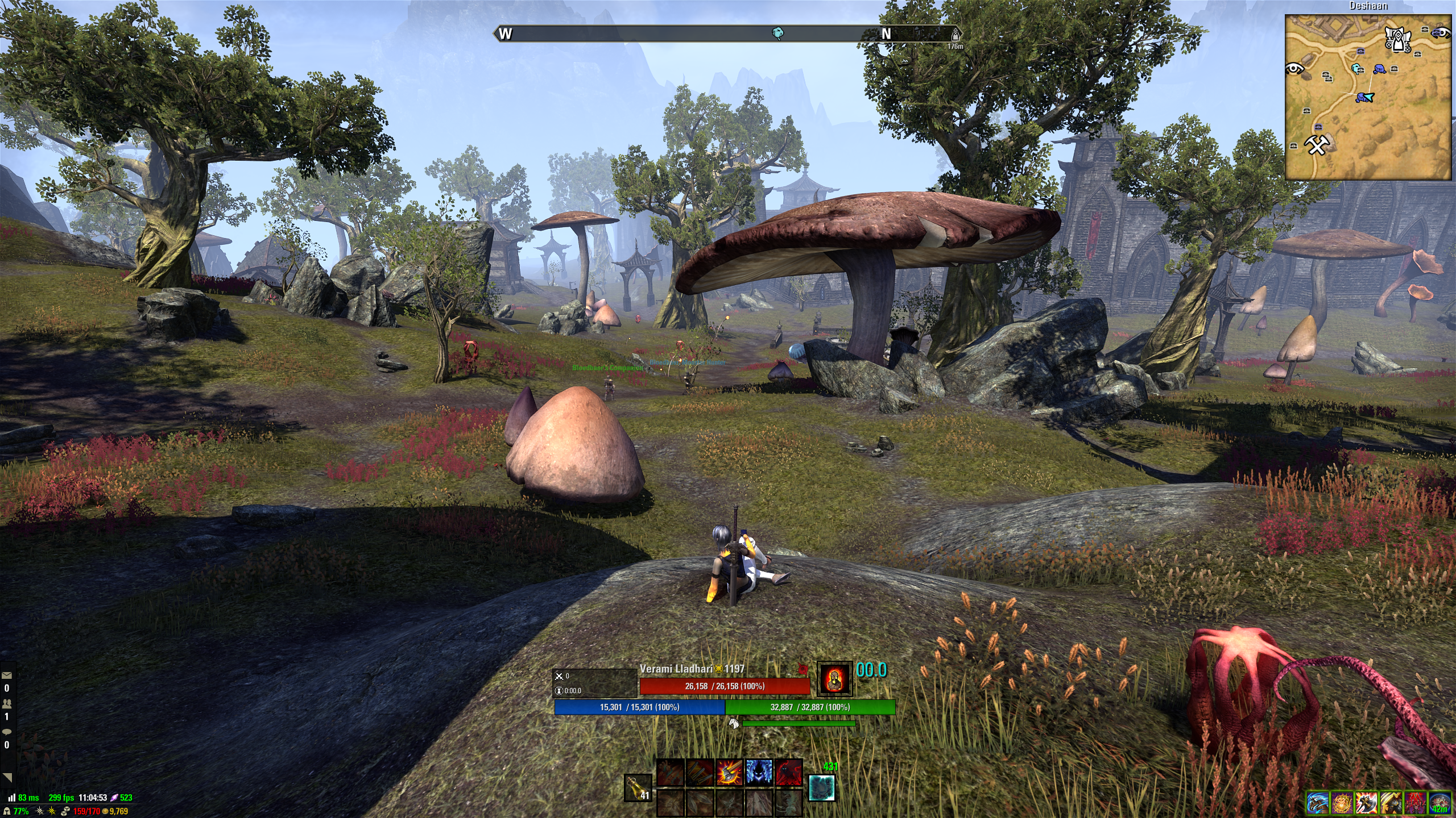
So I took you guys advice, and I couldnt agree more. So I tried something different this time. I think Its better this time, or can I improve even more?Edited by GodHawk on March 1, 2026 11:05AM0