Maintenance for the week of March 30:
• [COMPLETE] NA megaservers for patch maintenance – March 30, 4:00AM EDT (8:00 UTC) - 12:00PM EDT (16:00 UTC)
• [COMPLETE] EU megaservers for patch maintenance – March 30, 8:00 UTC (4:00AM EDT) - 16:00 UTC (12:00PM EDT)
• [COMPLETE] NA megaservers for patch maintenance – March 30, 4:00AM EDT (8:00 UTC) - 12:00PM EDT (16:00 UTC)
• [COMPLETE] EU megaservers for patch maintenance – March 30, 8:00 UTC (4:00AM EDT) - 16:00 UTC (12:00PM EDT)
Thoughts on the PC UI art style "modernization"?
-
 maboleth✭✭✭✭✭
✭I like itTruth to be told, whenever I asked this in the guild, most people seemed satisfied (super modern, clean - were the answers) or had no opinion. So I guess that's why ZOS is keeping silent. Probably majority of players either don't care or like it. 🙄
I still think the companion/group background block is Molag Bal-level of abomination.Edited by maboleth on June 3, 2025 4:25AM3 -
 driosketch✭✭✭✭✭
✭✭✭I have mixed feelings about itWhile I'm sure I'll get used to it, overall it feels too... flat? It's like, the older version was very Elder Scrolls, very fantasy video game. The new version feels like the Windows interface has bled into the game. I'm very aware I'm sitting at my computer. It kinda takes you out of your immersion, at least until I can become numb to it.
One more thing, I like the icon showing uncollected set items you pick up, but at the same time the bright green combined with the new interface makes it feel like I'm playing one of those free to play MMOs.Main: Drio Azul ~ DC, Redguard, Healer/Magicka Templar ~ NA-PC
●The Psijic Order●The Sidekick Order●Great House Hlaalu●Bal-Busters●4 -
 DerAlleinTiger✭✭✭✭✭I dislike itTruth to be told, whenever I asked this in the guild, most people seemed satisfied (super modern, clean - were the answers) or had no opinion. So I guess that's why ZOS is keeping silent. Probably majority of players either don't care or like it. 🙄
I still think the companion/group background block is Molag ball-level of abomination.
And every single time I've seen it talked about in guild chats and Discord servers, 90% of those talking about it hate it and ask for the link to Dack_Janiel's add-on to revert it. So I guess that's why both the PTS thread, this poll, and the 3 or so threads all on this topic are full of people who dislike it.
It's fine if you like it. Clearly most people chiming in do not. Even if there's a higher percentage of people in-game who do like it than there are on these forums and this thread, it's still safe to assume a pretty hefty chunk of the playerbase really does not like it. That's probably worth at least addressing it... but this is ZOS we're talking about. I wish they'd address it, but I'm not surprised they don't. They never have when something is immensely unpopular.10 -
maboleth✭✭✭✭✭
✭I like itDerAlleinTiger wrote: »Truth to be told, whenever I asked this in the guild, most people seemed satisfied (super modern, clean - were the answers) or had no opinion. So I guess that's why ZOS is keeping silent. Probably majority of players either don't care or like it. 🙄
I still think the companion/group background block is Molag ball-level of abomination.
And every single time I've seen it talked about in guild chats and Discord servers, 90% of those talking about it hate it and ask for the link to Dack_Janiel's add-on to revert it. So I guess that's why both the PTS thread, this poll, and the 3 or so threads all on this topic are full of people who dislike it.
It's fine if you like it. Clearly most people chiming in do not. Even if there's a higher percentage of people in-game who do like it than there are on these forums and this thread, it's still safe to assume a pretty hefty chunk of the playerbase really does not like it. That's probably worth at least addressing it... but this is ZOS we're talking about. I wish they'd address it, but I'm not surprised they don't. They never have when something is immensely unpopular.
I don't like it, despite having voted otherwise.
There are certain aspects I like, like new icons and a skill screen. Or a loadscreen with no borders.
But as I already told here before - hp/m/s bars are super strong and ruin immersion, and companion chunk block is almost unbearable.
But whenever I asked in the guild I met with positivity or indifference. So I guess majority do like it...Edited by maboleth on June 3, 2025 4:55AM0 -
 SilverBride✭✭✭✭✭
✭✭✭✭✭I like itI like it because I like a clean minimalistic look. Of the friends I asked about it, one feels the same way about it that I do, but another doesn't like it at all and is using the add-on.
I'd like to know what the reason was for changing it. Was it for performance?Edited by SilverBride on June 3, 2025 7:39AMPCNA3 -
 VDoom1✭✭✭✭✭I have mixed feelings about itI have yet to see the new UI ingame, just looking at the images posted here.
Now I have seen it ingame.
This is the "new" UI?
 ........
Well this is a disappointment to be sure. How is this an improvement? At first I thought things looked exactly the same. How is it like a step forward and making things better? The icons look weird, not modern or new....they strike me as old...just large and clunky.
I liked the like cloudy foggy edges the old UI had. The super sharp lines, not a fan.Edited by VDoom1 on June 3, 2025 7:08AMWe Fight For Cyrodiil.
We fight for The Daggerfall Covenant.
We fight for The Aldmeri Dominion.
We fight for The Ebonheart Pact.
We fight for Tamriel!CP 1200+
Grand Master Crafter | Tamriel Hero
Imperial Dragonknight
Khajiit Necromancer
Altmer Templar | Dunmer Nightblade
Khajiit Nightblade | Argonian Dragonknight
Altmer Sorcerer | Breton Nightblade
Nord Warden | Dunmer SorcererGuild - Priests Of Hircine
ESO Since 2014
PC - EU1 -
 Valen_Byte✭✭✭✭✭
✭✭I dislike it[snip]...no one asked for this change.
[edited for bashing]Edited by ZOS_Icy on June 3, 2025 10:19AM***Dixon Kay MagDK FORMER EMPEROR***Deca Dix MagDK FORMER EMPORER***Valonious MagPlar FORMER EMPEROR***
GM of BYTE
MAY YOUR DEATHS BE SWIFT, AND YOUR LOAD SCREENS LONG.
And alien tears will fill for him, Pity’s long-broken urn, For his mourners will be outcast men, And outcasts always mourn4 -
 Desiato✭✭✭✭✭
✭✭I like ittomofhyrule wrote: »Ugh
Well, at least the vanilla Group UI background doesn't look straight up unfinished anymore.
Still hate how flat everything is.
I just wish we'd gotten anything beyond "we modernized the UI!" as to why this was necessary. I assume it's to reduce filesize, but I always thought that UI files were local anyway so that shouldn't affect much data transfer from the servers.
I doubt there's any performance difference between the two UIs. Changing the UI imagery definitely wouldn't impact server performance. It's really inconceivable the gfx changes alone would improve client performance.
Whether one likes the old UI or not, it was dated. Modern UIs are clean for a purpose: so the emphasis is on the content.
Edited by Desiato on June 3, 2025 5:53AMspending a year dead for tax reasons0 -
maboleth✭✭✭✭✭
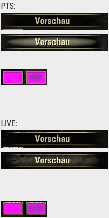
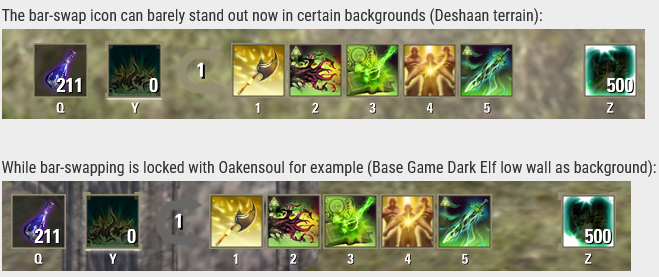
✭I like itAs of today's patch, the PC UI received a major style overhaul, having most (if not all) elements completely made into flat colors. This was extremely negatively received in the PTS Feedback Thread, with only a few players actually liking it and no developer responses for the reason behind the change.
Here's an example of existing company logos "modernized" to understand what I mean:
And here's some screenshots of the UI changes that players have shared in the Feedback Thread: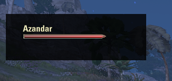


EDIT: @Dack_Janiels has made an add-on that brings back the old UI style, you can download it from below:
https://github.com/DakJaniels/Pre101046UI/releases/tag/v2
I still cannot get over that Vw sign. Had this been done years ago graphic designers would've laughed so hard and that guy would've lost the job. But now it's considered 'cool'.5 -
 Enokariel✭✭✭I have mixed feelings about itThere are minor changes which are slightly annoying. I will get used to it soon, but it was unnecessary.0
 -
 Frayton✭✭✭✭✭I like itIt doesn't match the Elder Scrolls medieval high fantasy theme. There was an addon that already did this, so I don't know why it was changed.7
 -
 Dack_Janiels✭✭✭I have mixed feelings about itDack_Janiels wrote: »For people that don’t like the new UI look that are on PC, I have uploaded a addon to GitHub to revert the changes. Due to the size it will not be published to esoui; that is also probably a reason the devs did not have an option to revert in the game since the goal was to trim file sizes. Unzipped folder size is roughly 1.2gigs.
https://github.com/DakJaniels/Pre101046UI/releases/tag/v2
Installation is the same as you would install any other addon. Unzip file, move the folderPre101046UI
into the addon directory. So,
the path would be\Elder Scrolls Online\live\AddOns\Pre101046UI
not\Elder Scrolls Online\live\AddOns\Pre101046UI-v2\Pre101046UI
Thank you very much for sharing this solution. It solves most of the problems caused by the new terrible UI and got my will back to continue playing. But I would like to know if there is any possibility to use this classic UI in ToT as well. Thanks again.
The crown store and tales of tribute scenes are secure scenes, so no addon can modify the textures there, sorry for the inconvenience.5 -
 bmnoble✭✭✭✭✭
✭✭I have mixed feelings about itIf you told me it was a placeholder I would believe you.
Think the old style looked, better from an artistic style perspective, new one I can tolerate but doesn't feel as immersive as the old one that is the only way I can describe it.6 -
 fizzylu✭✭✭✭✭
✭I have mixed feelings about itParts of it are nice and look a lot more clear (I'm noticing a big difference in the chat box and I like how my bar icons are standing out a bit more, for example), but most of it just looks odd and out of place. Biggest tragedy is what they did to the group members UI appearance by far.
And it's funny that you say that because I thought my addons were messing it up at first and logged out to update them all to fix it.... but nope, hahahahaaaa.If you told me it was a placeholder I would believe you.
Edited by fizzylu on June 3, 2025 6:38AM6 -
 PurpleScroll✭✭✭✭I have mixed feelings about itI've used the DarkUI addon for many years, and it feels like ZoS tried to copy said addon and did a poor job of it. I'm hoping the maintainer of the addon updates it soon so I can go back to it
 1
1 -
 iyx✭✭✭I dislike itI didn't realise how much I like classic ui before saw this... The Modern One
Thanks for the addon, @Dack_Janiels, installing it now.10 -
 Spacefish2323✭✭✭I dislike itA terrible change that no one asked for. Why should I need some massive mod (made by a true hero, thank you sir!) to revert the Cyperpunk Scrolls Online themepack back to what I loved for years. I had always put art style and the vanilla UI's design as a strength of the game, being both minimal and memorable at the same time.10
 -
 mesna✭✭✭I dislike itI wasn't really a fan of the old UI and have been using DarkUI forever, but I did like some elements like the smoke and worn textures. (For reference, Oblivion has my favorite UI of any TES game.) I didn't think I would need DakJaniels' addon, but after seeing the login screen and the exposed bits of the UI that DarkUI doesn't cover, I rushed to download and install it. After some slight tweaks to my other addons to fix a couple texture issues, my game is back to how it was before.
This change is so controversial, it really ought to have been part of a new themes feature. There could be a "Classic" and "Modern" option and everybody would be happy.PC/NA player since Closed Beta 2013.6 -
 Jotiqua✭✭I dislike itIts the Worst. So medical clean and smooth.Edited by Jotiqua on June 3, 2025 10:56AM7
 -
DerAlleinTiger✭✭✭✭✭I dislike itBut whenever I asked in the guild I met with positivity or indifference. So I guess majority do like it...
I'm having the complete inverse experience. I'd say a solid 9/10 people I've talked to on multiple different platforms and communication channels have all been negative towards it, but that's a low estimate. More like 19/20. I'm not even exaggerating. I know maybe 2 people who've said they don't really like it but it's tolerable, one who legitimately likes it more, another who said they like the idea but it's half-baked and horribly implemented... versus dozens who couldn't ask me for Dack_Janiel's mod link fast enough. I'm not saying that my experience is the 'true' one, just that... yours isn't necessarily it either.
We'll never really know the true ratio. However, when in-game chat channels of all kinds are full of people complaining about it when I log in... every Discord server I'm in based around ESO was half talking about how much they hate the new UI and half everything else about the update combined... and the forum has multiple threads with an overwhelming majority of the posts being negative.. At a certain point I start to think that people just might not like it!
Even if we account for people who are displeased being broadly more prone to voice themselves, the sheer volume and number of different places I'm seeing people beg for an alternative to the UI makes me think that it would still be a solid half - give or take - of the playerbase that has a generally negative view of it. Might not be the 70-90% negative we see in... well, basically every single forum thread that brings it up, but I'd hazard 40-60%. Might be majority, might not be, but it's enough that ZOS probably should have just given us a choice.7 -
DerAlleinTiger✭✭✭✭✭I dislike ittomofhyrule wrote: »Ugh
Well, at least the vanilla Group UI background doesn't look straight up unfinished anymore.
Still hate how flat everything is.
I just wish we'd gotten anything beyond "we modernized the UI!" as to why this was necessary. I assume it's to reduce filesize, but I always thought that UI files were local anyway so that shouldn't affect much data transfer from the servers.
I doubt there's any performance difference between the two UIs. Changing the UI imagery definitely wouldn't impact server performance. It's really inconceivable the gfx changes alone would improve client performance.
Whether one likes the old UI or not, it was dated. Modern UIs are clean for a purpose: so the emphasis is on the content.
You can say it's "dated" all you like, that doesn't mean that it is. In fact, I've yet to see a single person actually explain or justify how and why it's "dated." The most I've seen is that it's "low-rez," which I don't even agree with to start with playing on 1440p without any pixelation, jagged edges, or blurriness. But okay, fine. Then up the resolution and call it good. Anything else, you can keep calling it "dated" as much as you want, yet it's very clearly not in quite a lot of people's minds.
Which it's absurd to me to say that last part there. "Emphasis on the content." This isn't Microsoft Teams, or an OS, or a webpage. This is a game, interactive media. How the player interacts with the game and world within is a part of the content. And what's the very first layer of the game a player is likely to interact with? Yes, indeed, it's the UI! As long as the UI doesn't get in the way of playing the game, which for 11 years I never heard anyone ever complain about it doing so (if anything I saw people use add-ons to throw more UI elements on their screens) then what it should do is actually engage with the player and draw them in. If you have to make your UI get out of the way of the "content" of the game, you've automatically failed a fundamental part of videogame UI design.
Yes, lots of games are going with that clean, sleek, sterile, soulless, corporate style. You know why? Because their UI teams can't figure out how to engage the player with their UI without burying them in nonsense, so they just give up and use a cookie-cutter design. Just because everyone's doing it doesn't mean it's for a good reason. It can just as well mean that no one's able to actually do it right and just go with the safe option. For all its imperfections, I always considered ESO's UI to be a fantastic example of engaging, yet unobtrusive, UI design - even up to today. If anything, watching so many games just not even try to make a good-looking UI made me appreciate it even more. Now, with this update, I've come to appreciate it even more than that.Edited by DerAlleinTiger on June 3, 2025 8:57AM11 -
 Horace-Wimp✭✭✭✭I dislike itWhile in combat it is now significantly more difficult for me to see my status bars. They are complete washed out by players' abilities animations. I no longer know when to heal.1
 -
Sea_WolfSoul ShrivenI like the new UI a lot because it is much clearer and cleaner to see. The reflective 3D elements and some semi-transparent elements of the old UI made it sometimes hard to see white numbers or borders of areas. The new one is much easier on the eyes and I feel I can almost see the interface even without glasses.
E.g. boss health bars used to be a mix of white and read - and now we have clear white numbers on clear red background.0 -
 ADarklore✭✭✭✭✭
✭✭✭✭✭I like itI cannot answer because the "I don't really see much of a difference" option isn't available. Playing on PC with a controller, I'm used to switching back and forth between controller for gameplay and kb/m for menus... so now the PC menu looks like the controller menu... not really a huge difference IMO. I notice it more with the chat menu than anything else, the old PC chat menu was more blended into the background whereas the new style sticks out more.CP: 2105 ** ESO+ ** ~~ ***** Strictly a solo PvE quester *****
~~Started Playing: May 2015 | Stopped Playing: July 2025 | Returned: March 2026~~0 -
 Elsonso✭✭✭✭✭
✭✭✭✭✭I dislike itTruth to be told, whenever I asked this in the guild, most people seemed satisfied (super modern, clean - were the answers) or had no opinion. So I guess that's why ZOS is keeping silent. Probably majority of players either don't care or like it. 🙄
I expect that a lot players really haven't noticed. Maybe they have noticed something changed, but can't remember what it used to look like. Perhaps they haven't been really paying attention, or maybe it has been so long since they played that they can't remember.
It will be the people who are in the game all the time that notice.
As for why they are silent? They have never been really chatty in the first place. They aren't going to change course. One dev described the forum as an echo chamber, and he was not wrong. It is also a chunk of the most dedicated fan base, which must be both frustrating and confusing.XBox EU/NA:@ElsonsoJannus
PC NA/EU: @Elsonso
PSN NA/EU: @ElsonsoJannus
Total in-game hours: 11321
X/Twitter: ElsonsoJannus0 -
 Migoda✭✭✭✭I dislike itHonestly, it sucks. Too flat and sterile. It looks like a crappy console UI now.AGT - Archäologische Gesellschaft Tamriels7
 -
Lalothen✭✭✭✭✭I dislike itFlat, sterile, jarring... basically totally incommensurate with the established ESO art style.7
-
 SamuelDraconis✭✭✭I dislike itDack_Janiels wrote: »For people that don’t like the new UI look that are on PC, I have uploaded a addon to GitHub to revert the changes. Due to the size it will not be published to esoui; that is also probably a reason the devs did not have an option to revert in the game since the goal was to trim file sizes. Unzipped folder size is roughly 1.2gigs.
https://github.com/DakJaniels/Pre101046UI/releases/tag/v2
Where do we install it or where do we put it etc, can you advise on installation instructions, is it like an add on or need to go into another location. Please advise, thanks.
Extract the "Pre101046UI" folder into Documents\Elder Scrolls Online\live\AddOns. If done correctly, then you should see the add-on the next time you load the game (or use /reloadui if you were already in-game) in the ADD-ONS menu. Make sure that it is ticked for it to work.
I don't find it in ADD-ONS menu. I did everything as instructed.Edited by SamuelDraconis on June 3, 2025 11:22AM"Let me guess, someone stole your sweetroll."0 -
 Izanagi.Xiiib16_ESO✭✭✭✭✭
✭✭✭✭I dislike itThe new UI is actually part of the update's storyline. The Worm Cult stole our nice UI and force us to use this soulless design.
Maybe once the writhing wall goes down we'll get it back.@Solar_Breeze
NA ~ Izanerys: Dracarys (Videos | Dracast)
EU ~ Izanagi: Banana Squad (AOE Rats/ Zerg Squad / Roleplay Circle)12
