Maintenance for the week of March 16:
• PC/Mac: No maintenance – March 16
• ESO Store and Account System for maintenance – March 18, 6:00AM EDT (10:00 UTC) - 4:00PM EDT (20:00 UTC)
• PC/Mac: No maintenance – March 16
• ESO Store and Account System for maintenance – March 18, 6:00AM EDT (10:00 UTC) - 4:00PM EDT (20:00 UTC)
Thoughts on the PC UI art style "modernization"?
-
 Aylish✭✭✭✭✭I dislike itI wrote it on the other thread and I‘ll write it again:
This is beyond ugly.
Everyone who prefers flat UI can easily use DarkUI or Perfect Pixel instead. There was no reason to change the UI.
I will definitely use @Dack_Janiels‘ UI addon to get my beloved dusty and cloudy UI back.
@ZOS_Kevin Revert those changes before investing any more into further changes for something nearly everyone dislikes!
This UI is ridiculously bad done. Better work on making the UI better in functionality, wasting less space etc.Edited by Aylish on June 2, 2025 10:11PM17 -
 shadyjane62✭✭✭✭✭
✭✭✭I dislike itI have spent the day evaluating the new UI and I want to repeat how much I hate it. Looks cheap and nasty and I really want them to put it back. I hate addons and don't want to change it myself. I didn't do anything to deserve this ugliness and I shouldn't have to work to get rid of it.6 -
 Ekzorka✭✭✭✭✭I dislike itIt perfectly fits with the new font rendering that has no any updates for 1 year. Now are both unreadable.
Seems like maps and books will be the next in transformation to "sci-fi" style, because old paper is now looks odd for this flat strict style UI.

3 -
 darkriketz✭✭✭I dislike itI just installed and checked Dack Janiel's addon, and I'm back with the regular Elder Scrolls style.
The sad part is that I no longer have anything to say about this new official UI and that I need an addon for TESO to look like itself
The good part is that TESO now looks again like itself.
Thanks, Dack Janiel ^^14 -
 Rkindaleft✭✭✭✭✭
✭✭I dislike itThis just seems like a change for the sake of change update. I haven't met a single person in game or on the forums who has ever said "you know what, I'd really like a new modernized UI." Perhaps there are a small few, but a UI looking like this has never been in the top 100 of requested features. You could already change it with addons if you didn't like the original.
I feel like this is just another example of there being a disconnect between ZOS and it's player base, this development time would have been better spent on additional bug fixes or QoL.
Edited by Rkindaleft on June 2, 2025 10:40PMRuneblades enjoyer https://youtube.com/@rkindaleftI only DD in wizard elf game cuz I like seeing big number
Tick Tock Tormentor | Saintly Savior | Gryphon Heart | Godslayer | Kyne's Wrath | Planesbreaker | Swashbuckler Supreme | Mindmender | Unstoppable13 -
 TheMajority✭✭✭✭✭
✭I have mixed feelings about itanybody else notice that the new login screen got made boring as well? there was a cool sunset during the first PTS test and now it turned into a boring blue skyTime flies like an arrow- but fruit flies like a banana.
Sorry for my English, I do not always have a translation tool available. Thank you for your patience with our conversation and working towards our mutual understanding of the topic.5 -
 icapital✭✭✭✭I dislike itsuch an ugly UI update - all of this feedback was provided in the PTR thread which didn't get any official interaction.
unreal.5 -
 Sarannah✭✭✭✭✭
✭✭✭✭I dislike it
Personally I do not like this new UI update. It makes things(mostly categories) harder to see and read, especially when there is a darker background behind it.Sigh.
I guess the PTS version was the release version, after all?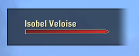
But the thing I absolutely dislike the most is a big black box sitting on my screen for the companion(as in quote)! This change needs to be reverted ASAP! This box is intrusive and annoying as hell. The old companion UI was nice and clean and small, bring it back.Edited by Sarannah on June 2, 2025 10:58PM4 -
 Alaztor91✭✭✭✭✭
✭I dislike itIt looks like some sort of unfinished beta version. Was there any problem with the old UI?11 -
 JBNimble✭✭✭I have mixed feelings about itI'm pretty sure they could've done something useful instead.9
 -
 Wildberryjack✭✭✭✭✭
✭I dislike itLooks like console, plain and boring. Don't like it at all.The purpose of art is washing the dust of daily life off our souls. ~Pablo Picasso5 -
 tomofhyrule✭✭✭✭✭
✭✭✭✭✭I dislike itHere's something else that makes me really salty:
If the desire was to try to unify the PC interface to the console/gamepad/accessibility interface, I wish the one thing they would have done was to convert the hair/eye/skin colors into a slider like they are on console.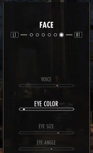
Why? Yeah, that does make it harder to pick a color... but it'd make it easier to add new ones.
AND I'M REALLY MAD THAT WE HAVE SEVERAL NPC-ONLY COLORS.
If we can't increase the 10x2 grid, then just give us a slider and give us those other colors. People have been angling for ages for black-haired Altmer or whatever, and now the first quest I did in Solstice sent me to a delve where I got to have a bunch of NPC-only cosmetics waved in my face.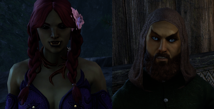
Why can't my Orc have that green skin tone!?! Why can't my Altmer have those blue eyes?!?
(and I'm still waiting for that Bard dress the other NPC in that quest was wearing that we've seen on NPCs since Leyawiin)
If you're going to force through a change to the UI, make it an improvement for us by giving us more options.
1 -
 Bethgael✭✭✭✭I dislike itIt's too intrusive. The idea of a UI is to make the game playable without breaking immersion. The darkened area around the companion name, for a start, my eye keeps going to it. It's too stark, too "demanding" of my attention. This is why advertisers and apps modernise their logos, by the by. Whomever thought this was a good idea.... no.
RPG, people, why do you want to break immersion, guys?
Look, I know it feels like people are complaining for the sake of complaining, a lot, but this change, while great in advertising because the text is there to catch the eye is absolutely stupid for a game.
If you guys don't revert yourselves (and get someone more into gaming rather than "modern design" to do these in future), soon as someone writes an add-on to change it back, I'll be downloading that thing. And I don't use add-ons. That's how much my brain is screaming at me.Edited by Bethgael on June 2, 2025 11:34PMIngame ID: Bethgael PC NA/EU but mostly NA9 -
Bethgael✭✭✭✭I dislike itDack_Janiels wrote: »For people that don’t like the new UI look that are on PC, I have uploaded a addon to GitHub to revert the changes. Due to the size it will not be published to esoui; that is also probably a reason the devs did not have an option to revert in the game since the goal was to trim file sizes. Unzipped folder size is roughly 1.2gigs.
https://github.com/DakJaniels/Pre101046UI/releases/tag/v2
Installation is the same as you would install any other addon. Unzip file, move the folderPre101046UI
into the addon directory. So,
the path would be\Elder Scrolls Online\live\AddOns\Pre101046UI
not\Elder Scrolls Online\live\AddOns\Pre101046UI-v2\Pre101046UI
Now that I've seen this. THANKYOU. I wish I could clicky on your awesome button twice!Ingame ID: Bethgael PC NA/EU but mostly NA6 -
 I dislike itDack_Janiels wrote: »For people that don’t like the new UI look that are on PC, I have uploaded a addon to GitHub to revert the changes. Due to the size it will not be published to esoui; that is also probably a reason the devs did not have an option to revert in the game since the goal was to trim file sizes. Unzipped folder size is roughly 1.2gigs.
https://github.com/DakJaniels/Pre101046UI/releases/tag/v2
Installation is the same as you would install any other addon. Unzip file, move the folderPre101046UI
into the addon directory. So,
the path would be\Elder Scrolls Online\live\AddOns\Pre101046UI
not\Elder Scrolls Online\live\AddOns\Pre101046UI-v2\Pre101046UI
It's just a regular addon right? I'm not gonna get banned for downloading something the game doesn't like?PC/NA
Hello, my name is Felicity, and I'm an ALT-a-holic.0 -
 Elvenheart✭✭✭✭✭
✭✭✭I dislike itRkindaleft wrote: »This just seems like a change for the sake of change update. I haven't met a single person in game or on the forums who has ever said "you know what, I'd really like a new modernized UI." Perhaps there are a small few, but a UI looking like this has never been in the top 100 of requested features. You could already change it with addons if you didn't like the original.
I feel like this is just another example of there being a disconnect between ZOS and it's player base, this development time would have been better spent on additional bug fixes or QoL.
The thing is that before, people wanting something more modem had several add-ons they could choose from, so everyone was happy. 😩4 -
 ArchangelIsraphel✭✭✭✭✭
✭✭✭✭✭I dislike itEvery time I get taken away from ESO by real life, I come back and havoc ensues >_>
I've done graphics and web design, and this hurts my soul in ways Molag Bal couldn't even begin to think up. There is so many things wrong with the UI- uneven glow effects, bleeding strokes around icons, varying line thicknesses that are several pixels off, use of highlights that isn't cohesive from one screen to the next...things that are a mere pixel off but are still making my eye twitch visually bothersome.
And this, THIS...this...incoherent sounds of suffering
Gradients with banding. Badly compressed images (This looks like it was 8-Bit!) It's just ever so slightly at a diagonal. The way the gradient abruptly cuts off where it meets the other parts of the UI....
What's really bugging me is that it's being called modern, when this is a huge step backwards in terms of design.
And oh sweet Y'ffre, the radial gradients on the buttons...those make me feel like I've time warped back to 2000-2010...this new UI looks dated. It's both unpleasantly minimalist, and yet it's simultaneously gone overboard with varying line thicknesses, icons, glows that overlap horribly in the corners...the glaring visual chaos of that stroke bleed around the icons is only highlighted by the lack of texture in the rest of the UI. Don't get me started on the blur on the transparent gradients...PC l NA
Legends never die
They're written down in eternity
But you'll never see the price it costs
The scars collected all their lives
When everything's lost, they pick up their hearts and avenge defeat
Before it all starts, they suffer through harm just to touch a dream
Oh, pick yourself up, 'cause
Legends never die25 -
Bethgael✭✭✭✭I dislike itFrom pts feedback thread on ui:
https://forums.elderscrollsonline.com/en/discussion/676245/pts-update-46-feedback-thread-for-ui-modernization/p1On the podcast with Rich Lambert and Matt Firor, I heard that they don't listen to forum comments much because it's difficult to distinguish between real players and just haters.
They want feedback from people who actually play the game.
So, the question is, have you also submitted your concerns as a ticket in-game?
I think we should follow this advice and make sure we also submit in-game feedback, F1. Perhaps with enough feedback through that channel, it may elicit change?
Agreed. Although if Maxxermax is correct, why did they waste time having a forum master post the thread and ask in the first place, on a forum specifically set up for giving feedback on the PTS? Seems very counterproductive to me.
ETA: I have installed @Dack_Janiels ' add-on: the first UI moid I have ever installed in 30 years of playing games (that's right, I don't even mod the UI in Oblivion or Skyrim!). May the Eight ever bless you, ser.
Whoever designed this UI (the char screen justification of the events box, OY!) should be forced to redesign the entire ESO website in notepad, coding their html by hand. Then they might learn something.Edited by Bethgael on June 3, 2025 1:25AMIngame ID: Bethgael PC NA/EU but mostly NA11 -
ArchangelIsraphel✭✭✭✭✭
✭✭✭✭✭I dislike itWhoever designed this UI (the char screen justification of the events box, OY!) should be forced to redesign the entire ESO website in notepad, coding their html by hand. Then they might learn something.
Let me be the Daedric Prince of Webdesign that instructs them >: } mwahaha..mwahahahahaha...
PC l NA
Legends never die
They're written down in eternity
But you'll never see the price it costs
The scars collected all their lives
When everything's lost, they pick up their hearts and avenge defeat
Before it all starts, they suffer through harm just to touch a dream
Oh, pick yourself up, 'cause
Legends never die6 -
 Reverb✭✭✭✭✭
✭✭✭✭✭I dislike itDon’t care for it at allBattle not with monsters, lest ye become a monster, and if you gaze into the abyss, the abyss gazes also into you. ~Friedrich Nietzsche5 -
TheMajority✭✭✭✭✭
✭I have mixed feelings about itI tried to play with this UI and I cannot do it in the least. every turn every menu I open I see a new thing that looks like a visual error
I'm replacing this UI I cant do it no moreTime flies like an arrow- but fruit flies like a banana.
Sorry for my English, I do not always have a translation tool available. Thank you for your patience with our conversation and working towards our mutual understanding of the topic.3 -
geosto1b16_ESO2✭✭✭I dislike itflat, angular, blocky, rigid.... COLD
no longer SOFT, WARM, blending
and why is there a BIG BLACK ANNOYING BLOCK that the companion health bar sits in, what the thing is that all about?
THERE WAS NOTHING WRONG with the original UI, it wasn't broke, it DIDN'T NEED FIXING
MAJOR FAIL13 -
 KiltMaster✭✭✭✭✭it is ugly, man .... too harsh borders in some places. Some that have zero line-out at all. Flat, basic colors.
[snip]
[edited for bashing]Edited by ZOS_Icy on June 3, 2025 10:15AMPC/NA
GM of "Kilts for Sale"
twitch.tv/thekiltmaster
He/Him6 -
 baratron✭✭✭✭✭
✭I like itI think the new UI is absolutely beautiful, but there is at least one major bug with it: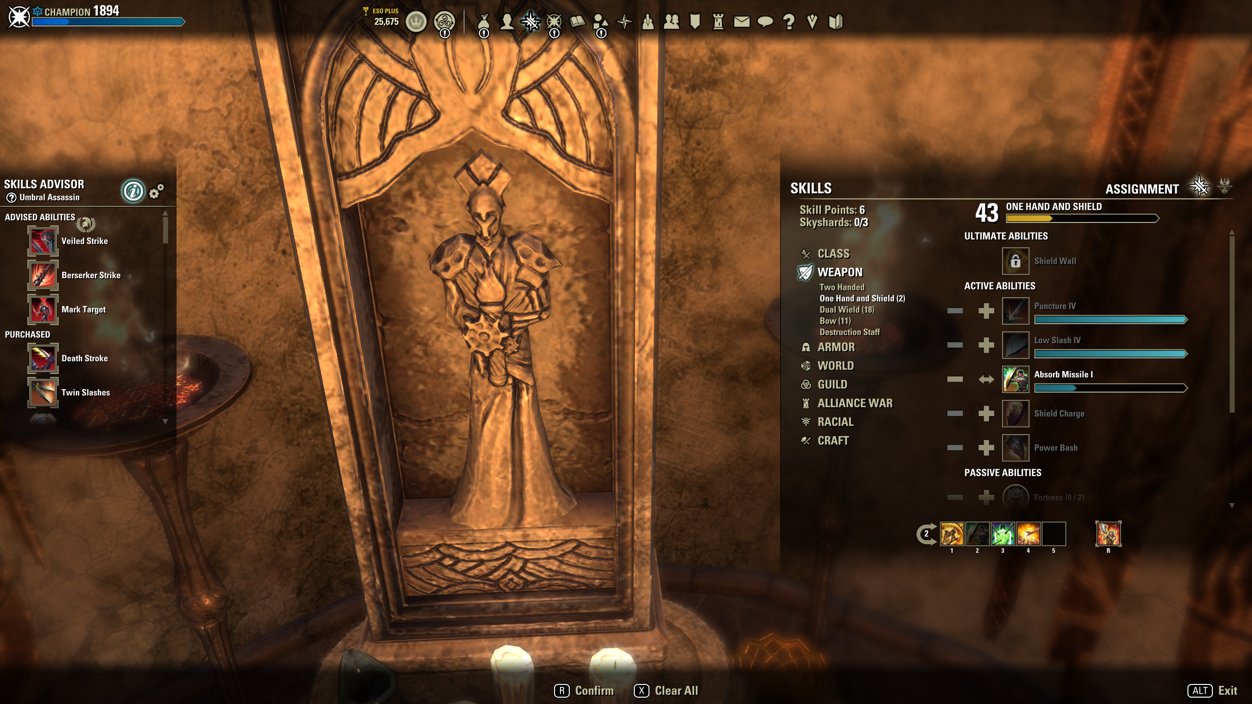
Since the bars look the same, it is now very difficult to tell the difference between skills which you have levelled but do not currently have active, versus skills that you are learning/have learned AND ALSO have active.
This isn't great considering this is the Subclassing patch and a lot of us are going to be levelling new skill lines.Guildmaster of the UESP Guild on the North American PC/Mac Server 2350+ CP & also found on the European PC/Mac Server 1700+ CP
These characters are on both servers:
Alix de Feu - Breton Templar Healer level 50
Brings-His-Own-Forest - Argonian Warden Healer level 50
Hrodulf Bearpaw - Nord Warden Bear Friend & identical twin of Bjornolfr level 50
Jadisa al-Belkarth - Redguard Arcanist Damage Dealer level 50
NA-only characters:
Martin Draconis - Imperial Sorceror Healer (Aldmeri Dominion) level 50
Arzhela Petit - Breton Dragonknight Healer (Daggerfall Covenant) level 50
Bjornolfr Steel-Shaper - Nord Dragonknight Crafter (Ebonheart Pact) level 50 EAGERLY AWAITING HIS BEAR
Verandis Bloodraven - Altmer Nightblade Healer & clone of Count Verandis Ravenwatch (Aldmeri Dominion) level 50
Gethin Oakrun - Bosmer Nightblade Thief (Ebonheart Pact) level 501 -
 DreamyLu✭✭✭✭✭
✭I like itWhen I did open the game, at first, I didn't notice any big differences. It came later when opening different windows, like the ones for crafting.
For me it looks like everything is a lot more "clean" and sharp. I also like very much the way the icons look now, a bit more round, with a highlight, like in a comix book.
No, really, I do like it very much.
Now honestly, I don't understand what is the trouble: Some like it and some other not, it's normal, no worries. But why such an escalation about it? The difference to before is rather little? Or do I fail to see something bigger?I'm out of my mind, feel free to leave a message... PC/NA2 -
 JimT722✭✭✭✭✭
✭I don't really think it's worse. I also don't think it's an improvement. Indifferent is how I feel.0 -
 NeoniKa✭✭✭✭I dislike itDack_Janiels wrote: »For people that don’t like the new UI look that are on PC, I have uploaded a addon to GitHub to revert the changes. Due to the size it will not be published to esoui; that is also probably a reason the devs did not have an option to revert in the game since the goal was to trim file sizes. Unzipped folder size is roughly 1.2gigs.
https://github.com/DakJaniels/Pre101046UI/releases/tag/v2
Installation is the same as you would install any other addon. Unzip file, move the folderPre101046UI
into the addon directory. So,
the path would be\Elder Scrolls Online\live\AddOns\Pre101046UI
not\Elder Scrolls Online\live\AddOns\Pre101046UI-v2\Pre101046UI
Thank you very much for sharing this solution. It solves most of the problems caused by the new terrible UI and got my will back to continue playing. But I would like to know if there is any possibility to use this classic UI in ToT as well. Thanks again.4


