Maintenance for the week of March 23:
• PC/Mac: No maintenance – March 23
• PC/Mac: No maintenance – March 23
Thoughts on the PC UI art style "modernization"?
-
Maitsukas✭✭✭✭✭
✭✭✭I dislike itDack_Janiels wrote: »For people that don’t like the new UI look that are on PC, I have uploaded a addon to GitHub to revert the changes. Due to the size it will not be published to esoui; that is also probably a reason the devs did not have an option to revert in the game since the goal was to trim file sizes. Unzipped folder size is roughly 1.2gigs.
https://github.com/DakJaniels/Pre101046UI/releases/tag/v2
Where do we install it or where do we put it etc, can you advise on installation instructions, is it like an add on or need to go into another location. Please advise, thanks.
Extract the "Pre101046UI" folder into Documents\Elder Scrolls Online\live\AddOns. If done correctly, then you should see the add-on the next time you load the game (or use /reloadui if you were already in-game) in the ADD-ONS menu. Make sure that it is ticked for it to work.PC-EU @maitsukas
Posting the Infinite Archive and Imperial City Weekly Vendor updates.
Also trying out new Main Quests, Companions, ToT decks, Events and Styles on PTS.0 -
zaria✭✭✭✭✭
✭✭✭✭✭I dislike itTo me the new resource bars are way to bright, its my main issue. It was however an unneeded change.Grinding just make you go in circles.
Asking ZoS for nerfs is as stupid as asking for close air support from the death star.7 -
Vedova✭✭✭I dislike itDack_Janiels wrote: »For people that don’t like the new UI look that are on PC, I have uploaded a addon to GitHub to revert the changes. Due to the size it will not be published to esoui; that is also probably a reason the devs did not have an option to revert in the game since the goal was to trim file sizes. Unzipped folder size is roughly 1.2gigs.
https://github.com/DakJaniels/Pre101046UI/releases/tag/v2
Where do we install it or where do we put it etc, can you advise on installation instructions, is it like an add on or need to go into another location. Please advise, thanks.
Extract the "Pre101046UI" folder into Documents\Elder Scrolls Online\live\AddOns. If done correctly, then you should see the add-on the next time you load the game (or use /reloadui if you were already in-game) in the ADD-ONS menu. Make sure that it is ticked for it to work.
Thankyou 1
1 -
zetavivern✭✭✭I dislike itBefore I even get to my main point, I will point out that my friend with astigmatism used to play ESO with no problems whatsoever, and now she can't read the menus. Way to be inclusive.
Now to the main part. User Interface is very important for User Experience. This is gamedev 101. The two are inseparable. UI is what your players see before them all the time while they're playing the game. So any changes to it should be well thought through.
The old interface worked to enhance the player immersion, it matched the world of the game very well. Now it looks like it was cut with scissors. It's not a fantasy RPG interface anymore, it's a text processor or a mobile banking app interface. Where there used to be mystical smoke and subtle shadows, there is now a grey box that was made in Photoshop in 2 minutes, tops. If it's what console players always had to work with, then I'm sorry they were subjected to it.
If you don't see what I'm talking about, let me give you a couple of examples. Think Fallout and UI on the screen of Pip-Boy. Think Oblivion and UI on sheets of parchment. Good UI enhances UX tremendously because it doesn't take the player out of the world, doesn't break the immersion. ESO's UI used to work that way, too, it had style, and now it doesn't.
You can't convince me a UI so horrible was done with some kind of purpose in mind. It's either a misunderstanding between dev departments, or a new department boss making changes just to make a show of doing something. The only way to fix the UI would be to revert it fully to how it was before. Make it optional if you like the new one so much.
Edit: I didn't notice it at first, but I now have troubles with the colors, too (I have mild deuteranopia). This just keeps getting crazier...Edited by zetavivern on June 2, 2025 4:12PM27 -
Syldras✭✭✭✭✭
✭✭✭✭✭I dislike itLogged out after 5 minutes. Never thought I'd ever install an UI add on, but that's it now.@Syldras | PC | EU
The forceful expression of will gives true honor to the Ancestors.
Sarayn Andrethi, Telvanni mage (Main)
Darvasa Andrethi, his "I'm NOT a Necromancer!" sister
Malacar Sunavarlas, Altmer Ayleid vampire
Soris Rethandus, a Sleeper not yet awake12 -
Dack_Janiels✭✭✭I have mixed feelings about itDack_Janiels wrote: »For people that don’t like the new UI look that are on PC, I have uploaded a addon to GitHub to revert the changes. Due to the size it will not be published to esoui; that is also probably a reason the devs did not have an option to revert in the game since the goal was to trim file sizes. Unzipped folder size is roughly 1.2gigs.
https://github.com/DakJaniels/Pre101046UI/releases/tag/v2
Where do we install it or where do we put it etc, can you advise on installation instructions, is it like an add on or need to go into another location. Please advise, thanks.
You install it the same way you would any other addon. Just unzip the file and move the Pre101046UI folder into your ESO AddOns directory. The correct path should be:\Elder Scrolls Online\live\AddOns\Pre101046UI
Make sure not to nest the folder like this:\Elder Scrolls Online\live\AddOns\Pre101046UI-v2\Pre101046UI
If you’re still seeing the new ui textures or the textures are blank/clear, you’ll need to regenerate the shader cache. To do that, close the game completely, then delete the file:\Elder Scrolls Online\live\ShaderCache.cooked
After that, relaunch the game, and it will rebuild the cache.6 -
zaria✭✭✭✭✭
✭✭✭✭✭I dislike it
You have an great point back in the days vga or 640x360 was the default resolution. Old ovlivion uses it as default.I love how the new modern is what I consider old school. Those flat icons where the standard 30 years ago, (and not due to technology it was an art decision back then as well). Now we've come full circle.
Everytime I look at the new icons, especially in the top bar, I first think "that looks strange", then that warm and fuzzy feeling of nostalgia kicks in and I think of simpler times and better™ games. Then I get flashbanged by some weirdo on an apex mount and I remember that I play ESO.
Remaster flattened it out.
Kingdom come deliverance 2 did not. Its match the feeling of the game like the pip boy in fallout also makes sense in the universe
Daggerfall was 320x200 pixels, we call this thumbnails so UI had to be minimalistic as it was no room for anything else.
Grinding just make you go in circles.
Asking ZoS for nerfs is as stupid as asking for close air support from the death star.0 -
Kartalin✭✭✭✭✭
✭✭I like itIsn't it sort of an implementation of the Perfect Pixel add-on?-
Tri-faction tryhard but mainly EP in Gray Host lately (PC/NA)
- DISCARNATE - Tertiary Meat - @ Kartalin - Youtube
1 -
WhiteCoatSyndrome✭✭✭✭✭
✭✭✭✭✭I dislike itNot a fan. It’s distracting. (And for context - I played on the PTS, so I’ve had time for some of the newness to wear off. It hasn’t helped.)
This isn’t changing my mind about dialing back my play time, rather the opposite - if I stay away long enough maybe it’ll change back by the time I want to play on a regular basis again!#proud2BAStarObsessedLoony
PAWS (Positively Against Wrip-off Stuff) - Say No to Crown Crates!
A useful explanation for how RNG works
How to turn off the sustainability features (screen dimming, fps cap) on PC4 -
leothedino✭✭✭✭I dislike itI have, quite honestly, never seen such poor quality icons in a triple-A title before. The under-stroke bleed is embarrassing.

Not to mention the ghastly box under the companions/party members. I don't mind more matte/flat colours, but a large number of these changes are such poor and low quality.
26 -
whitecrow✭✭✭✭✭
✭✭✭I have mixed feelings about itOne thing I definitely like is the full artwork on the loading screens, no text bar at the bottom.4 -
tomofhyrule✭✭✭✭✭
✭✭✭✭✭I dislike itIn case anyone wants proof that these issues were all reported and feedback was given over the last 6 weeks and nothing was ever acknowledged:
https://forums.elderscrollsonline.com/en/discussion/676245/pts-update-46-feedback-thread-for-ui-modernization#latest16 -
TheMajority✭✭✭✭✭
✭I have mixed feelings about ittomofhyrule wrote: »In case anyone wants proof that these issues were all reported and feedback was given over the last 6 weeks and nothing was ever acknowledged:
https://forums.elderscrollsonline.com/en/discussion/676245/pts-update-46-feedback-thread-for-ui-modernization#latest
the comparisons make the new UI look like the game is having major errors, god that gradient on every screen is so grossTime flies like an arrow- but fruit flies like a banana.
Sorry for my English, I do not always have a translation tool available. Thank you for your patience with our conversation and working towards our mutual understanding of the topic.5 -
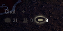
Aliniel✭✭✭✭✭I dislike itI dislike it very much. It's not even properly polished - this echo around the notification icon is there permanently.
 6
6 -
Syldras✭✭✭✭✭
✭✭✭✭✭I dislike itI dislike it very much. It's not even properly polished - this echo around the notification icon is there permanently.
The only way this could be made even more annoying would be by adding a permanent notification sound to it. Let's say the nirnroot sound. Or even better, the one from dark anchors. But what do I know, maybe that's the next cool update.@Syldras | PC | EU
The forceful expression of will gives true honor to the Ancestors.
Sarayn Andrethi, Telvanni mage (Main)
Darvasa Andrethi, his "I'm NOT a Necromancer!" sister
Malacar Sunavarlas, Altmer Ayleid vampire
Soris Rethandus, a Sleeper not yet awake8 -
KurganNazzir✭✭✭I dislike itIt's flat, boring, and an affront to my eyes. The menu icons, the achievement icons, the companion name box, the character health/stamina/power bars, the radar, the hotbars, just all of it looks absolutely terrible to me. What all these folks keep calling "modernization" is a huge leap back into flat, ugly crap.11
-
DerAlleinTiger✭✭✭✭✭I dislike itDack_Janiels wrote: »For people that don’t like the new UI look that are on PC, I have uploaded a addon to GitHub to revert the changes. Due to the size it will not be published to esoui; that is also probably a reason the devs did not have an option to revert in the game since the goal was to trim file sizes. Unzipped folder size is roughly 1.2gigs.
https://github.com/DakJaniels/Pre101046UI/releases/tag/v2
Installation is the same as you would install any other addon. Unzip file, move the folderPre101046UI
into the addon directory. So,
the path would be\Elder Scrolls Online\live\AddOns\Pre101046UI
not\Elder Scrolls Online\live\AddOns\Pre101046UI-v2\Pre101046UI
You are the hero we needed all along! I'm installing this right now before I even load into the game. I don't even want to look at this UI for an instant in-game. It's just so awful for a TES game.
For WEEKS those of us in the PTS forum were telling them not to do this. We kept saying "This looks awful. This is terrible. This breaks immersion in the game. This doesn't fit at all. It's really jarring. It looks really generic and soulless." etc. etc. etc. etc. etc. 95%+ negative feelings expressed towards it. Not a single, solitary, individual response to anything in that thread from ZOS. Not even a canned response. Now here it is, and just as several people in there predicted, most people don't like it. Shocker!
11 -
Marto✭✭✭✭✭
✭I have mixed feelings about itWhen they first announced it I was really excited! The UI looking so old, low-res, and covered in that "munge" has been an issue for a long time. We were long overdue an update.
But what they released here is way too unpolished and unfinished.
This was supposed to bring the PC interface up to parity to the gamepad UI. But what we got is way, way worse in every way. No proper borders, no proper sizing, no consistency. It's unacceptable."According to the calculations of the sages of the Cult of the Ancestor Moth, the batam guar is the cutest creature in all Tamriel"1 -
xencthlu✭✭✭✭I dislike itWhen they said that updating the UI was on the agenda for this year, I thought they were going to be adding new features and functionality that you usually have to get from addons. I was very excited by the prospect of having a UI with improved functionality. This is... Not that. Who on the UI team has it out for transparency? Besides the team window, this sidebar is awful. The overall footprint of the UI increased without actually adding any new information or improving visibility or usability.

Going to download one of the UI addons now, since the in game UI has roughly the same style with less functionality.I care what you think.10 -
DerAlleinTiger✭✭✭✭✭I dislike itLogged out after 5 minutes. Never thought I'd ever install an UI add on, but that's it now.
Same here. In all 11 years since the game launched and I started playing, I never once installed a UI overhaul add-on, or really any true UI add-on beyond pChat (and even that, I kept almost all of the settings as close to vanilla as possible with the QOL additions). Now, that's changing. So hey, good job, ZOS. You've gotten me to finally make the leap to overhauling your UI... to make it the exact same UI you used for 11 years.8 -
Ilsabet✭✭✭✭✭
✭✭I dislike itI'm guessing some suit got bit by the "modernization" buzzword bug, had a UI designer churn out a bunch of flat designs and call it good, and then either didn't want the time and money to go to waste or couldn't take the hit to their pride by admitting that their brilliant executive vision was a total disaster with the playerbase.Edited by Ilsabet on June 2, 2025 5:15PMIlsabet Menard - DC Breton Nightblade archer - Savior of Pretty Much Everything, Grand Overlord & Empress Nubcakes
My characters and their overly elaborate backstories
Ilsabet's Headcanon
The Adventures of Torbyrn Windchaser - Breaking the Ice & Ashes to Ashes
Bastian's Tattoos: An Inaccurate Headcanon
PC NA11 -
Syldras✭✭✭✭✭
✭✭✭✭✭I dislike itWhat's also strange is that there's no real style congruency anymore, as the launcher design still looks the same with rust effects, rugged edges and all.@Syldras | PC | EU
The forceful expression of will gives true honor to the Ancestors.
Sarayn Andrethi, Telvanni mage (Main)
Darvasa Andrethi, his "I'm NOT a Necromancer!" sister
Malacar Sunavarlas, Altmer Ayleid vampire
Soris Rethandus, a Sleeper not yet awake8 -
DerAlleinTiger✭✭✭✭✭I dislike itWhen they first announced it I was really excited! The UI looking so old, low-res, and covered in that "munge" has been an issue for a long time. We were long overdue an update.
But what they released here is way too unpolished and unfinished.
This was supposed to bring the PC interface up to parity to the gamepad UI. But what we got is way, way worse in every way. No proper borders, no proper sizing, no consistency. It's unacceptable.
Completely disagree on the first part. It was a beautiful UI reminiscent of earlier TES designs. I play in 1440p and never found it to be low-rez or ugly. It got the job done just fine with style and soul. There was no reason, no call, to update it. The only, ONLY, calls I ever heard to update the UI was to add features, not change the look and design.
The second part, though, absolutely agree. Unpolished, unfinished... and soulless in its very design and concept.16 -
Syldras✭✭✭✭✭
✭✭✭✭✭I dislike itDerAlleinTiger wrote: »Unpolished, unfinished... and soulless in its very design and concept.
Not even just soulless and technical like it's made for some office app, but it somehow reminds me of the simplified UI of a children's game. You know, not too complex or overwhelming, with clear fonts and edges. Some of the new symbols they applied also go in that direction. Or is that just me?@Syldras | PC | EU
The forceful expression of will gives true honor to the Ancestors.
Sarayn Andrethi, Telvanni mage (Main)
Darvasa Andrethi, his "I'm NOT a Necromancer!" sister
Malacar Sunavarlas, Altmer Ayleid vampire
Soris Rethandus, a Sleeper not yet awake9 -
TheMajority✭✭✭✭✭
✭I have mixed feelings about itWhen they first announced it I was really excited! The UI looking so old, low-res, and covered in that "munge" has been an issue for a long time. We were long overdue an update.
But what they released here is way too unpolished and unfinished.
This was supposed to bring the PC interface up to parity to the gamepad UI. But what we got is way, way worse in every way. No proper borders, no proper sizing, no consistency. It's unacceptable.
gamepad UI looks bad, why would we even want it on PC?Time flies like an arrow- but fruit flies like a banana.
Sorry for my English, I do not always have a translation tool available. Thank you for your patience with our conversation and working towards our mutual understanding of the topic.10 -
tomofhyrule✭✭✭✭✭
✭✭✭✭✭I dislike itI also really question how this was done in the first place.
We were told in Matt's letter that the whole point of the new patch scheme was to not have to rush things and instead release them when they were ready. And yet this patch proves that was all smoke and mirrors.
On PTS, we had a different UI every week it seemed. Sure, things were more polished from week 1 to week 5, but it was still being actively tweaked (and no feedback was considered) over that time. Even now, there are things that are different than they were on PTS.
So... why did this need to come out now, when it was obviously unfinished? Would it not have been better to wait until it was finished before pushing it out?
(Or even better: collect feedback from players and scrap it early?)14 -
Grizzbeorn✭✭✭✭✭
✭✭✭I have mixed feelings about itI imagine that they did it to reduce strain on the servers; a reason with which I can't argue.
But aesthetically-speaking... https://www.youtube.com/watch?v=cDGlN6mluGA&ab_channel=Triox 1
 -
NoticeMeArkay✭✭✭✭✭
✭I dislike itGrizzbeorn wrote: »I imagine that they did it to reduce strain on the servers; a reason with which I can't argue.
But aesthetically-speaking... https://www.youtube.com/watch?v=cDGlN6mluGA&ab_channel=Triox
The UI is run by your client. You do not constantly download data from the servers to uphold the appearance of the UI.14
