Maintenance for the week of April 6:
• PC/Mac: No maintenance – April 6
• PC/Mac: No maintenance – April 6
The new main menu is terrible
-
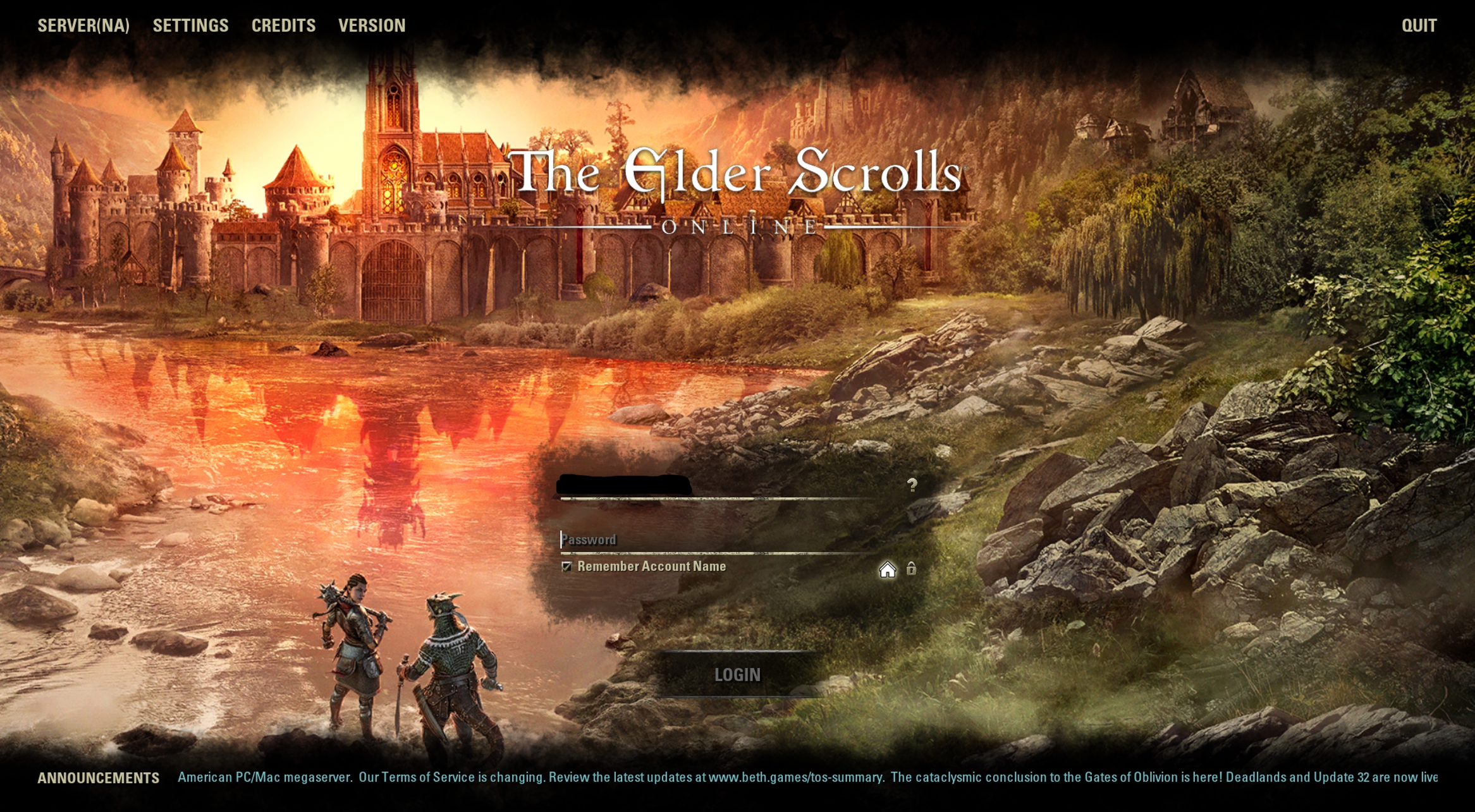
 Gleitfrosch✭✭✭✭Thats interesting, compared to some screenshots above, I see only a part of the picture, which seems to be streched (3440x1440):
[img][/img]
0 -
 Wolf_Eye✭✭✭✭✭
✭
I agree. The play on the 'two worlds' is nice. I think OP may be speaking in terms of image quality, like me.
Oh gotcha. That makes more sense. I thought it was a general disliking of the image itself. Sorry 0
0 -
 SeaGtGruff✭✭✭✭✭
✭✭✭✭✭The bigger controversy is the image stretching! I demand a fix!
I think you mean the LACK of image stretching, since what you're seeing is the center of the image-- i.e., the top and bottom are cropped off-- because your display is so wide. The image was cropped so its width fits the width of your display, since if it were scaled so its height fits the height of your display then you would have big fat black bars on the left and right sides of the display.I've fought mudcrabs more fearsome than me!1 -
SeaGtGruff✭✭✭✭✭
✭✭✭✭✭I can't notice a difference.
Unless you have an ultra-wide display, you should see a normal image. The OP's complaint was about the Oblivion-themed imagery and colors which are most notable in the central portion of the picture, where the reflection of Leyawiin in the river is replaced with an image of buildings and towers from Oblivion. That portion of the painting just happens to be in the central portion and is all you can see on an ultra-wide display, whereas it isn't quite so in-your-face if your normal-shaped display is showing you the entire painting.I've fought mudcrabs more fearsome than me!0 -
SeaGtGruff✭✭✭✭✭
✭✭✭✭✭Gleitfrosch wrote: »Thats interesting, compared to some screenshots above, I see only a part of the picture, which seems to be streched (3440x1440):
[img][/img]
That isn't stretched at all, it just has less of the painting cropped off at the top and bottom, since your wide display isn't nearly as wide as the OP's ultra-ultra-ultra-wide display.
EDIT: Sorry, I meant the person who posted the incredibly wide image, who actually is not the OP.Edited by SeaGtGruff on November 1, 2021 7:51PMI've fought mudcrabs more fearsome than me!0 -
 DarcyMardin✭✭✭✭✭
✭✭✭I hate it. I’m not into the fiery aesthetic.
Plus, I find it depressing — Greymoor, Blackwood, and now Deadlands — jeez! Dreaming longingly of Summerset.0