Maintenance for the week of December 22:
• [COMPLETE] NA megaservers for maintenance – December 22, 4:00AM EST (9:00 UTC) - 8:00AM EST (13:00 UTC)
• [COMPLETE] EU megaservers for maintenance – December 22, 4:00AM EST (9:00 UTC) - 8:00AM EST (13:00 UTC)
• [COMPLETE] NA megaservers for maintenance – December 22, 4:00AM EST (9:00 UTC) - 8:00AM EST (13:00 UTC)
• [COMPLETE] EU megaservers for maintenance – December 22, 4:00AM EST (9:00 UTC) - 8:00AM EST (13:00 UTC)
Combat UI sign is difficult to identify. Make it more recognizable design.
AvalonRanger
✭✭✭✭✭
✭
✭
Combat UI sign is difficult to identify. Make it more recognizable design.
-->> Current combat UI sign is really terrible design.
Imagine the complex combat situation (like dungeon boss fighting or West Skyrim Dolman).
There're lots of "buff effect", "fire effect", or "area damage effect" filling up screen. So, can't find out
enemy's dangerous attack or lethal damage caution. Must make it more recognizable design.
Very Please.
-->> Looks like newbies don't know West Skyrim Dolman game system. Put the " attack the vampire pillar !! "
marking UI around the pike object.
-->> Put the more recognizable combat " hint UI sign " at the dungeon boss. Consider more sophisticated "caution" UI design.
(example)
" Don't touch the laser, It's so lethal !!"
" Dangerous attack will come!!, ready to defend !! (or prevent it by the bashing)"
" DPS must eliminate this obeject. It's dangerous!! "
I don't try to display design example picture here.
But, if the ZOS is true professional game designer, you already understand what should do.
My playing time Mon-Friday UTC13:00-16:00 [PC-NA] CP over2000 now.
I have [1Tough tank] [1StamSorc-DD] [1Necro-DD] [1Real Healer]
with [1Stam Blade].
But, I'm Tank main player. Recently I'm doing Healer.
2023/12/21
By the way...Dungeon-Meshi(One of Famous Japanese fantasy story comic book) got finale...
Good-bye "King of Monster Eater".
2024/08/23
Farewell Atsuko Tanaka...(-_-) I never forget epic acting for major Motoko Kusanagi.
1
-
Vevvev✭✭✭✭✭
✭✭✭✭✭For a second I thought you were talking about the buffs/debuffs/ability bar timers that are able to be turned on in settings, but you're talking about the queues that tell you something bad is about to happen. If it's shimmering yellow while preparing a mighty swing it's heavy attacking.
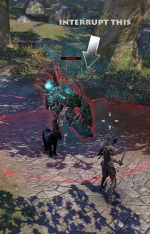
If it's glowing red it can be bashed and interrupted to stop it from doing something.
And you can go into settings and change the glowing on the ground to a more easily recognizable color. I prefer red since I can see it better, but a few people I know change it to bright pink.
Edit: Oh, and the Harrowstorms and other events pretty much tell you what to do. Like the Witches of Harrowstorms keep telling their minions to defend the pikes. You'll see this in other places to or so telegraphed it'd be hard to miss.Edited by Vevvev on July 15, 2021 4:33PMPC NA - Ceyanna Ashton - Breton Vampire MagDK0 -
Sephyr✭✭✭✭✭
✭✭For a second I thought you were talking about the buffs/debuffs/ability bar timers that are able to be turned on in settings, but you're talking about the queues that tell you something bad is about to happen. If it's shimmering yellow while preparing a mighty swing it's heavy attacking.
If it's glowing red it can be bashed and interrupted to stop it from doing something.
And you can go into settings and change the glowing on the ground to a more easily recognizable color. I prefer red since I can see it better, but a few people I know change it to bright pink.
On PC there's some of us that use the RGB AoE addon as well which makes them hard to miss as well. But before I discovered that? Insanely bright pink. I also made healing AoEs much vibrant as well, that way it would also not blend into the ground.0