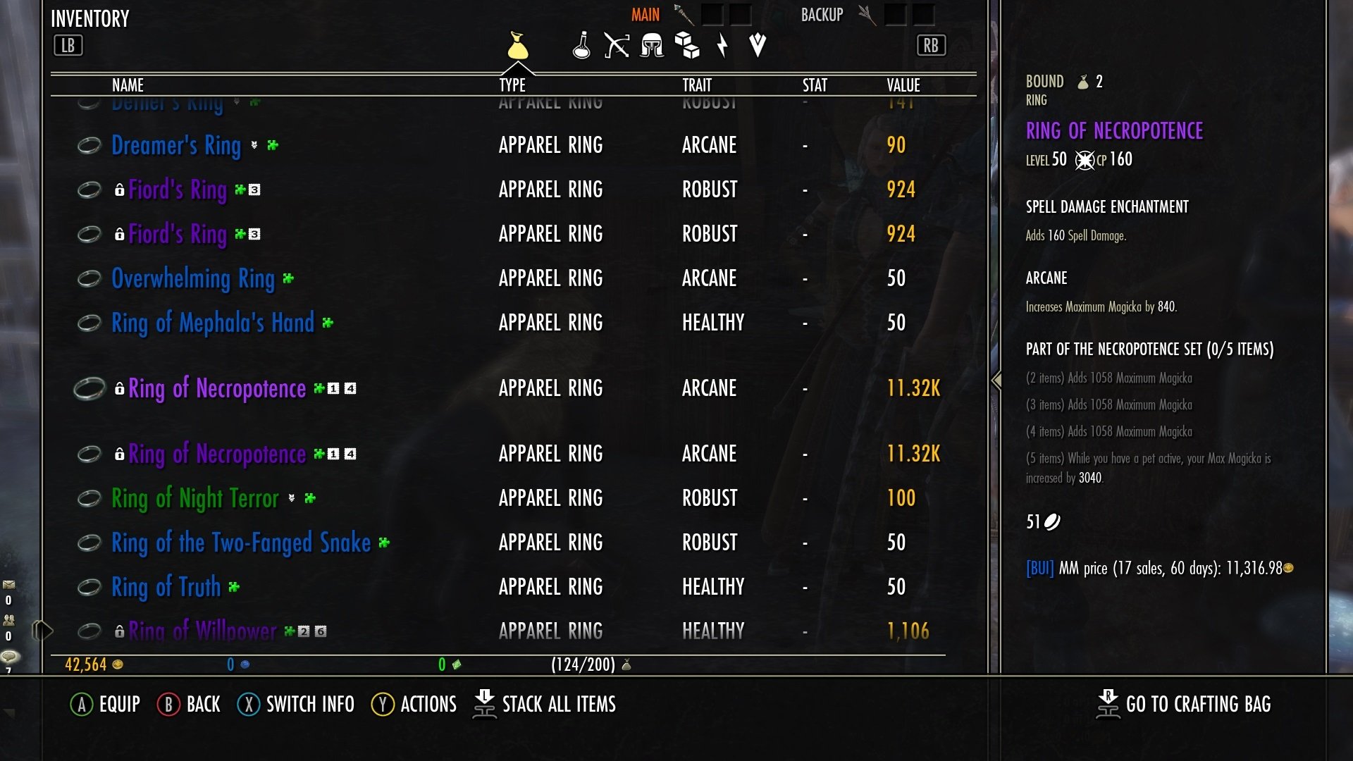
Maintenance for the week of April 13:
• PC/Mac: No maintenance – April 13
• PC/Mac: No maintenance – April 13
Update 50 is now available for testing on the PTS! You can read the latest patch notes here: https://forums.elderscrollsonline.com/en/categories/pts
UI Appreciation - Horizontal Scrolling is COMING!
Starlock
✭✭✭✭✭
✭✭✭✭✭
✭✭✭✭✭
In the PTS for this cycle, my eyes nearly fell out of their sockets when I read about this improvement to the UI for us console players:
• Horizontal scroll lists, like those found in crafting menus, will now continue to scroll when holding a directional input.
https://forums.elderscrollsonline.com/en/discussion/508802/pts-patch-notes-v5-3-0
THANK YOU THANK YOU THANK YOU THANK YOU THANK YOU.
More importantly, our poor hands thank you. Best. Update. Ever.
Carry on.
9
-
snoozy✭✭✭✭✭
✭In the PTS for this cycle, my eyes nearly fell out of their sockets when I read about this improvement to the UI for us console players:
• Horizontal scroll lists, like those found in crafting menus, will now continue to scroll when holding a directional input.
https://forums.elderscrollsonline.com/en/discussion/508802/pts-patch-notes-v5-3-0
THANK YOU THANK YOU THANK YOU THANK YOU THANK YOU.
More importantly, our poor hands thank you. Best. Update. Ever.
Carry on.
i wish it was that... but to me it sounds like it doesn't mean they are introducing this for inventory, bank etc.
only the ones that are already horizontal will be scrolled, like when you're selecting which type of staff or clothing to craft or which trait to use.
could be wrong tho, haven't checked on pts yet... i seriously hope they are giving us horizontal menus tho.
can anyone confirm this? 🤔
PC EU0 -
Hippie4927✭✭✭✭✭
✭✭✭✭In the PTS for this cycle, my eyes nearly fell out of their sockets when I read about this improvement to the UI for us console players:
• Horizontal scroll lists, like those found in crafting menus, will now continue to scroll when holding a directional input.
https://forums.elderscrollsonline.com/en/discussion/508802/pts-patch-notes-v5-3-0
THANK YOU THANK YOU THANK YOU THANK YOU THANK YOU.
More importantly, our poor hands thank you. Best. Update. Ever.
Carry on.
i wish it was that... but to me it sounds like it doesn't mean they are introducing this for inventory, bank etc.
only the ones that are already horizontal will be scrolled, like when you're selecting which type of staff or clothing to craft or which trait to use.
could be wrong tho, haven't checked on pts yet... i seriously hope they are giving us horizontal menus tho.
can anyone confirm this? 🤔
If I'm understanding you correctly, inventory and bank already scroll just in a different direction so why would they change those?PC/NA/EP ✌️1 -
Jayne_Doe✭✭✭✭✭
✭✭I haven't tested any other UIs which involve horizontal scrolling - are there any?
But I did test with crafting and it is AMAZING! It is particularly useful for the style mats.
And yes, most UI menus already scroll vertically, and that isn't what ZOS is changing - why would they?Edited by Jayne_Doe on January 28, 2020 8:57PM1 -
snoozy✭✭✭✭✭
✭Hippie4927 wrote: »
If I'm understanding you correctly, inventory and bank already scroll just in a different direction so why would they change those?In the PTS for this cycle, my eyes nearly fell out of their sockets when I read about this improvement to the UI for us console players:
• Horizontal scroll lists, like those found in crafting menus, will now continue to scroll when holding a directional input.
https://forums.elderscrollsonline.com/en/discussion/508802/pts-patch-notes-v5-3-0
THANK YOU THANK YOU THANK YOU THANK YOU THANK YOU.
More importantly, our poor hands thank you. Best. Update. Ever.
Carry on.
i wish it was that... but to me it sounds like it doesn't mean they are introducing this for inventory, bank etc.
only the ones that are already horizontal will be scrolled, like when you're selecting which type of staff or clothing to craft or which trait to use.
could be wrong tho, haven't checked on pts yet... i seriously hope they are giving us horizontal menus tho.
can anyone confirm this? 🤔I haven't tested any other UIs which involve horizontal scrolling - are there any?
And yes, most UI menus already scroll vertically, and that isn't what ZOS is changing - why would they?
what i was hoping for was introducing horizontal categories that you could cycle through. like at a crafting station when you switch between weapons and armour. or switching between inventory and craft bag.
and then incorporating the categories we have for regular pc ui like weapons, armour, jewelry, consumables etc.
there is an addon that does that for gamepad ui: better ui
i had to uninstall it though since it caused a lot of issues for me.
i really think they need to add that. inventory is barely tolerable, but scrolling through 480/500 items in your bank/guild bank is not. PC EU0
 -
GenjiraX✭✭✭✭✭Are console considered to be in "gamepad mode" by default, i.e. will this definitely apply to consoles or is it just for PCs in gamepad mode?
I've wanted horizontal scrolling for ages in crafting (also, use the trigger buttons to shift items left and right so I don't have go up, up, up, right, down, down, down, etc.).1 -
Jayne_Doe✭✭✭✭✭
✭✭Are console considered to be in "gamepad mode" by default, i.e. will this definitely apply to consoles or is it just for PCs in gamepad mode?
I've wanted horizontal scrolling for ages in crafting (also, use the trigger buttons to shift items left and right so I don't have go up, up, up, right, down, down, down, etc.).
Yes, the PC gamepad mode UI is the same as the console UI. I play mostly on console, but play in gamepad mode on PC, and they are identical in almost all respects, though, unfortunately gamepad mode on PC is losing the ability to scale it, so it will look as large as it does on console.
As for the triggers, they're already used to switch categories, like switching from armor to weapons, so I'm not sure how they'd incorporate it to work with switching from robe to shoes, for example. Unless I'm misunderstanding you.0 -
Jayne_Doe✭✭✭✭✭
✭✭Hippie4927 wrote: »
If I'm understanding you correctly, inventory and bank already scroll just in a different direction so why would they change those?In the PTS for this cycle, my eyes nearly fell out of their sockets when I read about this improvement to the UI for us console players:
• Horizontal scroll lists, like those found in crafting menus, will now continue to scroll when holding a directional input.
https://forums.elderscrollsonline.com/en/discussion/508802/pts-patch-notes-v5-3-0
THANK YOU THANK YOU THANK YOU THANK YOU THANK YOU.
More importantly, our poor hands thank you. Best. Update. Ever.
Carry on.
i wish it was that... but to me it sounds like it doesn't mean they are introducing this for inventory, bank etc.
only the ones that are already horizontal will be scrolled, like when you're selecting which type of staff or clothing to craft or which trait to use.
could be wrong tho, haven't checked on pts yet... i seriously hope they are giving us horizontal menus tho.
can anyone confirm this? 🤔I haven't tested any other UIs which involve horizontal scrolling - are there any?
And yes, most UI menus already scroll vertically, and that isn't what ZOS is changing - why would they?
what i was hoping for was introducing horizontal categories that you could cycle through. like at a crafting station when you switch between weapons and armour. or switching between inventory and craft bag.
and then incorporating the categories we have for regular pc ui like weapons, armour, jewelry, consumables etc.
there is an addon that does that for gamepad ui: better ui
i had to uninstall it though since it caused a lot of issues for me.
i really think they need to add that. inventory is barely tolerable, but scrolling through 480/500 items in your bank/guild bank is not.
Ah...I see. So, what you're wanting, if I'm understanding you correctly, is to have more information displayed horizontally, so there would be less vertical scrolling, and then give us categories that we can use the triggers to switch between, rather than horizontally scrolling through each category and then opening a sub-menu with all items in that category. So, closer to the PC UI in some respects. I'd love to have that on console, frankly, but I've gotten so used to the gamepad UI, which I also use on PC, so I don't remember how the PC UI looks/functions.1 -
snoozy✭✭✭✭✭
✭Hippie4927 wrote: »
If I'm understanding you correctly, inventory and bank already scroll just in a different direction so why would they change those?In the PTS for this cycle, my eyes nearly fell out of their sockets when I read about this improvement to the UI for us console players:
• Horizontal scroll lists, like those found in crafting menus, will now continue to scroll when holding a directional input.
https://forums.elderscrollsonline.com/en/discussion/508802/pts-patch-notes-v5-3-0
THANK YOU THANK YOU THANK YOU THANK YOU THANK YOU.
More importantly, our poor hands thank you. Best. Update. Ever.
Carry on.
i wish it was that... but to me it sounds like it doesn't mean they are introducing this for inventory, bank etc.
only the ones that are already horizontal will be scrolled, like when you're selecting which type of staff or clothing to craft or which trait to use.
could be wrong tho, haven't checked on pts yet... i seriously hope they are giving us horizontal menus tho.
can anyone confirm this? 🤔I haven't tested any other UIs which involve horizontal scrolling - are there any?
And yes, most UI menus already scroll vertically, and that isn't what ZOS is changing - why would they?
what i was hoping for was introducing horizontal categories that you could cycle through. like at a crafting station when you switch between weapons and armour. or switching between inventory and craft bag.
and then incorporating the categories we have for regular pc ui like weapons, armour, jewelry, consumables etc.
there is an addon that does that for gamepad ui: better ui
i had to uninstall it though since it caused a lot of issues for me.
i really think they need to add that. inventory is barely tolerable, but scrolling through 480/500 items in your bank/guild bank is not.
Ah...I see. So, what you're wanting, if I'm understanding you correctly, is to have more information displayed horizontally, so there would be less vertical scrolling, and then give us categories that we can use the triggers to switch between, rather than horizontally scrolling through each category and then opening a sub-menu with all items in that category. So, closer to the PC UI in some respects. I'd love to have that on console, frankly, but I've gotten so used to the gamepad UI, which I also use on PC, so I don't remember how the PC UI looks/functions.
yes, exactly one can only dream PC EU0
