Maintenance for the week of May 18:
• NA megaservers for maintenance – May 18, 4:00AM EDT (8:00 UTC) - 9:00AM EDT (13:00 UTC)
• EU megaservers for maintenance – May 18, 8:00 UTC (4:00AM EDT) - 13:00 UTC (9:00AM EDT)
• NA megaservers for maintenance – May 18, 4:00AM EDT (8:00 UTC) - 9:00AM EDT (13:00 UTC)
• EU megaservers for maintenance – May 18, 8:00 UTC (4:00AM EDT) - 13:00 UTC (9:00AM EDT)
Hakkvild's High Hall - wtf, dev architects?

davey1107
✭✭✭✭✭
✭
✭
Lol, this place is an architectural disaster. I wish the designers would put a little more thought into these places, taking into consideration that people want to decorate them. Some of the initial thoughts on where this property goes weird:
Interiors
- the entry lobby has doors and offsets on all walls. It didn't need three entry doors, and leaving the side doors off would have offered a better lobby to decorate. In early Versailles, this would be where you take a dump behind curtains, fun fact.
- just one main room to decorate?? On a $3.8 million home? This place has sad interiors. It should have side rooms like Hundings - a west and east wing w rooms, either two down below or four on lower and upper levels. I know the crypt offers some nice interior space, but still. I'd hope for at least a master bedroom or something.
- the doors to and from the balcony are just crammed in with no thought. They're not architecturally viable (what, is there a ladder to the upper level?) and the top one looks askew.
- the west balcony doesn't connect to anything and has no access. People will have to build ugly ramps to get to the side. Why doesn't it just wrap around?
- the balcony floor to ceiling windows and offsets will make it really hard for people to furnish this space.
Exteriors
- this place does have amazing patios. Anyone need 50 redguard grills?
- the rampart awnings do look very Nord, but in the interest of this being a furnishing game I wish they'd been left off so that owners had a larger rear patio with a view to decorate.
- I don't understand why the tower top has an entire elevator tube stairwell in the center. If this had been a simple trap door in a corner or offset, it would have been a cool sky patio space.
Crypt and burial mound
- this is very cool and unique, and they did manage to fit it into homesteading in a way that makes narrative sense.
Grounds
- love seeing a manor include considerable grounds, and the stone arches are really cool. I'll definitely flinch expecting to be hit with Forsworn arrows every time I walk out.
Overall I like this better than any of the other $4 million properties. It feels like a park hotel in Yosemite or Yellowstone. I just need a bear pet and a trash can and tent setup for him to raid. The interiors are weird to me, but since I don't decorate as much inside it's not that big a deal. Still, I wish they'd make the base interiors with the players more in mind. Spaces should be better suited to versatile decorating, with window and door placements as well as access taking that into consideration.
In my mind, for properties you buy with gold, Hundings Palace still reigns supreme.
17
-
 ricam✭✭✭It is strange that ZOS has not addressed the interior issues. I know that it was brought up in PTS feedback before the house lunched pc.
Although, the exterior is really nice. It's like somebody forgot to finish it. Something can be built to gain access to the area upstairs. It will difficult to make access look nice and will take up a chunk of the already limited item space.PS4 NA. Ebonheart Pact, Dark Elf, Sorcerer4 -
 Aurie✭✭✭✭✭
✭It is strange that ZOS has not addressed the interior issues. I know that it was brought up in PTS feedback before the house lunched pc.
Although, the exterior is really nice. It's like somebody forgot to finish it. Something can be built to gain access to the area upstairs. It will difficult to make access look nice and will take up a chunk of the already limited item space.
Since when did ZO$ ever take any notice of feedback?2 -
ricam✭✭✭It is strange that ZOS has not addressed the interior issues. I know that it was brought up in PTS feedback before the house lunched pc.
Although, the exterior is really nice. It's like somebody forgot to finish it. Something can be built to gain access to the area upstairs. It will difficult to make access look nice and will take up a chunk of the already limited item space.
Since when did ZO$ ever take any notice of feedback?
Oh yeah. Good point. I have no idea what got into me. PS4 NA. Ebonheart Pact, Dark Elf, Sorcerer2
 -
 Crimsonwolf666✭✭✭✭I agree, the outside seems an slight improvement (space wise) from the last Notable homes to me, but the inside is a joke. I don't get how these homes show 3 or 4 story windows up and only go up 2. Not talking about the basements for Daggerfall Overlook or Ebonheart Chateau. But even this new home, like the Chateau and even Serenity Falls, shows 3 floor windows or towers with no access. Plus this new one only has access to one side of the balcony, naturally. Don't know if you can put a plank or building stones/blocks down to get to the other side of the balcony, but the inside feels very cheaply and quickly done. Like with the Mushroom tower, not gonna bother ever getting till they put more effort and SPACE into the homes. Especially the Notable homes.1
 -
 sudaki_eso✭✭✭✭✭I was willing to spend some money on it, love the exterior and the crypt, but the interior....urgh what a mess. Wont use any crowns for it
 PS4 EU - StamDK3
 -
 BloodWolfe✭✭✭✭I was actually tempted to buy this one with crowns until I saw the terrible interior design. I love Nord architecture and the exterior is awesome but the interior is just ridiculous.
Way to go ZOS ruining what may have actually had a lot of people spending crowns on overpriced housing.4 -
 Jayne_Doe✭✭✭✭✭
✭✭It's really disappointing that with a notable home, they still used already existing assets for the house. When it was first announced, I was expecting something akin to the Jarl's hall in Falkreath - that was pretty amazing and would have fit in well with the grounds and style.
But, instead of creating something similar, or something new and grand, they used the same model as the Mages guilds in Windhelm and Riften. They then took out the staircase to make the hall look bigger and then stuck an awkward door in the walkway between the lobby and the main room to access one of the balconies. When they took out the stairs, they also took out the landing, disconnecting the two sides of the balcony - with no access to one of the sides? I just....this is just so sloppy. I guess they blew their allotted design time on the exterior and at the last minute just decided to plunk in the Mage's guild hall, modify it in strange ways and call it a day.
Definitely WON'T be getting this one, and that's a bunch of crowns they lost as it would have been the only way I would have purchased it.3 -
 Thrudra_Magia✭✭✭Simply put, it's incredibly sad the designers didn't make the inside look like the outside. It would've been an awesome home! But the way it is now, it's mediocre at best.
Sad job ZOS. I would be ashamed to let a poor design job this huge go to the public.
Frankly, it's an embarrassment.5 -
 RoyalPink06✭✭✭✭✭I was so excited to buy this. Initially when I read this post, I thought that OP was exaggerating, but after finally getting to check it out for myself, I was extremely disappointed in this home. I loooove the outside, but the inside is terrible. I was hoping for something like the interior of Dragonsreach in Whiterun in Skyrim.
I will not be buying this home.NA PS44 -
 iiYuki✭✭✭✭✭TBH awful home, I could see it being a cool guild hall but as a player home is so small especially for the price."Play how you want... unless its not how we intended you to play in which case we'll nerf it".
- ZO$
- The ZO$ Theme Song: https://www.youtube.com/watch?v=gmUJWP_ebsQ1 -
 Bladerunner1✭✭✭✭A friend of mine bought it and plans to convert the single room living space into an arena-style master bedroom.
Either that or a guild hall.1 -
 Zypheran✭✭✭✭✭
✭✭Like many other homes this was poorly designed in many details. The door going up to the upper viewing gallery was clumsy. The upper gallery being divided so you can only access half of it and need to finish the job yourself with platforms and jumping barriers to use the other side.
If these were mods made by amateurs, for free, I would accept this but when you charge that amount of real world money for something I really expect somebody to take their thumbs out when it comes to design.
Give me 3hours with a construction kit and I would have spat that out for free. I strongly urge the ZOS home designer to go onto something like Nexus mods and look at the Skyrim housing mods, filter by most popular and see what people are creating.
All my housing builds are available on YouTube
https://www.youtube.com/channel/UCf3oJ_cxuu01HmWZJZ6KK6g?view_as=subscriber
I am happy to share the EHT save files for most of my builds.5 -
BrianDavion✭✭✭✭basicly they just ripped out a part of falkreath's dungeon, walled it off and made it a house. feels very very lazy6
-
 Eatmyface✭✭✭✭I was considering creating a whole new Nord character for this house, and was super excited about playing the the EP quest line for the first time (obviously quite new to the game), but I just hate the entry!!
When compared to ALL of the other top tier dwellings - where you walk in and see a big grand structure staring down at you (EC being the epitome), or a huge expansive area like Earthtear, this just doesn't cut it for me.
When you walk into Hakkvild's you first have to trounce through an ugly as sin cave (I'm biased against caves, but I'm sure plenty of people like them!), then you come out of it and stare straight into a derelect old crypt. When you finally come out through the beautiful big arch - that you can only appreciate if you walk half way to the house and then turn around, you see the manor. Stunning to look at but at this stage I'm feeling slightly underwelmed. The shortcut into the house from the tunnel is also underwelming. It just doesn't have the same feel as the others.
I can deal with the many flaws of the interior - I'm more interested in views, crafting area's etc. on the exterior, and the current item limit doesn't really allow you to nail both, but I just can't deal with that tunnel!
I want to enter the grounds and feel stoked with what my in-game hard work - gold, or real life hard work - crowns, has eventuated in... Here I just see a tunnel
Just my opinion.Edited by Eatmyface on September 2, 2017 10:41PM1 -
 LadyNalcarya✭✭✭✭✭
✭✭✭✭✭I agree. I think they just copypasted the boss arena as an interior for the main building, and thats kind of underwhelming.
And the item limit seems intimidating. This place is huge, and 700 items surely wont be enough. Dro-m'Athra Destroyer | Divayth Fyr's Coadjutor | Voice of Reason
PC/EU1 -
Eatmyface✭✭✭✭I'm still not sure about an alternative, though.
The Imperial architecture of Linchal isn't overly appealing to me... If only I was playing the game when Grand Topal Hideaway was available
Ive got 50k crowns sitting there and I'd really like to spend them!0 -
 TonyRockaroni✭✭✭✭✭The interior is what keeps me from buying HHH. As someone who grew up playing games like The Sims 3, I LOVE housing in ESO. Sadly, I'm that guy who likes to decorate the interior just as much as the exterior. And the interior of HHH is ABYSMAL. Three entrances is unnecessary, the placement for the door to the upper balcony is horrendous, the balcony doesn't wrap around completely leaving the left half inaccessible without putting in some sort of "do-it-yourself" ramp, and the lack of having multiple rooms in a manor is frustrating. I still say the interior would've been O much better had they used the interior of the Jarl's Manor from Fort Amol instead.
This is the only manor that I can safely say is not worth the price.Edited by TonyRockaroni on September 5, 2017 11:15PM2 -
TonyRockaroni✭✭✭✭✭Like many other homes this was poorly designed in many details. The door going up to the upper viewing gallery was clumsy. The upper gallery being divided so you can only access half of it and need to finish the job yourself with platforms and jumping barriers to use the other side.
If these were mods made by amateurs, for free, I would accept this but when you charge that amount of real world money for something I really expect somebody to take their thumbs out when it comes to design.
Give me 3hours with a construction kit and I would have spat that out for free. I strongly urge the ZOS home designer to go onto something like Nexus mods and look at the Skyrim housing mods, filter by most popular and see what people are creating.
Why couldn't you have been one of the people from ZOS who help design the houses instead of whoever designed HHH? XD3 -
 I'm a Nexus modder for Skyrim and I too agree with all about how poorly this house was done, however; I tackled it. Picking and choosing what areas had to be left completely bare was hard but I have a feeling ESO will indeed increase the item slots in the future. So what I decided to to leave bare until that day was the dungeon, but everything else I decorated. I turned my Hakkvild's High hall into a player home plus Werewolf Guild hall. Check it out.
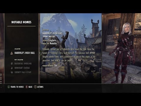 https://youtu.be/R76c7NjgSU8 Edited by sexyphenix on September 8, 2017 8:39PM4
 -
davey1107✭✭✭✭✭
✭@sexyphenix That's really well done! It's like the development team did it themselves. I love that it comes with a Mongolian BBQ station, lol.
2 -
FloppyTouch✭✭✭✭✭
✭✭✭I like the inside being one big room it's makes it easier to finish off and look complete. My issue with say the daggerfall outlook was to many rooms not enough slots.
Now with the main room finish I still have 500 slots for outside and that cave area. I feel that is pretty good to do something awesome, I'm just not sure right now what to do.
I agree with that weird door that looks out of place to the loft area wish they put stairs we could climb that went up. Also that space between the two upstairs parts are weird.
In all I'm happy with the home I think it's worth the price tag and found cleaver ways to hide those areas that I don't like.Edited by FloppyTouch on September 9, 2017 1:06AM1 -
@sexyphenix That's really well done! It's like the development team did it themselves. I love that it comes with a Mongolian BBQ station, lol.
Thank you so much come on over some time I'll save ya some BBQ ribs darlin... haha...0
