Maintenance for the week of December 15:
• PC/Mac: NA and EU megaservers for maintenance – December 15, 4:00AM EST (9:00 UTC) - 12:00PM EST (17:00 UTC)
• Xbox: NA and EU megaservers for maintenance – December 15, 4:00AM EST (9:00 UTC) - 12:00PM EST (17:00 UTC)
• PlayStation®: NA and EU megaservers for maintenance – December 15, 4:00AM EST (9:00 UTC) - 12:00PM EST (17:00 UTC)
any way to restore the uncollected icons?

kumenit_taeynav
✭✭✭✭
u47 changed the colour of the "this item can be learned or collected" icon in my inventory. it went from a bright and noticeable green to white. the white icons dont stand out like the original green did since theres already so many white ui icons.
theres nothing in the settings about the colour of the icons so is there a way to do that via addons? can the devs revert this awful change or at least let us choose the colour like we can for text in chat? ive already destroyed a few recipes i wanted to learn bc i completely missed the boring white icons
theres nothing in the settings about the colour of the icons so is there a way to do that via addons? can the devs revert this awful change or at least let us choose the colour like we can for text in chat? ive already destroyed a few recipes i wanted to learn bc i completely missed the boring white icons
6
-
 Danikat✭✭✭✭✭
✭✭✭✭✭They'd need to make it a choice, I suspect it was changed because so many people complained about the bright icon.
I'm normally one of those saying more addon functions should be part of the base game but IMO this is one that is better left to addons because they'll never get it right for everyone.
For example I have 1 dedicated crafter. My other characters don't need any icon for items they haven't learned because they don't know any traits or motifs and will never learn any, so it's useless information. On my crafter I don't mind it, as long as its not too obtrusive but I didn't like the big green icon, it looked like the kind of addon I'd avoid because it doesn't fit in with the UI.
I don't want the green back, but I'd absolutely support letting players choose the colour that works for them. Maybe I could make it match the background so it doesn't show up at all.PC EU player | She/her/hers | PAWS (Positively Against Wrip-off Stuff) - Say No to Crown Crates!
"Remember in this game we call life that no one said it's fair"4 -
 LunaFlora✭✭✭✭✭
✭✭✭✭✭oh that's not good news.
The bright green made it easy to seemiaow! i'm Luna ( she/her ).
🌸*throws cherry blossom on you*🌸
"Eagles advance, traveler! And may the Green watch and keep you."
🦬🦌🐰
PlayStation and PC EU.
LunaLolaBlossom on psn.
LunaFloraBlossom on pc.12 -
 Sturmfaenger✭✭✭✭✭
✭The moment it drops from... say, an urn... you can still see the bright green icon in the right corner of the screen. Just in inventory its white. I like the white better, it gives the information without jumping in your face^^PC/EU4 -
 tsaescishoeshiner✭✭✭✭✭
✭✭The green was distracting even after a few months. I think the white will become more noticeable over time (just like the magnifying glass for unresearched gear traits) as the habit of looking for it is reinforced.PC-NA
in-game: @tsaescishoeshiner0 -
 spartaxoxo✭✭✭✭✭
✭✭✭✭✭Oh man, that is very disappointing news. While I'm not disabled, I don't have great eyesight. So, I miss icons sometimes. The bright green icon was so easy to see, even while quickly scrolling guild traders. This was one of my most favorite changes of all time. I get that some didn't like it, but I wish this was handled as an option for those of us who can benefit from bigger and brighter icons.Edited by spartaxoxo on August 19, 2025 9:25PM11 -
kumenit_taeynav✭✭✭✭sad to hear theres no solution right now. sure would be nice to get a colour-picker for this so i can have something noticeable, others can pick something mellow, and those who dont want it at all just max out the transparency6
-
 Tra_Lalan✭✭✭✭✭I don't like this change too. Please give us back the green colour or make it an option.
4 -
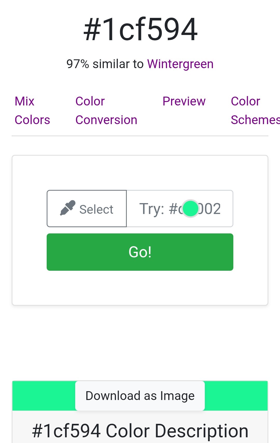
 FurryCandyHearts✭✭✭a color in this range my be better suited?
1cf594
not that one specifically but something similar might be better received by the most peopleEdited by FurryCandyHearts on August 20, 2025 11:45AM0 -
 LalMirchi✭✭✭✭✭
✭✭Green is an informative color while white is neutral. I much prefer the green icon.4 -
 katanagirl1✭✭✭✭✭
✭✭✭✭✭This was a great tool for knowing whether or not you knew an item in guild traders or from a loot drop, but traders especially. Sifting through a page or more of results was so much easier by just looking at the one icon. I expect now it will take longer.
A few people complained about the color and a change was made instantly. I wish the devs could get a better gauge on how much these changes affect the whole playerbase before acting on them. Another case where a vocal minority has caused an impact on the majority.
Khajiit Stamblade main
Dark Elf Magsorc
Redguard Stamina Dragonknight
Orc Stamplar PVP
Breton Magsorc PVP
Dark Elf Necromancer
Dark Elf Magden
Khajiit Stamblade
Khajiit Stamina Arcanist
PS5 NA7 -
Danikat✭✭✭✭✭
✭✭✭✭✭FurryCandyHearts wrote: »a color in this range my be better suited?
1cf594
not that one specifically but something similar might be better received by the most people
For anyone who doesn't want to google it: this is dark blue.
IMO this is another good example of why the best solution would be to let players choose a colour (something a lot of addons do, but for some reason the base game options rarely do). For me that would be the worst of both - too dark to stand out but not completely invisible. I suspect all the people who say they liked the very bright green would say it's too dark.
Personally I'd prefer the option to just turn it off entirely, but if we have to be stuck with it I'd prefer something that blends in with the exisitng UI instead of demanding attention whenever I open my inventory.Edited by Danikat on August 21, 2025 9:07AMPC EU player | She/her/hers | PAWS (Positively Against Wrip-off Stuff) - Say No to Crown Crates!
"Remember in this game we call life that no one said it's fair"0 -
 shadyjane62✭✭✭✭✭
✭✭✭I'd rather have the bright green back instead of the "plague" green in the War standings.1 -
 tincanman✭✭✭✭✭
✭That explains why the icon seems to have returned; changed colour has impacted add-on efficacy.1 -
 Maitsukas✭✭✭✭✭
✭✭PC-EU @maitsukas
Posting the Infinite Archive and Imperial City Weekly Vendor updates.
Also trying out new Main Quests, Companions, ToT decks, Events and Styles on PTS.2 -
FurryCandyHearts✭✭✭
that's what i meant yes but perhaps not quite so bright? i use it with bar steward and replace the standard red color with that as it stands out very well and the red - for out of space and such - really clashes and is hard to read often.Edited by FurryCandyHearts on August 21, 2025 8:42AM0 -
Danikat✭✭✭✭✭
✭✭✭✭✭spartaxoxo wrote: »
It is. Apparently the site I found "helpfully" starts on a random colour with the one you searched for loaded into the search bar instead of going straight to its page.
Edit: have a look at this thread for the feedback the original icon got: https://forums.elderscrollsonline.com/en-gb/discussion/678589/god-awful-green-collect-icon
Considering the descriptions given by people who didn't like it I don't think a different shade of bright green would help.
The best fix would be a way to turn it off on characters that don't need it. Then it could be as big and bright as they want.Edited by Danikat on August 21, 2025 9:42AMPC EU player | She/her/hers | PAWS (Positively Against Wrip-off Stuff) - Say No to Crown Crates!
"Remember in this game we call life that no one said it's fair"1 -
 Mai_Selph✭✭Haven't they added an option to change some map marker to a custom color? It's certainly doable and would be very helpful if we could set our own custom colors for some icons.0