Maintenance for the week of May 25:
• PC/Mac: No maintenance – May 25
• ESO Store and Account System for maintenance – May 27, 6:00AM EDT (10:00 UTC) - 4:00PM EDT (20:00 UTC)
• PC/Mac: No maintenance – May 25
• ESO Store and Account System for maintenance – May 27, 6:00AM EDT (10:00 UTC) - 4:00PM EDT (20:00 UTC)
Thoughts on the PC UI art style "modernization"?

Maitsukas
✭✭✭✭✭
✭✭✭
✭✭✭
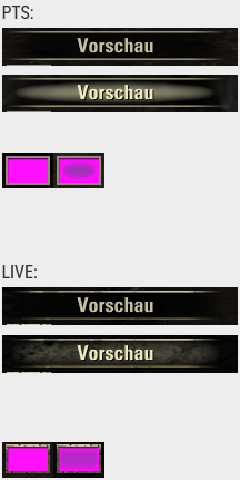
As of today's patch, the PC UI received a major style overhaul, having most (if not all) elements completely made into flat colors. This was extremely negatively received in the PTS Feedback Thread, with only a few players actually liking it and no developer responses for the reason behind the change.
Here's an example of existing company logos "modernized" to understand what I mean:

And here's some screenshots of the UI changes that players have shared in the Feedback Thread:


EDIT: @Dack_Janiels has made an add-on that brings back the old UI style, you can download it from below:
https://www.esoui.com/downloads/info4130-Pre101046UI.html
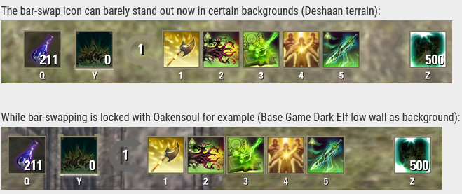
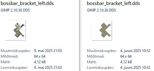
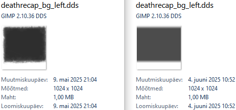
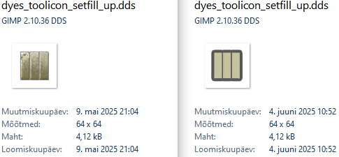
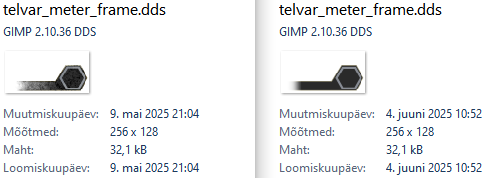
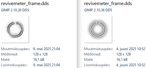
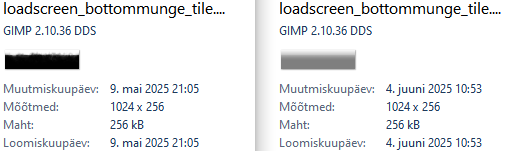
EDIT 2: Here's some comparisons of a few UI .dds image files that I've extracted from U45 (left) and U46 (right):
Boss bar bracket:
Death recap background:
Fill all dye slots:
Tel Var meter:
Revive meter:
Loading screen edges:
Trading window (player ready to trade):
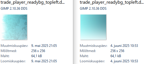
There isn't ANY file size or resolution difference at all!
Edited by Maitsukas on June 16, 2025 12:03PM Here's an example of existing company logos "modernized" to understand what I mean:
And here's some screenshots of the UI changes that players have shared in the Feedback Thread:
EDIT: @Dack_Janiels has made an add-on that brings back the old UI style, you can download it from below:
https://www.esoui.com/downloads/info4130-Pre101046UI.html
EDIT 2: Here's some comparisons of a few UI .dds image files that I've extracted from U45 (left) and U46 (right):
Boss bar bracket:
Death recap background:
Fill all dye slots:
Tel Var meter:
Revive meter:
Loading screen edges:
Trading window (player ready to trade):
There isn't ANY file size or resolution difference at all!
PC-EU @maitsukas
Posting the Infinite Archive and Imperial City Weekly Vendor updates.
Also trying out new Main Quests, Companions, ToT decks, Events and Styles on PTS.
Posting the Infinite Archive and Imperial City Weekly Vendor updates.
Also trying out new Main Quests, Companions, ToT decks, Events and Styles on PTS.
Thoughts on the PC UI art style "modernization"? 522 votes
I like it
18%


 97 votes
I dislike it
61%


 322 votes
I have mixed feelings about it
19%


 103 votes
23
-
 Cardhwion✭✭✭I am fine either way. There is nothing really annoying there, so it is all good. Whether they keep the old or bring the new is all equal to me."Why did I follow him...? I don't know. Why do things happen as they do in dreams? All I know is that, when he beckoned... I had to follow him. From that moment, we traveled together, East. Always... into the East."3
 -
 Treeshka✭✭✭✭✭
✭I like itI like it and i wonder why the top middle menu is not yet modernized. Maybe they did it for live server but it was still same during last test server patch.1 -
 Dack_Janiels✭✭✭I have mixed feelings about itFor people that don’t like the new UI look that are on PC, I have uploaded a addon to GitHub to revert the changes. Due to the size it will not be published to esoui; that is also probably a reason the devs did not have an option to revert in the game since the goal was to trim file sizes. Unzipped folder size is roughly 1.2gigs.
https://github.com/DakJaniels/Pre101046UI/releases/tag/v2
Installation is the same as you would install any other addon. Unzip file, move the folderPre101046UI
into the addon directory. So,
the path would be\Elder Scrolls Online\live\AddOns\Pre101046UI
not\Elder Scrolls Online\live\AddOns\Pre101046UI-v2\Pre101046UI
Edited by Dack_Janiels on June 2, 2025 3:54PM66 -
 Tatanko✭✭✭✭I dislike it
You are my hero! Any chance there are installation instructions included? I manually manage my addons so digging in doesn't bother me, I just need to know where to put thingsDack_Janiels wrote: »For people that don’t like the new UI look that are on PC, I have uploaded a addon to GitHub to revert the changes. Due to the size it will not be published to esoui; that is also probably a reason the devs did not have an option to revert in the game since the goal was to trim file sizes. Unzipped folder size is roughly 1.2gigs.
https://github.com/DakJaniels/Pre101046UI/releases/tag/v2") 4
4 -
 LesserCircle✭✭✭✭✭
✭I dislike itI dislike it and we have been able to have basically the same style of UI for years using addons that I have always tried to avoid.14 -
 Aliniel✭✭✭✭✭I dislike itPretty much hate it. And installing a 1.2GB AddOn to revert is not really a solution since I use OneDrive to sync my AddOns.9
 -
Dack_Janiels✭✭✭I have mixed feelings about it
You are my hero! Any chance there are installation instructions included? I manually manage my addons so digging in doesn't bother me, I just need to know where to put thingsDack_Janiels wrote: »For people that don’t like the new UI look that are on PC, I have uploaded a addon to GitHub to revert the changes. Due to the size it will not be published to esoui; that is also probably a reason the devs did not have an option to revert in the game since the goal was to trim file sizes. Unzipped folder size is roughly 1.2gigs.
https://github.com/DakJaniels/Pre101046UI/releases/tag/v2
Same as you would install any other addon. Unzip file, move the folderPre101046UI
into the addon directory. So,
the path would be\Elder Scrolls Online\live\AddOns\Pre101046UI
not\Elder Scrolls Online\live\AddOns\Pre101046UI-v2\Pre101046UI
10 -
 LunaFlora✭✭✭✭✭
✭✭✭✭✭I have mixed feelings about itTo me it looks mostly fine and i understand why others dislike it.
Though i use Accessibility Mode on PC so these changes don't affect me regardlessEdited by LunaFlora on June 2, 2025 12:43PMmiaow this is my forum signature! my name is Luna ( she/her ).
🌸*throws cherry blossom on you*🌸
"Eagles advance, traveler! And may the Green watch and keep you."
🦬🦌🐰
PlayStation EU is my primary server.
LunaFloraBlossom on PlayStation 5 and PC.
my main character is a Bosmer Warden named Greehnhart in-game, Greenie Florahart in full.
all characters on PS EU:- Luna Blossom, Bosmer Dragonknight.
- Dotty Greehnhart, Bosmer Sorcerer.
- Lía Greehnhart, Khajiit Nightblade.
- Lady Greehnhart, Altmer Templar. Lady is her name and title.
- Holly Blossom, Altmer Sorcerer.
- Sally Jadehart, Argonian Nightblade. Like a green salamander.
- Dorothy Pizzalover, Orc Warden. add pizzas to the game please.
- Greehnhart, Bosmer Warden.
- Lúcia Azurehart, imperial Necromancer. Azureblight, she has a Maarselok outfit.
- Bunny Rubyhart, Dunmer Nightblade.
- Wisteria Antheia, Khajiit Templar. blue hair like the wisteria.
- Cynthia Turquesa, Breton Warden.
- Rubyhart, Bosmer Nightblade.
- Hestia Rubyhart, Dunmer Dragonknight.
- Aurelia Cherryhart, Altmer Warden. Spriggan.
- Aurora Honey, Redguard Templar. Meridian cultist.
- Speaks-With-Blossom, Argonian Warden.
- Lulu Nightshade, Nord Necromancer.
- Lunetta Gleamblossom, Bosmer Arcanist. Ohmes Khajiit.
- Dianna Hyacinth, Altmer Arcanist. Maormer, water hyacinth.
Links to my Housing threads:Weapon Racks
https://forums.elderscrollsonline.com/en/discussion/692081/housing-request-weapon-racks-wishlist-with-pictures
Desks
https://forums.elderscrollsonline.com/en/discussion/691313/housing-request-more-desk-furnishings-please
Orc
https://forums.elderscrollsonline.com/en/discussion/687765/wishlist-for-orcish-furnishings
Music control
https://forums.elderscrollsonline.com/en/discussion/683673/request-for-housing-music-changer
Sanguine
https://forums.elderscrollsonline.com/en/discussion/679400/housing-sanguine-furnishings-from-west-solstice-please
Statues
https://forums.elderscrollsonline.com/en/discussion/691652/housing-statues-from-zones-as-furnishings-please
Links to my Fashion threads:Tassets and Loincloths
https://forums.elderscrollsonline.com/en/discussion/650919/list-of-outfit-styles-without-tassets-and-loincloths-will-try-to-update
Outfit System refresh
https://forums.elderscrollsonline.com/en/discussion/690938/lunas-outfit-system-improvements-request-thread
Dye Stamps
https://forums.elderscrollsonline.com/en/discussion/688775/please-let-us-collect-the-dye-stamp-exclusive-dyes-outfit-system-request
Unavailable Styles
https://forums.elderscrollsonline.com/en/discussion/686841/please-release-all-unavailable-outfit-styles-for-outfits0 -
 DreamyLu✭✭✭✭✭
✭I like itHave no idea. Server is still in maintenance for now for me. I need to see it first... I'm out of my mind, feel free to leave a message... PC/NA0
 -
Enemoriana✭✭✭✭✭
✭✭✭✭✭I dislike itI always was calm about updates. "This makes game better" or at least "doesn't really matter'. I don't remember any changes in game I really dislike.
This ui update?
I hate it.
Ok, I can forgive textures! They are beautiful, I love them, but I can get used to live without them.
But those damned cutted sides? They are ugly, and worse, their contrast in many places are painfully contrast.
Thanks, will try it!Dack_Janiels wrote: »For people that don’t like the new UI look that are on PC, I have uploaded a addon to GitHub to revert the changes.
(it would be first global ui addon I use ever)
PC EU, @Enemoriana. Ru.
Houses: all sets crafting hub at Rosewine Retreat inn room, Erstwhile Sanctuary as actual Dark Brotherhood Sanctuary, Hunter's Glade as werewolf tavern (downstairs), Strident Springs Demesne as adventurer's house.
Wishlist: character slots, minstrel personality, molten war torte and white gold war torte recipes, Willowpond Haven, Kor and Hildegard houseguests, crown crates.11 -
licenturion✭✭✭✭✭
✭I have mixed feelings about itI am mixed because I played mostly with controller while player (although I do use the menu's for inventory/questing/crafting) so I am used to a more flat UI already.
I am more annoyed they have no new login screen music this year to be honest. XDEdited by licenturion on June 2, 2025 1:21PM2 -
Elsonso✭✭✭✭✭
✭✭✭✭✭I dislike itFrom what I have seen of the UI modernization efforts on PTS, it is pretty bland. It seems to be part of some new wave of "grey" (aka boring, uninspired, etc) UI and art styles going around. I already can't wait for it to end!
Of course, we won't know what the new UI looks like until they open the servers. PTS was incomplete.XBox EU/NA:@ElsonsoJannus
PC NA/EU: @Elsonso
PSN NA/EU: @ElsonsoJannus
Total in-game hours: 11321
X/Twitter: ElsonsoJannus6 -
 tomofhyrule✭✭✭✭✭
✭✭✭✭✭I dislike itUgh
Well, at least the vanilla Group UI background doesn't look straight up unfinished anymore.
Still hate how flat everything is.
I just wish we'd gotten anything beyond "we modernized the UI!" as to why this was necessary. I assume it's to reduce filesize, but I always thought that UI files were local anyway so that shouldn't affect much data transfer from the servers.
It sure would be a lot easier to take this if we knew that they had to save space for something like a new Class...11 -
Bucky Balls✭✭✭✭I dislike itBloody awful. Should be optional.
Icons are cartoonish and ugly, the ui is jarring and unidimensional. All character has been removed in comparison to the original, perfectly usable and aesthetically pleasing ui.16 -
Elsonso✭✭✭✭✭
✭✭✭✭✭I dislike itSigh.
I guess the PTS version was the release version, after all?
XBox EU/NA:@ElsonsoJannus
PC NA/EU: @Elsonso
PSN NA/EU: @ElsonsoJannus
Total in-game hours: 11321
X/Twitter: ElsonsoJannus9 -
ospray315✭✭✭I dislike itAnyone know how to change it back to something, less, flat and lifeless?
An addon maybe?Edited by ospray315 on June 2, 2025 2:10PM3 -
 Soarora✭✭✭✭✭
✭✭✭✭✭I dislike itWe spoke for many pages and never got an answer why. Why a fantasy mmo with plenty of modern ui addons needs a modern ui. Why an elder scrolls game needs its iconic elder scrolls feel taken away.[PC/NA] Dungeoneer (Tank/DPS), Semi-retired Trialist, and amateur Battlegrounder (DPS) with a passion for The Elder Scrolls lore.
Current GM of Hard Dungeoneers
Tanks: Sorcerer - Necromancer - Templar
DPS: Frost Warden - Stamarc - StamDK - Hybrid NB Healer
Ex-Healer: Warden - Arcanist
Dungeons: 32/32 HMs - 26/26 Tris23 -
Freelancer_ESO✭✭✭✭✭
✭I dislike itDack_Janiels wrote: »For people that don’t like the new UI look that are on PC, I have uploaded a addon to GitHub to revert the changes. Due to the size it will not be published to esoui; that is also probably a reason the devs did not have an option to revert in the game since the goal was to trim file sizes. Unzipped folder size is roughly 1.2gigs.
https://github.com/DakJaniels/Pre101046UI/releases/tag/v2
Thank you very much for making the addon.5 -
sunfyre✭✭I dislike itIt should have been optional.
Who, exactly, requested this flat ugly and lifeless change?26 -
 LadyAstrum✭✭✭✭✭
✭I dislike itThe UI was nice as it was. Now, it has a flat appearance that has no actual style and feels more like something I'd see in a children's game. I don't understand the change. Who asked for it? Who chose it? Who decided the older style needed to be changed?~ "You think me brutish? How do you imagine I view you?" - Molag Bal #misunderstood ~26 -
 Syldras✭✭✭✭✭
✭✭✭✭✭I dislike itSigh.
I guess the PTS version was the release version, after all?
Hard to comprehend who found that to be an improvement.@Syldras | PC | EU
The forceful expression of will gives true honor to the Ancestors.
Sarayn Andrethi, Telvanni mage (Main)
Darvasa Andrethi, his "I'm NOT a Necromancer!" sister
Malacar Sunavarlas, Altmer Ayleid vampire
Soris Rethandus, a Sleeper not yet awake27 -
SporkyRatSoul ShrivenI dislike ittom your luck in finding bugs is already legendary, and now you're ascending to further levels.4
-
 tincanman✭✭✭✭✭
✭I dislike itwoah, flat & fugly...
Thanks @Dack_Janiels for the addon but zos should have given us the choice. And unfortunately add-ons only kick in on character load so there's still some navigation required through the black boxes of uglinesss...
@ZOS_Kevin - this is appalingly bad. Please convey to devs how unimpressed the lack of choice is here. And the lack of communication when the issues surrounding how bad these ui changes were commented on during pts.
The original ui was fine and preferable to this ugly and cartoonish replacement. Why no choice? The data was already there, all you had to do was to provide a 'nice pre u46 ui' or 'fugly u46 ui' option: everyone happy. As opposed to now with many not.
When are you zos people going to wake up and realise that 'choice' is actually better?30 -
Maxxermax✭✭✭I dislike itDack_Janiels wrote: »For people that don’t like the new UI look that are on PC, I have uploaded a addon to GitHub to revert the changes. Due to the size it will not be published to esoui; that is also probably a reason the devs did not have an option to revert in the game since the goal was to trim file sizes. Unzipped folder size is roughly 1.2gigs.
https://github.com/DakJaniels/Pre101046UI/releases/tag/v2
Yes, 1.2 gigs for an addon, that is what I meant. You have to integrate all the old textures to make it work.
Wasn't there a Lua memory limit for addons? 1024 MB or so?
Saving storage space on the client side is laughable because they increased storage usage from 88 gigabytes to 128 gigabytes for the live server.1 -
Varana✭✭✭✭✭
✭✭✭I dislike itIt looks boringly flat, surprisingly uninspired, and excessively bland.
It has absolutely zero personality, character, or uniqueness.
It has all the flair and appeal of Random Mobile App #38335.
Like that random mobile app, it is mostly ... kind of serviceable. Which is more or less the only positive thing to say about it.
With one major exception:
Those hard edges from pure black to world e.g. in the character/inventory screens, are unforgiveable.
How on earth can a UI designer who does this for a living, and has standards for themselves, and has some experience, live with that sin?
Sorry for the flowery language. It's just ... between unnecessary and bad. It's basically the Scouring of the Shire in UI form.26 -
 Silaf✭✭✭✭✭I dislike itAfter 10 minutes of the update i had to close the game to comment on this.
It's horrible. I hope for an option to disable the changes or an addon.
To the person responsable for greenlighting this abomination WHAT THE HELL ARE YOU DOING???30