Maintenance for the week of December 8:
• [COMPLETE] ESO Store and Account System for maintenance – December 10, 9:00AM EST (14:00 UTC) - 12:00PM EST (17:00 UTC)
• [COMPLETE] ESO Store and Account System for maintenance – December 10, 9:00AM EST (14:00 UTC) - 12:00PM EST (17:00 UTC)
How do you feel about the mages guild related cosmetics in the new crown crates?
ThelerisTelvanni
✭✭✭
Today the new crown crates for the „Order of the Lamp“ dropped. The order is described by the following paragraph in the article:
Raise up your blade, oh Knight of the Lamp. The Mages Guild calls for aid! Stand as a bulwark, protect magic wherever it dwells, and take your oath as a Votary in the Order. Don the armor of your sacred charge and stand tall beside the adepts of the guild. Protect them as they seek ancient secrets in caves below, in realms beyond, and even in the mind within. As a Knight in service to spellcraft and sorcery your duty is clear. Will you serve?
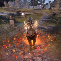
We got mounts, weapons, armor and a costume for the order of the lamp, to customize our character.
So how do you feel about the mages guild themed cosmetics inside these crates?
How do you feel about the mages guild related cosmetics in the new crown crates? 35 votes
I was waiting for something mages guild related, but this is not what I had in mind! I wanted something more elegant and discreet instead. This is sadly not what I wanted.
40%
0
-
LunaFlora✭✭✭✭✭
✭✭✭✭✭I love them! They are on point! Just perfect!i love them!
i think it's the first crate that i like all the apex mounts from.
and the recall animations isn't as flashy as i expected so that's cool too.
i like the outfit style too miaow! i'm Luna ( she/her ).
🌸*throws cherry blossom on you*🌸
"Eagles advance, traveler! And may the Green watch and keep you."
🦬🦌🐰
PlayStation and PC EU.
LunaLolaBlossom on psn.
LunaFloraBlossom on pc.1 -
Necrotech_Master✭✭✭✭✭
✭✭✭✭✭my vote would be "indifferent" as the theme of the crate overall is kind of eh because its crates, i know im unlikely to bother getting anything in them because of the nature of the crates
the only things that tend to interest me are polymorphs or alt animations that look cool, but ill only ever get them with endeavorsplays PC/NA
handle @Necrotech_Master
active player since april 2014
i have my main house (grand topal hideaway) listed in the housing tours, it has multiple target dummies, scribing altar, and grandmaster stations (in progress being filled out), as well as almost every antiquity furnishing on display to preview them
feel free to stop by and use the facilities1 -
moo_2021✭✭✭✭✭I was hoping for a completely different theme. (Write a comment!)Don't like the theme. Apex mounts are okay but I don't have room for non-shiny mounts.0
-
ThelerisTelvanni✭✭✭I was waiting for something mages guild related, but this is not what I had in mind! I wanted something more elegant and discreet instead. This is sadly not what I wanted.Don't like the theme. Apex mounts are okay but I don't have room for non-shiny mounts.
Well it seems like I am on the opposite end here. I perfer it baced, elegant and discreet instead of shiny and flashy.
But if you do not like the theme, what is it you want as a theme? These polls exist not only to show the devs what we like/dislike but also give them ideas as to what we want next 4
4 -
moo_2021✭✭✭✭✭I was hoping for a completely different theme. (Write a comment!)ThelerisTelvanni wrote: »But if you do not like the theme, what is it you want as a theme? These polls exist not only to show the devs what we like/dislike but also give them ideas as to what we want next

A colorful theme like Easter would be a perfect match to the jester event.
I like shiny mounts to a certain agree, e.g.
The glowing should be an enhancement on something that's already beautiful, not the entirety.0 -
SkaiFaith✭✭✭✭✭
✭Good. Not bad. And not perfect.Ornaugs and Quasigriffs are not my cup of tea, so their cool designs feel wasted on them imo.
I don't really like the armor outfit style.
Everything else seems good. Very funny the "rooster enlargement potion" XD
Very much appreciated the new recall since "it's not too much" for my tastes: sound and animation are good. Same for the Mining one.
The Wisp and the Blue lights furnishing are also cool.A: "We, as humans, should respect and take care of each other like in a Co-op, not a PvP 🌸"
B: "Many words. Words bad. Won't read. ⚔️"1 -
colossalvoids✭✭✭✭✭
✭✭✭✭✭I was waiting for something mages guild related, but this is not what I had in mind! I wanted something more elegant and discreet instead. This is sadly not what I wanted.Exceptionally bad imo, kinda too out of universe even considering I'm not against pretty bold stuff, but that's not it entirely.2 -
fizzylu✭✭✭✭✭
✭I was waiting for something mages guild related, but this is not what I had in mind! I wanted something more elegant and discreet instead. This is sadly not what I wanted.They really dropped the ball on these, everything I was excited about looks terrible in game. The recall locked behind 8k crowns is especially obnoxious and I hope no one ever uses it even remotely near me.
Also noticed that my character sits super far up on the saddle of this mount when previewing it and.... yeah, looks bad. Not that the mounts are good to begin with and I'm tired of seeing so called apex mounts without summon VFX, and meanwhile radiant apex mounts are getting enough VFX to cover 20 mounts.0 -
metheglyn✭✭✭✭✭Good. Not bad. And not perfect.The costume looks too jester-related for me, so I don't care much for it. I do like the outfit style and the saber mount, so will work on getting those with either gems or endeavors.0
-
Bo0137✭✭✭✭✭I love them! They are on point! Just perfect!I loved this crate season so much!
it's probably the crate season I loved most so far.
The Order of the Lamp style is just brilliant. And I love the 40 gems stuff, like the arcanist mohawk, the emotes, the makeups...
I don't care about the apex though.-On my shoulder, Ms. Ahvine0 -
NotaDaedraWorshipper✭✭✭✭✭
✭✭✭✭✭I was waiting for something mages guild related, but this is not what I had in mind! I wanted something more elegant and discreet instead. This is sadly not what I wanted.Feels more jester themed than some mage's guild related faction.
The apex mounts aren't as bad as they often are. I prefer the more subtle ones and not moving eye sores.
But the radiants, skins and recall? Absolutely obnoxious. Especially the recall. I'm getting so tired (and in pain) from all these extremely flashy and VFX filled cosmetics. The recall's effect is even so damn big you don't even see the whole thing in preview! And this is going to get spammed by some people in crowds. The radiants are as always too much and 2/3 needs to be summoned with a damn flash.
Skins: The amount of nice looking skins they make I can probably count on one hand. None of these are on it. What even is that colour vomit Aether-Tempered Mystic thing.
Weapon styles: Like the apex mounts, so isn't the effect that bad, not like other ones lately, but the model choices are. Especially the sword.
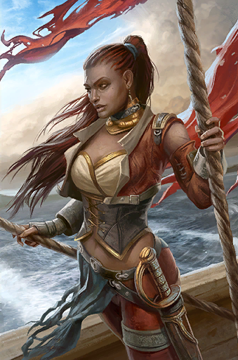
Costumes: The Wizard About Town is nice, albeit I would've prefered something going for a more simpler classical Elder Scrolls mage look instead of it, it looks too much like other magey styles and costumes we have gotten. Would've rather seen something taken inspiration from the TES5 mage's robes or such. Meanwhile Evoker on Errantry looks more like some jester/carnival inspired costume and not a mage's one. The cleavage also looks weird on male characters. What's even worse is that Evoker on Errantry supposedly is based off the Niben Bay Cutthroat card artwork from Legends, which is not mage related and it doesn't really look like it.
Non-apex mounts: Same old. Some random ones which aren't terrible but not great either. Odd choice with a ram, a bear and a furless welwa, though. The furless welwa I don't like, I prefer them with fur.
A lot of random emotes this season, with many not feeling very mage either. Like the Apprentice Idle Magic does, but then you have Potion Peddler and Syrabane Living Statue which again is a more carnival theme. Also, how many hand clapping emotes do we actually need?
Body markings are like skins. The ones that are nice and lore suiting are very few, and these are not it. Sheogorat Branding is especially atrocious.
Pets: Hard to fail with those. They are fine, the shepard dog is cute. But I would be happy if we never saw a dragon imp ever again.
Furniture: I hate the crate furniture on principle.
Make up: People have requested more subtle and nice make-up, not less subtle.
Arcanist's Crest hairstyle: For once it doesn't look like the hairstyle missed quality check, but we already have several mohawks?
Hats: Plumed Cavalier- I like it, been a fan of such hats for a long time. Windhelm Fox Mask- do we actually need a recolour of this mask with some nord pattern added?
Adornments: One of my biggest gripes with these crates funny enough. I was actually interested in the Eyevea Evoker's Flair and Warlock's Veil. A bit unusual adornments from what we often get but suiting the world, albeit niche themes. Much better than the weird Mora's eyeball-tentacle hair pin. Buuut, the colour of the Evoker's Flair is terrible, it looks like it's missing its texture from how white it is. Would've liked it much more if it followed the haircolour choice colour scheme.
The Warlock's Veil got a weird fit, and of course a default gold colour that is just too saturated and doesn't look that good nor fits most gold dyes.
[Lie] Of course! I don't even worship Daedra!3 -
SkaiFaith✭✭✭✭✭
✭Good. Not bad. And not perfect.To be honest... The more I look at that Quasigriff, the more I think I would have purchased it if I had enough Seals, but I am sooo behind.
The animation and colors are really cool.
What pisses me a bit is that I spent 16.000 Seals 1 year ago for the Glimmertarn Ursauk, and this new Quasigriff outshines it.
(What I don't like of Quasigriffs is the sound, that chirp...)
Also - since I got the purple skin "for free", I've come to appreciate it. I wouldn't have bought it myself, but it turned out pretty cool. I'm really liking it.A: "We, as humans, should respect and take care of each other like in a Co-op, not a PvP 🌸"
B: "Many words. Words bad. Won't read. ⚔️"0
