Maintenance for the week of January 5:
· [COMPLETE] NA megaservers for maintenance – January 7, 4:00AM EST (9:00 UTC) - 10:00AM EST (15:00 UTC)
· [COMPLETE] EU megaservers for maintenance – January 7, 4:00AM EST (9:00 UTC) - 10:00AM EST (15:00 UTC)
· [COMPLETE] NA megaservers for maintenance – January 7, 4:00AM EST (9:00 UTC) - 10:00AM EST (15:00 UTC)
· [COMPLETE] EU megaservers for maintenance – January 7, 4:00AM EST (9:00 UTC) - 10:00AM EST (15:00 UTC)
Please for the love of God do not change Puncturing Strikes animation!!!
-
 Sindrik8x✭✭✭✭MovesLikeJaguar wrote: »I'm an animator, that's my job. I mainly animate for television and movies, but have done some work on games. I can tell you right now, the old animation was better. Exaggeration, anticipation, follow through, arcs, slow in and slow out... It used the principles of animation in a much better way than the new animation. See, the principles exist because without them, animation looks bad. A cartoon doesn't look like reality if you rotoscope exactly, it looks more alive if you exaggerate movements, squash and stretch beyond what a normal human can, etc.
Watch the new animation closely. The first two attacks are exactly the same with no variation in timing. There's no slow in or slow out, anticipation, squash or stretch, or exaggeration. It's just a straight forward animation, frame by frame. It feels stiff, like a robot is moving. The last jab is also slow. It pulls back at the same speed that it stabs, which does not look like a stab.
Here's how I'd fix the animation; for one, there would be variation in the first two strikes, which wouldn't be perfect stabs but have little arcs that the tip of the spear moves in to make it look alive and like an actual warrior is wielding the spear. The arms wouldn't move in perfect repetition. There would be a slight pause at the end of the pull back animation for the first two strikes, and the stab itself would launch forward faster. The body would also move back with the pull back, and arch forward when attacking. Not as much as the final attack, but the body would move a bit unlike the current animation. The second stab would not pull back as far as the first. They're two quick jabs, and pulling back that far both makes the timing of the animation slower, but also makes it look weird. The final attack would pull back similar to how it does, but the launch forward would be faster, and the spear would reach further. It would go in a straight line this time to contrast the arcs from the first two hits, as the arms themselves would be moving in arcs. The character would let go of the spear with their left hand towards the end of the animation to allow them to lunge forward even more than before, which would also give it a better explosive feeling.
That's how I'd fix it. Right now, it needs a complete rework, but the animation I outlined would take an experienced animator maybe a day or two of work to do.
Not to mention, the game has always been fast paced as far as the combat goes. This feels sluggish, it feels slow, it feels off. Light attack weaves and animation cancelling are the big selling points of the combat that make it interesting, because combos can be pulled off in so many ways in such quick succession. This animation does not go with the pace of current gameplay.3 -
 LeBrenn✭✭✭✭They have shortened the skills duration and adjusted the animation time before without touching the overall visual design.
I dont know why they had to mess with it now.
Yeah...but the old animation is really low resolution. This is more defined. Is it being more defined and thus more noticeable bothering you? The old one just looks like a yellow blur...this one you can actually see a weapon being used.
An ugly ass weapon with a lazy animation
The other one was so low resolution and was broken in pieces and not even whole because of the low quality. The newer one is higher resolution and you can finally see the detail of it. Lazy animation? What is lazy about it? The main differences between the animations is the newer one has a trail effect added to it so you see the movement more clear and the final thrust is now more accurate since it goes from back to front instead of trying to lunge forward and over extending yourself.
I have no problem with upgrading it for a better resolution one. I have a problem with THIS specific one.
The old one might be a shiny blur, but I'd rather go with that for a ''holy'' templar than a regular golden sprayed spear.
Everything I feel about this change was already said by others, but here we go:
1. Ugly regular spear that doesn't feel ''aedric'' at all, which takes away templar's identity
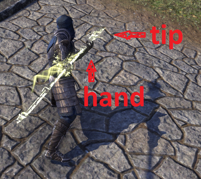
2. Too big and wrongly held (whats the point of having a huge ass spear if youre gonna fight holding it at the tip?)
3. Animation feels silly
4. It looks like a noodle
Ok I am on PTS right now...where are you seeing it being held wrong? Im on an argonian right now and it feels like its held correctly and nowhere close to the tip. More so than the original because on the last swing you are not over extending anymore. Noodle? What? The only time I heard that was when Deltia made a joke about it and then people just repeated it but then never actually tried it themselves. So I am going to ask again...what is the scenario you are personally seeing this in game and not on some content creators stream where they talk like this to get clicks and I'll go try and recreate it right now to see what you are seeing.
Got it, my man. You like it. I don't.
And as you said yourself, others didn't like it too. You can't choose which opinions are valid or not.
Others before me have already described why it feels lazy and silly and as long as we have eyes, we don't need to test it on pts to criticize the aesthetics of it. And yes, I've tested it myself. It looks awful.")
2 -
 morrowjen✭✭✭✭✭From what I've seen... Rapid Strikes is awful too -- bad animation and the sound is out of sync. Jabs is ok when there's a target around but looks horrible if you just cast it.
0 -
Sindrik8x✭✭✭✭I dunno, I tested my new build last night, and I think Rapids is fine tbh. Really enjoying the rotation and ease of weaving with it. Damage is fine. The move to werwolf was a good choice. Next up, to farm brokensoul.0
-
TheGreatBlackBear✭✭✭✭✭
✭MovesLikeJaguar wrote: »I'm an animator, that's my job. I mainly animate for television and movies, but have done some work on games. I can tell you right now, the old animation was better. Exaggeration, anticipation, follow through, arcs, slow in and slow out... It used the principles of animation in a much better way than the new animation. See, the principles exist because without them, animation looks bad. A cartoon doesn't look like reality if you rotoscope exactly, it looks more alive if you exaggerate movements, squash and stretch beyond what a normal human can, etc.
Watch the new animation closely. The first two attacks are exactly the same with no variation in timing. There's no slow in or slow out, anticipation, squash or stretch, or exaggeration. It's just a straight forward animation, frame by frame. It feels stiff, like a robot is moving. The last jab is also slow. It pulls back at the same speed that it stabs, which does not look like a stab.
Here's how I'd fix the animation; for one, there would be variation in the first two strikes, which wouldn't be perfect stabs but have little arcs that the tip of the spear moves in to make it look alive and like an actual warrior is wielding the spear. The arms wouldn't move in perfect repetition. There would be a slight pause at the end of the pull back animation for the first two strikes, and the stab itself would launch forward faster. The body would also move back with the pull back, and arch forward when attacking. Not as much as the final attack, but the body would move a bit unlike the current animation. The second stab would not pull back as far as the first. They're two quick jabs, and pulling back that far both makes the timing of the animation slower, but also makes it look weird. The final attack would pull back similar to how it does, but the launch forward would be faster, and the spear would reach further. It would go in a straight line this time to contrast the arcs from the first two hits, as the arms themselves would be moving in arcs. The character would let go of the spear with their left hand towards the end of the animation to allow them to lunge forward even more than before, which would also give it a better explosive feeling.
That's how I'd fix it. Right now, it needs a complete rework, but the animation I outlined would take an experienced animator maybe a day or two of work to do.
Not to mention, the game has always been fast paced as far as the combat goes. This feels sluggish, it feels slow, it feels off. Light attack weaves and animation cancelling are the big selling points of the combat that make it interesting, because combos can be pulled off in so many ways in such quick succession. This animation does not go with the pace of current gameplay.
[snip] The channel time is shorter at .8 seconds vs 1 second on live. This actually makes it more conducive to LAW and other forms of animation cancelling. Did you bother to hop on the PTS, do research, or even read the patchnotes?
[edited for baiting]Edited by ZOS_Exile on July 21, 2022 7:24PM0 -
cptscotty✭✭✭✭They have shortened the skills duration and adjusted the animation time before without touching the overall visual design.
I dont know why they had to mess with it now.
Yeah...but the old animation is really low resolution. This is more defined. Is it being more defined and thus more noticeable bothering you? The old one just looks like a yellow blur...this one you can actually see a weapon being used.
An ugly ass weapon with a lazy animation
The other one was so low resolution and was broken in pieces and not even whole because of the low quality. The newer one is higher resolution and you can finally see the detail of it. Lazy animation? What is lazy about it? The main differences between the animations is the newer one has a trail effect added to it so you see the movement more clear and the final thrust is now more accurate since it goes from back to front instead of trying to lunge forward and over extending yourself.
I have no problem with upgrading it for a better resolution one. I have a problem with THIS specific one.
The old one might be a shiny blur, but I'd rather go with that for a ''holy'' templar than a regular golden sprayed spear.
Everything I feel about this change was already said by others, but here we go:
1. Ugly regular spear that doesn't feel ''aedric'' at all, which takes away templar's identity
2. Too big and wrongly held (whats the point of having a huge ass spear if youre gonna fight holding it at the tip?)
3. Animation feels silly
4. It looks like a noodle
Ok I am on PTS right now...where are you seeing it being held wrong? Im on an argonian right now and it feels like its held correctly and nowhere close to the tip. More so than the original because on the last swing you are not over extending anymore. Noodle? What? The only time I heard that was when Deltia made a joke about it and then people just repeated it but then never actually tried it themselves. So I am going to ask again...what is the scenario you are personally seeing this in game and not on some content creators stream where they talk like this to get clicks and I'll go try and recreate it right now to see what you are seeing.
Got it, my man. You like it. I don't.
And as you said yourself, others didn't like it too. You can't choose which opinions are valid or not.
Others before me have already described why it feels lazy and silly and as long as we have eyes, we don't need to test it on pts to criticize the aesthetics of it. And yes, I've tested it myself. It looks awful.
So...not holding it by the tip. Here...I challenge you to go try this motion outside in some manual labor. Please do make sure you have a doctor or friend on stand by when you try and prove yourself right by holding it further back. You will get a lesson in physics you probably wont enjoy.
As for the constant "others have said" comments...its what I am trying to address in the first place. You are complaining that ZOS is being "lazy" but then you are repeating what others are telling you to repeat as if its your own thoughts which is lazy itself.0 -
 Unknown_Redemption✭✭✭✭✭
If you held a spear like this in combat, you would be cut in half by a sword - or gutted by a dagger. The point of the spear is to gain reach; staying out of the arc of a swinging blade. You also hold it further back, so when you do connect on an enemy, you can leverage upwards and get under armor to cause fatal wounds with little energy.
3 -
 ArchMikem✭✭✭✭✭
✭✭✭✭✭YstradClud wrote: »Your a stamplar how do you think us magplars feel. It's like they are messing with all we have.
I'm on stamplar and I feel completely made redundant between the nerfs to jabs, ritual of retribution and the burning light change. All us poor templars will be wandering around lonely wondering what to do with ourselves, asking if anybody wants a shard lol
Off to the Healer corner with you!CP2,100 Master Explorer - AvA Two Star Warlord - Console Peasant - Khajiiti Aficionado - The Clan
Quest Objective: OMG Go Talk To That Kitty!1 -
 Vulkunne✭✭✭✭✭
✭Ok so here's a question. I'm not certain if anyone else has brought this up yet but I think it should be put on the table.
So this new animation is not befitting a magicka templar. OK. Its not, it just doesn't work its also not even from a spear style that a Templar would use. I think the spear model shown comes from one of the vampire DLC sets but please feel free to let me know if this is incorrect.
Now, if they want to make changes and use something that they think is closer to an actual Spear weapon, then maybe add a new animation to the Stam side of the morph. And leave the magicka side with the golden shard which I personally cannot help but feel is more appropriate and looks a hell of a lot better. Honestly I have no clue why they would want to throw away a better looking animation especially for something that appears as out of place as what they're wanting to throw at us.
That could be an option, make changes to the Stam morph and leave the golden shard spear for magicka users. I think that would go a long way towards mending wounds over this. But even still I prefer the old model for both magicka or stam yet if given a choice I really don't think what they have here is appropriate for a magplar experience as a typical mage would not train with spears anyways, yet could summon a force that works similar to a spear without it being an actual spear weapon.
They should put more thought into this.Edited by Vulkunne on July 21, 2022 5:52PMToday Victory is mines. Long Live the Imperial Empire. -Grand Admiral Vulkunne3 -
 ZOS_ExileadminGreetings,
We've removed a few non-constructive comments around baiting, please remember that while it’s all right to disagree or even debate with each other, provoking conflict, baiting, inciting, mocking, etc. is never acceptable in the official The Elder Scrolls Online community.0 -
merpins✭✭✭✭✭
✭✭✭TheGreatBlackBear wrote: »MovesLikeJaguar wrote: »I'm an animator, that's my job. I mainly animate for television and movies, but have done some work on games. I can tell you right now, the old animation was better. Exaggeration, anticipation, follow through, arcs, slow in and slow out... It used the principles of animation in a much better way than the new animation. See, the principles exist because without them, animation looks bad. A cartoon doesn't look like reality if you rotoscope exactly, it looks more alive if you exaggerate movements, squash and stretch beyond what a normal human can, etc.
Watch the new animation closely. The first two attacks are exactly the same with no variation in timing. There's no slow in or slow out, anticipation, squash or stretch, or exaggeration. It's just a straight forward animation, frame by frame. It feels stiff, like a robot is moving. The last jab is also slow. It pulls back at the same speed that it stabs, which does not look like a stab.
Here's how I'd fix the animation; for one, there would be variation in the first two strikes, which wouldn't be perfect stabs but have little arcs that the tip of the spear moves in to make it look alive and like an actual warrior is wielding the spear. The arms wouldn't move in perfect repetition. There would be a slight pause at the end of the pull back animation for the first two strikes, and the stab itself would launch forward faster. The body would also move back with the pull back, and arch forward when attacking. Not as much as the final attack, but the body would move a bit unlike the current animation. The second stab would not pull back as far as the first. They're two quick jabs, and pulling back that far both makes the timing of the animation slower, but also makes it look weird. The final attack would pull back similar to how it does, but the launch forward would be faster, and the spear would reach further. It would go in a straight line this time to contrast the arcs from the first two hits, as the arms themselves would be moving in arcs. The character would let go of the spear with their left hand towards the end of the animation to allow them to lunge forward even more than before, which would also give it a better explosive feeling.
That's how I'd fix it. Right now, it needs a complete rework, but the animation I outlined would take an experienced animator maybe a day or two of work to do.
Not to mention, the game has always been fast paced as far as the combat goes. This feels sluggish, it feels slow, it feels off. Light attack weaves and animation cancelling are the big selling points of the combat that make it interesting, because combos can be pulled off in so many ways in such quick succession. This animation does not go with the pace of current gameplay.
[snip] The channel time is shorter at .8 seconds vs 1 second on live. This actually makes it more conducive to LAW and other forms of animation cancelling. Did you bother to hop on the PTS, do research, or even read the patchnotes?
You're right when you say it's easier to light attack weave with the new animation. By a little bit, it's not hard to do it with the old skill either. Though he was talking in response to my post about the animation being slow and sluggish. The old animation was faster despite lasting longer. Although it had an extra hit, it still needed to be animated correctly to look fast, and it was. The new animation wasn't animated correctly, so it looks slow despite being a shorter cast time.Edited by ZOS_Exile on July 21, 2022 7:25PM3 -
Firstmep✭✭✭✭✭
✭✭✭They have shortened the skills duration and adjusted the animation time before without touching the overall visual design.
I dont know why they had to mess with it now.
Yeah...but the old animation is really low resolution. This is more defined. Is it being more defined and thus more noticeable bothering you? The old one just looks like a yellow blur...this one you can actually see a weapon being used.
They are using a staff motif for the new animation, and they made it slightly see thru and yellowish.
Its lazy and ugly.
Ofc aesthetics ar subjective.
The old jabs looks like a spear made out of pure light even if low res.
The new one doesnt even look like a spear at all.5