Maintenance for the week of March 3:
• PC/Mac: No maintenance – March 3
• NA megaservers for maintenance – March 5, 4:00AM EST (9:00 UTC) - 11:00AM EST (16:00 UTC)
• EU megaservers for maintenance – March 5, 9:00 UTC (4:00AM EST) - 16:00 UTC (11:00AM EST)
• ESO Store and Account System for maintenance – March 6, 6:00AM EST (11:00 UTC) - 4:00PM EST (21:00 UTC)
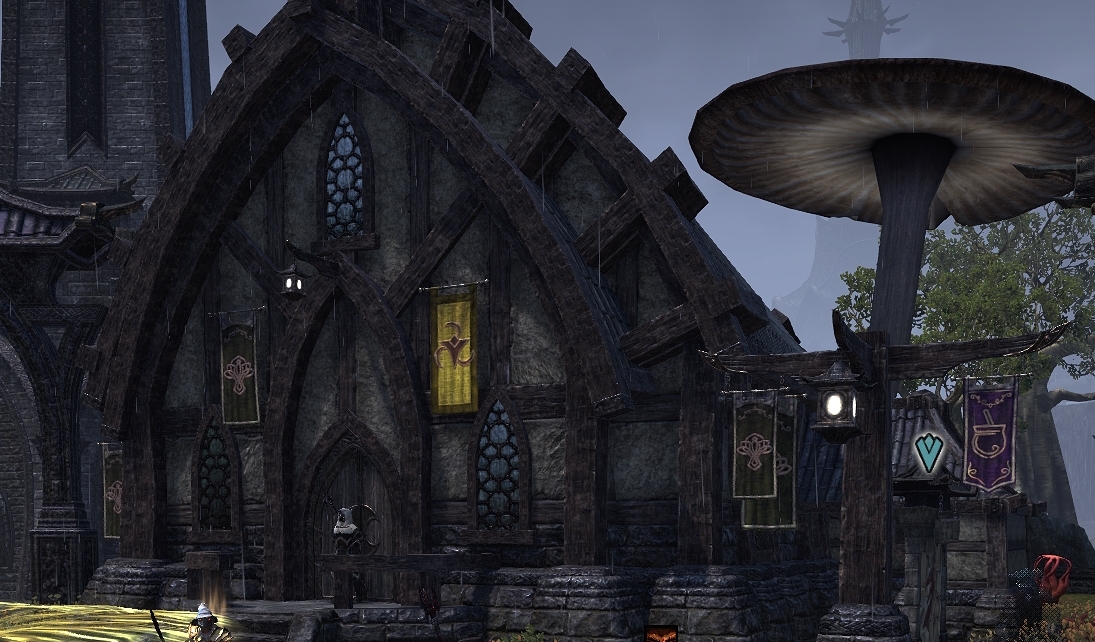
Outfit station - not every banner got replaced
zsban
✭✭✭✭
The large one on the building looks new... however the banner post a few meters away avoided the update?


3
-
DharmahelmSoul ShrivenThe sign for the outfit station is just plain ugly. And it's the only one that doesn't match with the design of the other ones (dye station did match). They could've just used the same banner and used the little guy graphic instead of the pot graphic, maybe changing the color a bit. Would've had the same effect but maintained the overall style.
 8
8 -
Aliyavana✭✭✭✭✭
✭✭✭✭✭Dharmahelm wrote: »The sign for the outfit station is just plain ugly. And it's the only one that doesn't match with the design of the other ones (dye station did match). They could've just used the same banner and used the little guy graphic instead of the pot graphic, maybe changing the color a bit. Would've had the same effect but maintained the overall style.
I wish this icon was different, I instead get a spellcrafting vibe from it2 -
bottleofsyrup✭✭✭✭✭
✭Dharmahelm wrote: »The sign for the outfit station is just plain ugly. And it's the only one that doesn't match with the design of the other ones (dye station did match). They could've just used the same banner and used the little guy graphic instead of the pot graphic, maybe changing the color a bit. Would've had the same effect but maintained the overall style.
Agreed. Sticks out like a sore thumb.0 -
ArchMikem✭✭✭✭✭
✭✭✭✭✭Why'd they use the Transmutation swirls?CP2,000 Master Explorer - AvA One Star General - Console Peasant - The Clan
Quest Objective: OMG Go Talk To That Kitty!0 -
Carbonised✭✭✭✭✭
✭✭✭✭✭The glaring yellow banner is a huge eyesore. It really ruined Mournhold central plaza. They just couldn't go with something more anonymous like the original alchemy or dye banners. They just had to pick something neonlike and blazing because GOD FORBID SOME NEWBIE SHOULDN'T BE ABLE TO FIND THE OUTFITTING STATION - THE HORROR!!!1 -
SydneyGrey✭✭✭✭✭
✭✭✭✭✭There was zero reason to change the dye station sign anyway. I prefer the old purple sign. It's a whole lot more clear what it's supposed to be.
0
