Maintenance for the week of November 25:
• PC/Mac: NA and EU megaservers for maintenance – November 25, 4:00AM EST (9:00 UTC) - 7:00AM EST (12:00 UTC)
• Xbox: NA and EU megaservers for maintenance – November 27, 6:00AM EST (11:00 UTC) - 9:00AM EST (14:00 UTC)
• PlayStation®: NA and EU megaservers for maintenance – November 27, 6:00AM EST (11:00 UTC) - 9:00AM EST (14:00 UTC)
Change the appearance of the Stormfist set helmet?
Burgererer
✭✭✭
Personally, I never hide my helm. But after getting this particular set, I've changed my ways. Let me be clear here: I don't like hiding armor, as I'd rather see a fully-armored character than one that's not. I've had monster sets in the past like Selene's, Valkyn, Chudan, and Mephala. All of these helmets looked okay through amazing to me, but the Stormfist set just seems lackluster.
I don't know if it's the ominous fact that the helm looks just like the boss, wrinkled upper lip, or just a perfectly round dome, but I got tired of the look of this helmet extremely fast. Don't get me wrong, I thought it'd be fun mocking my enemies in PvP and lower-scoring DPS in PvE with such an odd helmet, but I'm hoping this thread gets some attention to ZoS.
My suggestion is that the helm made to look more like a trophy and less like the monster itself, as monster sets tend to do either. More specifically, make the helmet look like a skull of Stormfist, in which the lower jaw has been smashed out, and the character wears it over a leather-ish covering. Sets that have done similar work to this are Ilambris, Grothdarr, and Selene's; all of these appear to have part of the helm, with a cool leather-ish covering over the lower part of the character's face. I've listed what Stormfist currently looks like, the examples of the other monster helms, and my suggestion.
Please, ZoS. If you want to make monster helms not be part of the [Crafting Motif X: Hidden] for a lot of people, consider making aesthetic changes to the wonky-looking ones. And I apologize in advance if anyone really appreciates the current appearance of Stormfist, this is just my personal preference.
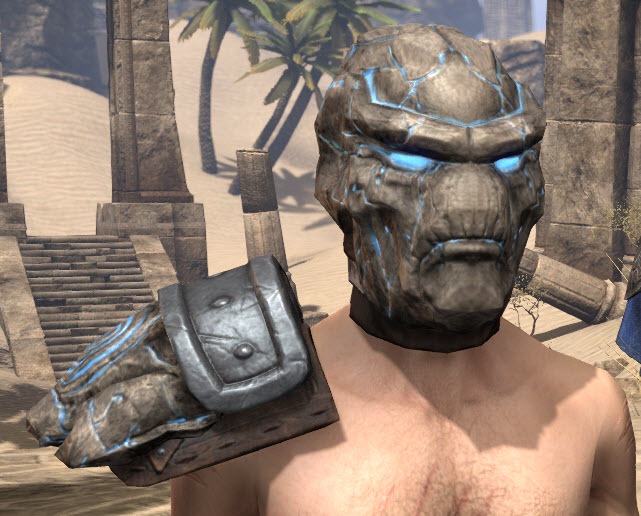
Current Stormfist
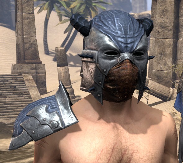
Ilambris
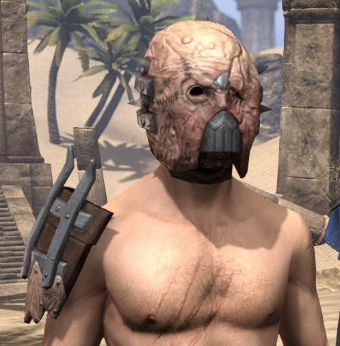
Grothdarr

Selene's

Troll King
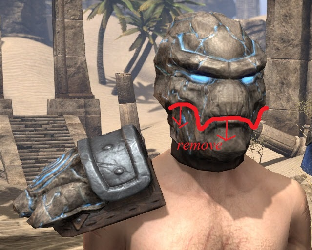
my suggestion
Edited by Burgererer on April 16, 2017 6:50AM
I don't know if it's the ominous fact that the helm looks just like the boss, wrinkled upper lip, or just a perfectly round dome, but I got tired of the look of this helmet extremely fast. Don't get me wrong, I thought it'd be fun mocking my enemies in PvP and lower-scoring DPS in PvE with such an odd helmet, but I'm hoping this thread gets some attention to ZoS.
My suggestion is that the helm made to look more like a trophy and less like the monster itself, as monster sets tend to do either. More specifically, make the helmet look like a skull of Stormfist, in which the lower jaw has been smashed out, and the character wears it over a leather-ish covering. Sets that have done similar work to this are Ilambris, Grothdarr, and Selene's; all of these appear to have part of the helm, with a cool leather-ish covering over the lower part of the character's face. I've listed what Stormfist currently looks like, the examples of the other monster helms, and my suggestion.
Please, ZoS. If you want to make monster helms not be part of the [Crafting Motif X: Hidden] for a lot of people, consider making aesthetic changes to the wonky-looking ones. And I apologize in advance if anyone really appreciates the current appearance of Stormfist, this is just my personal preference.

Current Stormfist

Ilambris

Grothdarr

Selene's

Troll King

my suggestion
0
-
Mojmir✭✭✭✭✭
✭✭✭✭✭No, thank you.monster sets look exactly as they should, you ripped the face off a monster you killed and are wearing as a trophy/bonus.
if anything monster sets should be more interactive with the game(npcs should make comments and be terrified/intimidated by you).
0 -
KochDerDamonen✭✭✭✭✭
✭Yes, please.It's fine that it's like, atronoch looking but...
potato
it looks like a potato
and how do you see out of itIf you quote someone, and intend for them to see what you have said, be sure to Mention them with @[insert name].2 -
Burgererer✭✭✭Yes, please.I think you might be misdirecting the point here. Not all monster sets look exactly like they've been "ripped" off a face.
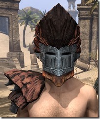
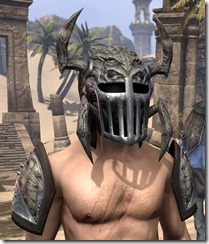
There are sometimes additions or changes to make them more like armor and less like the monster. I understand ZoS made them to resemble the monster, but simply making a helm look less awkward would be simpler than re-scripting dialogue (and less expensive, too).Edited by Burgererer on April 16, 2017 6:56AM0 -
Burgererer✭✭✭Yes, please.KochDerDamonen wrote: »It's fine that it's like, atronoch looking but...
potato
it looks like a potato
and how do you see out of it
Lol thanks for pointing out those two facts. They help further my point.0 -
wolfdoggie_ESO✭✭✭Yes, please.I always wished Blood Spawn didn't have the face mask part. It'd of been the coolest lookin helmet ever. Still is one of the few cool looking ones either way. I hide majority of them most of the time. Too bad there isn't prettier monsters.1
-
Burgererer✭✭✭Yes, please.To be honest, if the mask didn't just look like a metal face, it'd probably look cooler. But yes, no mask at all would be a nice change.0
-
andreasranasen✭✭✭✭✭
✭✭✭All monster sets are hideous#VMATOKENSYSTEM #WEAPONDYE #TRAITCHANGE #CROWNCRATELOVER- Alliance/Platform: Aldemerii - PS4/NA - CP 800+
- Mag Sorc: Arya Rosendahl - Altmer - Highelf
1 -
Oakmontowls_ESO✭✭✭✭✭
✭How else are they going to sell hats in the crown store if they make monster sets look better?0 -
Burgererer✭✭✭Yes, please.Lol these last two comments. I'm just surprised by the first comment, because you can tell he didn't open a single picture. The Ilambris and Grothdarr are literally armor made out of the monsters, and Troll King just looks awesome with the straps in back. Even if they altered Stormfist to look slightly less like you're stuck mid-Storm-Atronach-Transform-gone-wrong, I'd be happy. Simply putting his head on top of the character's just seems strange to me.0
-
Sinolai✭✭✭✭✭Lord Warden looks horrible aswell.
Edit: They all look horrible. But Lord Warden is special kind of ugly.Edited by Sinolai on April 16, 2017 7:46AM0 -
Burgererer✭✭✭Yes, please.Lord Warden looks horrible aswell.
Edit: They all look horrible. But Lord Warden is special kind of ugly.
Even with the low-res eyes and mouth, it beats Stormfist in my book. I think Lord Warden looks a lot better than a lot of them: Shadowrend, Nerien'eth, Kra'gh. And personally, Kra'gh looks a lot like the way Lord Warden was done; rip the eyes and mouth bits out, and put some straps on there to hold it onto my face. Both look a lot better than Stormpotato (Thanks, @KochDerDamonen ).Edited by Burgererer on April 16, 2017 7:54AM0 -
davey1107✭✭✭✭✭
✭No, thank you.I like it because I dye it orange and yell IT'S CLOBBERIN TIME Wherever I go.
Honestly, of the 20 or so helms it's not even top five butt ugly to me. Velidreth is awful. Illambris and Grothdar look like Hannibal Lechter and Leatherface fell in love and started a bondage club in New Jersey.0 -
Burgererer✭✭✭Yes, please.Serious LOL on both those @davey1107. Just like in OP, no doubt it's good for looking funny. But that's also why I'd prefer a change.0
