Maintenance for the week of December 15:
· [COMPLETE] PC/Mac: NA and EU megaservers for maintenance – December 15, 4:00AM EST (9:00 UTC) - 12:00PM EST (17:00 UTC)
· [COMPLETE] Xbox: NA and EU megaservers for maintenance – December 15, 4:00AM EST (9:00 UTC) - 12:00PM EST (17:00 UTC)
· [COMPLETE] PlayStation®: NA and EU megaservers for maintenance – December 15, 4:00AM EST (9:00 UTC) - 12:00PM EST (17:00 UTC)
Anyone else notice how different Auridon is from its concept art?
RealLifeRedguard
✭✭✭
This thread is pretty insignificant, and will probably only appeal to lore-nerds and people who really like the game for its atmosphere, but I thought I'd share some of this stuff with you and see what you all think.
This isn't in any way a complaint, as I've grown fond of Auridon since I started playing, but I was looking at some artwork for the zone and noticed some interesting differences between the art and what we got in-game.


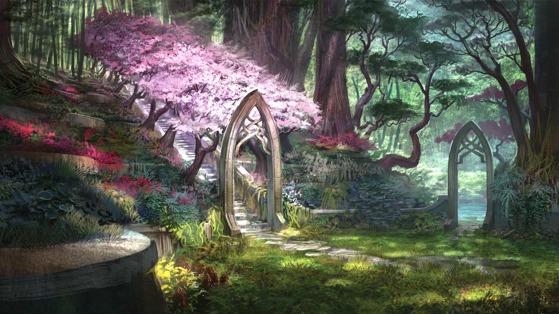
Notice anything different? The artwork looks way more tropical and colorful and lush, with palm trees in the background and a less bright atmosphere. All in all I really like this artwork, and wish Auridon had looked more like it. One thing that bothered me about Auridon is that it didn't feel enough like an island in the southern hemisphere. You would expect the climate to be a bit more like the artwork and less like what we got. Of course artwork never translates perfectly into the game, but the difference is enough to make me wonder if Zenimax consciously decided to change Auridon's environment later in development.
So, what do you think? Do you wish Auridon looked more like the artwork, or do you prefer what we got in-game? Would you like to see future regions in Summerset look like this? What are your general hopes for future high elf content? Are there any other locations in the game that look significantly different from their artwork? Let's discuss.
Edited by RealLifeRedguard on January 24, 2017 8:24PM This isn't in any way a complaint, as I've grown fond of Auridon since I started playing, but I was looking at some artwork for the zone and noticed some interesting differences between the art and what we got in-game.


Notice anything different? The artwork looks way more tropical and colorful and lush, with palm trees in the background and a less bright atmosphere. All in all I really like this artwork, and wish Auridon had looked more like it. One thing that bothered me about Auridon is that it didn't feel enough like an island in the southern hemisphere. You would expect the climate to be a bit more like the artwork and less like what we got. Of course artwork never translates perfectly into the game, but the difference is enough to make me wonder if Zenimax consciously decided to change Auridon's environment later in development.
So, what do you think? Do you wish Auridon looked more like the artwork, or do you prefer what we got in-game? Would you like to see future regions in Summerset look like this? What are your general hopes for future high elf content? Are there any other locations in the game that look significantly different from their artwork? Let's discuss.
#MakeSummersetGreatAgain! http://bit.ly/1sphMz7
5
-
mb10✭✭✭✭✭
✭✭✭Could potentially be referring to Summerset Isles? Something we could see in future in ESO, I hope.
However, it would make more sense for the next TES game to be there based on the big influence of High Elves and Thalmor in the time period of Skyrim and just before with the Great War.0 -
SlayerSyrena✭✭✭✭✭
✭The middle image, Eyevea, isn't technically Auridon.
I have seen elements of these images in Auridon, just probably not as close together or, lush, as they are portrayed in the artworks. (Maybe due to loading issues? Dunno ...)PC/NA, Level 50 * Current Champion Points: 1600+
Cyndril - Bosmer Vampire Nightblade - Dual Wield Blades and Bow
***Member of the closed early beta group, The Psijic Order***
Guest on first ESO Live
My ESO fan art and comics2 -
RealLifeRedguard✭✭✭SlayerSyrena wrote: »The middle image, Eyevea, isn't technically Auridon.
I have seen elements of these images in Auridon, just probably not as close together or, lush, as they are portrayed in the artworks. (Maybe due to loading issues? Dunno ...)
I thought this too, but Grahtwood definitely has a more dense and lush feel to it. I'm sure they could have done something similar for Auridon. The palm trees and more saturated colors are "missing" as well. What do you think about the art as a whole though? Do you prefer it over what we got?#MakeSummersetGreatAgain! http://bit.ly/1sphMz72 -
Vaoh✭✭✭✭✭
✭✭✭✭✭These are the sacrifices that ESO must make being an MMO that covers so much land.
Each individual zone/handful of zones will not be as perfect and unique as in singleplayer TES games. Otherwise I'm positive it would look just like the concept art.2 -
MLGProPlayer✭✭✭✭✭
✭✭✭✭✭Auridon was really underwhelming. The cities are just villages (Skywatch literally has like 5 houses) and the landscape was pretty boring. Really hoping we see the main Summerset island in a future DLC. I would love to see what the devs do with that using the design principles they applied in Hew's Bane and Wrothgar.Edited by MLGProPlayer on January 24, 2017 9:12PM3 -
andreasranasen✭✭✭✭✭
✭✭✭As a high elf i really don't want to talk bad about Auridon. But at the same time the entire map feels more like a giant park with pretty trees comparing to other maps...#VMATOKENSYSTEM #WEAPONDYE #TRAITCHANGE #CROWNCRATELOVER- Alliance/Platform: Aldemerii - PS4/NA - CP 800+
- Mag Sorc: Arya Rosendahl - Altmer - Highelf
1 -
andreasranasen✭✭✭✭✭
✭✭✭RealLifeRedguard wrote: »SlayerSyrena wrote: »The middle image, Eyevea, isn't technically Auridon.
I have seen elements of these images in Auridon, just probably not as close together or, lush, as they are portrayed in the artworks. (Maybe due to loading issues? Dunno ...)
I thought this too, but Grahtwood definitely has a more dense and lush feel to it. I'm sure they could have done something similar for Auridon. The palm trees and more saturated colors are "missing" as well. What do you think about the art as a whole though? Do you prefer it over what we got?
I definitely wish it was as lush as Grahtwood, like the last picture in OP's thread.#VMATOKENSYSTEM #WEAPONDYE #TRAITCHANGE #CROWNCRATELOVER- Alliance/Platform: Aldemerii - PS4/NA - CP 800+
- Mag Sorc: Arya Rosendahl - Altmer - Highelf
1 -
Nestor✭✭✭✭✭
✭✭✭✭✭The concept art was pretty close to the early art in the game, at least in the Late Alpha/Early Closed Beta. From a color saturation standpoint. You can see this in the video they put out where they talk about how the game evolved over time.Enjoy the game, life is what you really want to be worried about.
PakKat "Everything was going well, until I died"
Gary Gravestink "I am glad you died, I needed the help"0 -
Glaiceana✭✭✭✭✭
✭✭I think its not too bad in terms of keeping with the concept.
Have to remember that their purpose is to show the look and feel, all in one image. So often they can get more grand and crowded. But it gives the artists something to go off, "ok we need these kind of plants, this kind of terrain etc."
These are old screenshots of mine (poorer quality from old computer), from when I first reached Auridon, back when that was the linear progress as a Veteran character that was EP


Might go back and take some new ones haha Priests of Hircine
Werewolves who bite for FREE! PC/EUOur total free bites: 7000+Guild Subreddit | Forum Thread | YouTube PlaylistTotal Champion Points: 1000+Main Character: Ithaera - Stam DK, Nord, Female, DD, Werewolf.
Rothelnog - Stam NB, Orc, Male, DD, Werewolf.
J'Xena - Mag DK, Khajiit, Female, DD, Werewolf.
Dances-With-Frost-Dragons - DK, Argonian, Male, Tank, Werewolf.
Raziel The Paradox - Mag TP, Dark Elf, Male, DD, Vampire.
Swims-Through-Starlight - TP, Argonian, Female, Healer, Werewolf.
Glaicean Mag Ward, High Elf, Male, Ice DD, Werewolf.
Hjurne Hircine's Forsaken - Sorc, Redguard, Male, PvP DD, Werewolf.
My Total Free Werewolf Bites: 400+ (Ask me about bites if you need one!)Playing since July 2015!1 -
starkerealm✭✭✭✭✭
✭✭✭✭✭Honestly, those do kinda remind me of some places on Auridon. Well, not the Eyevea one, but still.0 -
menedhyn✭✭✭✭✭
✭I thought the lush colours of the concept art are represented pretty well in the game, as is the architecture (whether you like it or not). But you're right, the density of the foliage and the mix of dappled shade and shadow isn't the same for reasons already stated. I have grown to love Auridon despite this. Some parts are a bit thematic, but there are some parts that have a pretty special feel to me. Tanzelwil is one of them.
I like Auridon, but I wish there was more of it.0 -
RealLifeRedguard✭✭✭You guys make a lot of good points, but I disagree that they couldn't make the area look like the artwork because of limitations. Grahtwood is very dense and tropical for example, at least compared to Auridon.
We're also forgetting that some of the foliage is just missing. I don't recall many palm trees in Auridon, even though they seem prominent in some of the art. I think we should also note the difference between concept art and general artwork. This is not concept art. Concept art is made much earlier in development, before the zones are created and isn't typically made to be this detailed. This art is all from 2014-15, which would imply that auridon was already well on its way to completion.#MakeSummersetGreatAgain! http://bit.ly/1sphMz70 -
Rev Rielle✭✭✭✭✭
✭I think the art is fairly accurate for Auridon. The realization of the zone (i.e. the actual zone in the game) covers all the themes seen in the paintings, keeping in mind the limitations that are always present when actually building such worlds.
As others have said, it's not a 1 to 1 representation: It's trying to capture the feel of what the zone would be like. Art is art, it's not science.Edited by Rev Rielle on January 24, 2017 10:31PMIf you can be anything, be kind.2 -
RealLifeRedguard✭✭✭I respect the points you guys are making, but I'm still not sure I agree.
I find it hard to believe that the differences (if we agree there are differences) are down to the limitations of an mmo, since we see other zones with a density closer to that of the artwork, and some of the foliage is altogether different in the artowkr from what we got.
I still enjoy Auridon, but I don't think the differences came down to anything other than late stage aesthetic choices. I would like to see more Summerset zones in the future, and I hope we get to see a more tropical and colorful environment in line with this artwork.Edited by RealLifeRedguard on January 24, 2017 11:56PM#MakeSummersetGreatAgain! http://bit.ly/1sphMz70

