Maintenance for the week of May 4:
• PC/Mac: No maintenance – May 4
• PC/Mac: No maintenance – May 4
How is your HUD / UI setup?
phaneub17_ESO
✭✭✭✭✭
✭✭✭✭✭
✭✭✭✭✭
I know a lot of people out there prefer a more bare-bones HUD or UI where it only shows the most minimal of details to get the full experience out of their immersion. There are those who require as much data going in and out, so they can read what his happening as it's happening, whether its to you or your group. Then there's the middle ground like me, who like some amount of details without too much forward clutter.
I took an updated view of the HUD on my Tank Templar as an example:
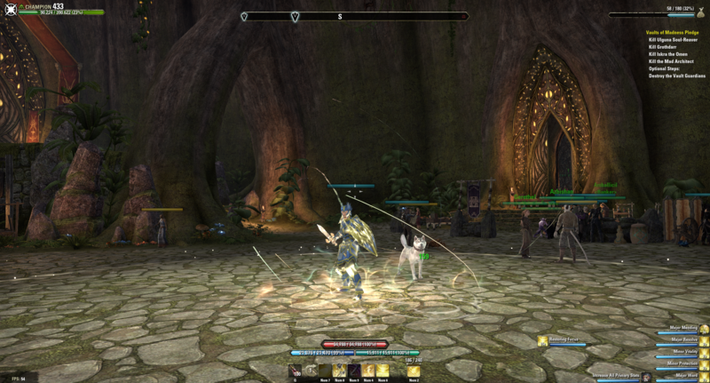
Edited by phaneub17_ESO on June 7, 2016 3:55AM I took an updated view of the HUD on my Tank Templar as an example:

0
-
Lumi✭✭✭I'm using monstly default ui, only thing I think I need to add is buff/debuff timers. Really hope zos would add glow around the abilities which buff you have or somekind of another intrinsic way of managing buffs and debuffs. Perhaps icons for showing which major/minor buff/debuff you have without cluttering the screen too much... Or a way to be able to show only buffs you feel are relevant, I hate when I got nearly 10+ buffs going on on trials, its hard to see if you got the one that matters.0
-
Duiwel✭✭✭✭✭
✭I use default UI with 1 added thing FTC - which obviously replaces the default status bars at the bottom.@Duiwel:Join ORDER OF SITHIS We're recruiting! PC EU"Dear Brother. I do not spread rumours. I create them..."0 -
Troneon✭✭✭✭✭
✭✭✭It's an old screen shot but this is basically what I use, I like to have as much information as possible, even have some addons active you can't see but come up on map screen and other menu's but I also like to keep it as minimalistic and subtle as possible as well. I don't like clutter, really hate clutter. I also see active buffs / debuffs, harvest locations, rare fish tracker, guild trader stuff and a zillion other addons.
I also use ESO Enhanced Graphics Launcher created by Sorien + Sweetf FX to remove in game fog, enhance shaders and effects/colors/graphics.
Edited by Troneon on June 7, 2016 7:10AMPC EU ADMaster Crafter - Anything you need!!High Elf Magicka Templar Healer/DPS/TankTrials / Dungeons / PVP / Everything0 -
Mojmir✭✭✭✭✭
✭✭✭✭✭It's an old screen shot but this is basically what I use, I like to have as much information as possible, even have some addons active you can't see but come up on map screen and other menu's but I also like to keep it as minimalistic and subtle as possible as well. I don't like clutter, really hate clutter. I also see active buffs / debuffs, harvest locations, rare fish tracker, guild trader stuff and a zillion other addons.
I also use ESO Enhanced Graphics Launcher created by Sorien + Sweetf FX to remove in game fog, enhance shaders and effects/colors/graphics.
what map addon is that?0 -
Troneon✭✭✭✭✭
✭✭✭It's an old screen shot but this is basically what I use, I like to have as much information as possible, even have some addons active you can't see but come up on map screen and other menu's but I also like to keep it as minimalistic and subtle as possible as well. I don't like clutter, really hate clutter. I also see active buffs / debuffs, harvest locations, rare fish tracker, guild trader stuff and a zillion other addons.
I also use ESO Enhanced Graphics Launcher created by Sorien + Sweetf FX to remove in game fog, enhance shaders and effects/colors/graphics.
what map addon is that?
http://www.esoui.com/downloads/info605-MiniMapbyFyrakin.html
@Mojmir
Addon settings in game - Mini Map - Mini Map View and Settings - Round Wheel Mode ON - Round Wheel Texture : Moosetrax Astro Lense Wheel - Mini Map Texture Color: BlackEdited by Troneon on June 7, 2016 7:17AMPC EU ADMaster Crafter - Anything you need!!High Elf Magicka Templar Healer/DPS/TankTrials / Dungeons / PVP / Everything0 -
Mojmir✭✭✭✭✭
✭✭✭✭✭It's an old screen shot but this is basically what I use, I like to have as much information as possible, even have some addons active you can't see but come up on map screen and other menu's but I also like to keep it as minimalistic and subtle as possible as well. I don't like clutter, really hate clutter. I also see active buffs / debuffs, harvest locations, rare fish tracker, guild trader stuff and a zillion other addons.
I also use ESO Enhanced Graphics Launcher created by Sorien + Sweetf FX to remove in game fog, enhance shaders and effects/colors/graphics.
what map addon is that?
http://www.esoui.com/downloads/info605-MiniMapbyFyrakin.html
@Mojmir
Addon settings in game - Mini Map - Mini Map View and Settings - Round Wheel Mode ON - Round Wheel Texture : Moosetrax Astro Lense Wheel - Mini Map Texture Color: Black
thanks,might check it out. ive been using AUI's minimap for so long i forget about his LOL0 -
Troneon✭✭✭✭✭
✭✭✭
@MojmirIt's an old screen shot but this is basically what I use, I like to have as much information as possible, even have some addons active you can't see but come up on map screen and other menu's but I also like to keep it as minimalistic and subtle as possible as well. I don't like clutter, really hate clutter. I also see active buffs / debuffs, harvest locations, rare fish tracker, guild trader stuff and a zillion other addons.
I also use ESO Enhanced Graphics Launcher created by Sorien + Sweetf FX to remove in game fog, enhance shaders and effects/colors/graphics.
what map addon is that?
http://www.esoui.com/downloads/info605-MiniMapbyFyrakin.html
@Mojmir
Addon settings in game - Mini Map - Mini Map View and Settings - Round Wheel Mode ON - Round Wheel Texture : Moosetrax Astro Lense Wheel - Mini Map Texture Color: Black
thanks,might check it out. ive been using AUI's minimap for so long i forget about his LOL
I love it because it is very customizable, feels more like an Elder Scrolls Minimap and natural, it also can have auto rotate features if you wish as well as being able to refresh it at anytime if it lags out or gets stuck when changing zones or towns.
The only issue I have had with Fyrakins minimap is when entering and leaving small town maps, sometimes the game freezes for a split second but that is only because I have a zillion other addons with harvest nodes and custom map pins on zones maps, so when it switches between mini town map and full zone map when I leave and enter towns, it has to re load all the map pins and it sometimes freezes the screen for less than a second and then it's fine.
Had no issues using it in pvp or performance, it's an awesome mini map with a ton of options I have not even touched yet.Edited by Troneon on June 7, 2016 7:24AMPC EU ADMaster Crafter - Anything you need!!High Elf Magicka Templar Healer/DPS/TankTrials / Dungeons / PVP / Everything0 -
NolaArch✭✭✭✭✭Couldn't get pic to load on mobile, but have to edit to something!Edited by NolaArch on June 7, 2016 7:37AMArdat-Yakshii EP Stam NB
36k anchovy club
Mash the buttons, hope for the best!
I have some achievements0 -
d8rmir✭✭✭phaneub17_ESO wrote: »I know a lot of people out there prefer a more bare-bones HUD or UI where it only shows the most minimal of details to get the full experience out of their immersion. There are those who require as much data going in and out, so they can read what his happening as it's happening, whether its to you or your group. Then there's the middle ground like me, who like some amount of details without too much forward clutter.
I took an updated view of the HUD on my Tank Templar as an example:
Where does the inventory counter in the top right corner come from?0 -
phaneub17_ESO✭✭✭✭✭
✭✭✭✭✭phaneub17_ESO wrote: »I know a lot of people out there prefer a more bare-bones HUD or UI where it only shows the most minimal of details to get the full experience out of their immersion. There are those who require as much data going in and out, so they can read what his happening as it's happening, whether its to you or your group. Then there's the middle ground like me, who like some amount of details without too much forward clutter.
I took an updated view of the HUD on my Tank Templar as an example:
Where does the inventory counter in the top right corner come from?
Azurah. Has a Bag Watcher option, I set it to the max bag space so it will always show up.1 -
Stoltverd✭✭✭phaneub17_ESO wrote: »I know a lot of people out there prefer a more bare-bones HUD or UI where it only shows the most minimal of details to get the full experience out of their immersion. There are those who require as much data going in and out, so they can read what his happening as it's happening, whether its to you or your group. Then there's the middle ground like me, who like some amount of details without too much forward clutter.
I took an updated view of the HUD on my Tank Templar as an example:
I used the barebones UI for immersion. But since i can't toggle the blocking indicator nor the bow heavy attack indicator... It's kinda pointless0 -
Dimentiza✭✭✭

I use some of the Wykkyd's addons, FTC, MiniMap and G Quick Slot Bar
I used to go for very bare-bones UI but nowdays I need more info so had to sacrifice little bit of my immersion.EU ⋅ PC ⋅ DC0
