Maintenance for the week of January 5:
· [COMPLETE] NA megaservers for maintenance – January 7, 4:00AM EST (9:00 UTC) - 10:00AM EST (15:00 UTC)
· [COMPLETE] EU megaservers for maintenance – January 7, 4:00AM EST (9:00 UTC) - 10:00AM EST (15:00 UTC)
· [COMPLETE] NA megaservers for maintenance – January 7, 4:00AM EST (9:00 UTC) - 10:00AM EST (15:00 UTC)
· [COMPLETE] EU megaservers for maintenance – January 7, 4:00AM EST (9:00 UTC) - 10:00AM EST (15:00 UTC)
Calligraphy manual : Daedric alphabet in Dunmeris

Llevndryn
✭✭✭
Property Decree wrote:The original of this document is available in the library of House Arador Dayn. (in French)
Calligraphy manual
Daedric alphabet in Dunmeris
by Llevndryn Sershilavu of House Arador Dayn
Daedric alphabet in Dunmeris
by Llevndryn Sershilavu of House Arador Dayn
In this little manual, I would like to complete and adapt the Daedric alphabet to Dunmeri language. So I invented signs and rules that do not exist in the lore. Each sign has been carefully considered and I tried as much as possible to base the rules on typography examples that can be crossed in the games,
in particular the clustering used several banners in TESIII: Morrowind. But what follows is a personal and adaptation is by no case canon.
in particular the clustering used several banners in TESIII: Morrowind. But what follows is a personal and adaptation is by no case canon.
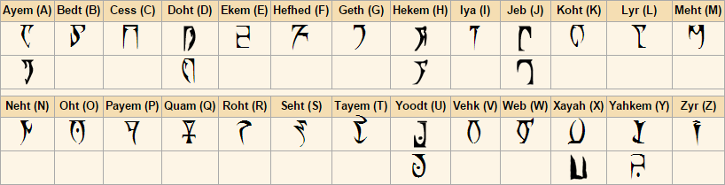
None of the folks who use the Daedric alphabet adapted it as much as the Dunmers did. And although its origins are not fully defined and that, as I suggest in my book «The symbolism of the Daedric alphabet», it might take root in ancient Chimerii uses, it has undergone many transformations since its appearance.
Outside the regional variants that turn some letters, shorten or extend some features, round corners, or even - in the case of Yahkem and to a lesser extent Xayah - simply change form; outside these variants, that's also the text formatting and typographical and orthotypographical rules intrinsic to the use of the Daedric alphabet in Dunmeris that wear the Dunmers culture and contribute to prepare the alphabet to the needs of the language.
First, if, as history seems to show the letters were first engraved, practices have evolved and with them the writing tools. It is now on vellum, or on a few parchments and clothes taht we file the ink of our words.
The ink is designed by mixing with animal glues and resins, various kinds of soot that we find in abundance in our provinces. Some rarer are used to subtly change the texture and, mixed with good mixtures, will better hook the surface. A color can come bite the surface if the ink is made of good products. Some plants, salts, and insects, can be used as pigment for coloring.
The writing tool is more difficult to obtain. Of course, any pen may work for a while, but only a strong and well treated nib will write more than a few sentences. It is also possible to use the ossicles, the finest of the animal taht are still hollow. The important thing is to clear the marrow therein and let it dry the inside that will host the ink. Some fibrous plants finally can serve as brush. The brush is however dedicated to some specific tasks, its softness preventing to marry the angularity of the alphabet, especially when the font size is smaller. As shown in the following table, the letters are such that they require some dash movements rather than a fluid maze.
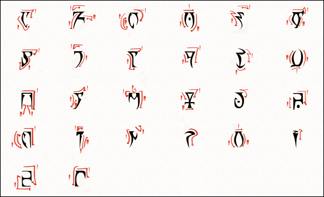
The majority of the letters has a serif at the top that will be the starting point where the tool start its route. Most letters require two or three twists of the wrist; some can be made with a line and none request to lift the nib more than three times.
Only the motion requested by the Quam can really surprise. His fuzzy history and late addition in the alphabet did probably not yet chafed enough that it can be designed perfectly by neophytes learning calligraphy.
In the case of the two letters, or three depending on the regional variant used, which have a point, this one is places once the body is completed and not vice versa, otherwise unsightly twists will be invited.
But these twenty-six symbols cannot alone reflect the complexity of the Dunmeri language. So in addition to the letters of the alphabet various signs will support the emphasis, query, punctuate and give sighs, or allow certain conjugations and the formation of certain words.
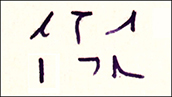
In the order (from top to bottom and left to right), here are the comma, the period, the hyphen, the apostrophe, the exclamation point and the question mark.
I will detail later the first four to focus now on the last two punctuation marks.
In the example on the right, the exclamation point is used in the interjection b'vek!* and the interrogative point in the question ju'okor?**. The first indicates emphasis or surprise, while the second mark a question. In both cases, the punctuation mark is placed at the right of the last letter, centered vertically. This is the case for all punctuation marks that take this up at the end of words like here, or at the end of the sentence when it is it that is punctuated. Punctuation may need to be rotated in the case of horizontal writing.
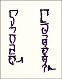
To illustrate the use of the others special characters as well as some standards, I will use the text below that I copy at first without any formatting, and secondly edited and annotated.
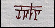
Llevndryn Sershilavu wrote:Dash Azura’m abhahr molhi’ag as balkhun am as Velothii en asuhn abahr Dunmere. Asuhn veyse’ag as mer sudas Kilicithal en asuhm jakeesh vishe’ag amel askabahn.
Lah juohne’ag Azura sut eam indkhes, busaad eremnesi’ag as gah-julan wine’ag ru ALMSIVI en amalde’ag as Thiil.
Azura juohne’ag tost ***’or bahni’ag gher as ara en jikhi’ag asuhl biihn. Tost leyshad as re ***’or dahrdig as devahr am as Nerevarine.
Then Azura’s wrath darken the skin of the Velothi and they were Dunmers. They became the people around the Red Mountain and their eyes blew its color.
Some thank Azura for her gift, others were seduced by the great benefits promised by ALMSIVI and created the Houses.
Azura thanks those who stood in the ash and gave them the prophecies. Those ones listen to the wind whom whisper the return of the Nerevarine.
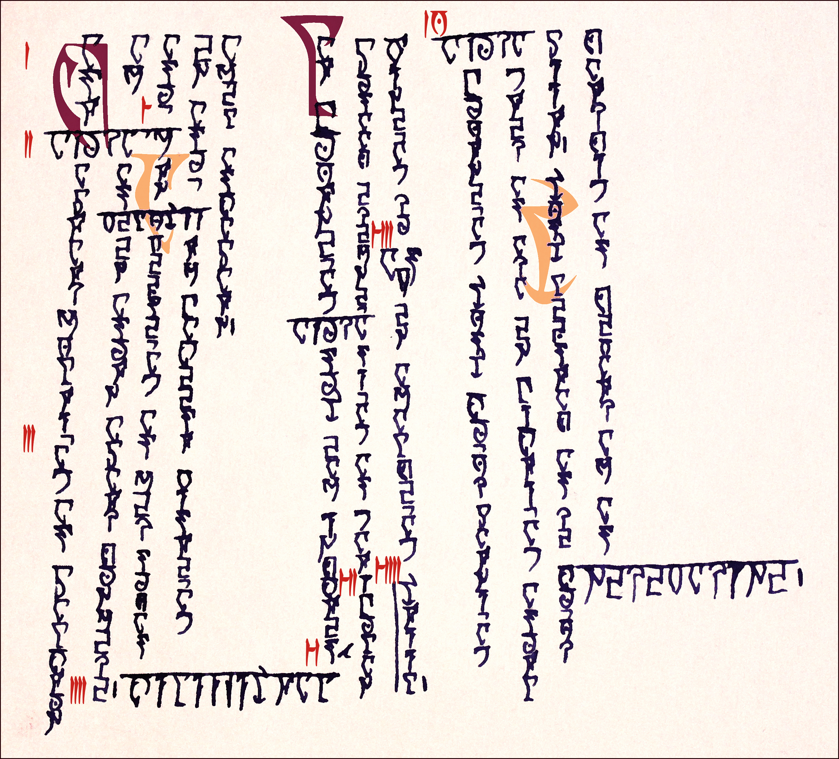
Dunmeris is written from top to bottom and from left to right with the Daedric alphabet. Although this practice is common with the Daedric alphabet, some write it horizontally, no doubt influenced by the writing practices of other ethnic group, especially the Men.
For the typographic analysis to be clearer, I marked in red ten points to refer to.
- First, a dropcap is required in the beginning of each paragraph. This is generally dark to contrast with other initials that can inhabit the paragraph. Indeed, each new sentence will have its initial letter, this last one is clearer and less remarkable than that the one of input. The first dropcap replaces the first letter in the text and should be placed so that the word is legible, while secondary initials are added without removing the letter in the text and are placed according to aesthetic criteria more than readability.
- Proper names are written in capitals. To do so, the serif is linked throughout the word and it is positioned horizontally. No repositioning is required when the entire text is already written horizontally.
- We note here the use of an apostrophe for conjugation purposes. This has several functions like in the possessive case met in point 2.
- The point just finish the sentence and, like all punctuation, is placed to the right of the last letter, centered vertically.
- When a word in capitals crosses the vertical text, it is possible that a word must be splited. In this case, the apostrophe, or, depending on the practice, the dash can be used to indicate that the word continues after the break.
- The comma is used to translate a pause in the sentence without finishing it. It provides the reader with a sigh. It is placed under the same rules as other punctuation marks.
- Gah-Julan is one of the few words in which the hyphen is used. He seems to have a reason to be more historical than a real grammatical function. Here it is used as a binder of two words, although the prefix word gah usually apponde to his partner.
- ALMSIVI is always written with the three letters that bear the name of the Tribunes, arranged in a triangle.
- A word or sentence can be highlighted to emphasize their importance, or ironize their subject. This is done through a vertical line to the left along the sentence or word.
- An exception is made that eliminates the dropcap at the beginning of paragraph when it starts with a proper name.
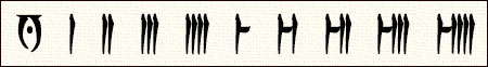
Finally, we must address the numbers and figures. These come ten in number, although the zero is represented by Oht which then has a different function than symbolizing a sound. It is also used to mark the ten. To form the numbers, a figure is placed to the left to represent the tens, and another one to the right for units. Tens and units are separated by a longer space as used in the figures so as not to cause confusion.
Daedric alphabet is used in multiple designs and is not always formatted so. Thus, the initial letters which have no real grammatical value are often crowded out in simple letters and are more common in the documents treated as official missives or books.
But more than pageantry, the use of the Daedric alphabet in Dunmeris carries culture and history. He turns, bend to the customs and standards, and serves as social marker. He buried his secrets more slightly for each change that is made to it, but shapes our societies and shares its name with the gods without losing its first essence. It freezes our words and our thoughts and in its angles, takes us through the eras.
____________
* b’vek! : an exclamation of surprise
** ju’okor? : How?
English is not my mother tongue, so if you find mistakes, just tell me. 
2
-
Llevndryn✭✭✭To complete this manual and to give this alphabet a history to make it change over the centuries, I wrote this appendix which discusses its evolution during the Third Era.
This addition is written during the Fourth Era in the hands of an unknown author.Appendix : The horizontal arrangement
Added in 4E192
With the incorporation of the Province of Morrowind in the Third Empire and the ever-increasing imperial colonization throughout the Third Era, many acculturations hit the Dunmer, especially in their administrative practices.
Indeed, to exchange more easily with the Imperial high authorities, but also with local Men, and for the sake of facilitating the translation of texts, Dunmer massively adopted several typographic rules of the Men alphabet, including its horizontal disposal to read from left to right and from top to bottom.
A fun fact driven this change was the reversal of the proper names typography, to distinguish from other text now written horizontally, were now arranged to the vertical, as was once all the words of the text, except precisely proper names. The other words saw, them, a continuous bar connecting the top of their letters serif. A Dunmer of the Second Era reading such a text might believe in a provocation from its author to those whose names, not only would not be highlighted, but would be aped by the other words of the text to which this distinction was paid .
To make these changes observable, I will attach myself to retype the text that was exemplified in the first pages of this volume, by applying all the adjustments that came enrich or impoverish depending on the point of view, the Daedriquo-Dunmeri alphabet while the Dunmer people mingled with the Imperials.
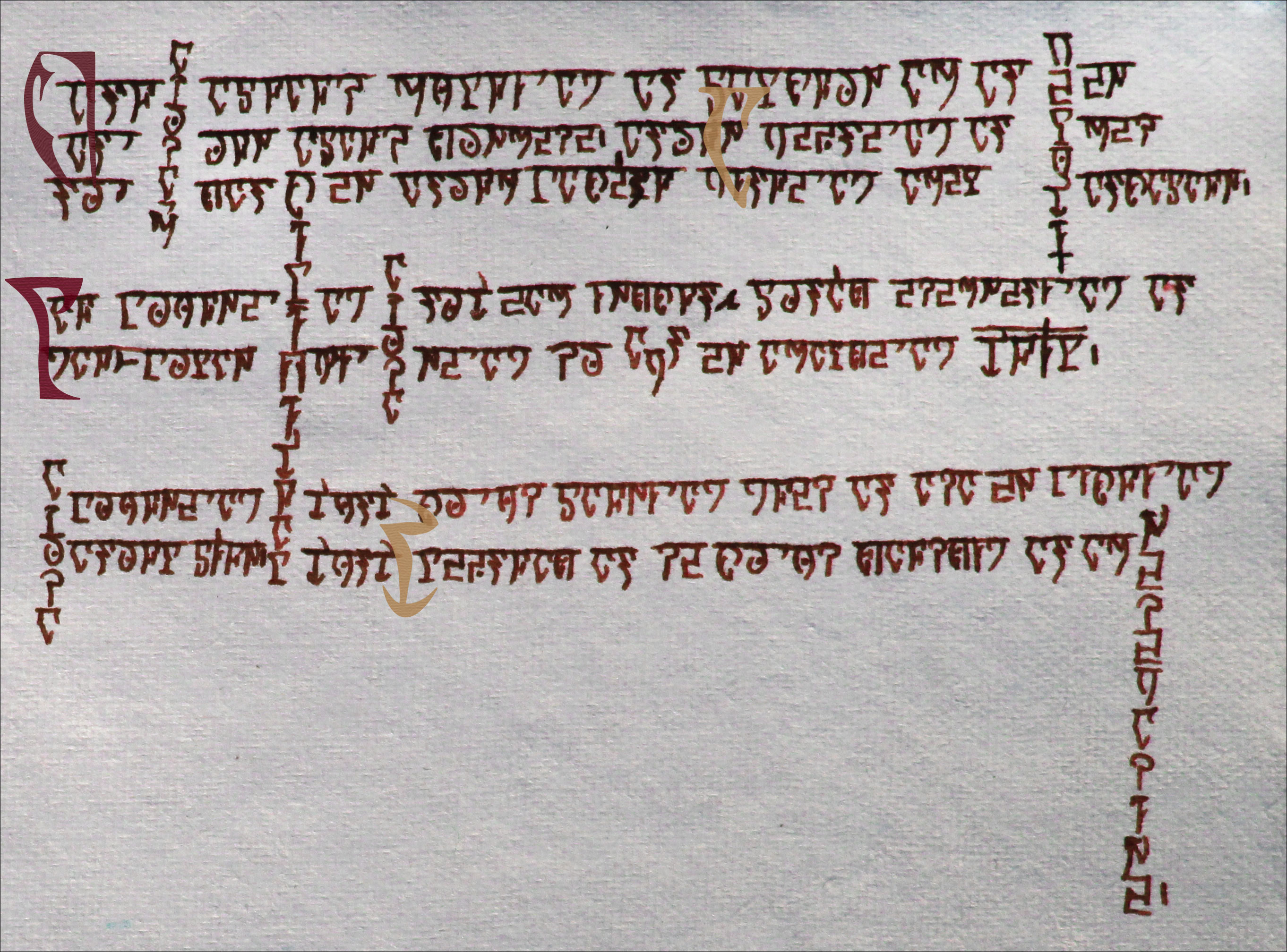
Several interesting changes in the text can be observed, in addition to the reversal mentioned above. But before addressing the differences, it is important to note that many things have survived. We easily recognize the punctuation that is generally the same as for the vertical arrangement, except maybe the dash that can be seen in the word gah-Julan* which is rotated to a quarter turn. Since proper names always come cross the text in some places, we observe the same rule as when the inversion had not yet occurred. The dropcaps are also preserved.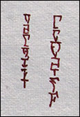
One of the major additions to the Daedriquo-Dunmeri alphabet during the Third Era is the macron, a diacritic to replace the dubbing of the last vowel of a word in the plural. In fact, it was already used during the Second Era, but anecdotally by a pedantic fringe of the erudite population. Its generalization was really effective only at the time the alphabet underwent the modifications that made it change orientation. As shown by the two words in plural in the left box, for vertical words, a vertical line is added in the letter that was once doubled. In the example on the left, a lower serif is added to the Iya so that we can distinguish the macron. This is not the case for the example on the right, since the Ekem that is "doubled" needs no additional serif so that we can distinguish the macron.
In the words written horizontally, the macron is placed above the letter, and exceeds the upper serif binding the letters of the word. See box at right.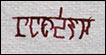
The identification of a word or phrase in order to support its significance or irony was characterized in the vertical arrangement by a line along the left of its object. This same feature is found here over the latter, as we can see for the word thīl* in the text, here on the left box.
Thereby was normalized the use of the Daedric alphabet during the Third Era. Of course, some conservatives have raised their voices loudly to save the traditions inherited from the Chimers and most Daedra worshipers continued to use the vertical arrangement like their gods. This distinction became an important social marker that was quick to associate the vertical arrangement to the worship of the masters of the Oblivion. The amalgam between simple conservatives and them accused more than one Mer of heresy. This was enough to spread widely the horizontal arrangement and ancient writing from top to bottom was broadly preserved only by the Ashlanders and in some families with little concern for their reputation.
Today, as the Tribunal is no more, we are witnessing a resurgence of the vertical arrangement, probably to honor the Reclamations and to forget the days of Imperial grasp and blind faith that led us to the fall, while Baar Dau was crashing on our decadent civilization.
____________
* gah-julan : great benefit
** thīl : housesEdited by Llevndryn on May 16, 2016 2:59PM1 -
 Nestor✭✭✭✭✭
✭✭✭✭✭For a practical application of the font: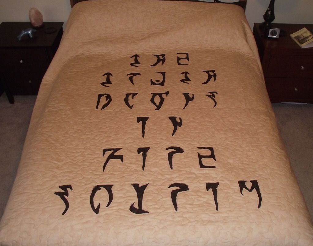
Enjoy the game, life is what you really want to be worried about.
PakKat "Everything was going well, until I died"
Gary Gravestink "I am glad you died, I needed the help"1 -
 dodgehopper_ESO✭✭✭✭✭
✭✭✭One thing I noticed right off the bat is the similarity between that alpha-bet and Hebrew aleph-beit.
Obviously not all of the letters. Take Zyr for instance, it looks a lot like Zayin. Meht has the wavy quality of ancient Mem (or regular Mem, although the bottom isn't closed on Meht. Roht looks a lot like a squiggly Resh. etc. I definitely see some inspiration here, and while I'm not familiar with the Arabic, Aramaic or any Semitic alpha bet I wouldn't be surprised if some of those letters might inspire the appearance of these. Just a thought, and I'm curious if anyone else noticed this.US/AD - Dodge Hopper - Vet Imperial Templar | US/AD - Goj-ei-Raj - Vet Argonian Nightblade
US/AD - Arondonimo - Vet Altmer Sorcerer | US/AD - Azumarax - Vet Dunmer Dragon Knight
US/AD - Barkan al-Sheharesh - Vet Redguard Dragon Knight | US/AD - Aelus Vortavoriil - Vet Altmer Templar
US/AD - Shirari Qa'Dar - Vet Khajiit Nightblade | US/AD - Ndvari Mzunchvolenthumz - Vet Bosmer Nightblade
US/EP - Yngmar - Vet Nord Dragon Knight | US/EP - Reloth Ur Fyr - Vet Dunmer Sorcerer
US/DC - Muiredeach - Vet Breton Sorcerer | US/DC - Nachtrabe - Vet Orc Nightblade
EU/DC - Dragol gro-Unglak - Vet Orc Dragon Knight | EU/DC - Targan al-Barkan - Vet Redguard Templar
EU/DC - Wuthmir - Vet Nord Sorcerer | EU/DC - Kosh Ragotoro - Vet Khajiit Nightblade
<And plenty more>0 -
Llevndryn✭✭✭Yes, maybe the square appearance is inspired by the Hebrew alphabet. And of course the Latin alphabet is the base.0