Update 50 is now available for testing on the PTS! You can read the latest patch notes here: https://forums.elderscrollsonline.com/en/categories/pts
Maintenance for the week of April 20:
• [COMPLETE] NA megaservers for patch maintenance – April 20, 3:00AM EDT (7:00 UTC) - 12:00PM EDT (16:00 UTC)
• [COMPLETE] EU megaservers for patch maintenance – April 20, 7:00 UTC (3:00AM EDT) - 17:00 UTC (12:00PM EDT)
• [COMPLETE] NA megaservers for patch maintenance – April 20, 3:00AM EDT (7:00 UTC) - 12:00PM EDT (16:00 UTC)
• [COMPLETE] EU megaservers for patch maintenance – April 20, 7:00 UTC (3:00AM EDT) - 17:00 UTC (12:00PM EDT)
Tome UI - suggestion

DoofusMax
✭✭✭✭
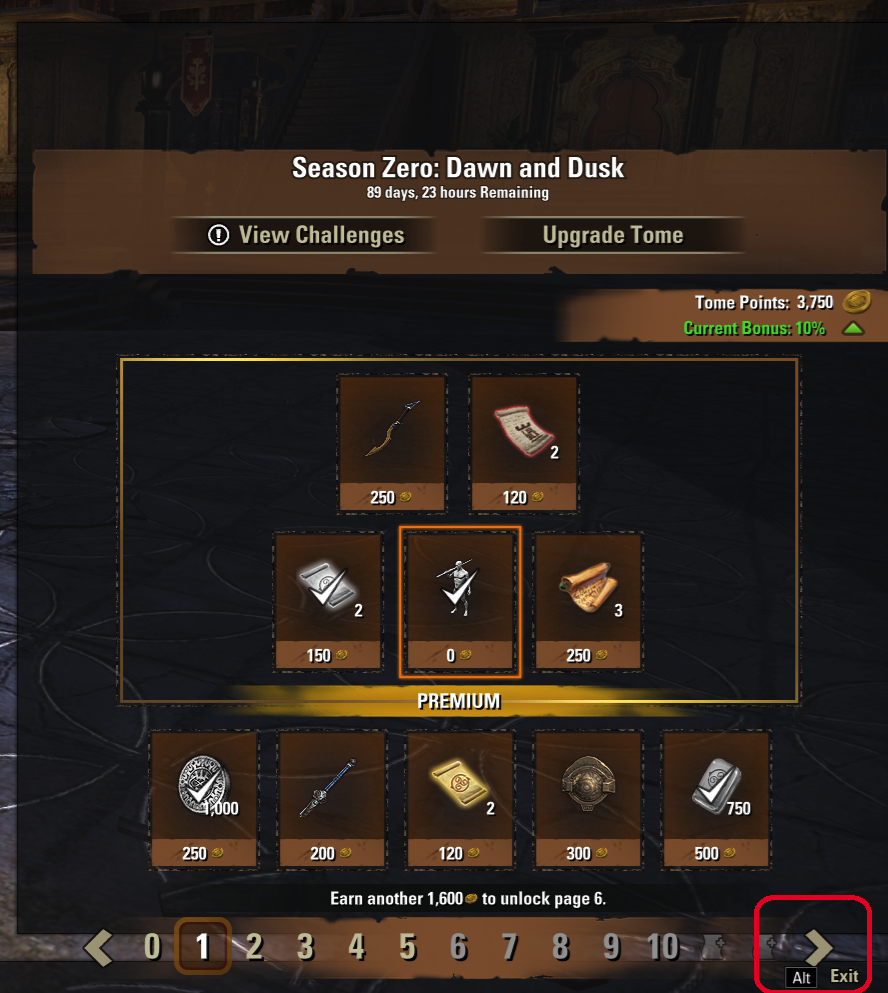
This is not a bug as much as it's a bit of very inconvenient UI design. The Tome interface sits very low on the screen (I'm on a 16:9 monitor) such that the "Next Page" and "ALT Exit" buttons slightly overlap. It would probably be a good thing if that were raised several pixels to give some breathing room to the controls.
I'm fresh out of outrage, but I could muster up some amused annoyance if required.
0
-
DoofusMax✭✭✭✭Giving the benefit of the doubt here, but they probably considered that. If I had to guess, I'd go with it not being purely in-game currencies. The Crown Store is crowns, the Bazaar is Trade Bars, Seals are seals (or gems), etc., but that "Upgrade Tome" button is a real-currency transaction while the stuff on the pages is Tome Points.
EDIT: Going to have to take some of that back because there is a real-currency button ("Buy Crowns") on the first tab of the Crown Store, so it's not the mixed currencies preventing the Tome from being a tab in the Crown Store. Back to having to guess and without the currency issue, it's very likely trying to keep all Tome-related stuff in a single UI, so rewards, challenges, and the whole shootin' match are there in one place rather than being scattered (challenges over there with Pursuits, Groups, BGs, Activity Finder, etc., and the rewards and buying in the Crown Store).Edited by DoofusMax on 11 April 2026 15:02I'm fresh out of outrage, but I could muster up some amused annoyance if required.0
