Maintenance for the week of May 11:
• PC/Mac: No maintenance – May 11
• PC/Mac: No maintenance – May 11
I don't love the Tome UI
-
 Marto✭✭✭✭✭
✭The whole UI and UX looks extremely low quality and cheap.
The assets are bad, the inconsistency is bad, the position of buttons and info is downright dreadful.
The presentation doesn't match what is ostensibly a paid feature. Compare this to the menus and animations of Antiquities and Tales of Tribute, two other paid features with brand new UI elements. Both of them animated, with custom effects, sounds, particles, and high-quality textures.
The Tome should've matched that level of production quality. We should be seeing a 3D model of a book open in front of us. Flipping through the pages should have some sort of animation. If it needs to be 2D for one reason or another, fine. But at least give it some animations and unique sounds.
This is a feature players are expected to pay $15-60 per year for. And some players may spend as much as $120/year on it. It should look like it.Edited by Marto on 3 April 2026 21:29"According to the calculations of the sages of the Cult of the Ancestor Moth, the batam guar is the cutest creature in all Tamriel"6 -
 Frayton✭✭✭✭✭How do you see that? I saw it when I first logged in, but now I just get the black popup box that lists tasks when I click Tomes.
I don't have paid Tomes just ESO+.0 -
 SneaK✭✭✭✭✭
✭PUBG has a more interactive and cleaner UI than this and that’s saying a lot tbh."IMO"Aldmeri Dominion1 Nightblade - 1 Templar - 7 Hybrid Mutt Abominations0 -
 emilyhyoyeon✭✭✭✭✭
✭✭✭✭I wouldn't have expected the Tomes UI even to go with an ''old'' look at all considering the modernizing of the rest of the menu UI, which was like less than a year ago IIRC.
I actually like the old style looks-like-paper kind of UIs in the genre that TES is. I hate the modern look (and of course it always has to be black because that's sleek and classy or whatever), like the one Skyrim has and the one ESO has now.
But, since ESO has already committed to the sleek look, I'm surprised the Tomes page doesn't follow it, book theme or not.IGN @ emilypumpkin
Tullanisse Starborne altmer spellsword battlemage & scholar of the ayleids
Qa'Rirra khajiit assassin & dancer
Seliwequen Narilata altmer necromancer & debaucher2 -
Marto✭✭✭✭✭
✭PUBG has a more interactive and cleaner UI than this and that’s saying a lot tbh.
ESO has a more interactive and clean UI, and that is what's the most frustrating about this. Tomes don't even live up to their previous standards.
For another comparison, let's look at crown crates. Crown crates have:- A 3D model that tilts when you mouse over it, and plays an opening animation when you click
- Different textures for every crate.
- An NPC with some funny dialogue and an animation when they deal each item as a card.
- An animation and sound for flipping each of the cards.
Tamriel Tomes have:- A low resolution jpeg of a book. Even lower quality than existing book textures.
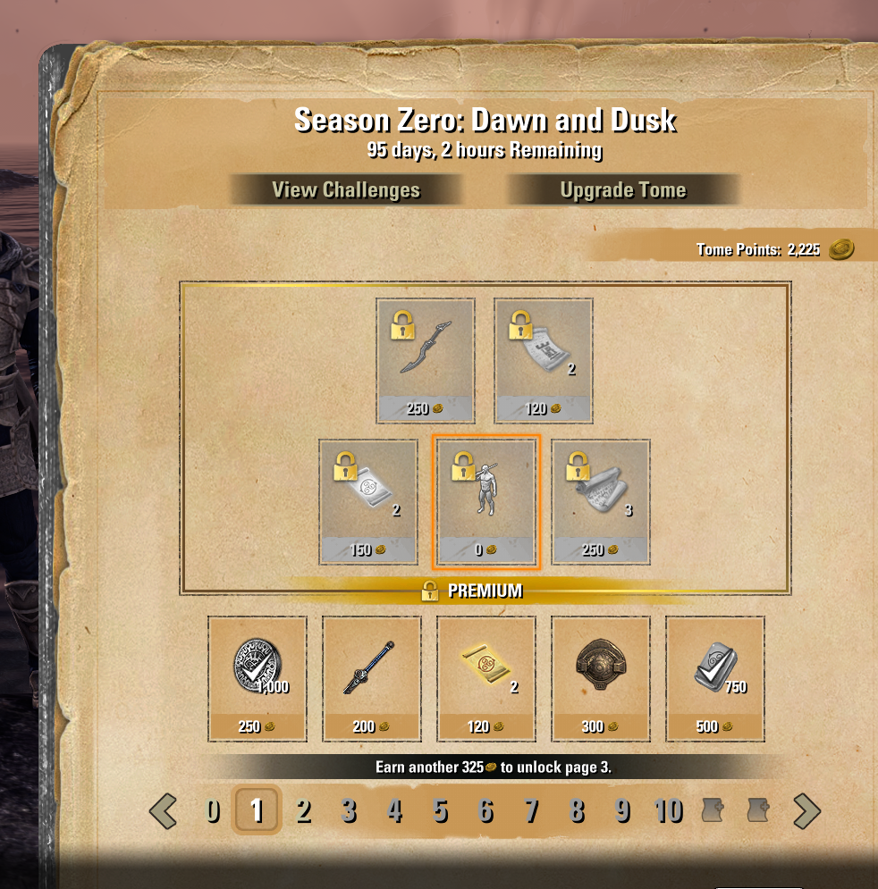
- No unique assets to fit the theme of the Tome. No moon or sun icons or anything like that. If you go to the main ESO website you see a "logo" for "Season Zero: Dawn and Dusk". In page 0 of the tome, it's only plain text.
- No unique sound effects or animations of any kind.
Edited by Marto on 3 April 2026 21:48"According to the calculations of the sages of the Cult of the Ancestor Moth, the batam guar is the cutest creature in all Tamriel"4 -
 Masteroshi430✭✭✭✭I did modifications to the brown textures and I think it is now slighly better, I can release it as an addon if anyone interested.
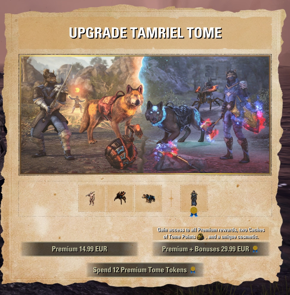
@Masteroshi430 PC/EU (old French guy playing in English & addon author/maintainer) My addons2 -
 DrMedBorn✭✭✭pretty disappointing. Just like the gold bazaar not beeing in game. Maybe its just me but I really like that eso is otherwise so immersive1
 -
 imPDA✭✭✭✭This is first version of an addon I told before. I made it because I would like to make it more practical and also see all rewards on one screen. I am planning to add some more features so it will become a bit more useful in the future, any suggests and critic are welcomed.
https://www.esoui.com/downloads/fileinfo.php?id=4496
P.S. I was thinking if I can add some fancy animations and effects, but I can't decide what I want in particular, so I just decided to make it practical for now.Your Friendly Neighborhood PvP Enjoyer (prior to U48)0 -
 Faltasë✭✭✭✭✭Agree, Tome UI is ugly.
XBOX 2015-2019
PC-NA 2019-2022, 2025-present
Please keep fixing the combat. It's good to fix the combat.
Auri-El is the one true God.1 -
Alastrine✭✭✭✭Wow, a lot of dislike here, but I get it.
Well, I'll be the odd person out and say that though I agree it could definitely be improved upon that I personally had no issue understanding it or navigating it.
Thought it was pretty clear I couldn't get the higher rewards unless I paid for the upgrade.
I could always read my 'quests' or assignments, whatever you want to call them, and I could always tell what rewards were accessible to me and how many more points I needed to get to the next page.
All in all it was quite workable, kind of baffles me how some find it as difficult to decipher as is said here.
Improvements could definitely be made though, but only because its just a little vanilla. But it's a big change so I for one am willing to give it time.0 -
 whitecrow✭✭✭✭✭
✭✭✭The thing I got stuck on was how to bring up the "store" screen after I viewed the challenges. I didn't notice the "back" at the bottom and even when I did I thought "back to what?" It needs to be more clear. Or maybe just have F4 toggle between the two, which is what I tried first.Edited by whitecrow on 16 April 2026 13:540 -
 AllenaNightWood✭✭✭✭i have 2 issues with it and there not huge really maybe some increase in parchment textures and the highlights on items and choices could be brighter0
 -
Taarente✭✭✭The Tome UI doesn't seem to follow the design language of ESO, in fact neither does the Vengeance and Veterancy UI. The Crown Store design would have worked perfectly well for both.2
-
Masteroshi430✭✭✭✭@Masteroshi430 PC/EU (old French guy playing in English & addon author/maintainer) My addons2