Maintenance for the week of November 24:
• PC/Mac: No maintenance – November 24
• PC/Mac: No maintenance – November 24
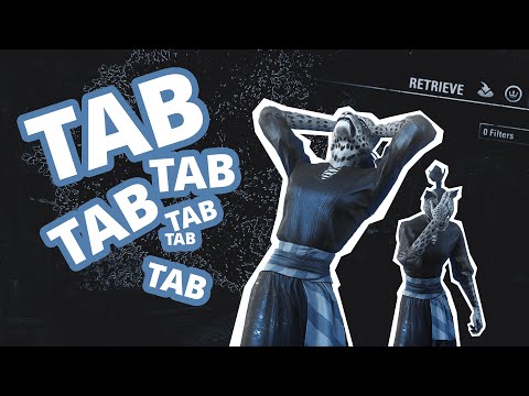
[HOUSING UI] Tab tab tab tab tab tab tab tab... (No, Retrieve is not a solution)
MoonPile
✭✭✭✭✭
I may get carpal tunnel from Housing Editor.
Item selection is terrible / hilarious. Some things have a massive hitbox and others a tiny point somewhere in a stupid location that makes placing them feel like purgatory (Ahem, TREES: can't even see it when placing).
Then when you want to edit a piece, tab-select gets every other thing within like a 100-meter radius EXCEPT the one you need. Until you've tab-tab-tabbed so many times that you accidentally skip it and have to start again. (see video below)
So you resort to Retrieve menu...
but wait, which Leyawiin Turret were you looking for? Is it the one 61m away, or 62m, or 65 m? (All in the wrong direction, since your character got rotated to open the menu.) The video shows this at 00:40. There are even worse scenarios where you might have 10+ of the same exact object in the same location. You then spend time selecting to check each one, each time you need to edit this area, only to introduce a new problem: the camera bug.
Related posts:
Edit: made a video
 https://www.youtube.com/watch?v=Y7QyR4goV_g
Edit 2: Another video – actual, while building:
https://moonpile.tumblr.com/post/776951177777725440/the-constant-tab-select-issue
—
Edited by MoonPile on 2 March 2025 23:41 Item selection is terrible / hilarious. Some things have a massive hitbox and others a tiny point somewhere in a stupid location that makes placing them feel like purgatory (Ahem, TREES: can't even see it when placing).
Then when you want to edit a piece, tab-select gets every other thing within like a 100-meter radius EXCEPT the one you need. Until you've tab-tab-tabbed so many times that you accidentally skip it and have to start again. (see video below)
So you resort to Retrieve menu...
but wait, which Leyawiin Turret were you looking for? Is it the one 61m away, or 62m, or 65 m? (All in the wrong direction, since your character got rotated to open the menu.) The video shows this at 00:40. There are even worse scenarios where you might have 10+ of the same exact object in the same location. You then spend time selecting to check each one, each time you need to edit this area, only to introduce a new problem: the camera bug.
Related posts:
- Main Post with Potential Solutions: https://moonpile.tumblr.com/post/774590743855644672/tab-tab-tab-tab-tab-eso-housing-uiux
- Maybe an addon could help? – https://forums.elderscrollsonline.com/en/discussion/672927/ui-addon-request-help-with-the-tab-object-selection-issues-in-housing-editor
- Camera bug - Housing Editor menus: https://forums.elderscrollsonline.com/en/discussion/658782/housing-editor-placing-items-changes-camera-fov-zoom
- No way to switch between Mouse vs Keyboard editor: https://forums.elderscrollsonline.com/en/discussion/671574/housing-ui-please-add-an-easy-way-to-switch-btwn-mouse-vs-keyboard-precision-positioning
Edit: made a video
 https://www.youtube.com/watch?v=Y7QyR4goV_g
Edit 2: Another video – actual, while building:
https://moonpile.tumblr.com/post/776951177777725440/the-constant-tab-select-issue
—
1
-
Diebesgut✭✭✭✭✭
... on Playstation it's most of the time just point and click... but the ruby candlefly gathering is difficult to handle 🤔
Khajiit Sicherheitsdienst ~ Überprüfung von Schlössern aller Art ~ Khajiit Security ~ Inspection of any kind of locksKhajiit Gebrauchtwaren ~ Handel mit Waren aller Art ~ Khajiit Store ~ Trading of any kind of goodsPlaystation0 -
tsaescishoeshiner✭✭✭✭✭
✭✭I think the retrieve menu could improve to help you know which item you're selecting when you have multiples of the same near each other.
I had the same issue with tab tab tab tab tab in a recent build I was making, but it's actually soooo nice that we can tab target furnishings now that idk what to even suggest as an improvement.PC-NA
in-game: @tsaescishoeshiner1 -
MoonPile✭✭✭✭✭tsaescishoeshiner wrote: »I think the retrieve menu could improve to help you know which item you're selecting when you have multiples of the same near each other.
I had the same issue with tab tab tab tab tab in a recent build I was making, but it's actually soooo nice that we can tab target furnishings now that idk what to even suggest as an improvement.
Yeah that would be a nice improvement to Retrieve. When I was working on something, I thought "it'd be nice if I could name this tower to know which it is". Just a thought though, not a good solution - like nobody wants to name every hedge out of dozens in landscaping.
Anyway it's silly and a nuisance, but definitely a case of "the street finds its own uses for things". They probably imagined users decorating with a few items clustered at most, not heavily-layered cobbling like we actually do.1 -
katanagirl1✭✭✭✭✭
✭✭✭✭✭tsaescishoeshiner wrote: »I think the retrieve menu could improve to help you know which item you're selecting when you have multiples of the same near each other.
I had the same issue with tab tab tab tab tab in a recent build I was making, but it's actually soooo nice that we can tab target furnishings now that idk what to even suggest as an improvement.
That’s a good idea, like maybe it could outline the particular item in yellow or something.
Khajiit Stamblade main
Dark Elf Magsorc
Redguard Stamina Dragonknight
Orc Stamplar PVP
Breton Magsorc PVP
Dark Elf Magden
Khajiit Stamblade
Khajiit Stamina Arcanist
PS5 NA0 -
Elvenheart✭✭✭✭✭
✭✭✭I’ve never tried the tabbing thing, is it one direction only or can you go forwards and backwards some way, like tab to go forward and shift tab to go backwards or something?0 -
Pixiepumpkin✭✭✭✭✭
✭✭✭Tab is not perfect, especially in a dense decorated area...
....but man I am sure happy to have it. So much easier to dig out that item behind an item (even if I have to spam tab 15 times to find it)."Class identity isn’t just about power or efficiency. It’s about symbolic clarity, mechanical cohesion, and a shared visual and tactical language between players." - sans-culottes1 -
MoonPile✭✭✭✭✭Elvenheart wrote: »I’ve never tried the tabbing thing, is it one direction only or can you go forwards and backwards some way, like tab to go forward and shift tab to go backwards or something?
One direction, that's why "you've tab-tab-tabbed so many times that you accidentally skip it and have to start again." A way to go backwards would be a slight help.
For anyone who cobbles, landscapes, places things out-of-bounds, or basically anything beyond sparse decoration, it's not possible to select something by direct click, since pivot points become obscured.
It's interesting that the housing system is simultaneously one of the most flexible I've ever seen (even compared to The Sims for example), while also being so restrictive in UI and item limit. Like they didn't anticipate what players would do with all this freedom.0 -
Kaelthorn_Nightbloom✭✭✭✭✭
✭✭✭Highly recommend playing with a controller or at least rebinding keyboard hotkeys. The default keybinds will break your hand. Sprint is probably the worst offender. My pinky went numb the first hour I played ESO. Not sure how the ZOS dev team finds their default keybinds playable.PC NA0 -
MoonPile✭✭✭✭✭SkaraMinoc wrote: »Highly recommend playing with a controller or at least rebinding keyboard hotkeys. The default keybinds will break your hand. Sprint is probably the worst offender. My pinky went numb the first hour I played ESO. Not sure how the ZOS dev team finds their default keybinds playable.
Oh yeah this is a separate issue, but the lack of sprint toggle is something I've asked them for as well, through all the ways we have to contact them. Lately I get around that other ways and don't need to sprint so much, but it's awful for new players.
Controller is not the solution for me though. And the tabbing issue, even if rebound, you'd still have to press *something* multiple times to find an item in a dense cluster. It needs a better UI solution; unfortunately I can't offer an example att.1 -
MoonPile✭✭✭✭✭Update: I made a video, updated the OP
 https://www.youtube.com/watch?v=Y7QyR4goV_g Edited by MoonPile on 4 February 2025 22:240
 -
cyclonus11✭✭✭✭✭
✭✭We also need our characters to switch to a default personality when placing objects! I have to remove personalities when editing in first-person otherwise objects get placed incorrectly because I sighed or shifted or started whistling or whatever.0 -
MoonPile✭✭✭✭✭cyclonus11 wrote: »We also need our characters to switch to a default personality when placing objects! I have to remove personalities when editing in first-person otherwise objects get placed incorrectly because I sighed or shifted or started whistling or whatever.
Ahahaha yeahh, I find turning down/off settings like Screen Shake and Head Bob in Camera settings to help there, or addon/wheel to quickly switch personality.
There's just a lot of UI management in general. I change camera position *so much* to get my toon out of the way when building, I cannot imagine building without camera addons among others.1 -
MoonPile✭✭✭✭✭Another video.
https://moonpile.tumblr.com/post/776951177777725440/the-constant-tab-select-issue
Direct link:
https://va.media.tumblr.com/tumblr_ssirt2iN7b1ay1sac_720.mp4
I couldn’t re-select the Nord Lantern after I’d JUST placed it, which is silly. (Why wouldn’t the hitbox be recognized from the position I’d placed it?) So I decided to record again.
Oftentimes I do not want to go into the F5 menu to Retrieve, for all of the reasons stated prior.
.Edited by MoonPile on 2 March 2025 23:360
