Let's talk about 2 handed new animations.
Hi, previously I created a post complaining about new animations because I thought many of them are worse than the current animations. Many of you said that you like a lot the new animations and I started to check all new animations in PTS. You were right, most of new animations are great and look pretty good but not in two handed case.
I have created this post to implore ZOS to keep the current two handed animations because the new are simply horrible :-(.
- LIGHT ATTACKS: Ok, the new light attacks animation are slightly better than current animations but not for much. Nothing more to say.
- HEAVY ATTACKS: OMG the new heavy attack animation is the worse animation I have seen in a game, please don't put this on live!!!! PLEASE!!!!!!!!!!!!. Check the difference:
1.5:
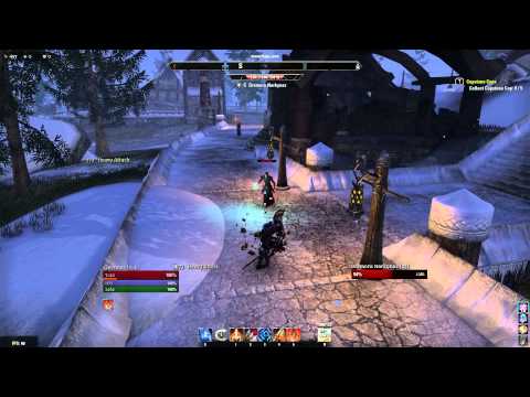 https://www.youtube.com/watch?v=djbpQ2PbeEI&feature=youtu.be
1.6
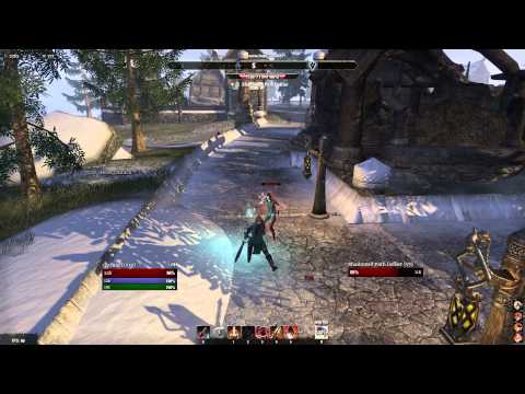 https://www.youtube.com/watch?v=BqqKrc7YGzs&feature=youtu.be
- UPPERCUT: The new Uppercut animation is horrible too. It looks more cartoonish, less realistic, less natural and less an Elder Scrolls game.
1.5:
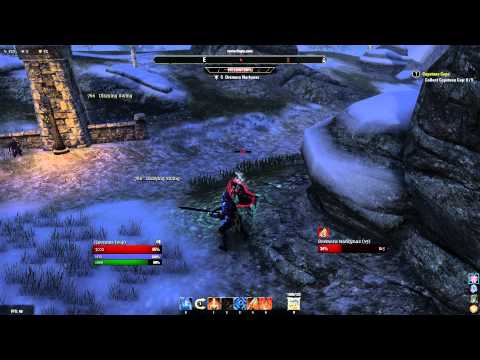 https://www.youtube.com/watch?v=un0qcfdRDnM&feature=youtu.be
1.6:
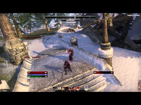 https://www.youtube.com/watch?v=dnQicfSG1MM&feature=youtu.be
Believe, the animations are even worse when you play than they look in videos. You feel like you are playing a cartoon game.
Edited by arnaldomoraleseb17_ESO on 1 February 2015 01:08 I have created this post to implore ZOS to keep the current two handed animations because the new are simply horrible :-(.
- LIGHT ATTACKS: Ok, the new light attacks animation are slightly better than current animations but not for much. Nothing more to say.
- HEAVY ATTACKS: OMG the new heavy attack animation is the worse animation I have seen in a game, please don't put this on live!!!! PLEASE!!!!!!!!!!!!. Check the difference:
1.5:
 https://www.youtube.com/watch?v=djbpQ2PbeEI&feature=youtu.be
1.6
 https://www.youtube.com/watch?v=BqqKrc7YGzs&feature=youtu.be
- UPPERCUT: The new Uppercut animation is horrible too. It looks more cartoonish, less realistic, less natural and less an Elder Scrolls game.
1.5:
 https://www.youtube.com/watch?v=un0qcfdRDnM&feature=youtu.be
1.6:
 https://www.youtube.com/watch?v=dnQicfSG1MM&feature=youtu.be
Believe, the animations are even worse when you play than they look in videos. You feel like you are playing a cartoon game.
Debon Templar VR14 Thorn Blade (EU)
Gaunnes DK VR14 Haderus (EU)
Gaunnes DK VR14 Haderus (EU)
7
-
danno8✭✭✭✭✭
✭✭✭✭✭Heavy attack:
The over-the-left-shoulder swing looks very strange and unnatural for a right-handed individual. Did he suddenly go lefty? A switch-hitter?
Uppercut:
I think most of the problem is that they sped up the forward-swing part of the animation when they should have sped up the wind up. Probably did it that way so people have a moment to react to it. But I agree the old one looks better.2 -
jagaclasesb16_ESOSoul ShrivenHonestly, the new animations are horrible. Im totally agree about the uppercut, that speed up looks weird. Hope they change this.2
-
Vyle_Byte✭✭✭✭✭
✭Wow, those are just... terrible.Member of the Old GuardMother of the Byte FamilyVyle Byte||Ivana Byte||Vyible Byte||Hakate Vampler Former EMPRESS BWB||Haan Zolo {Retired} (He swung first)||Lunari ||Wardyn Chalyk Tahno||Dirti Dianah||Bonnie||
Viva la Byte1 -
Pausekey✭✭✭The heavy attack over the left shoulder pauses for a sec, looks like the guy is cramping up or something.4
-
Khivas_Carrick✭✭✭✭✭Light and Heavy look better on the PTS imho, but I completely agree with the part about Uppercut looking weird as hell and making weaving harder than it has to be. I would say go back and do what @jagaclasesb16_ESO said to do, which was speed up the wind up but leave the actual swing portion alone.Bobbity Boop, this game might become poop, but I'll still play because I'm just a pile of goop!0
-
Recremen✭✭✭✭✭
✭✭✭✭✭The heavy attack over the left shoulder pauses for a sec, looks like the guy is cramping up or something.
It's a common fake-out maneuver, I actually like it a lot. The main problem I have is that for some techniques (on all melee weapons) your character ends up looking away from the target. Very bad form.Men'Do PC NA AD Khajiit
Grand High Illustrious Mid-Tier PvP/PvE Bussmunster1 -
Lynx7386✭✭✭✭✭
✭✭✭✭✭They need to stop animating in 3ds max and get a motion capture team.PS4 / NA
M'asad - Khajiit Nightblade - Healer
Pakhet - Khajiit Dragonknight - Tank
Raksha - Khajiit Sorcerer - Stamina DPS
Bastet - Khajiit Templar - Healer
Leonin - Khajiit Warden - Tank1 -
Aren_Liore✭✭✭I agree, the new animations look awkward, especially the heavy animation. Uppercut shouldn't have been changed. I think 1.5's uppercut felt heavier, and felt more powerful.1
-
xaade✭✭✭I think they are trying to get more realistic with the animation.
The new heavy animation is trying to put more into the hip, which is what you do with that kind of weapon.
But, it was awkwardly done. The body movement needs more refinement with where the legs are placed.
The weapon arc is more correct however.1 -
xaade✭✭✭The uppercut needs to go back.
It no longer follows through and that's actually incorrect. It was more correct before.2 -
Soris✭✭✭✭✭
✭2h animations are awesome currently in live server. You can feel the weight of the weapon and when you use uppercut, you know it's gonna be deadly.
But in pts, they are just unnatural and weird and looks funny. Why bother changing?Welkynd [Templar/AD/EU]1 -
Tarrin✭✭✭The jamming, when weapon goes through the target was deleted
 Because of that weight of the hit was lost. Samurai without a sword
Like a samurai with the sword
But without the sword0 -
Soris✭✭✭✭✭
✭Camera shake you mean? Yeah, it was also beautiful. Please undo this change zeno. It isn't feels right for so many people appereantly.
@ZOS_GinaBrunoWelkynd [Templar/AD/EU]0 -
2h animations are awesome currently in live server. You can feel the weight of the weapon and when you use uppercut, you know it's gonna be deadly.
But in pts, they are just unnatural and weird and looks funny. Why bother changing?
Exactly! I think 2handed is the only weapon that doesn't need new animations. Right now it feels good in live. Maybe a little laggy sometimes but I am not sure if this a animations problem or a server population problem.Debon Templar VR14 Thorn Blade (EU)
Gaunnes DK VR14 Haderus (EU)0 -
Goresnort✭✭✭Guess this is a matter of preference and taste.
I play extensively with 2h weapons on live and it is also the weapon I’ve used most on 1.6 pts.
I just love how much better 2h combat feels in 1.6 compared to live, and would be gravely disappointed if they changed it back to how it feels on live.
1.6 2h combat has more weight to it, feels smoother and looks more brutal.
And in regards to the jitter/stutter/wobbly effect on impact we have for melee weapons on live today, I’m oh so happy they got rid of that ; ) Made it look like both our weapons and the targets hit were made of rubber. The first time I noticed this in combat shortly after launch, I thought the animations were bugging out or lagging.
I’m not saying I’m right, but just how this player feels about 2h combat on PTS.
1 -
Guess this is a matter of preference and taste.
I play extensively with 2h weapons on live and it is also the weapon I’ve used most on 1.6 pts.
I just love how much better 2h combat feels in 1.6 compared to live, and would be gravely disappointed if they changed it back to how it feels on live.
1.6 2h combat has more weight to it, feels smoother and looks more brutal.
And in regards to the jitter/stutter/wobbly effect on impact we have for melee weapons on live today, I’m oh so happy they got rid of that ; ) Made it look like both our weapons and the targets hit were made of rubber. The first time I noticed this in combat shortly after launch, I thought the animations were bugging out or lagging.
I’m not saying I’m right, but just how this player feels about 2h combat on PTS.
While I can't understand what do you like about the new animations, I respect your opinion. I only hope ZOS will be able to find a solution that make all happy.
I still believe that old animations are extremely better.Debon Templar VR14 Thorn Blade (EU)
Gaunnes DK VR14 Haderus (EU)0
