Maintenance for the week of December 2:
• PC/Mac: NA and EU megaservers for patch maintenance – December 2, 4:00AM EST (9:00 UTC) - 9:00AM EST (14:00 UTC)
• Xbox: NA and EU megaservers for patch maintenance – December 4, 6:00AM EST (11:00 UTC) - 12:00PM EST (17:00 UTC)
• PlayStation®: NA and EU megaservers for patch maintenance – December 4, 6:00AM EST (11:00 UTC) - 12:00PM EST (17:00 UTC)
Chat Bubbles - Good Start But Needs Work
bellanca6561n
✭✭✭✭✭
✭
✭
This is a reposting of something I originally posted in response to a thread in General Discussion. But, for those scanning topics selectively, I thought it a good idea to put it here as well.
Executive summary: it will need just a few changes to be robust and viable.
Good set of options:

Tool Tips to explain them:

But it's lacking two more features it will need to function in the game:
1. The beginning of long statements scroll off the top of the screen. And, "so don't talk so much" is neither an answer nor an option if you've even seen fine roleplayers in action.
2. There is no font size option in the Chat Bubbles options field. This contributes to number 1 above.
3. The screen will become unusable during any RP event, due to numbers 1 and 2 above.

Chat size in Social options does not change the size of the font here. Nor should it. It would be unreadably small.
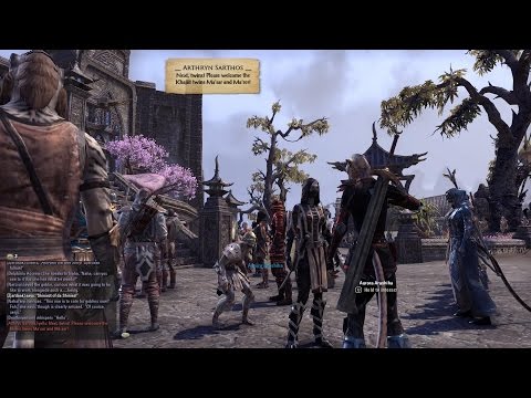
Also the chat bubble can appear too high above the player. It looks clear who's talking in this screen shot but only because there is only one person there. Imagine if there were several standing near each other. That little V that serves as an arrow can also get easily lost in the background.
The problem is that, unlike regular text chat, there is no label.

Two things that would be good to have and improve adoption:
1. More fonts.
3. Option to label who is talking. Right now the little V pointer is supposed to do this but that won't work in a crowd.
3. Texture options. This would also require options for level of transparency.
To better illustrate my point, here's a video of a recent RP event that I posted earlier.
These are your most social players and they create their own content. This feature helps them and other more social players who don't like or don't use voice servers.
With just a little work it will be a splendid addition to the game.
Executive summary: it will need just a few changes to be robust and viable.
Good set of options:

Tool Tips to explain them:

But it's lacking two more features it will need to function in the game:
1. The beginning of long statements scroll off the top of the screen. And, "so don't talk so much" is neither an answer nor an option if you've even seen fine roleplayers in action.
2. There is no font size option in the Chat Bubbles options field. This contributes to number 1 above.
3. The screen will become unusable during any RP event, due to numbers 1 and 2 above.

Chat size in Social options does not change the size of the font here. Nor should it. It would be unreadably small.
Also the chat bubble can appear too high above the player. It looks clear who's talking in this screen shot but only because there is only one person there. Imagine if there were several standing near each other. That little V that serves as an arrow can also get easily lost in the background.
The problem is that, unlike regular text chat, there is no label.

Two things that would be good to have and improve adoption:
1. More fonts.
3. Option to label who is talking. Right now the little V pointer is supposed to do this but that won't work in a crowd.
3. Texture options. This would also require options for level of transparency.
To better illustrate my point, here's a video of a recent RP event that I posted earlier.
These are your most social players and they create their own content. This feature helps them and other more social players who don't like or don't use voice servers.
With just a little work it will be a splendid addition to the game.
2
-
Gidorick✭✭✭✭✭
✭✭✭✭✭I pretty much agree 100% with this post.
I did think the height of the text bubbles was to accommodate a horse, but when I hopped onto the horse, the text pop up slightly higher.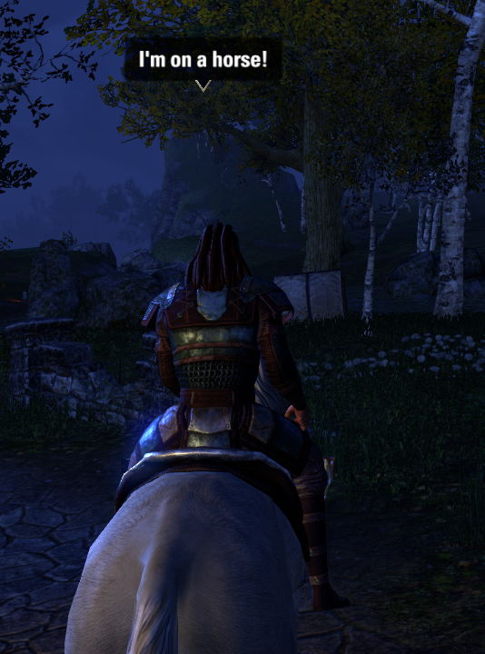
If possible, the text bubbles should be more floaty. As you scroll in closer to the character in 3rd person, the bubble should be pushed down by the edge of the screen.
Also, if we could have the last 2 things we said be shown on screen at once, that would be helpful. The "arrow" pointing to the character that is speaking should be RIGHT on top of the character with a trailing tail to the floating chat box. Additionally, the option to make the chat-boxes glow (different colors) would be nice.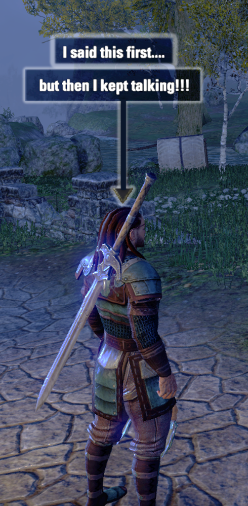
Lastly, a quick-button to hide and show all text boxes on screen would be welcomed. It could just be tied into the UI On/Off function.Edited by Gidorick on 1 November 2014 06:10What ESO really needs is an Auction Horse.
That's right... Horse.
Click HERE to discuss.
Want more crazy ideas? Check out my Concept Repository!0 -
bellanca6561n✭✭✭✭✭
✭I should probably ask this elsewhere but I'll try here first:
Does the (beta) tag on this feature mean what it implies - that it is still being worked on?
Feedback was asked for. Feedback was provided. Nothing has changed in this feature from the PTS version.
This is not a complaint. I simply need to know.0 -
bellanca6561n✭✭✭✭✭
✭Okay, I think I've been proven wrong here and, in this case, I'm glad I am.
Seems the problem is not font scaling but clipping. Just saw this video of a test of the system with a group. It's not bad.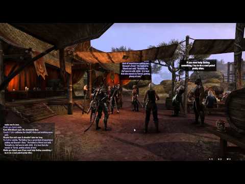 http://youtu.be/9n1aakRpRa0 0
 -
bellanca6561n✭✭✭✭✭
✭And this one from the EU Wayrest Mages Guild Seminar on Cosmology.
There is no overhanging banner but there is a small problem with chat bubbles overlapping when multiple people are sitting in a row, and the scene is viewed edge on. Plus someone notes that they had to raise their graphics settings to get the feature to work.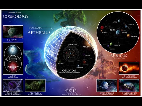 http://youtu.be/8i9dRMSaaoY
The question I have is whether Stravinsky was a Russian, as commonly believed, or an Orc.0
 http://youtu.be/h0yCNZk7hhc