Maintenance for the week of September 15:
• [COMPLETE] PC/Mac: NA and EU megaservers for patch maintenance – September 15, 4:00AM EDT (8:00 UTC) - 9:00AM EDT (13:00 UTC)
· Xbox: NA and EU megaservers for patch maintenance – September 16, 6:00AM EDT (10:00 UTC) - 12:00PM EDT (16:00 UTC)
· PlayStation®: NA and EU megaservers for patch maintenance – September 16, 6:00AM EDT (10:00 UTC) - 12:00PM EDT (16:00 UTC)
[DLC card game] ZOS UI design is extremely painful...Sigh. Never improved (/._.\)
AvalonRanger
✭✭✭✭✭
✭
✭
[DLC card game] ZOS UI design is extremely painful...Sigh. Never improved (/._.\)
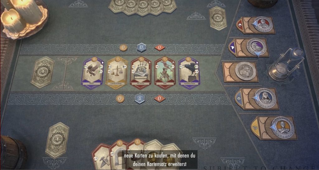
Yesterday, I played new card game tutorial quest. Despite of beautiful visual,
I couldn't fully understand the concept of this game by my first attempting.
The visual is very gorgeous, but this is NOT UI design at all.
It's too much abstractive visual like combat UI design of ESO.
Far from sophisticated, and not so friendly for beginner.
Definitely, UI design is the weakest aspect of Zenimax online studio.
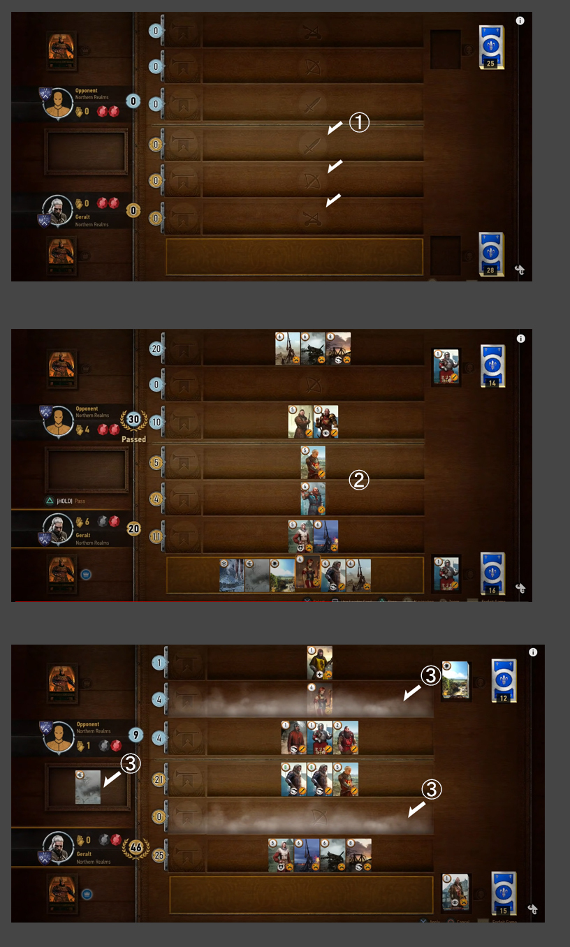
Here is Witcher3 "gwent card game" sample as reference for example.
(not for stealth marketing. of course.)
I could fully understand concept of this game design by my first attempting through the game playing.
1, There're 3 different combat distance concept. Easy to understand.
2, The characters belong to the distance concept.
3,There're de-buff function penalty.
4,Simple and easy, but sophisticated.
Edited by ZOS_Hadeostry on 10 June 2022 03:26 Yesterday, I played new card game tutorial quest. Despite of beautiful visual,
I couldn't fully understand the concept of this game by my first attempting.
The visual is very gorgeous, but this is NOT UI design at all.
It's too much abstractive visual like combat UI design of ESO.
Far from sophisticated, and not so friendly for beginner.
Definitely, UI design is the weakest aspect of Zenimax online studio.

Here is Witcher3 "gwent card game" sample as reference for example.
(not for stealth marketing. of course.)
I could fully understand concept of this game design by my first attempting through the game playing.
1, There're 3 different combat distance concept. Easy to understand.
2, The characters belong to the distance concept.
3,There're de-buff function penalty.
4,Simple and easy, but sophisticated.

My playing time Mon-Friday UTC13:00-16:00 [PC-NA] CP over2000 now.
I have [1Tough tank] [1StamSorc-DD] [1Necro-DD] [1Real Healer]
with [1Stam Blade].
But, I'm Tank main player. Recently I'm doing Healer.
2023/12/21
By the way...Dungeon-Meshi(One of Famous Japanese fantasy story comic book) got finale...
Good-bye "King of Monster Eater".
2024/08/23
Farewell Atsuko Tanaka...(-_-) I never forget epic acting for major Motoko Kusanagi.
0
-
ZOS_HadeostrymodGreetings,
This thread has been moved to the Tales Of Tribute, as it is better suited there.
Thanks0 -
Lysette✭✭✭✭✭
✭✭✭✭✭I don't know, what you have against the design of the ToT board - eventually it just takes getting used to for you. I quite like it.4 -
Michae✭✭✭✭✭
✭✭I don't know, if we're comparing Gwent to ToT I'd say both of them are pretty straightforward, but both of them need some getting used to. The three rows in Gwent were just as confusing at a time as anything in ToT. And ToT isn't really that complicated.
What you really need to pay attention to is that your cards are at the bottom, left of them are unspent cards, right of them are the ones that you spent.
Next, above them are cards that both players can draw from and indicators of what resources both of them have.
On the right, out of the way, are patrons.
You can hover your mouse over everything and get short explanations on what is what. It's hardly a rocket science.
And I prefer the 3d table look over Gwent's "2d shelf thingy". And I'm Polish, so you know I mean it when I say I prefer something else over the Witcher. It's illegal to dislike the Witcher here. "I bear the cruel weight of certainty. Total, absolute, relentless certainty. People rarely comprehend the luxury of doubt... the freedom that comes with indecision. I envy you."
―Sotha Sil
@Michae PC/EU1 -
Lysette✭✭✭✭✭
✭✭✭✭✭I don't know, if we're comparing Gwent to ToT I'd say both of them are pretty straightforward, but both of them need some getting used to. The three rows in Gwent were just as confusing at a time as anything in ToT. And ToT isn't really that complicated.
What you really need to pay attention to is that your cards are at the bottom, left of them are unspent cards, right of them are the ones that you spent.
Next, above them are cards that both players can draw from and indicators of what resources both of them have.
On the right, out of the way, are patrons.
You can hover your mouse over everything and get short explanations on what is what. It's hardly a rocket science.
And I prefer the 3d table look over Gwent's "2d shelf thingy". And I'm Polish, so you know I mean it when I say I prefer something else over the Witcher. It's illegal to dislike the Witcher here.
I liked to play Qwent a lot, but I think ToT is on par with it - ZOS did a really good job with this game - the problem is just, how to make it popular - a lot will say, that the rewards in the beginning are much too low to stay with the game - what is sad.0 -
opaj✭✭✭✭✭
✭I'm still having a little trouble with the font size in ToT on my setup, but I much prefer the aesthetic of being at a card table over Gwent's more abstract interface. I'm sure that the UI could be improved, but I hope ZOS continues to focus on interfaces that feel like they're actually in the world, like they did with ToT and Antiquities.1 -
AvalonRanger✭✭✭✭✭
✭This is not only "ToT" card game problem, but also most of ESO UI design sense are going wrong direction .
ESO has extremely beautiful visual immersion, and it fits the Elder Scrolls world perfectly. ZOS did nice work at this point.
Maybe director of ZOS want to sustain those beautiful immersion for the players, then I can accept ZOS's attitude also.
But!! ZOS is still wrong. Because, It's a "game". OK? It's not kind of movie watching at the theater.
Please communicate with players more better way!
Maybe, ESO players did these group chat...in the dungeon or something group mission.
"Hey bro. press "X" on the green circle and must become werewolf before you...."
"Hey bro. press "X" on the green circle and must become machine mouse before you...."
"Hey bro. wear the poison yourself, and bring it to the fountain and press "X"....otherwise
our combat will never finish...."
"Please attack the pike!!!!!!! "
"
(Recently players go to vacation to the High Isle. Maybe vampire people are happy now... )
)
Or....keep "making" extremely long explanation about some mysterious gimmick of boss character,
...with keep killing additional mob enemy as a tank.
"Hey...we were all dead except you. what wrong with us? can't understand what happening here."
"Yea...I know. Wait sec...after kill this thing, I'll explain gimmick. Sorry, no chance to revive you now."


Doing these thing through the combat is really good immersion !!? I've never thought like that.
Put the something UI mark on the beautiful visual will destroy immersion. I can understand that.
But those stupid group chat moment are more destroying immersion.
Why ZOS can't understand such a fundamental game design knowledge?
My playing time Mon-Friday UTC13:00-16:00 [PC-NA] CP over2000 now.
I have [1Tough tank] [1StamSorc-DD] [1Necro-DD] [1Real Healer]
with [1Stam Blade].
But, I'm Tank main player. Recently I'm doing Healer.
2023/12/21
By the way...Dungeon-Meshi(One of Famous Japanese fantasy story comic book) got finale...
Good-bye "King of Monster Eater".
2024/08/23
Farewell Atsuko Tanaka...(-_-) I never forget epic acting for major Motoko Kusanagi.0

